Google Gives Docs, Sheets, And Slides A Design Refresh On Android
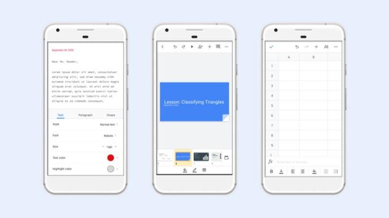
Google has introduced a new design for its Google Docs, Slides, and Sheets apps on Android, giving them a look that's more consistent with the rest of the company's G Suite apps. The actual functionality of these apps remains unchanged, according to the company — this is a purely visual upgrade, one that is first arriving for Slides and Docs.
Google announced the new design on Monday. The Material redesign, as the company calls it, brings a number of UI improvements to the three apps, including 'highly-legible' typefaces, a document list that has been 'restyled,' more consistent controls across the three mobile products, and iconography that has been updated across the apps.
The redesign is already live in Google Docs and Google Slides on Android to start with; the company started rolling it out to Google Sheets on Android earlier today, as well. The update follows Google's previous release of its Material design style on Google Sheets, Slides, Sites, and Slides on the Web back in January.
Following that January update for the Web apps, Google released the Material design look for its Google Drive app on both Android and iOS in March. Users already familiar with the design in those apps and platforms should find it simple to adjust to the new look for the office apps on Android.
Google's free office apps are similar to the alternatives offered on both mobile platforms, the most notable of which is likely Microsoft's own suite of office apps. Of course, managing spreadsheets or text documents on smartphones is a bit difficult, but the same apps can also be downloaded on tablets.
