Google Chrome Introduces New Features To Reorder Tab Clutter
Many people live in their browsers to the point that having 30 or more tabs open at the same time, some of them might even be days old. And that's on just one device, with some people these days owning at least a phone in addition to a computer. In other words, managing browser tabs can be quite the mess and Google is finally giving Chrome users a bit of help with new features that won't exactly reduce the number of tabs you open but at least make them more manageable.
Browser tab management is a hairy topic and different browser makers have different solutions to the problem. Google's doesn't exactly involve helping users reduce their tab addiction but just to tidy up their tabs or make them easier to identify. After all, when you have dozens of tabs open, it can be hard to see which one is which. Especially when the default UI makes tabs overlap each other.
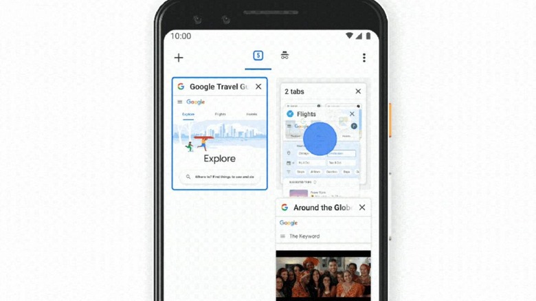
On desktops where Chrome doesn't have much control over UIs, Chrome will let users hover over tabs to see their names. On Android, though, Google is switching from the usual overlapping cards to a grid view that will let users more easily identify tabs at a glance.
Android users have an even better tool to manage tabs. Chrome on Android will let users group tabs by dragging and dropping those boxes on top of each other. This will add a new panel at the bottom of the screen for those groups. Admittedly, it's a new convention that may need a bit of getting used to.
Chrome also has a few new features to make browsing an even more pleasurable experience, like sending tabs directly between Android and desktop and vice versa, no need for third party apps. Users will also be able to customize their desktop browsers not just with a background image but with a set color themes to choose from.
