Google Assistant Redesign Adds Bigger Visuals, Simple Smart Home Control
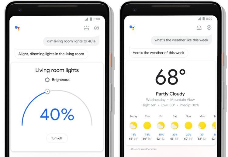
Google has pushed out a major redesign for its Google Assistant mobile product, bringing a new look that makes it easier to retrieve information and perform actions using touch and voice. The redesign incorporates larger visual elements, which make it easier to get data at a glance; there are also new controls and sliders for rapidly adjusting smart home items like connected lights.
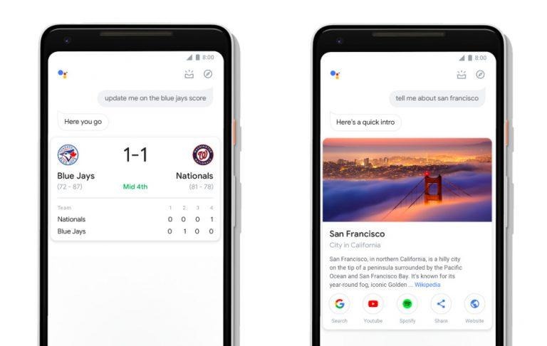
As the images show, users get access to a clean interface with prominent visual elements, such as videos, weather info, info cards for places, direct access to apps and sharing options, and more. Smart home device owners likewise can easily adjust their devices from Google Assistant using large dials and sliders; these can be used for things like volume.

As well, Google says Assistant on mobile now has an interactive messaging interface, this making it easier to quickly edit messages. Assuming the user has an Android phone, the redesigned Google Assistant also provides easier access to the user's daily overview. This can be accessed by opening the Assistant, then swiping up on the screen.
The overview provides things based on how the user has recently used Google Assistant, as well as the current time of the day. Experiences with brands has also changed; Google says both they and developers have new tools for fully utilizing a phone's screen. Thanks to this, Starbucks, for example, presents thumbnails for menu items, making it easier for the user to make their selections.
Google Assistant is available to download on Android and iOS smartphones — iPhone users will need to open the app, while Android users can access the assistant by long-pressing the device's home button.
SOURCE: Google
