Google App Launcher And Logo Redesigned
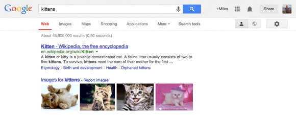
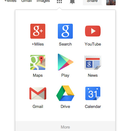
Google has redesigned its branding and app launcher, with a new square drop-down menu that offers quicker access to all of the company's apps like Google+, Maps, and YouTube. The new "Apps" grid button replaces the "More" drop-down in the old UI, and is joined by a flatter company logo which, Google says, is now "refined" in both its colors and the shapes of the letters themselves.
That logo, it's fair to say, looks a whole lot flatter than the old version. Google has dropped the faux shadowing and replaced it with cleaner lines and solid colors, a design strategy that fits in with not only Android's "authentically digital" aesthetic but what Apple is doing with iOS 7.
The new launcher, meanwhile, also brings Google in the browser more in line with how apps are accessed on both Android phones and tablets, and in Chrome OS on Google's Chromebooks.

Changes to how Google arrays its various apps have prompted controversy in the past. The decision process which sees some services put straight into the menu bar, and others "hidden" in the "More" drop-down, has been hotly argued before now, depending on which apps individual users value the most.
This new launcher, however, changes that by giving most apps equal treatment. It also allows for more readily expanded space for what seems like an ever-increasing range of titles on offer, something the existing horizontal menu bar wouldn't easily accommodate.
As with most Google updates of this sort, you might not see the new design straight away. Google says it will be rolling it out "across most Google products over the next few weeks."
