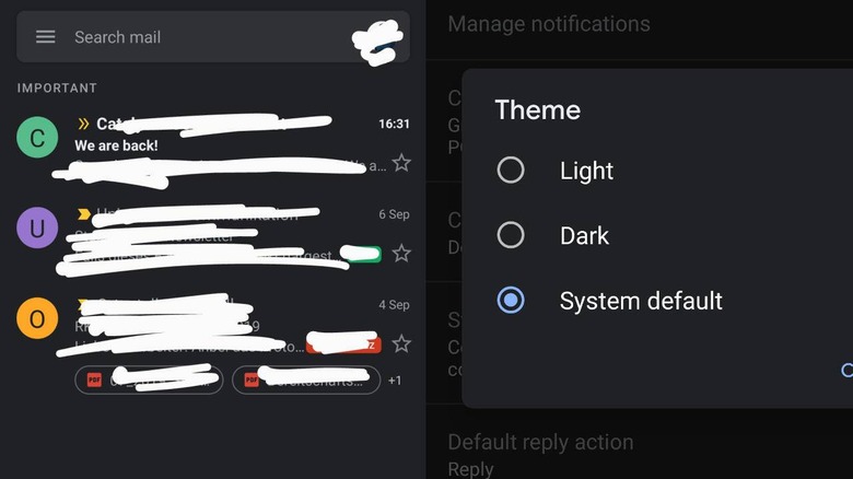
Gmail On Android Finally Gets A Less Scathing Dark Mode
Google almost had a winner with its Material Design that people started imitating in all other places. With the version 2 of its design language, it seemed that Google has generated split opinions on the dominantly white aesthetic. More than just a matter of personal taste, however, Material Design v2 was criticized for burning not just batteries but also eyes. Fortunately, Google is slowly relenting but it seems to be taking its sweet time doing so.
The old Material Design espoused the use of bold colors and images to create a somewhat "joyful" experience but v2 has reduced that to a primarily white color scheme. The focus may have been on minimalism that may be OK on desktops and even laptops. Mobile users, in contrast, found it painful.
At a time when users are becoming more conscious of how dark modes can help save them a bit of battery life, Google ironically pushes a design language that does the exact opposite. And at a time when users have started clamoring for dark themes in apps, Google dumps a bucket of white in theirs. And, almost ironically, these Material Design v2 apps don't even respect the new system-wide dark or night mode settings in Android.
Google did promise it will be bringing dark mode options to its apps and has, to its credit, slowly done so. A few apps like Calendar and Keep Notes have indeed gained theme-switching abilities but it's only now that Google's next most used app is following suit. That is, if you're one of the lucky few that's already getting the new option posted on Reddit.
Google's slow progress on what looks like a small change is irking no small amount of users. That said, given the amount of customizations Android users and even OEMs can do, Google might find it a bit cumbersome to choose a proper dark mode that takes into consideration users' modifications.
