Gmail Logo Change Drops The Envelope
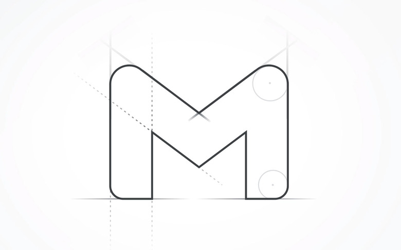
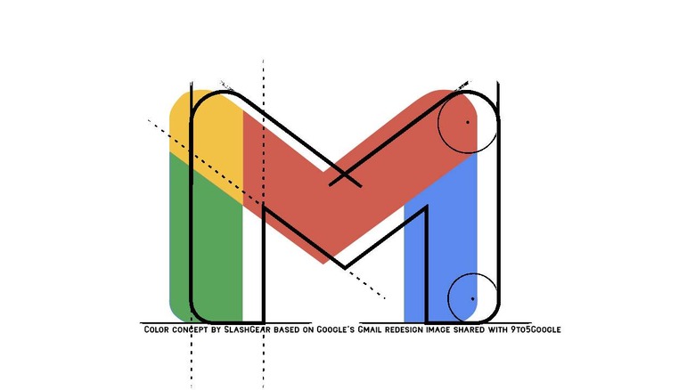
There's a new Google logo in the works right now, looking a lot like it's about to drop a key element. We're on the edge of the world now, looking over into the future. This is a future where Google's finally prepared to forget the past in which email is just an electronic version of paper mail. Now, as the envelope is removed entirely, just the M remains.
Google's always considering their future on multiple fronts. Much like any major success story in a very visible company here in the year 2020, Google's conscious of its image. Google's image isn't just about their main logo, but the tiny baby images they've got on their devices, in front of the eyes of users multiple hours a day, every single day.
As such, each pixel must be considered. Google needs to take the time to work with professional designers who are able to translate what Google wants users to see into graphics to which Google users respond.

The imagery shared today via 9to5Google showed just the M with some marks – as shown just above this paragraph. Given the color scheme Google's currently using and the arrangement Google's shown here, the colors at the top of this article seem most likely to us — NOTE: The imagery shown at the head of this article utilizes the original direct from Google to create a concept for what expect they'll eventually deliver for the final app redesign.
What do you think this means for Gmail? Could this be the beginning of a big set of changes, or is Google just leaning into a future where their icons are simpler? We've seen similar redesigns of iconography for a variety of Google apps over the past few months – have you noticed?
