Glass UI Concept Trades Minimalism For Wearable Workability
Google's Glass may be a self confessed work-in-progress for the company, but that hasn't stopped early-adopters from coming up with their own alternative visions for how the wearable should work. Disappointed by the shortcomings of Glass' minimalistic interface, one explorer has cooked up a new UI of his own, trying to cut down on the amount of needless touchpad swiping, make media easier to find in the timeline, and make better use of voice commands.
The handiwork of Serge Berig, the concept was first shared over at the Google Glass Explorers Community (you'll need to have Glass in order to access it) as his answer to the "messy" default.
"For me, this not just about sharing – it's about quickly finding stuff which Google is known for" Berig suggests. "I'm in NYC, finding a music track in the subway is a PAIN with the current interface. I have to scroll the entire timeline. The songs are stored locally once you play them, but "listen to" is deactivated with no data signal. If the interface was built something like this, I'd just navigate by touch or voice to music, select an album/offline songs, and play them."
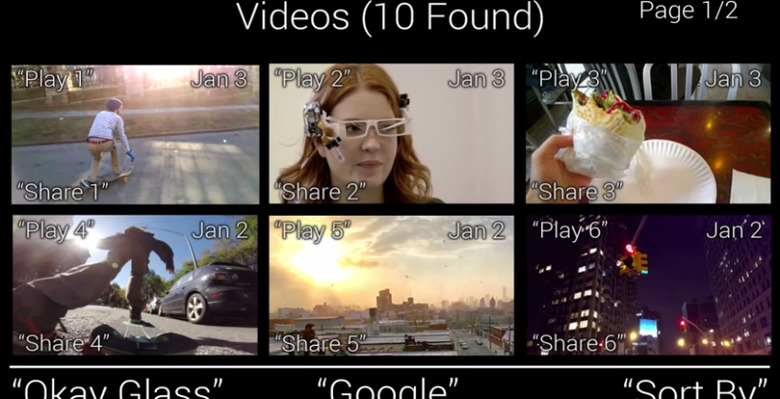
Whereas Google has kept each of its "card" UI panes minimalistic, Berig opts to add a few more details to each; the video shows six, though two or four could also be used, he points out. He also breaks down the existing timeline – which shows a chronological stream of everything that Glass has been used for, whether Hangouts messages, emails or SMS, photos or video taken, notifications from apps, or social updates – into different sections.
Content in each of those sections is numbered, which means the wearer can simply call out which item they want and have Glass' speech recognition flag it. Persistent voice prompt guides would run along the bottom of the display so as to encourage more exploration.
Google's initial goal with Glass' UI was to translate what we're familiar with from smartphones – Glass itself is based on Android – into something more convenient for everyday, glance-friendly use. Berig's argument is that it went too far, something which has already prompted several pages of discussion among Glass users.
