Gesture Controls On Phones Could Make Things Harder, Not Easier
There seems to be a new trend looming over the horizon and, unsurprisingly, Apple is the trend setter. With smartphone screens almost fully flushed to the edges and with no room for buttons, it seems like the perfect time to reintroduce a new but not really new convention: gesture controls. Although it's not really certain Google will adopt it in Android P, some OEMs, like OnePlus, seem to be headed in that direction regardless. And while gestures could make our user interfaces look fancier, they could actually make phones a bit more cumbersome to use in the long run.
It's Apple's world
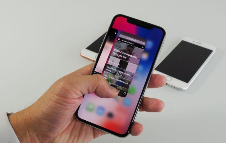
Like Face ID, the "slide up" multitasking gesture was meant to solve a problem that was really unique to Apple. iOS has no navigation bar and the only way you can jump between apps was via the home button. The iPhone X, however, doesn't have a home button either, and Apple would rather be caught dead than make its assistive floating home button a permanent part of the UI. So gestures it is.
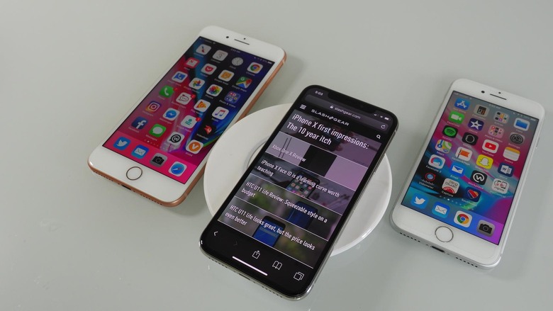
Android has never had that problem. Even when capacitive buttons became an endangered specie, the standard navigation bar stepped in to save the day. Without any physical buttons at all, Android phones are still easy to use and not confusing because of that standard UI. So when OEMs, and maybe even Google, start to switch to such gesture controls, they're really applying a solution to a non-existent problem.
Deja vu
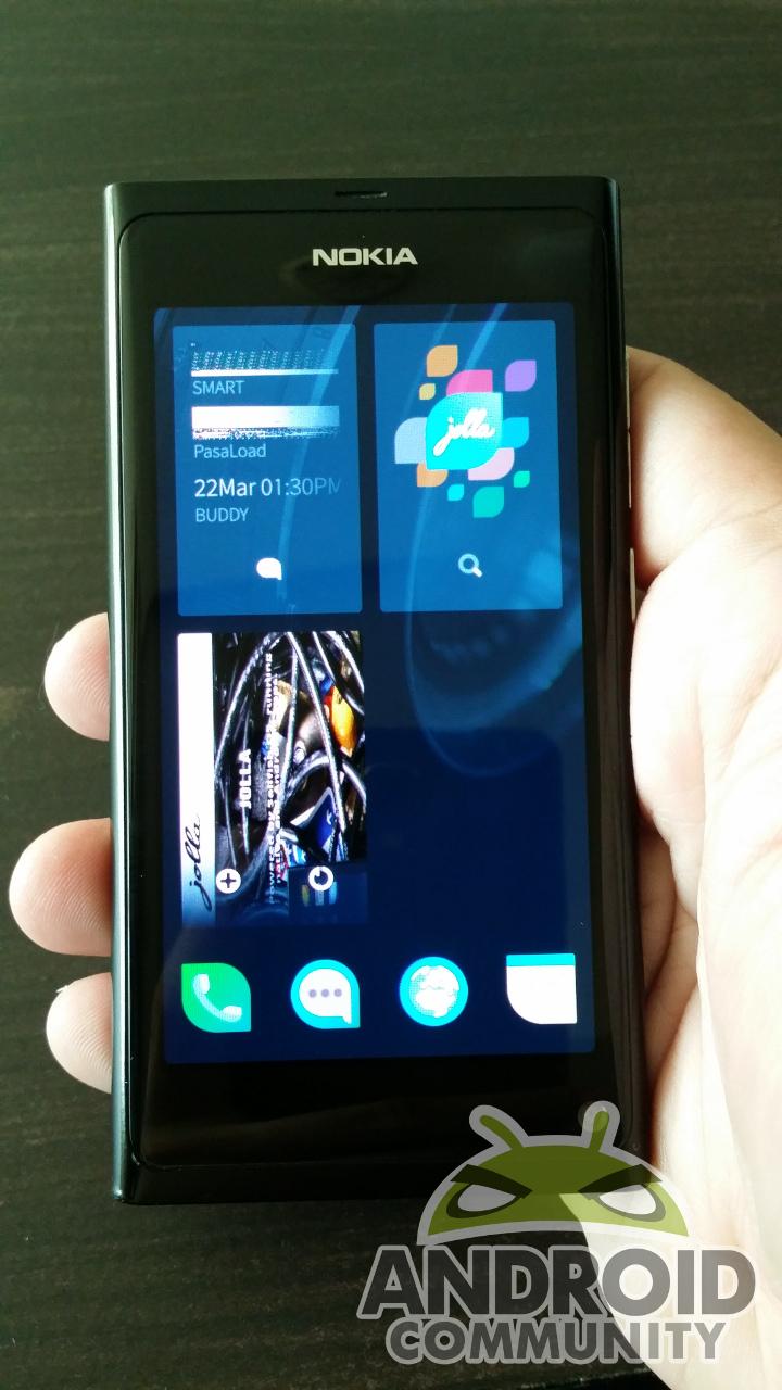
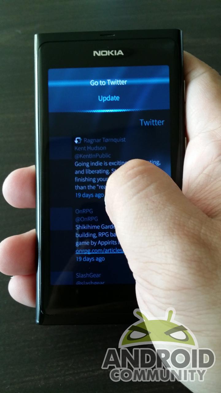
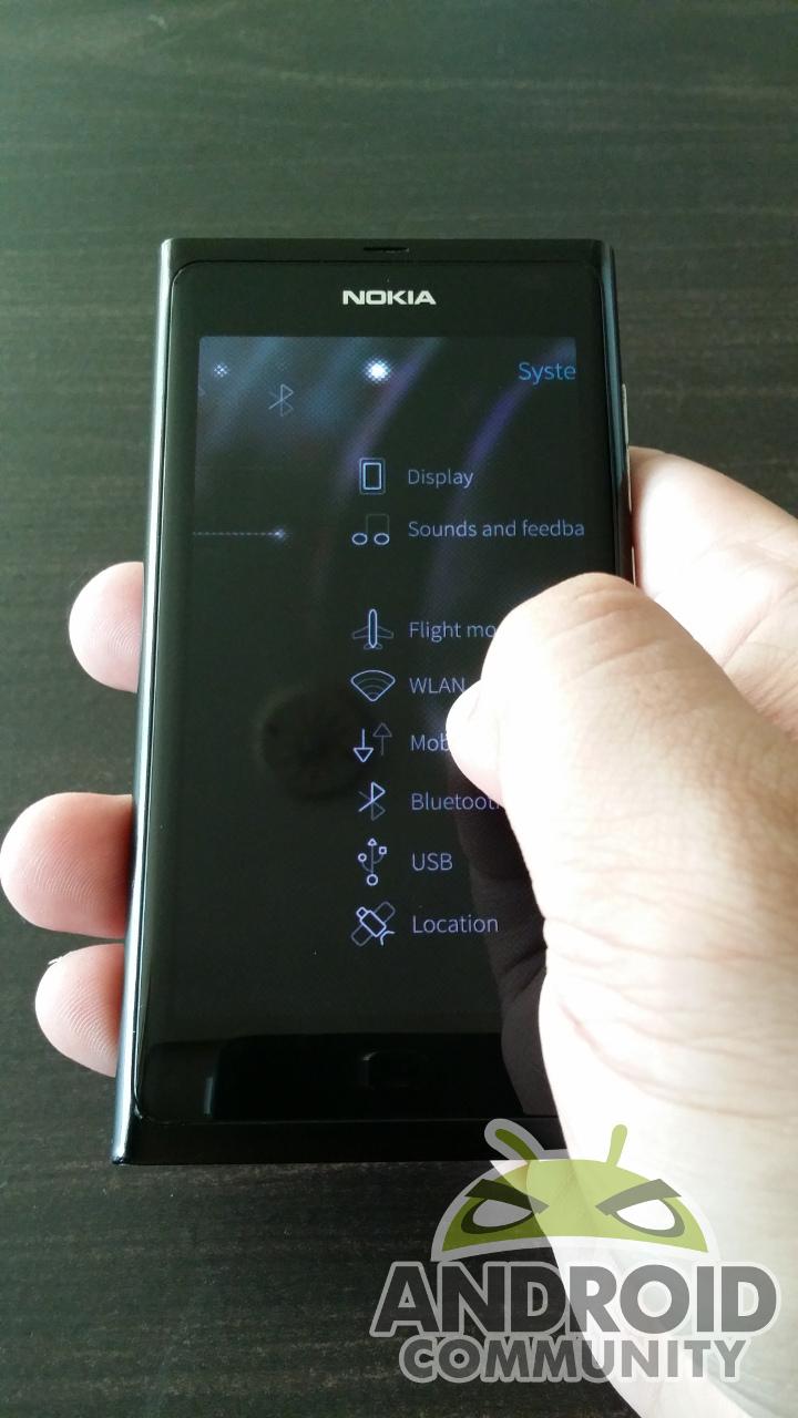
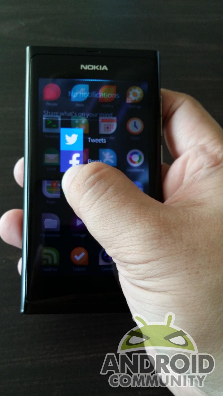
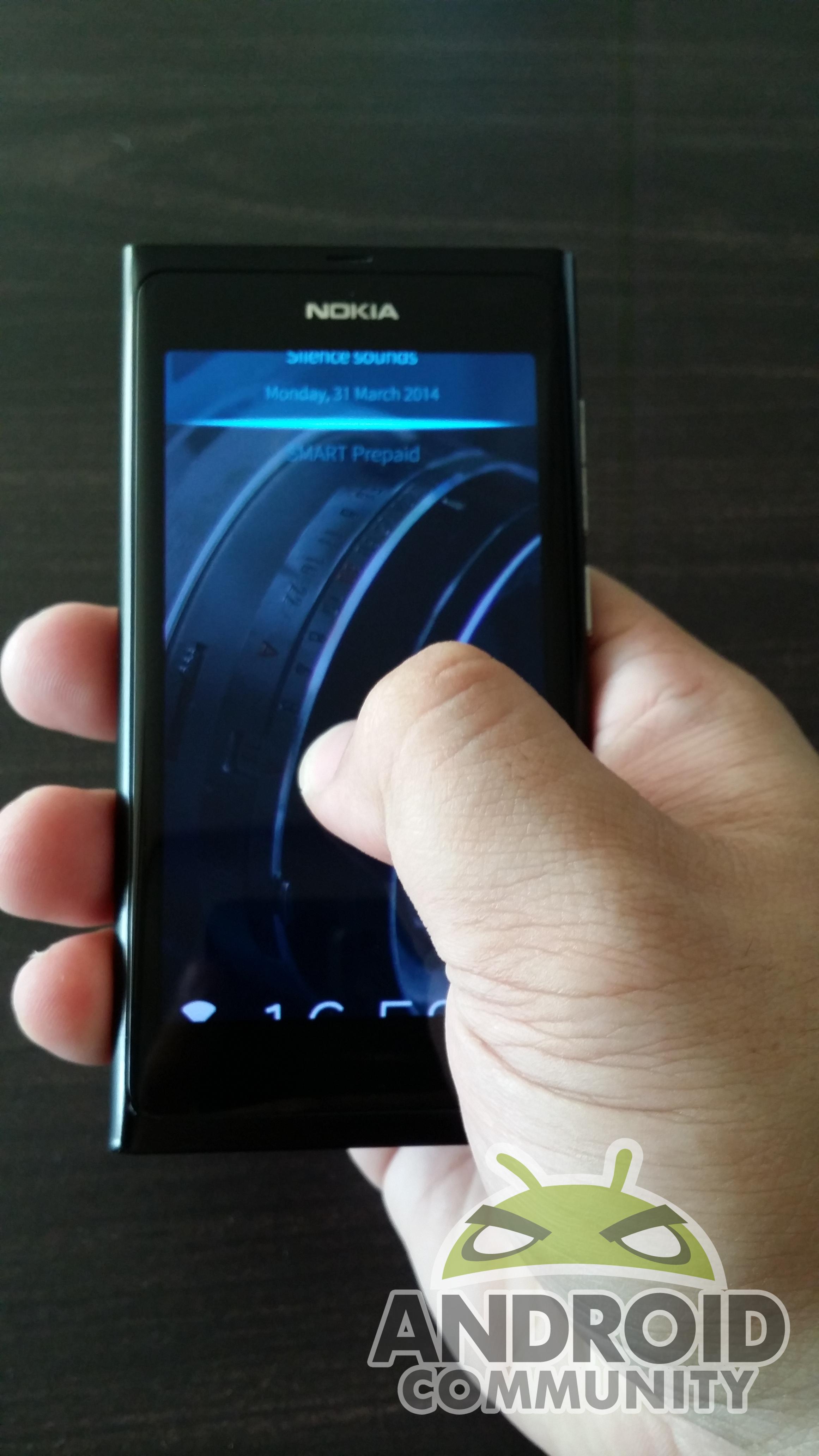
Gesture-based navigation isn't entirely new. Even before bezel-less phones where a thing, Finnish startup Jolla already envisioned a future without home buttons. The whole phone could be driven by gestures. Even better, you could use those gestures one-handed. But Jolla's Sailfish OS had the advantage of being its own world, almost like iOS. But unlike iOS or Android, it didn't immediately have to deal with the problem of compatibility with existing apps and their own gestures. It also bears the same problems that could pop up if OEMs go to that extent.
Why stop at one
To be fair, the iPhone X has just that one gesture. From the mistakenly posted Google screenshot, Android P might also have just one gesture, leaving the back button intact and resulting in an asymmetrical design worthy of the notch.

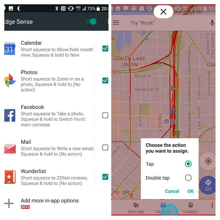
The problem is that OEMs don't always exercise restraint when implementing new features. How many notch sizes are there? How many "hide the notch" implementations are there? And how many gestures are there? With bezels nearly gone, it's almost too easy to think this and that edge could do with a hidden gesture control. Maximize the use of the edges and keep the screen clutter free. Only problem is that those will clutter the mind instead.
Thumb and mental exercises
Confusing as the behavior of the Android back button may be, the advantage of the navigation bar is consistency. There are only three buttons and, again with the exception of the Back button, they behave consistently all throughout. To save up on buttons, iOS also overloads its home button. With gestures, you have to keep in mind which gesture does which. Factor in edge gestures, and the number increases.
In addition to mental exercise, gesture also require finger exercise, especially the thumb. They often require more precise and steadier movement than simply tapping on a button. Well and good for well-abled, young users. Not so much for those with less dexterity or muscle control.
Fragmentation
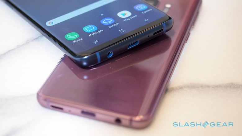
If one manufacturer does it, chances are, others will follow. And chances are, they'll all do it differently as well. Wouldn't be much of a problem if they all copied just one gesture and all copied how Apple did it, but what are the chances of that. It's such a shame that Samsung only recently finally allowed users to at least follow the standard Android navigation button order. Now we run the risk of having companies run around again like headless chicken over a fad.
Wrap-up
There's no denying that our current UIs and conventions for navigating smartphones are less than perfect. But jumping on a new system just because it looked and maybe even worked great on an iPhone is just inviting confusion and problems in the long run. Maybe this time manufacturers will exercise constraint. Maybe this time Google will preempt them and establish a standard before things get out of hand, like with the notch. Or maybe they'll decide that the maintenance costs are far too high than keeping to the standard. One can only hope.
