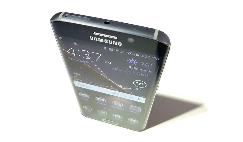
Galaxy S6 Edge: Android At Peak Elegance
The LG G4 is coming to market with a leather back, the HTC One M9 looks the same as last year, and the Sony Xperia Z4 isn't coming to the United States. The iPhone has rounded edges now, and they've released a big one, too! Even the Samsung Galaxy S6 is pretty much just an internal upgrade on what was delivered last year, when you consider the Samsung Galaxy S6 Edge. This device, I contend, is the future of the aesthetically pleasing smartphone.
Fashion has suddenly become important. With the launch of the iPhone 6, it's like a blast from nowhere: packs of technology enthusiasts fancy themselves fashionistas, deciding which band to buy with their next multi-hundred-dollar accessory.
Accessories for accessories, that is.
But I'm not talking about fashion. The Galaxy S6 Edge sits in your pocket most of the day, after all.
I'm talking about industrial design, and graphic design.
I believe the Samsung Galaxy S6 Edge is the most well-designed smartphone ever created by Samsung, and that it might be the most aesthetically pleasing smartphone released in the past several years.
Let's start at the back.
On the back of the Samsung Galaxy S6 Edge you've got a bit of a lump where the camera array juts out.
At first glance, the camera doesn't look great. It's not a very user-aware sort of lump either, when you first start to try to get used to it. I feel like I'm about to get a big gash in the lens glass every time I put the device down.
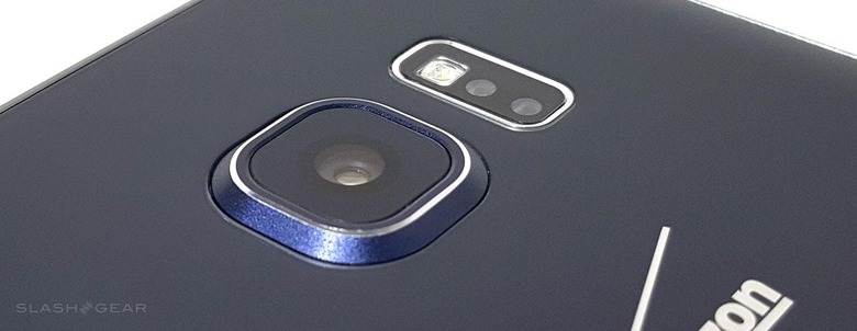
Upon closer inspection, however, there are several extremely well-thought-out elements here around the lens.
First – the glass leading up to the metal rim around the glass the covers the lens leaves an indistinguishable gap. Small enough that no dust appears after using the device several weeks.
The same is true of the gap between the metal rim and the glass of the camera lens.
The transition from one glass to the other is one that won't be tarnished any time soon.
In previous Samsung Galaxy smartphones, the collection of sensors and LED flashes has been directly below the camera array, making the device a bit more symmetrical.
But we don't want symmetrical, we want beautiful.
Sometimes symmetrical can be beautiful, sure, but a mix of symmetry and asymmetry makes the difference between mechanical and natural, art and design. Samsung has reached a point where they've got a healthy balance.
Buttons left and right
On the right of the phone you've got a single power/lock button, while on the left you've got your volume up and volume down buttons. At first the power button looks like it's been placed randomly.
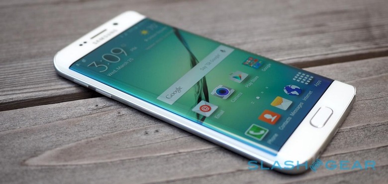
But look to the volume buttons and you'll see. First, there's approximately enough space above the top bottom for another button of the same size, creating a natural place for the remaining two buttons to rest.
Across the phone and down one more space you'll find the next button – the power button.
These buttons also sit in perfect positions for your pointer finger and thumb – if you're right-handed.
The Edge
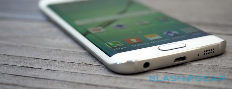
The edge on the Galaxy S6 Edge is the real crown on this design, opening up the device's design where all previous smart machines were closed.
Generally I'm not a fan of devices with no bezel at all. The few that exist leave no room for your eye to rest, a place where your eye naturally knows to stop. With the Galaxy S6 Edge, you still get that resting place for your eyes while the sides of the phone fall away.
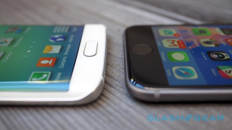
The smooth transition from the top and bottom of the phone to the sides with a dip make for a design that doesn't waste any space.
Not that the display itself doesn't waste any space, since it kind of does when you consider the curve and the oddity of the edges of the screen when viewing content full-screen. But the oddity is far outweighed by the unique experience.
The experience that feels completely natural now that I've used the device for several weeks.
Wrap-up
The Samsung Galaxy S6 Edge is a fantastic smartphone in its own right. It has a top-tier camera, an operating system that's cleaner than any Samsung smartphone released in the past, and it rolls with a display that's absolutely gorgeous.
It's also a sign of great things to come.
Samsung is in the perfect position to continue to create devices like this – devices that push the boundaries of what a smartphone can look like while remaining usable in the real world.
Devices that function and compete with the best smartphones in the world while remaining on the cutting edge, creating a look and a feel that no other company has yet accomplished.
I look forward not only to more Samsung smart devices, but to more competition from other industry leaders – and newcomers to the smartphone design world – as well.
