Galaxy S10 Android 10 Beta Puts The Spotlight On One UI Changes
Samsung has gotten a lot of flack for its heavily modified Android UX, formerly called TouchWiz. It has changed it ways and the software's name over the past years but, truth be told, it just can't full throw away all the custom changes and features it has accumulated over the years. Unsurprising, when it announces the start of the Android 10 beta program for the Galaxy S10, it focuses not on what Android 10 itself brings but what changes users can expect from One UI 2.0
Some might argue that Samsung made a rather unfortunate turn in One UI, the successor of Samsung Experience which, in turn, was the successor of the reviled TouchWiz. It may have overshot its target of emulating Android 9 Pie's love of rounded corners and have taken it to the extreme. One UI 2.0 with Android 10 will seemingly dial that down, at least as far as the size of some UI elements is concerned.

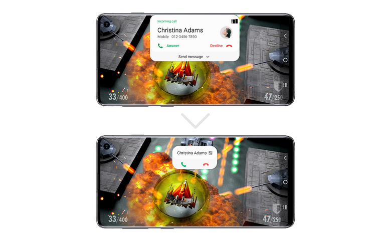
Notification popups, for example, will take up less space so that they won't be in your face, especially when using full-screen apps. That goes even for some of the sliders, like when adjusting the volume. While the icons and sliders actually remain the same size, Samsung is able to compress the UI down by removing most of the text labels, which may be a usability or readability tradeoff.
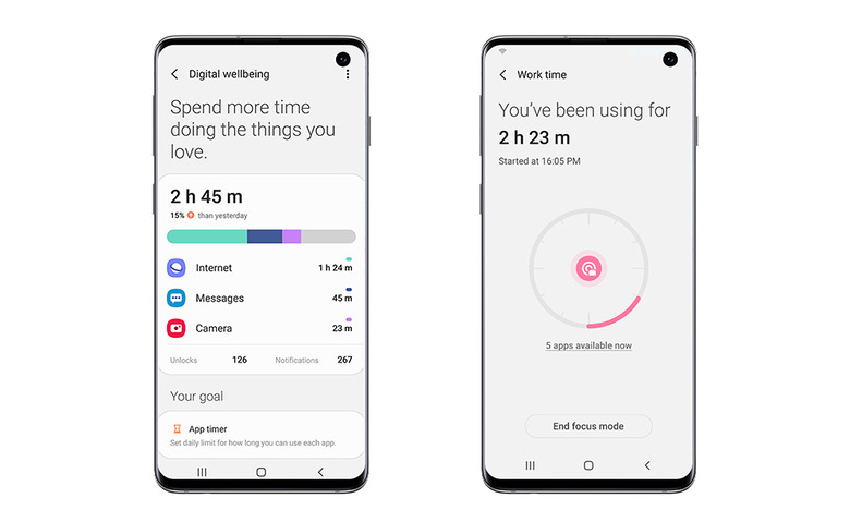
Android 10 itself promoted the features that enhanced Digital Wellbeing but, of course, Samsung has its own suite of apps and tools for that. That includes the now renamed (for the N-th time) Device Care and Focus Mode. The lock screen is now also more aware of the time of day and dark mode settings so they won't burn your eyes when you try to unlock your phone.

As with previous beta programs, the One UI with Android 10 beta is available in only a few select markets but at least covers all four Galaxy S10 models. When it will arrive in final form will depend, of course, on how many bugs are discovered and fixed, hopefully before those hit end users en masse.
