Firefox Proton Will Give The Browser Another Facelift
It's hard to argue that Google Chrome is probably the most-used web browser in the market, especially if you add browsers based on the same Chromium foundations. What may be harder to determine is which is Number Two. There was a time when Mozilla Firefox was perhaps neck to neck with Chrome but those days are long gone. Mozilla has recently been working hard to make up for lost time and opportunities and an upcoming "Proton" project is attempting to give it a much-needed visual refresh.
At one point, it seemed that Chrome and Firefox stood on opposite ends of the spectrum. Chrome embraced Google's old minimalist design language but pretty much hid all the advanced features behind flags. Firefox, on the other hand, offered a lot more options upfront but also tended to overwhelm users.
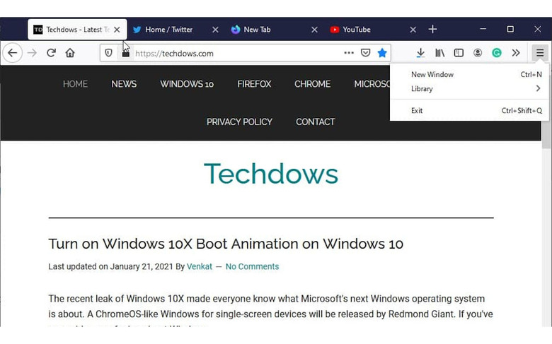
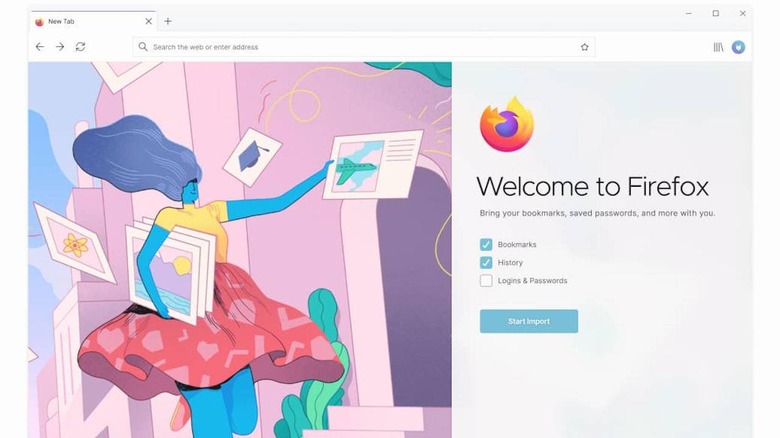
Proton is an attempt to clean that up, at least based on the information that Techdows was able to glean from the efforts. Mozilla seems to be focusing largely on the New Tab experience and the dreaded hamburger menu. The former will offer easy options for personalizing and customizing new tabs with themes, background images, and content to be shown in "quick dial" boxes.
Firefox's Proton visual refresh also addresses the browser's main menu at last. Currently, it has about a dozen options right off the bat, options that might not be needed immediately or all the time. Unlike Chrome, however, it seems that Mozilla will be utilizing an expandable UI instead of shoving them into hidden flags or settings pages.

Proton will also give the browser a softer and livelier personality thanks to more rounded corners and "whimsical" colors. While this visual refresh is quite needed and perhaps overdue, there will be some long-time Firefox users that may be wishing Mozilla focused, instead, on addressing more technical concerns, especially on performance.
