Facebook's New Look Will Be Facebook's Only Look Next Month
Change is inevitable, many say, and so is Facebook's new design. Although the writing has been on the wall for months, users have always had the choice to pretend that Facebook is the same old Facebook that it was years ago. Come September, however, everyone will be on the same page and will see the same, more spacious design. Facebook's new look, however, brings more than just an aesthetic change and introduces Facebook's expanded interests, especially in gaming.
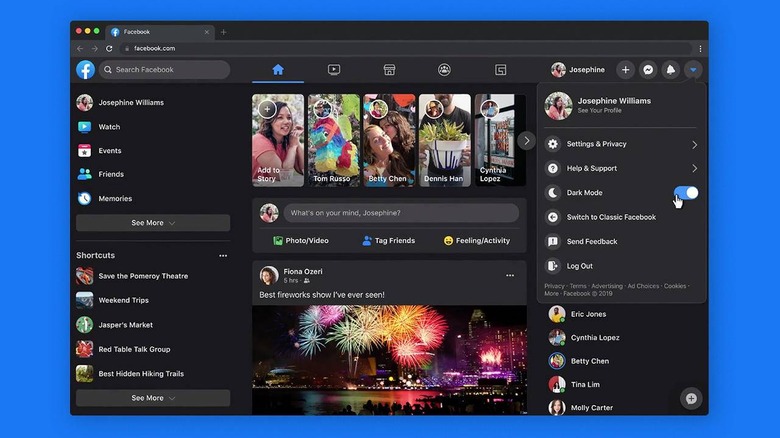
In some ways, the redesign is a breath of fresh air, with elements no longer crammed in the middle. The Feed still takes up the center, of course, but everything else is spaced out and gives some visual breathing room, at least depending on your screen size and resolution. It also finally adds a Dark Mode toggle to keep Facebook's predominantly white design from searing your retinas.
It isn't just a simple visual refresh though. Facebook's announcement last May highlights how the website is not only faster but also faster in letting you find things you want. It also makes it faster to find things you may not want as Facebook expands from social networking to social watching to social shopping, and finally, to social gaming. By pushing everything else to the sides, Facebook's new design also enthrones these new areas of focus for the company.
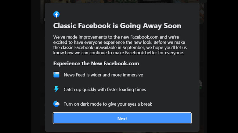
Although the New Facebook has actually been rolled out months ago, it did give users the freedom to switch back and forth between past and present. Some users today, however, have been greeted by a notice that Classic Facebook is going away forever next month.

Facebook has given users enough time to acclimate to the New Facebook but, of course, there will always be those who will protest the change. They've also had months to voice their strong opposition and, judging by its non-response, Facebook isn't going to delay flipping that switch any longer.
