Facebook's Desktop Website Redesign Is Now Live For Some Users
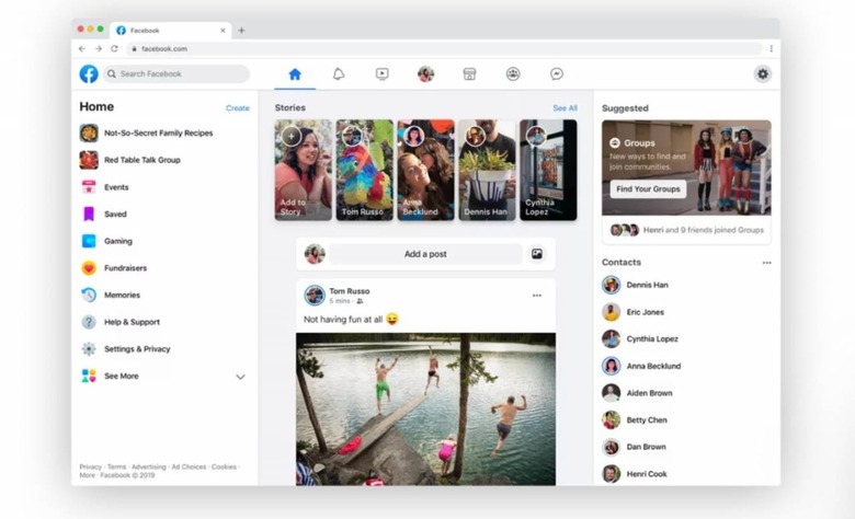
The updated desktop interface first promised in April has started appearing for some Facebook users. The design finally updates Facebook's increasingly archaic and messy interface with a clean, sleeker alternative that ditches many of the colorful elements and cluttered sidebar. More users will get access to the updated interface over the next few months.
Facebook first revealed intentions to update its desktop interface back in April 2019. As of this week, a small percentage of the company's users are seeing the new design now, giving them a chance to test it out before the company deploys it more widely to its users. Facebook is calling this refresh 'The New Facebook.'
According to CNET, users who have access to the redesign will see a prompt that invites them to participate in the test. The user must agree to participate, at which point the current interface will be replaced by the new version. There's also a dark mode version of the new white interface featured above, mirroring the popular trend of using darker designs.
Facebook plans to expand the number of people who have access to the new interface at some point within the next few months. The new desktop interface will come only a few months after Facebook introduced a new logo, presenting a new look for the company that has increasingly lost the public's confidence.
The new desktop website is more closely aligned with the design now found in the social network's mobile apps. Staunch traditionalists — and confused elderly users — will be able to continue using the old (current) design once the updated interface goes lives for everyone. It is possible we may see some tweaks applied before the final design rolls out.
