Facebook Paper Review: Zuckerberg Finally "Gets" Mobile
Facebook and mobile haven't had an easy run of it. Facebook Home, an attempt to capitalize on mobile with a near-walled-garden met with derision and faded with barely a whimper; so far, the only real success stories Facebook has had on smartphones have been the results of acquisitions, not its own development. Paper, new for 2014, aims to change all that, an iPhone-exclusive news reader that promises the best shared content from your friends as well as trusted third-party sources. It's a handsome app, that's clear, but does it do enough to usurp Flipboard, Pulse, and others from the homescreen?
Concept
Facebook is all about sharing – over-sharing, some might say – though so far that's predominantly been from your friends and contacts. Anything extra injected into the news stream has been mainly promotional, Facebook controversially mining your interests to slot in what it thinks you might be interested in.
If you broaden your interpretation of sharing, however, it could also include what a news organization chooses to share: the articles and videos it produces. That's the approach Facebook's new Paper app takes, blending together not only the content shared by people you know, but that curated by people in the business of finding news.
It also addresses part of one of Facebook's perennial issues: the rise of the mobile user, and how to monetize them. For the moment Paper doesn't have adverts, though we'd be very surprised if that was the case forever, but what's clear is that the app was designed for mobile – and for smartphones specifically – from the outset.
Design and Usability
Facebook Paper bills itself as a news reader, but you could also see it as an alternative to the standard Facebook app for iOS. Currently only available for iPhone, and with no timeline (or even confirmation) on an Android version, it packages up a combination of your friends' shared stories and those on topics you're particularly interested in, all in a brand new UI.
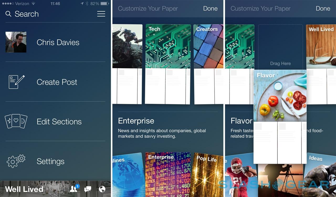
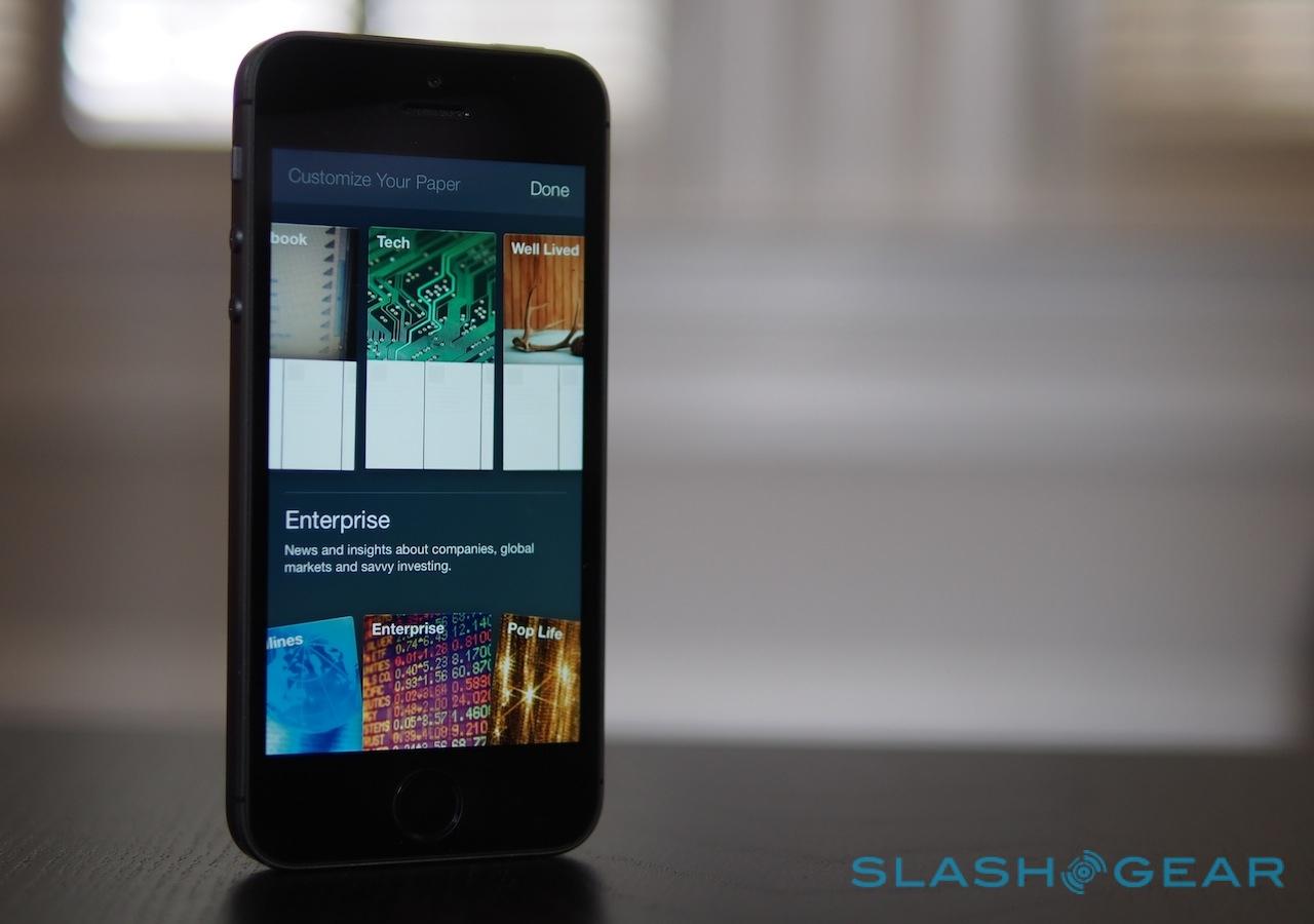
Paper unfolds with a slick interactive video tutorial, which guides you through selecting which topics you care about. News from your friends is there by default, but then there are twenty other categories – ranging from world news, tech, and sport, through "LOL" and "Cute" – to choose from, each represented by an individual card.

To add a topic to your collection, you swipe up from the fan of cards at the bottom. Long-pressing on a card already selected allows you to change the order they're presented in; t's a little webOS-styled, but works neatly, and the animations are smooth but not intrusive. From there it guides you through the homescreen view, which uses a combination of side-swiping to go through the categories and then tap or tap-and-drag to actually open content.
The tutorial does a fair amount of handholding, and even though you can dismiss it we were never quite sure when it was actually over. At one point, we thought we were simply reading and then Paper tried to walk us through how to share posts with others.

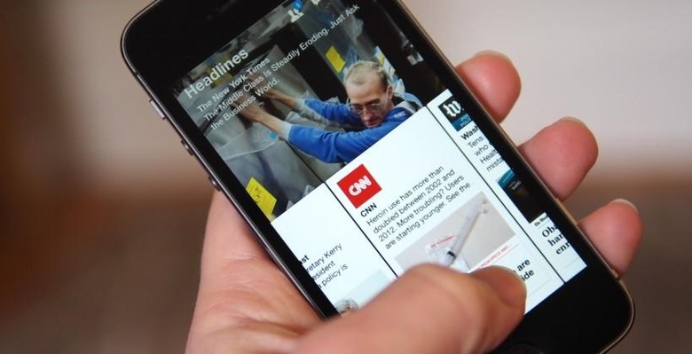
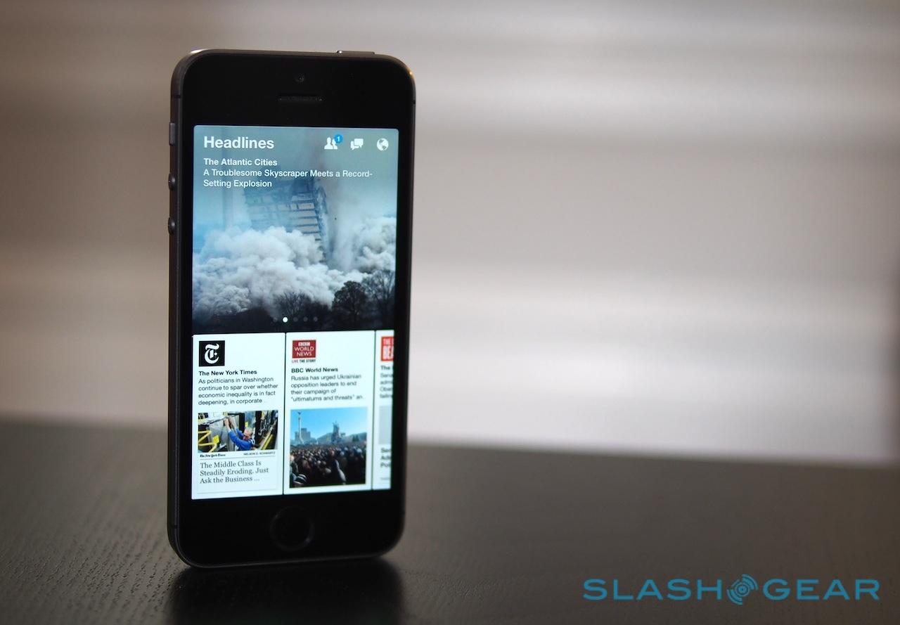
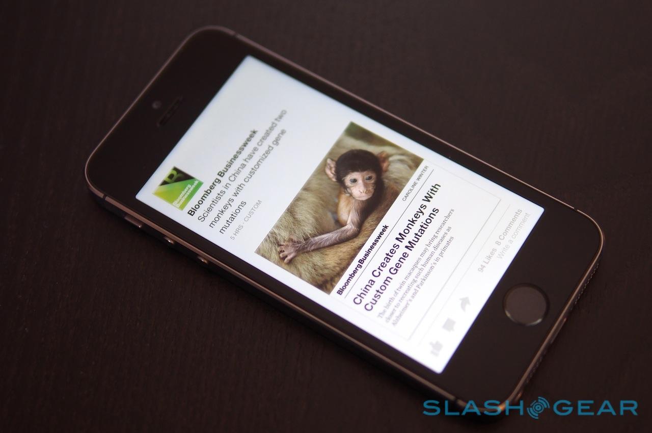
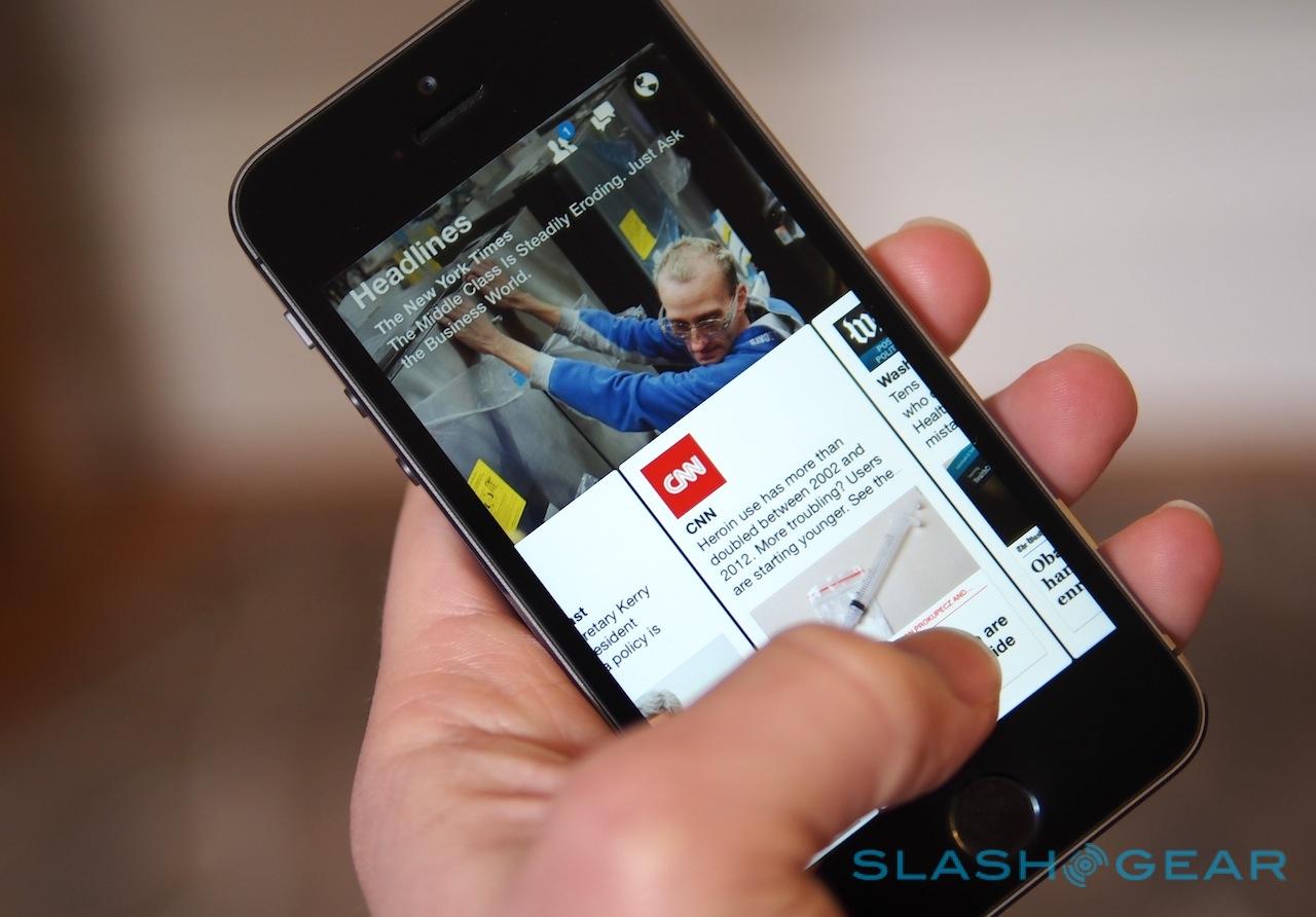
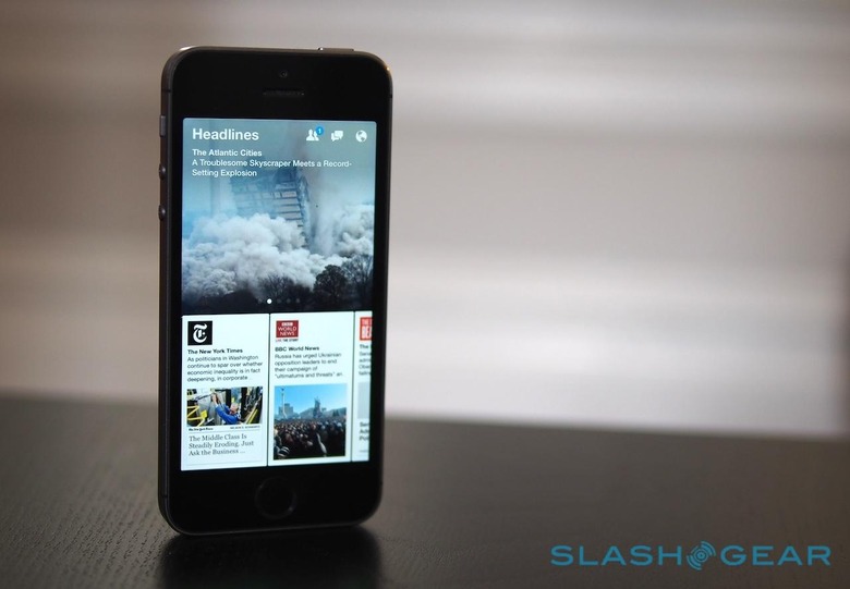
Overbearing tutorial aside, Paper's UI is generally successful. it's designed for portrait use, with one main story from the category on top and then two more cards underneath. A side-swipe on the top switches category; a swipe on the bottom moves through articles in the category, with the name of the source – CNN, Time, etc. – and a brief except from the story itself.
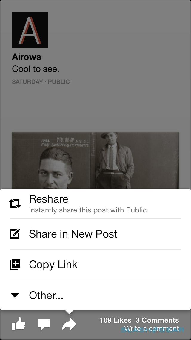
You can tap on a story to open it up – it takes over the whole screen – or you can tap-and-drag to magnify the article bar. When you're reading full-screen, a side-swipe takes you between articles in the category; swiping down closes the article. The familiar Like, Comment, and Share buttons run along the bottom left, with a count of how many Likes and Comments have already been made alongside.
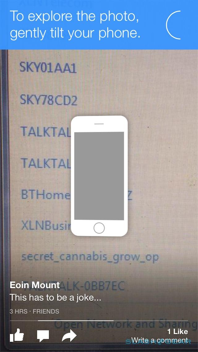
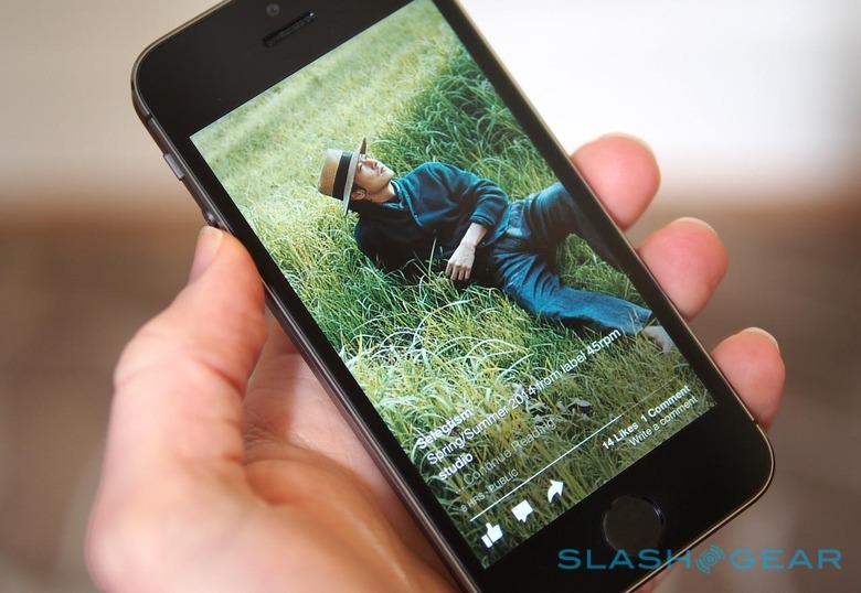
Since many images are intended for landscape not portrait viewing, by default Paper shows you the center portion and then scrolls the picture as you physically tilt your iPhone. That can be turned off, however, with the app then using a Ken Burns-style pan instead; either way, a tap opens up the full image.
Settings like that are found in a relatively sparse page accessed by pulling down on the main view, exposing a main menu. From there you can make a new post on your Facebook wall, edit which categories are included in your feed, and change the settings; there's the option to toggle where Facebook push-notifications open, in Paper or the original Facebook app, as well as whether videos autoplay and if tapping opens up the next article.
It's also where you can choose which read-it-later service you want to use, if any. Currently supported are Pocket, Instapaper, and Pinboard, along with Safari's own Reading List. Shortcuts to Facebook's account and privacy settings are also here, and the social site's Code Generator, its authentication system similar to Google Authenticator.
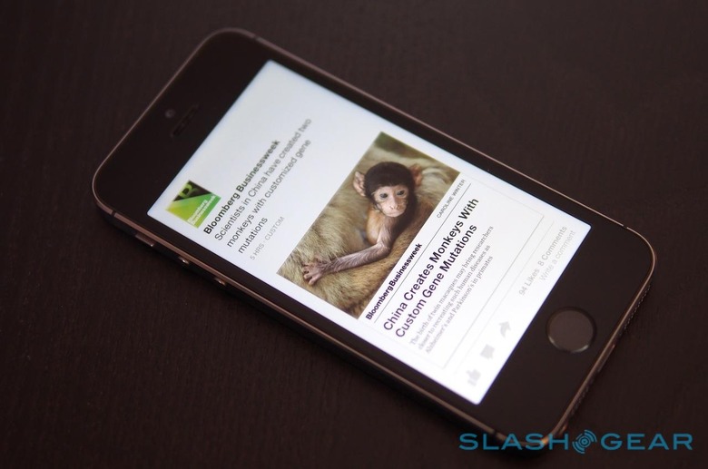
Unfortunately, there's no way to add your own sources in, either by creating a custom category or by inserting a site to one of Paper's pre-existing collections. You're effectively at the mercy of what Facebook or your friends decide you ought to be reading, unlike say Flipboard which encourages people to curate their own magazines or at the very least make their own categories based on their specific interests.
Facebook says that each of the sections will be dynamically updating, with content from any site showing up in each category as long as it's been posted publicly from a page or profile. Nonetheless, so far we've seen it skew heavily toward the same handful of sources, though that could well change as the background algorithms catch up with the app's launch.
Goodbye Facebook
The option to open Facebook push-notifications in Paper rather than the usual app is a big hint as to how central to everyday use the social network expects the new news reader to be. In fact, it can effectively replace the normal app: icons for new friend requests, messages, and notifications run along the top right, and you can post text, photos, and video statuses, along with location check-ins, to your own wall.
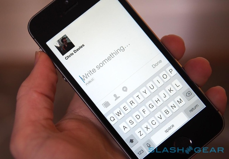
Most importantly, your personal feed doesn't just include links your Facebook friends have shared. Instead, you get every recent update from them, whether it be text-only, a personal photo, or notification of a change to their profile picture. There's no artificial separation of "this is news" and "this is social" between the two apps.
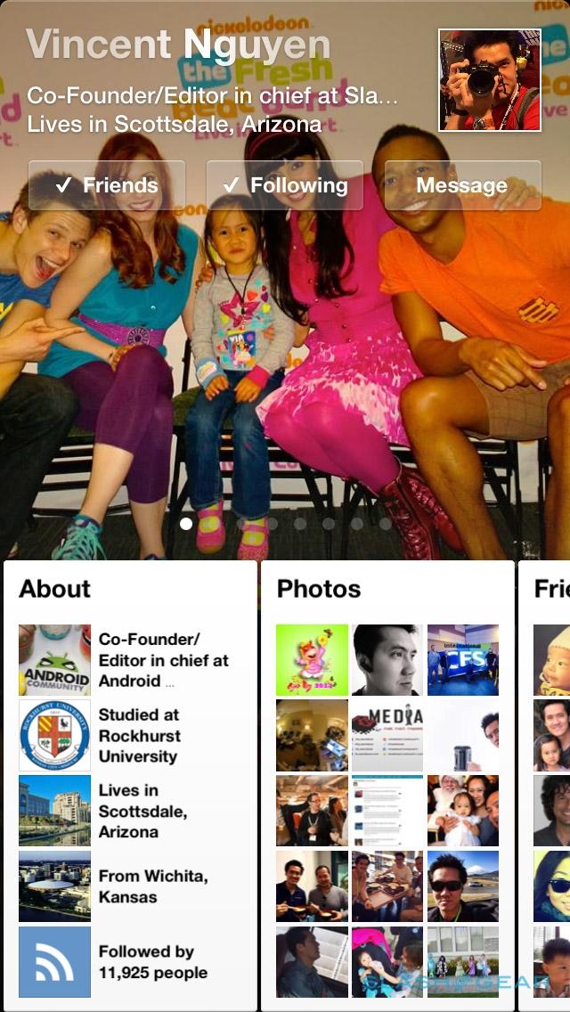
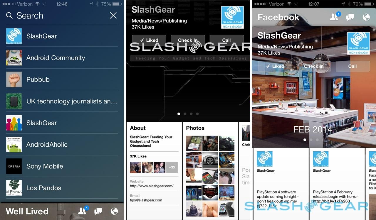
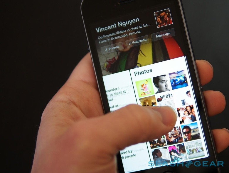
Tap on a friend's icon, or that of a page you follow, and you see their full profile, their contact details, and recent photos they've posted or been tagged in, and then you can side-swipe across to scroll back through their timeline.

What's especially notable is how much fresher it all feels compared to the existing Facebook app. The greater focus on photos, showing them off in as chrome-less a way as possible, borrows the interface gloss we liked of Facebook Home but without feeling like it was hiding the meat of the content underneath.
Wrap-Up
Facebook's apps have traditionally been seen as something of a joke, either clunky make-do software perpetually in the shadow of the regular desktop browser view, or pale imitations of rival services. The disastrous reception to Facebook Home, meanwhile, left many assuming Zuckerberg & Co.'s mobile aspirations would dwindle and fade.
Facebook Paper challenges all that. Not only is it slickly designed, but it works well too, blending together social and news, friends and external sources, in a way that feels holistically sound without being overwhelming.
What apps like Facebook Paper do is cater to the casual reader. Paper isn't the way to storm through thousands of articles in the shortest possible time; it's a distraction while you're on the train, or sitting in Starbucks, or waiting for a class to start. That it's so much nicer an environment to do that within than the existing Facebook app only encourages more reading (and perhaps, Facebook is hoping, a little extra sharing too).
Still, casual news apps aren't rare, and Facebook's algorithm needs to prove itself if the glossy first-impressions are to segue into everyday usefulness. If Paper can satisfy our interests and surface unusual and engaging content, that's why we'll keep using it.
