Facebook Messenger Design Update Brings Tabs To The Home Screen
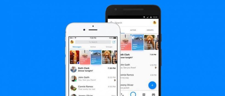
Facebook Messenger is on the receiving end of an update that brings with it a redesigned interface, one that breaks the home screen up into tabs that, overall, offer better organization. These tabs, as one example, isolates users who are active that moment, making it easier to find who is online versus those who aren't currently available. The update will be pushed out to Facebook Messenger users across the globe on both iOS and Android; the update is rolling out this week.
The update was recently detailed on Facebook by Messenger lead David Marcus, who says the updated home screen is 'now organized around making Messenger your hub for connecting with all the people and businesses you care about." A red dot is used to indicate any places where there is new content you haven't seen yet, and groups are now isolated in their own specific home screen tab.
The bottom of the home screen, meanwhile, contains icon-based tabs for things like pulling up the camera, making a call to a specific Messenger user, returning to the home screen from a different screen, searching for people, and for quickly accessing those new fancy Messenger games. In the future, Marcus says this section will also include a 'Discover' tab.
As the image above shows, the same general design will be arriving in both the iOS and the Android app — if you're not seeing the new interface yet, check to see if the update is available. Precise timelines for the update's rollout weren't provided. Not familiar with the latest Messenger features? Check out the timeline below!
SOURCE: Facebook
