Facebook Messenger 4 Tackles Chat App's Biggest Problem
Facebook Messenger is getting a complete overhaul, and if you've been increasingly frustrated by how much cruft there is in the way of your chats, this new app might make you very happy. Messenger 4, the social network says, puts simplicity at the forefront, with the promise of easier navigation, cleaner designs, and more.
It's that revamped UI that will likely be of most interest. The old Messenger had bloated to nine different tabs; Facebook Messenger 4 pares that back to just three.
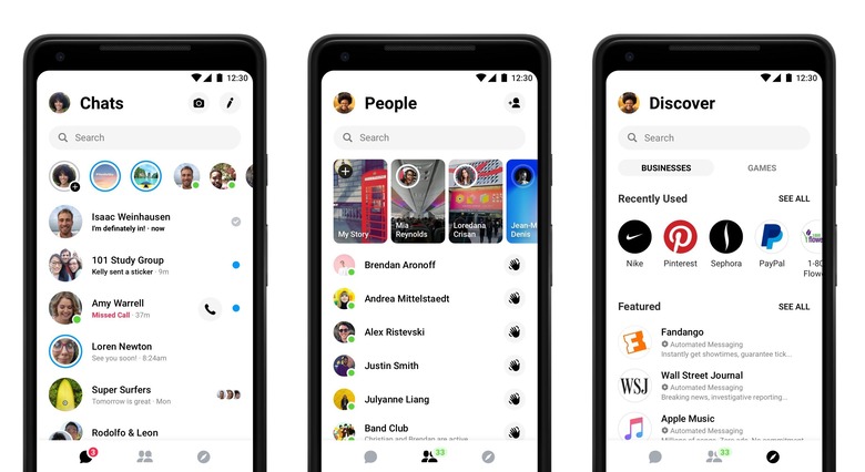
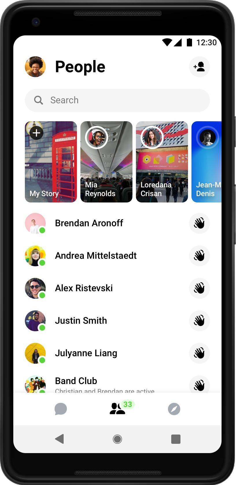
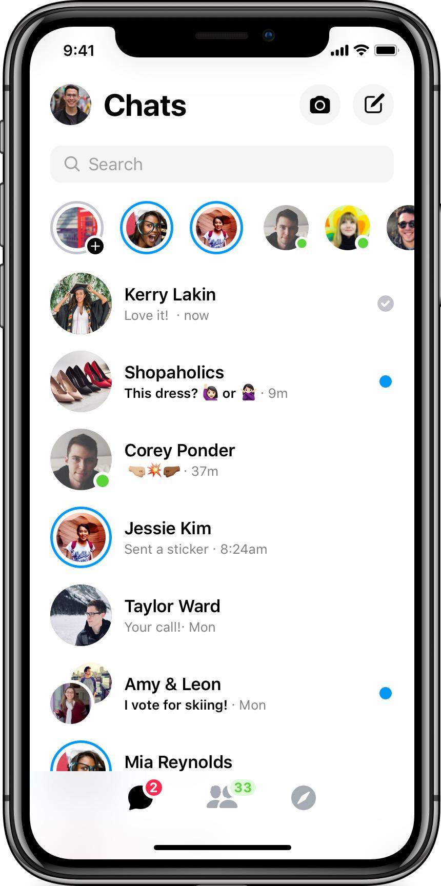
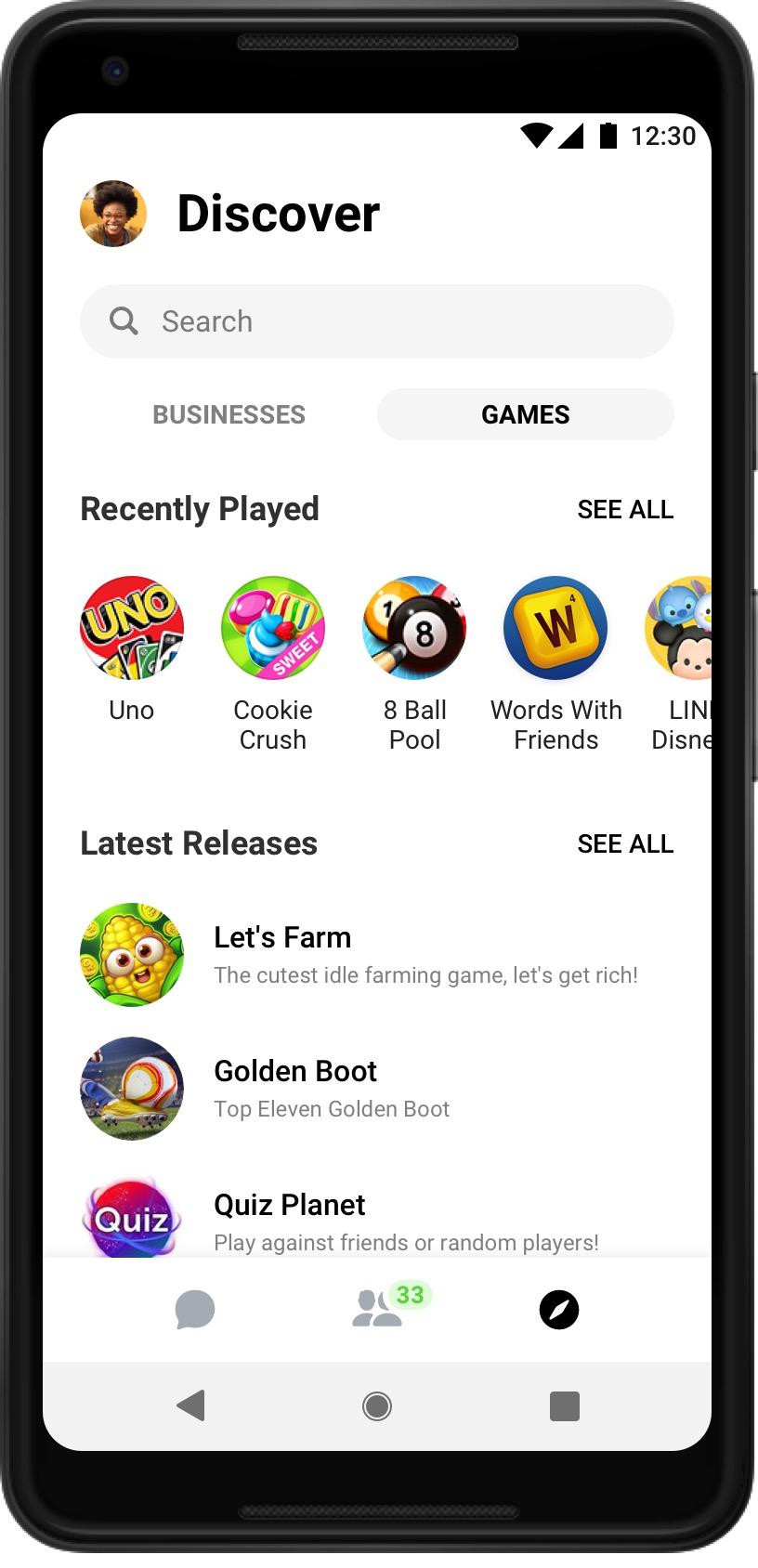
First and foremost is the Chats tab. That contains both one-to-one conversations and group chats. The People tab, meanwhile, shows who is currently active, along with recent Stories that have been shared. Finally, there's the Discover tab, which gathers up all the businesses, games, news headlines, and more.
A persistent search bar runs across the top, visible no matter which tab you're in. Facebook has put the new message and camera buttons at the top of the Chats tab, while the People tab gets an Add Friend button.

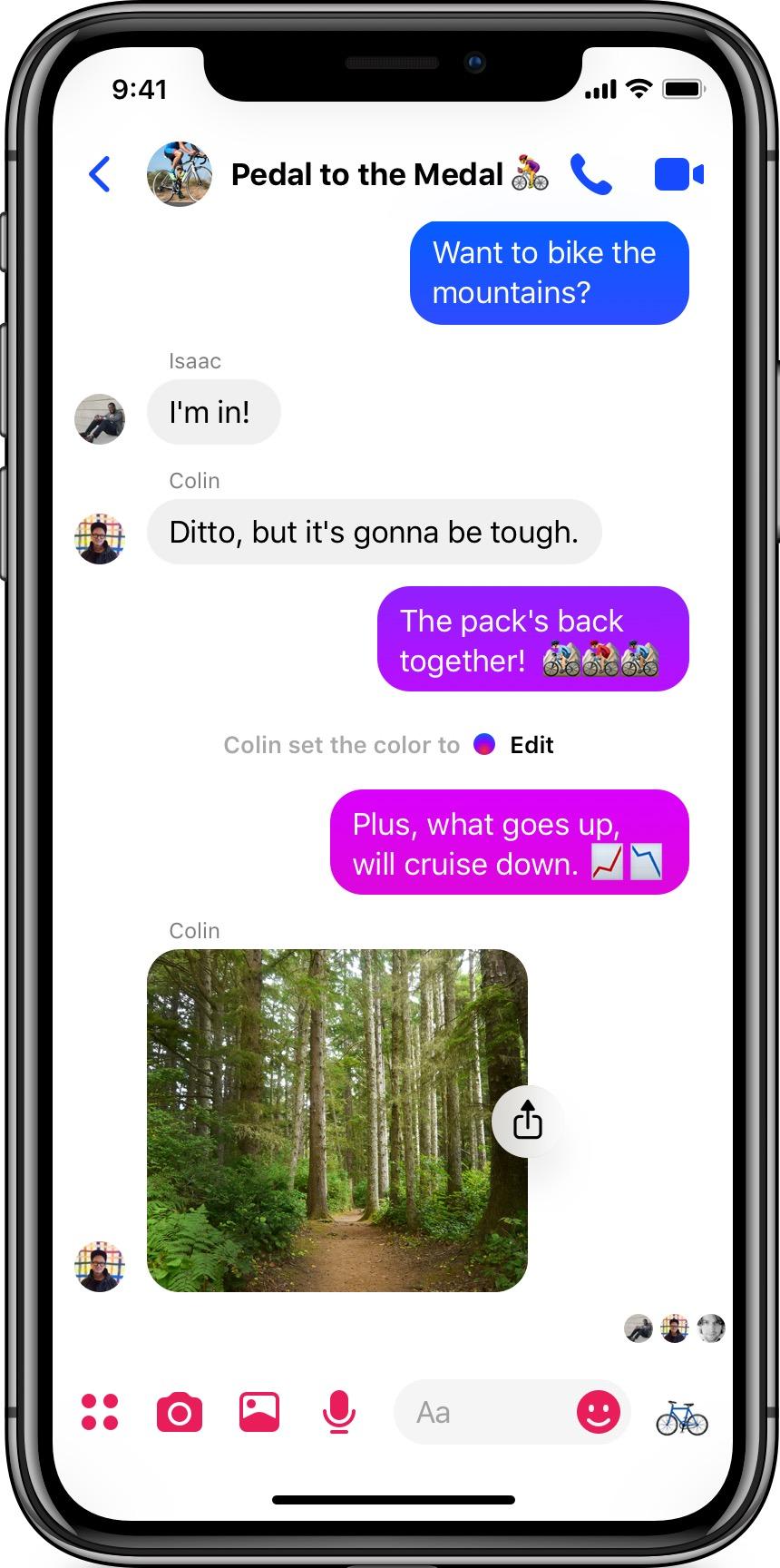
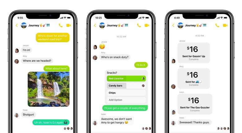
The interface isn't just laid out differently in Messenger 4, but it uses different colors, too. Color gradients are used for chat bubbles, with the hues changing as older messages fade up the screen. The colors themselves can be selected manually.
Importantly, none of the existing Messenger features are actually being retired. There'll still be video calling and group video chat, along with location sharing, social games, and other apps. However you may have to go digging to find those features, what with Facebook's new emphasis on simplifying the UI.
To make that process easier, Facebook says it will be rolling the new Messenger 4 features out over the space of four separate phases. In the near future, meanwhile, there'll be extra additions like a Dark Mode, too. So, don't be surprised if you don't see this updated app straight away on your iOS or Android device, but do get ready to change how you chat over the coming weeks.
