Facebook Introduces Cleaner Look To Timeline
Facebook may have finally ignored the Timeline at the company's most recent press event when they unveiled the new News Feed that'll be coming shortly, but that doesn't mean they're not making changes. Facebook has introduced a cleaner look to Timeline, and they'll be slowly rolling out the new design over the coming weeks.
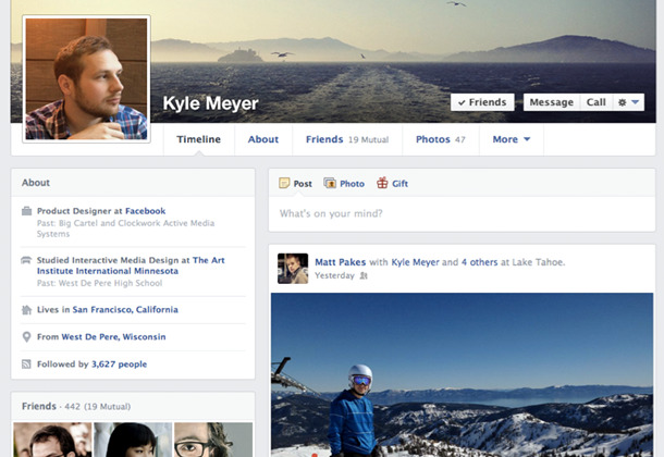
One of the biggest differences you'll notice right away are the elimination of the "Friends," "Photos," and "Likes" thumbnails, which are now compressed into simple text links toward the top. The "About" section also looks different this time around, as it now sits vertically on the left side of the Timeline.

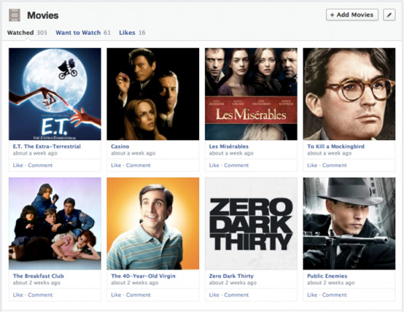
Overall, though, your various Likes are organized much more neatly, and you can manage your favorite movies, books, TV shows, etc. in a more orderly fashion, including the ability to not only add your favorites, but also add movies and books that you want to read. These are separated from your favorites using tabs.
Apps also are more integrated into your Timeline, meaning that certain apps can have dedicated sections. For instance, if you use Instagram a lot, you can dedicate a section of your Timeline to strictly Instagram photos that you've taken. And now, all of your likes on the left side of your Timeline, with all recent activity being posted on the right side, allowing for easier browsing and scanning.
