Droid 2 Review
It's been over nine months since we reviewed Motorola's first DROID smartphone, the Verizon handset that arguably reversed the company's fall from grace and set their foundations as a key player in the Android segment. Now, in an increasingly competitive smartphone market, Motorola have returned to their pivotal handset for a much-anticipated makeover, the Motorola DROID 2. Question is, have they done enough to maintain their pace? Check out the full SlashGear review after the cut.
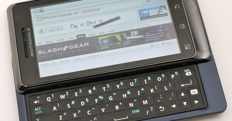
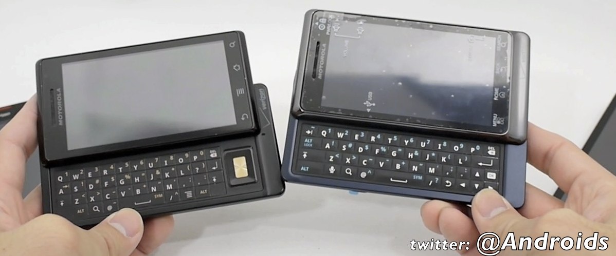
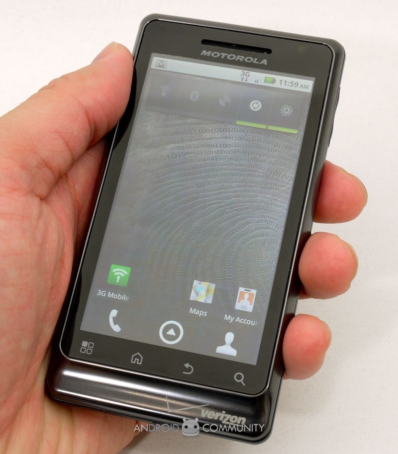
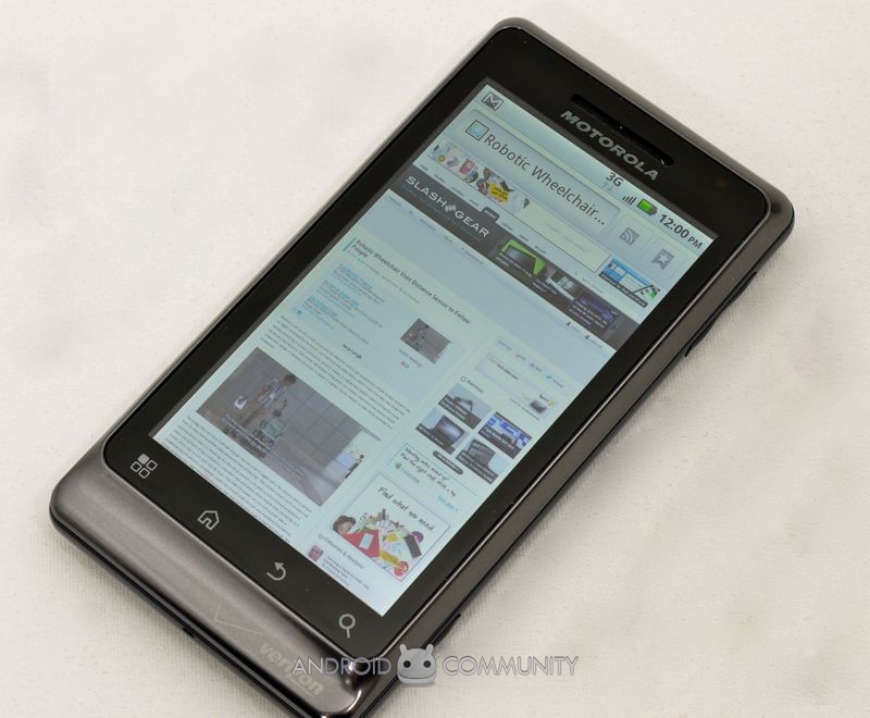
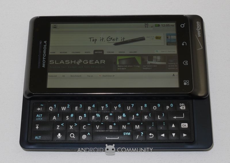
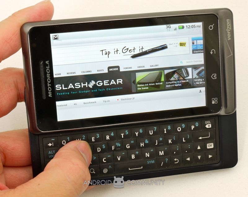
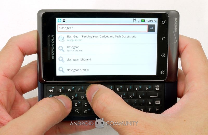
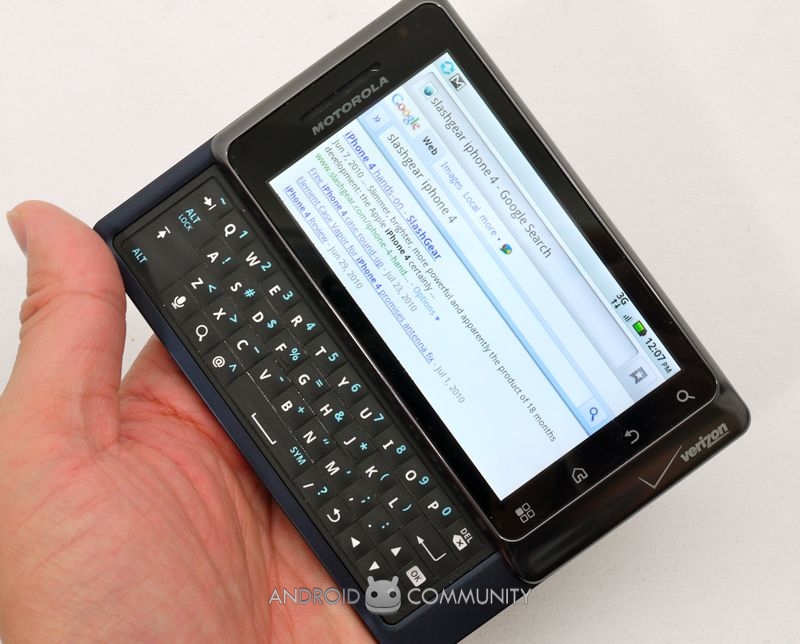
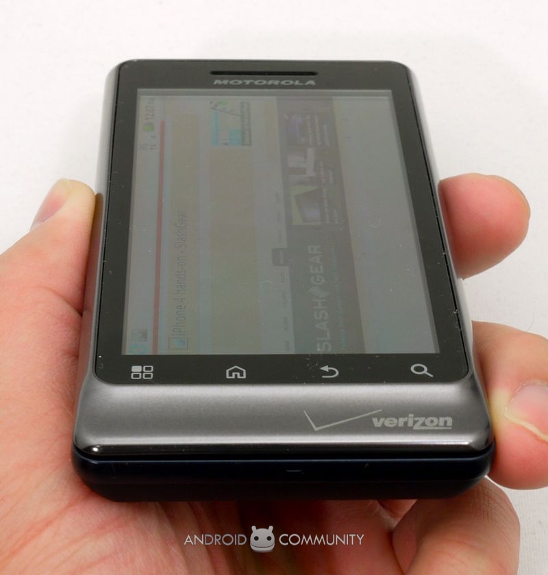
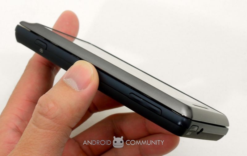
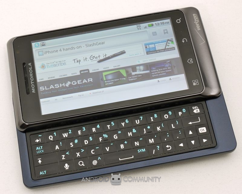
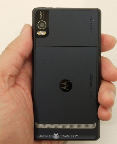
Physically and aesthetically the DROID 2 is very much an evolution of its predecessor, itself a particularly distinctive device. Motorola has toned down some of the more dramatic hard lines and eye-catching detailing – gone, for instance, is the gold grill-work, replaced by more traditional silver – and the result is an altogether smoother, slicker device. The most noticeable physical change is to the keyboard, and welcome it is too. The original DROID's QWERTY was frustratingly flat and even more annoyingly offset, with Motorola choosing to put a large D-pad on the right hand side and forcing users to stretch their thumb across.
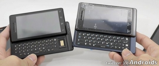
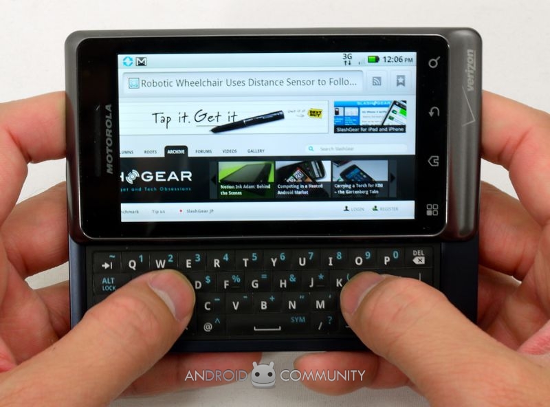
On the DROID 2, however, the D-pad has been relegated to a small, far more usable arrow key cluster integrated with the keyboard itself, and the buttons are now all slightly domed. The layout itself is improved, with no blank placeholder keys left wasted, and the typing experience on the whole is significantly improved. Not as good as, say, the Samsung Epic 4G (review) – which benefits from being a bigger handset and thus having more room for its keyboard – but certainly enough to put the original DROID to shame.
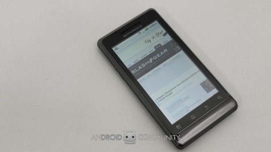
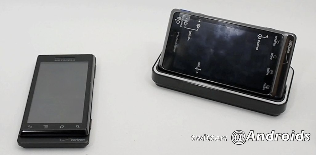
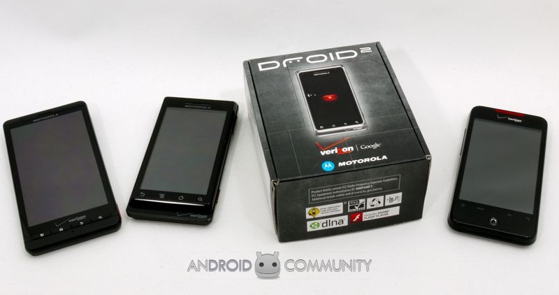
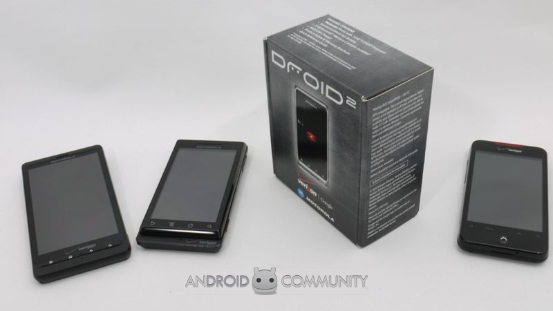
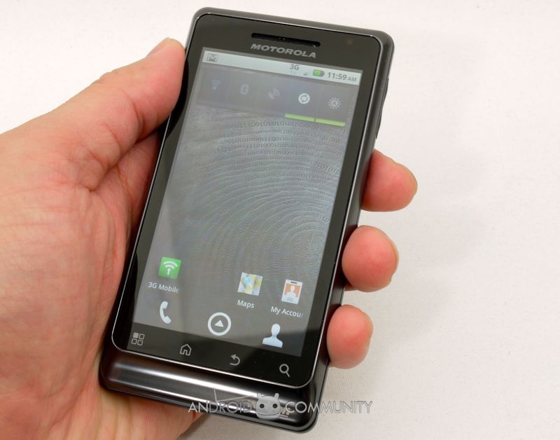
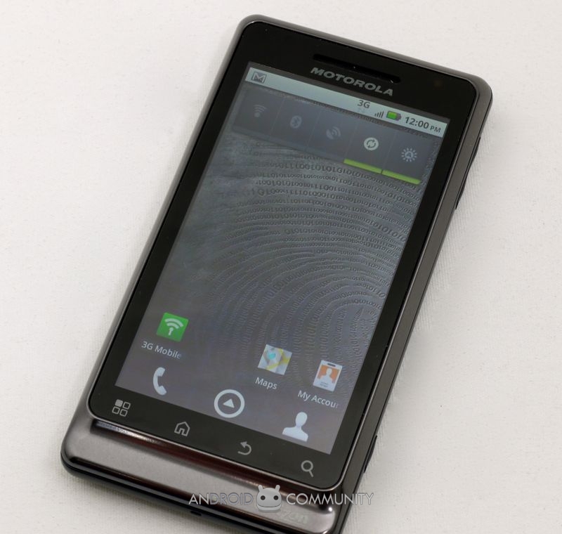
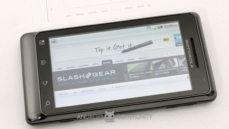
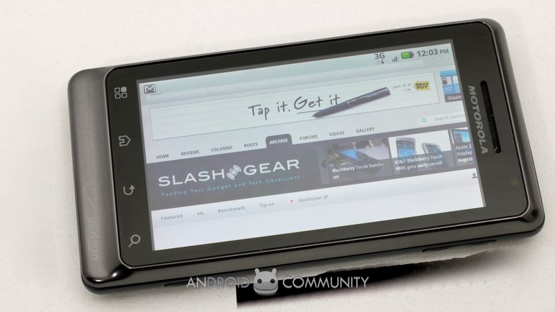
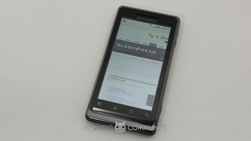
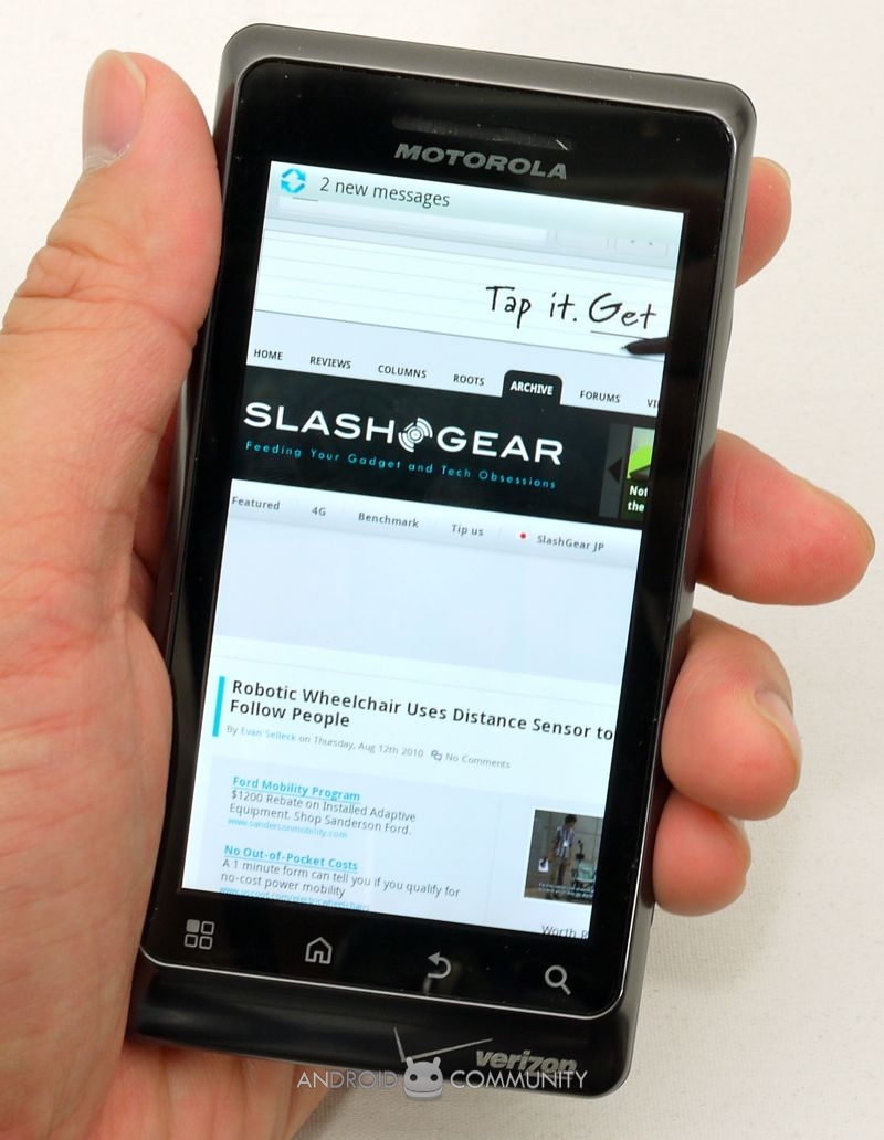
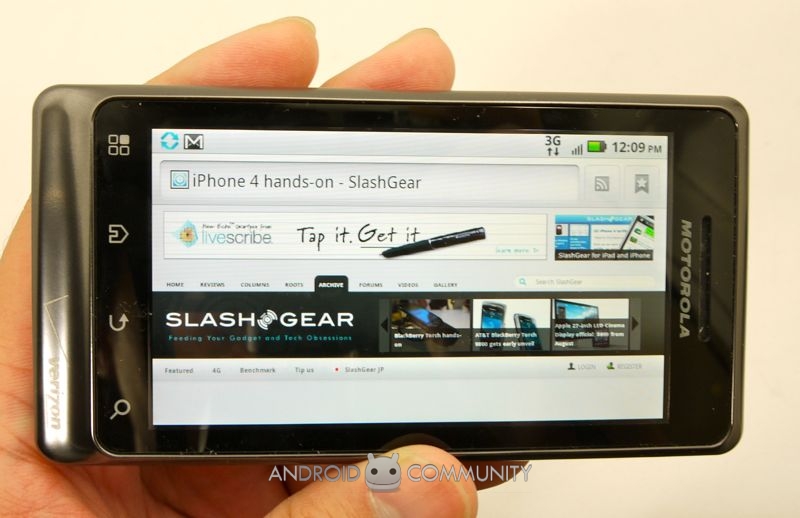
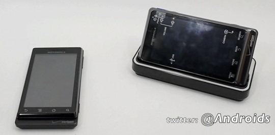
Other changes between the two handsets are more subtle, certainly when viewed from the outside. The same 3.7-inch 854 x 480 capacitive LCD touchscreen is used, and it remains a strong panel (though pales these days in comparison to the Galaxy S' Super AMOLED screen or the iPhone 4's Retina Display). Motorola has changed the order of the touch-sensitive buttons under the screen – search is still on the far right, but menu, home and back have all been shifted, meaning DROID 2 upgraders will have to do a little muscle-memory retraining – but the overall shape of the new phone is generally the same. That means you can use the same accessories, the Desk Dock and Car Dock, as for the original DROID, rather than spending on new ones.
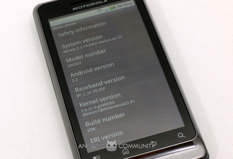
Inside, Motorola has used a 1GHz OMAP 36x0 series processor, almost twice as fast as the original, and that – coupled with Android 2.2 Froyo being loaded as standard – makes for a generally swift moving software experience. It's the same CPU as in the Motorola DROID X (as well as 512MB of RAM) but of course the touchscreen-only phone ships with Android 2.1 Eclair. We've seen the improvement Google's more recent Android release makes to day-to-day performance on other devices, and indeed the DROID 2 felt a little snappier completing regular task than the DROID X did.
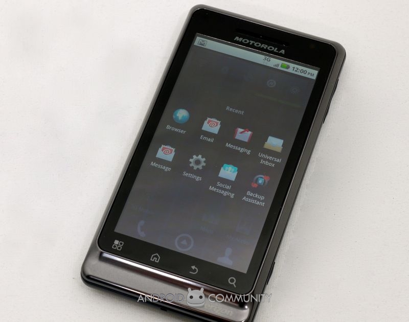
It's worth remembering, however, that the original DROID is getting an Android 2.2 update right now, potentially smartening up the existing phone to the point where current owners might not choose to upgrade to the DROID 2. Also in their favor is the original handset's unmodified OS; in contrast, like the DROID X, Motorola has customized Android 2.2. The latest, relatively pared down version of MOTOBLUR makes an appearance, together with dynamically resizable widgets, for pulling in social networking updates from Facebook, Twitter and others. Unfortunately, as we've seen before (from Motorola and other device manufacturers), when the OS is modified from stock it usually takes longer for handsets to get newer Android versions. As we felt with the DROID X, the customizations Motorola have chosen simply don't deliver enough extra usability, for us, to warrant the likelihood of later delays.

The DROID X's camera UI is carried over to the DROID 2, but unfortunately the hardware hasn't come with it; instead there's a 5-megapixel autofocus camera, just as you'd get on the first DROID. It pales in comparison to modern rivals, too. Indoor stills, despite the dual-LED flash, are fuzzy and prone to blurring, while outdoor shots have decent color balance but still lack fine detail when blown up. It's not a terrible camera, no, but rivals like Samsung are definitely doing better. As for the camcorder, it falls short of the 720p HD video commonly found on high-end alternatives, instead maxing out at 720 x 480. Clips tend toward the blurry, though the exposure and color-balance is reasonable.
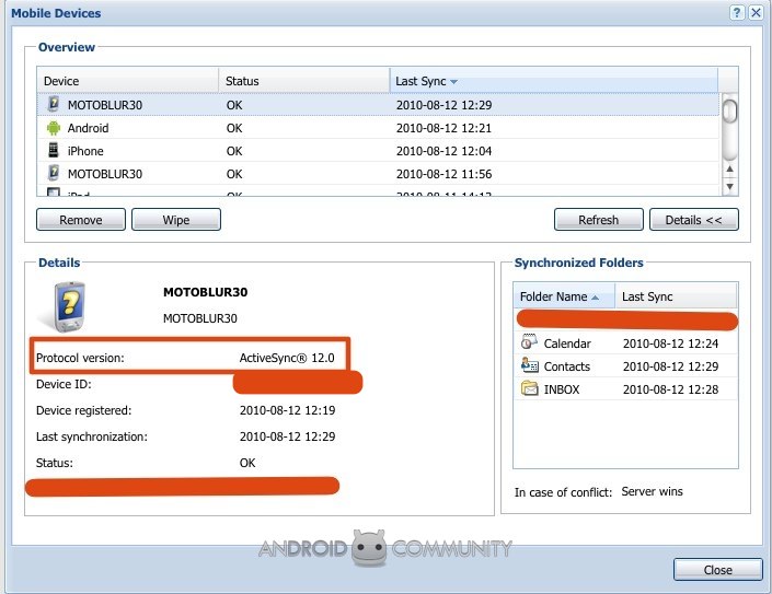
Motorola's other main changes to the software are to preload Swype, the gesture-based onscreen keyboard gaining momentum on Android phones, and a Mobile Hotspot app, which allows you to share your 3G connections among up to five WiFi clients. However we wish the company had spent some more time finessing their Microsoft Exchange integration; the problems with sync we experienced on the original DROID are still apparent on the second-gen model, despite an update to ActiveSync 12.0. There's now Flash 10.1 support in the Android browser, which worked reasonably well, though certain games are obviously written for keyboard and mouse control and don't lend themselves so well to touchscreens. We were able to stream in-page video, but higher bitrates content did tend to choke the DROID 2.
More worrying, though, were the persistent signal and call issues. We praised the original DROID for its strong audio quality and tenacious grip on Verizon's network, but the same really can't be said for the DROID 2. Without physically moving the handset we saw it flick between various levels of Internet connection speed, and minor changes in position were enough to prematurely end conversations. It's a shame, because when we had a solid connection the in-call audio was strong and clear. Hopefully Motorola will release a firmware update to address reception, since we're not the only people to have complaints about the DROID 2's abilities in this area. Finally, we'd like to have seen Motorola make this a world-phone, rather than CDMA-only; as with its predecessor, take the DROID 2 outside of North America and you won't be able to roam onto the more common GSM networks.
With the DROID 2's WiFi b/g/n and Bluetooth 2.1+EDR turned on, we managed to get through a regular workday on a single charge of the 1,400mAh battery. Still, as with most other recent smartphones, you'll be charging nightly: Motorola's Desk Stand – which automatically puts the DROID 2 into a clock/media player mode – makes this more palatable, at least.
When we started, we asked whether Motorola had done enough with the DROID 2 to maintain their momentum, or whether they'd perhaps been too conservative in their changes. The outcome is certainly less clear-cut than back when we reviewed the DROID. In the new handset's favor are the improved keyboard, faster CPU and boosted RAM; however the mediocre camera and customized Android 2.2 OS count against it. That's before you get to aberrations of the cellular wireless, which we're hoping will be addressed soon. For original Verizon DROID owners, we don't see any great push to upgrade; the keyboard is improved, yes, but if physical QWERTY is your priority then there are better 'boards out there, and the Android 2.2 update for the first phone closes the gap when it comes to functionality.
In the context of the rest of the market, meanwhile, the DROID 2's 3.7-inch display is beginning to feel a little small. The DROID X's 4.3-inch panel is huge in comparison, and even 4-inch phones leave the DROID 2 feeling cramped. Still, there are plenty of people who prefer physically smaller devices. We're glad to see the Android smartphone segment continue to grow – we're all for more choice, after all – but Motorola will likely find the Verizon DROID 2 makes less of a splash than its illustrious predecessor managed.
