Deezer Revamps Its Android App For Faster Access To Everything
Some say we live in a fastlane generation, where everything is almost instant and always right at our fingertips, from instant noodles to microwave meals to the apps that give fast access to content and services. A common design principle these days hold that if it takes more than a few seconds for your app to deliver what a user wants, you've lost that user. That's why when music streaming service Deezer worked to refresh its Android app, it made sure that it gives users instant access to everything they care about.
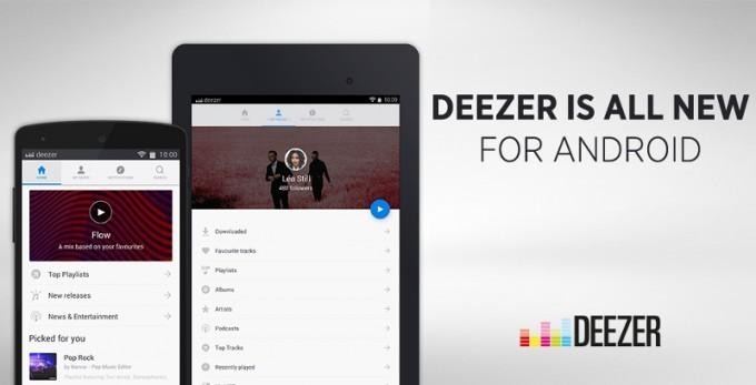
Of course, it doesn't just simply dump all the options and content on a single screen. That would be akin to finding a needle in a haystack and would be counterproductive to the goal of making it easy to find and access everything. In conventional Android design, pages are often accessed via a side menu that appears when you touch the "hamburger" (three horizontal lines) icon. For Deezer, however, that's one tap too many. Instead, they've relocated the main navigation areas to tabs at the top, mirroring the same design convention it uses on the iOS app.
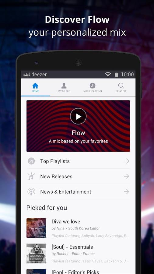
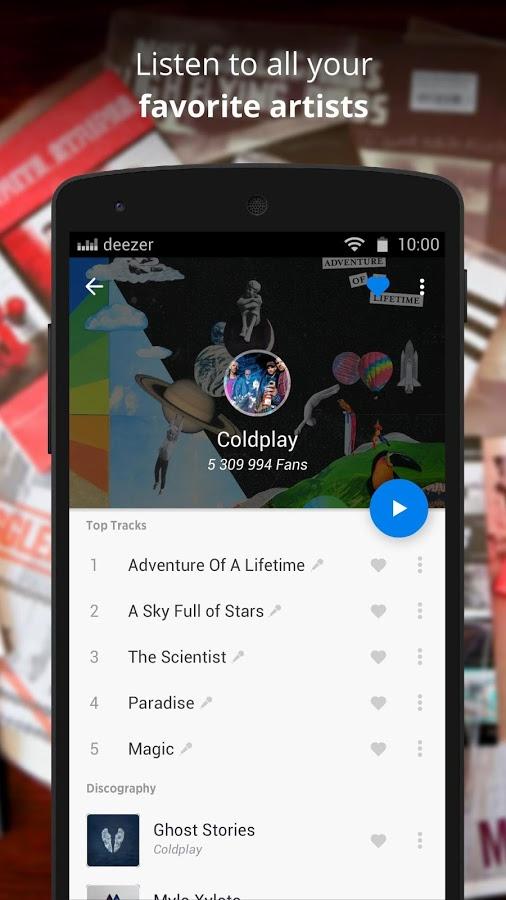
Those tabs give users instant access to four key areas: Homepage, My Music, Navigation, and Search. Home is where your heart is, or at least will be. Here you will have access to personalized mixes and recommendations, everything you need to immediately start listening to your music. The My Music tab is, of course, where you will find your library. Instead of jumping around to artists, albums and whatnot, the new Deezer app streamlines the navigation. All you need is to scroll down or up to get to the music you want.
This tab also features one of Deezer's most standout feature: Flow. Have you ever been at a loss thinking of what music to play? Have you ever experienced that awkward silence at a party while you scroll with sweaty hands for just the right playlist mix? Deezer Flow solves those kinds of problems by instantly handing you a non -stop selection of your own tunes, picked based on your own listening habits. Best of all, Flow is also available to free users.
The fresh and stylish new Deezer app should be rolling out now to Android users. The latest app finally brings the Android version on par with the iOS app, which got the new UI earlier but also in bits and pieces. The gap in time was due to Deezer's designer and developers taking extra care to conform to Google's design guidelines for Android, while making sure to give users the music that they want and love when they need it, instantly.
