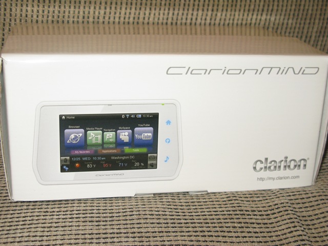
ClarionMiND Navigation MID Reviewed: Car Crash
The ClarionMiND seems like it's been around for a long time now, though it was only CES 2008 when the company officially unveiled the touchscreen navigation MID. It took all the way until November to be released, then we had to wait until last month to see it in action; now Gear Diary have reviewed the MiND. Clarion promise the full internet, navigation and media experience from one single device; unfortunately it seems they fall well short.
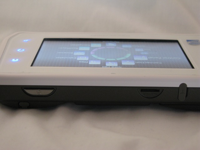
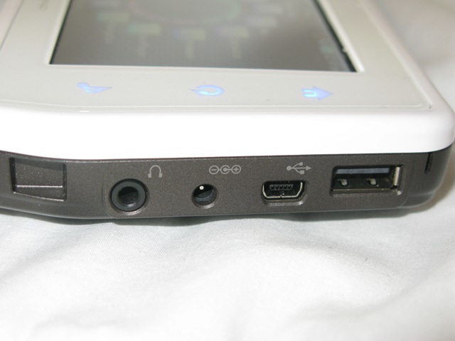
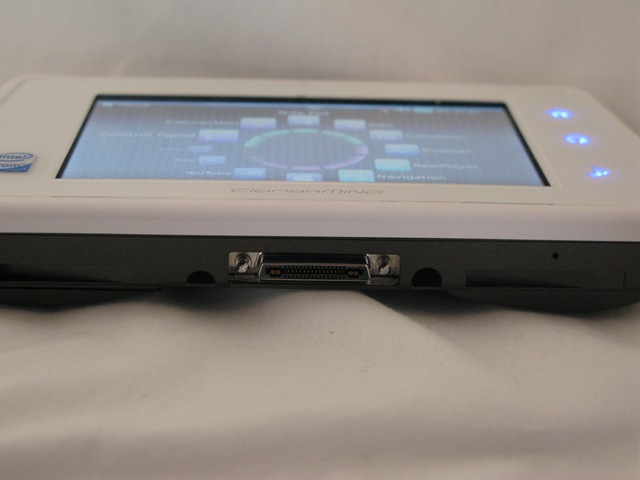
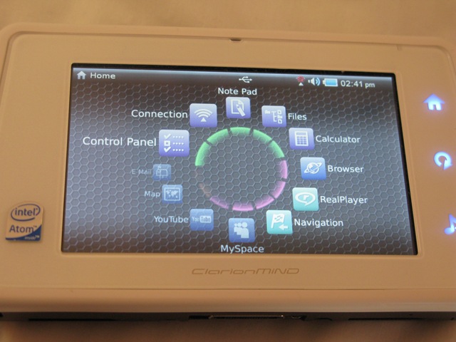
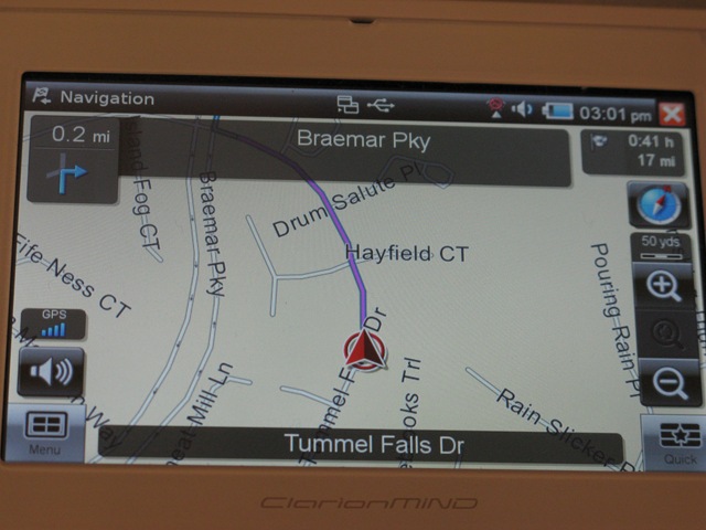
The list is good points is woefully brief: GPS works well, perhaps unsurprising given Clarion's history of PND products, and the 4.8-inch WVGA display is great for watching video, but pretty much everything else is a disappointment. The MiND is over-bulky and has poor audio from the integrated speaker; the GUI is pretty slick, but can't be customized to bring often-used apps to the foreground, and the photo viewer is slow and poorly designed. Biggest drawbacks are the low internal memory and woeful battery life: the MiND lasted just an hour in standby.
I briefly played with the MiND at MWC earlier this week, where Intel had brought along the MID to display among their Atom device showcase. Even there, in the briefest of hands-on, it felt outclassed among the other devices; my attention was more easily taken by the UMID M1 and the Samsung SWD-M100. For $650, you'd have to be particularly addicted to the Clarion brand name to pick the MiND.

