C U L8R BlackBerry 10
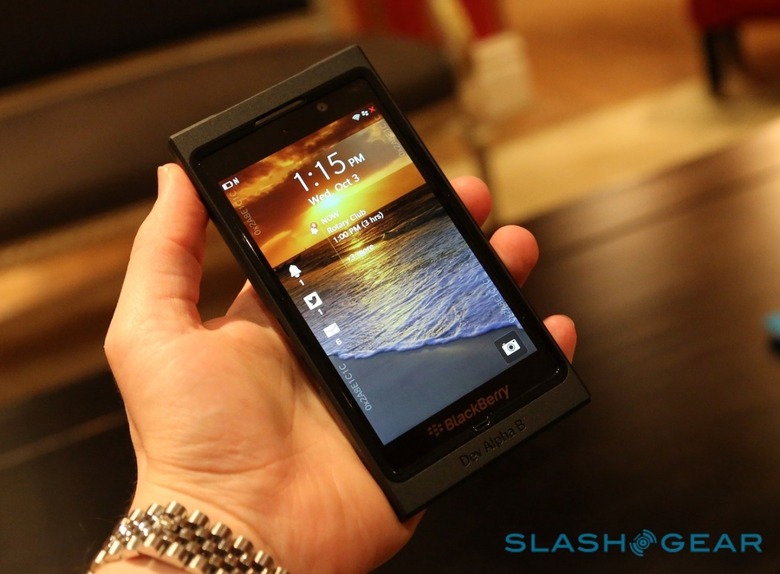
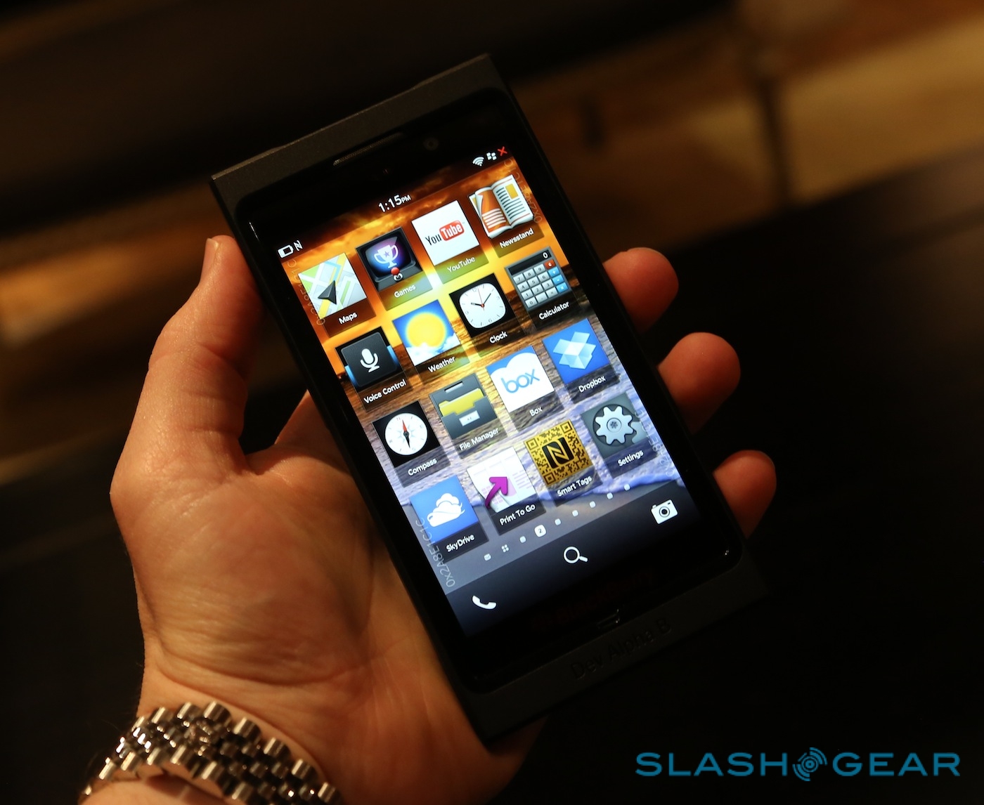
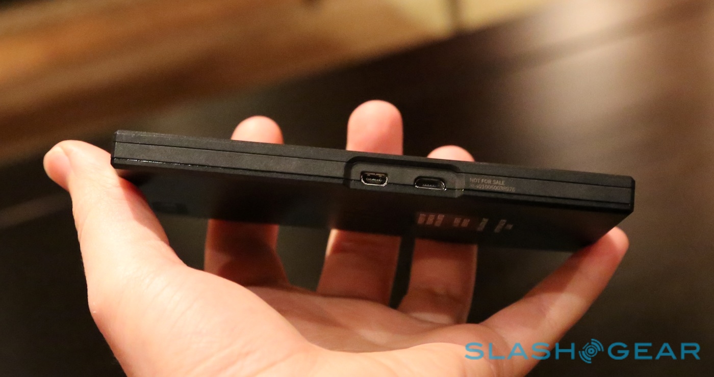
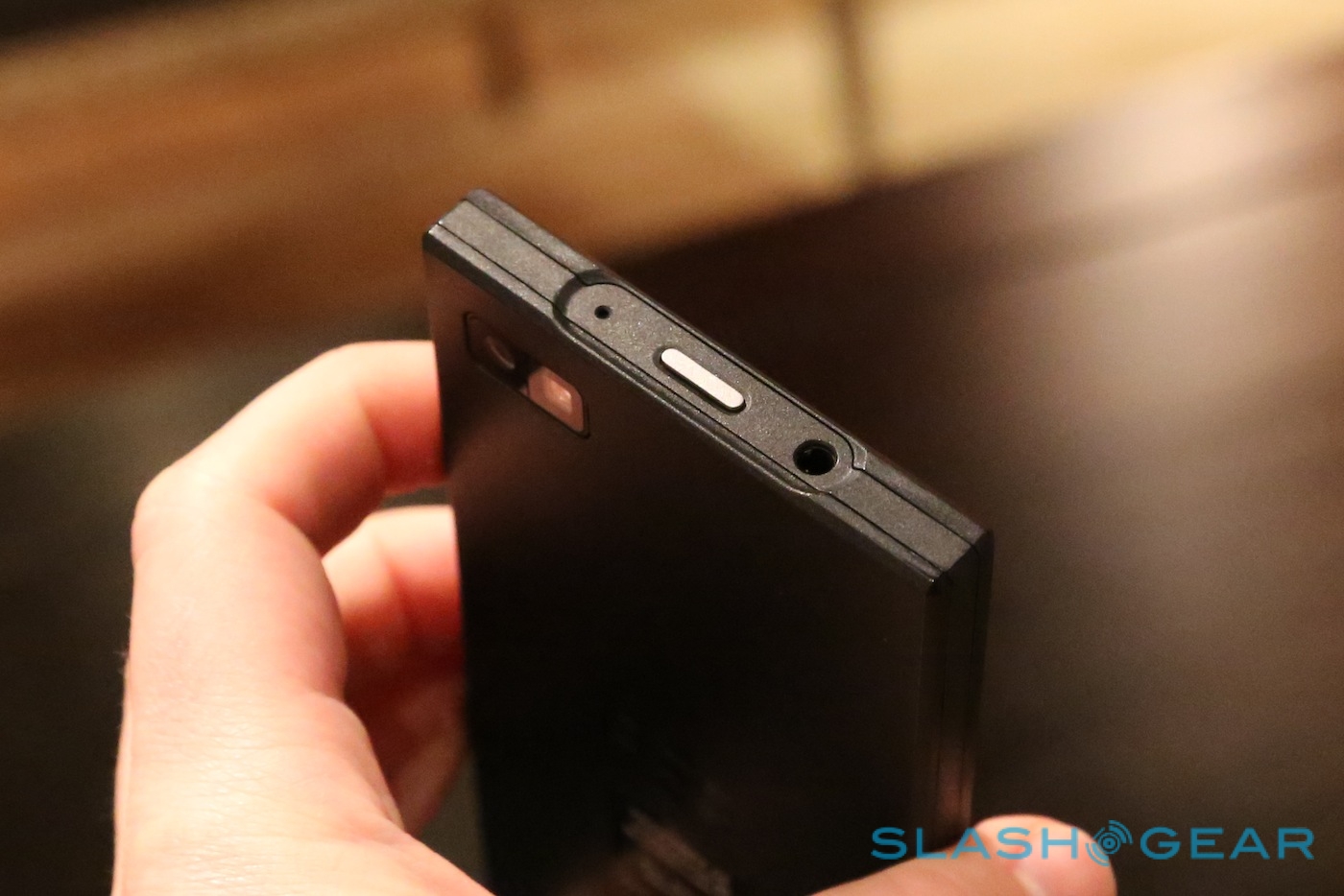
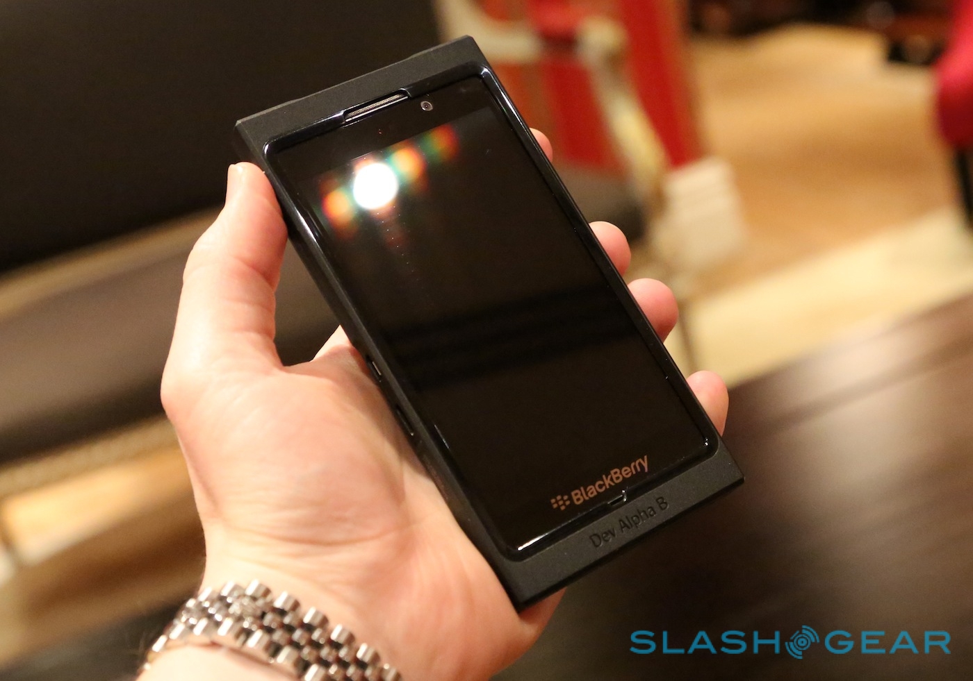
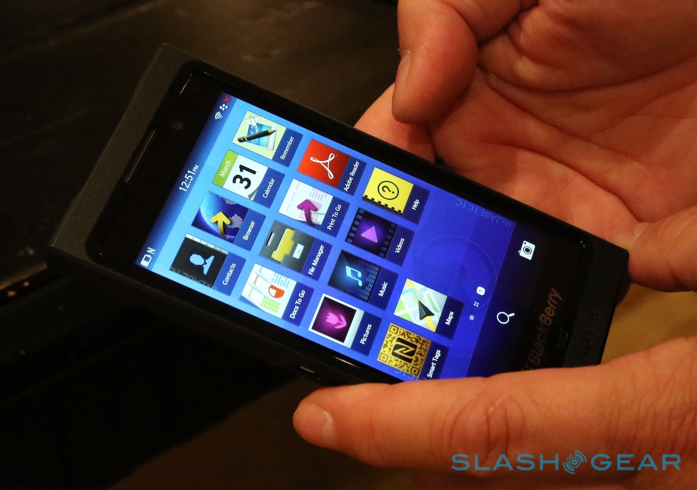
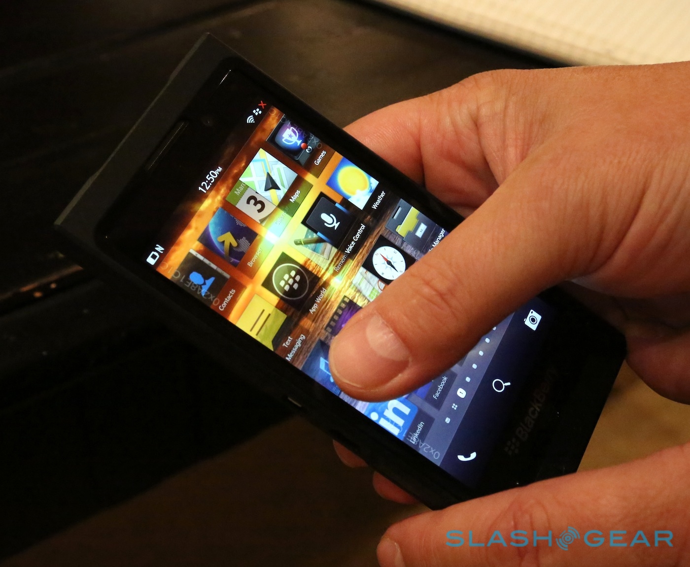
BlackBerry is in a precarious place right now. RIM's surprise good news in user count and financial figures for Q2 2013 remain overshadowed by the tardy arrival of BlackBerry 10, now expected sometime early in the new year. Last week, RIM handed out the latest iteration of its developer device, BlackBerry 10 Dev Alpha B, and demonstrated a few more details of the upcoming OS and how the company believes it has addressed information-overload. We caught up with RIM in London to talk clever keyboards, game-changing context, and check out the new features for ourselves.
Star of the BlackBerry 10 show may well be the soft keyboard. RIM is known for its physical QWERTY, and initial reports that the first BlackBerry 10 device would be all-touch filled some smartphone stalwarts with dread; thankfully, unless you're a dyed-in-the-wool thumbboard addict, RIM's on-screen keyboard is likely to satisfy.

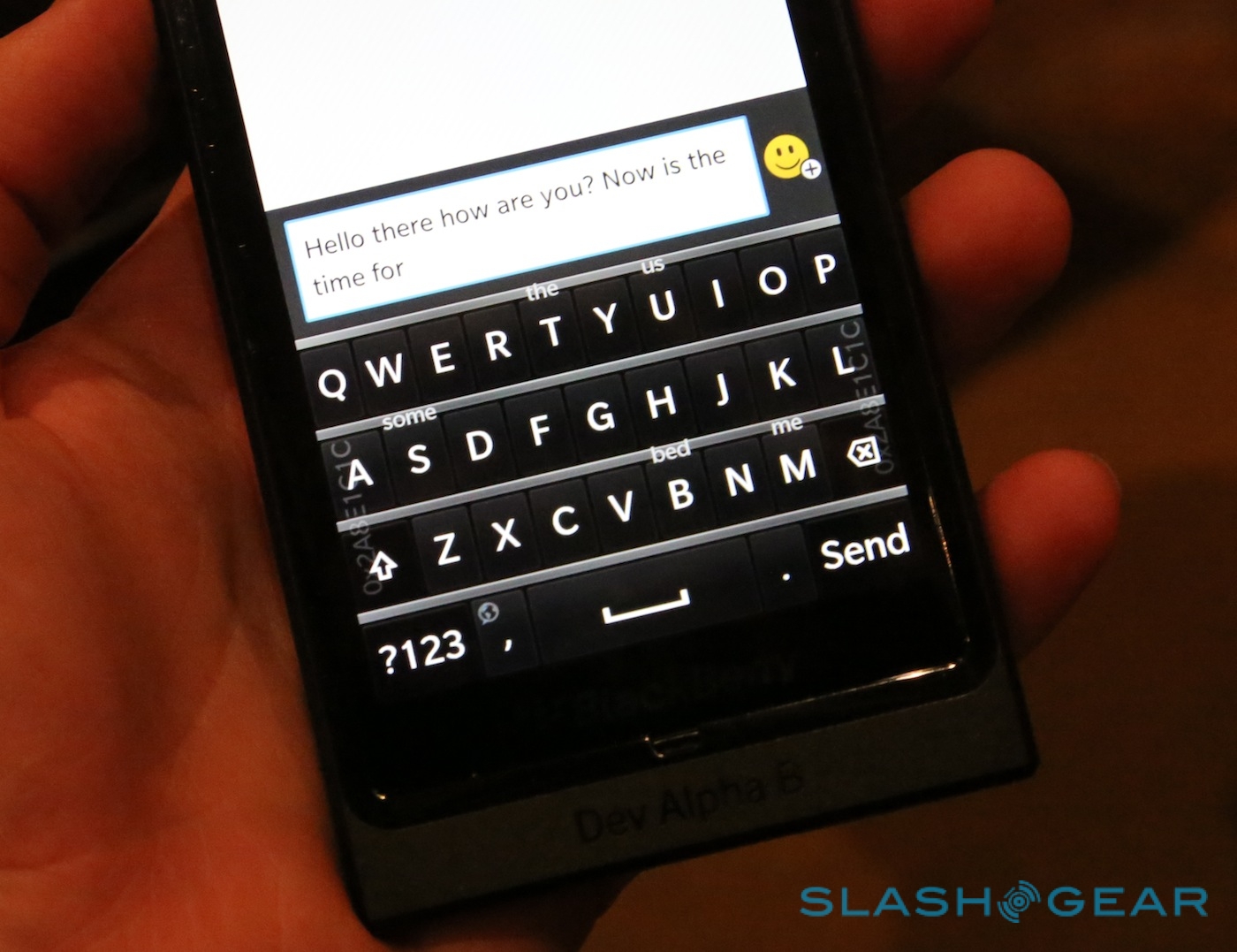
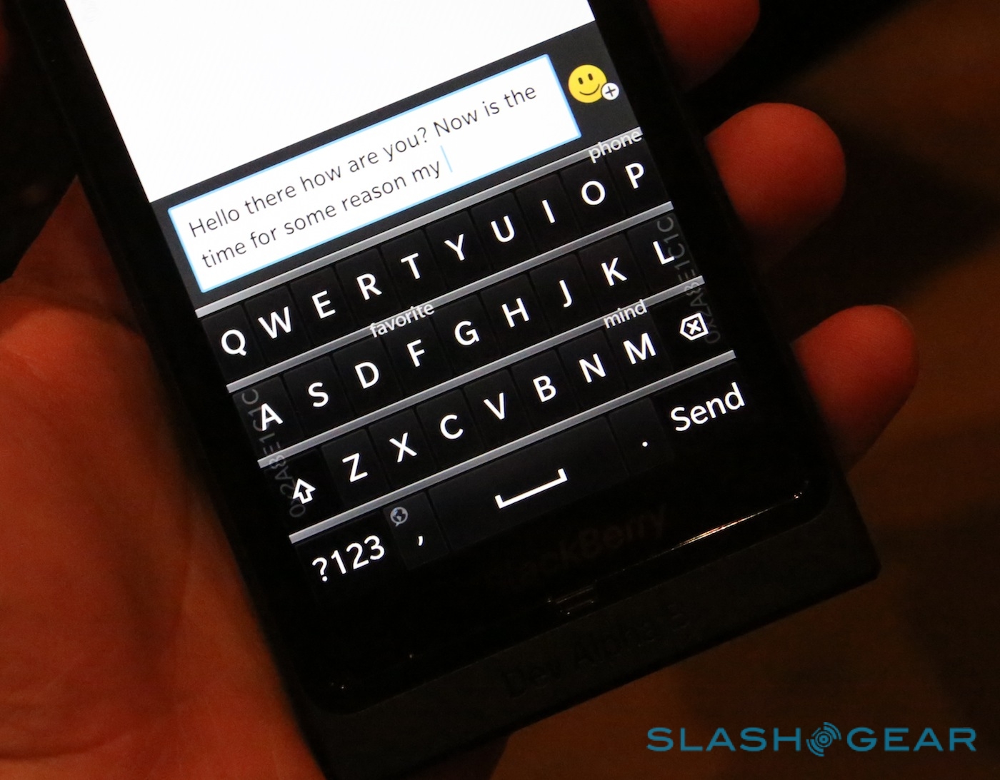
As with just about every soft keyboard out there, RIM's offers auto-prediction and auto-correction. Unlike rivals, however, which slot word suggestions in a row on top of the keyboard or below it, RIM's 'board floats them over the keys themselves. It looks messy and cluttered at first glance, but there's method to the madness: the predicted word is in fact positioned over the next letter you'd be typing if you were trying to spell it. Rather than having to glance up above the keys to see if the system has guessed your next word, your eyes are probably already looking where the word will be shown. A simple upward flick selects it, and you're off to the next.
It doesn't sound like it should make much difference, but in practice it's supremely straightforward, even for a new user. Within the space of a few minutes you can be battering out sentences with ease, and it's merely a matter of time before knock-off versions of the BlackBerry 10 keyboard proliferate, it really is that good. What they're unlikely to have, though, is the machine-learning behind the 'board: BlackBerry 10 tracks not only what words you use, but the context in which you use them.
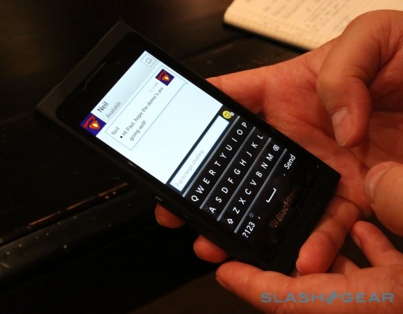
So, if you abbreviate to "C U L8R" in BBM and text messages, but spell out "see you later" in emails, BlackBerry 10 will prompt you with your preferred spelling style when you're in the appropriate app. Up to three different languages can be juggled simultaneously – according to Rob Orr, UK and Ireland MD at RIM, 30-percent of the BlackBerry user base is multilingual – without demanding the user actively switch between dictionaries. It even learns how you press the keys: whether you stab with your fingertip dead-center, or use two thumbs and generally hit the edges of the buttons, building up a second layout map over a period of use that fits the user's typing style.
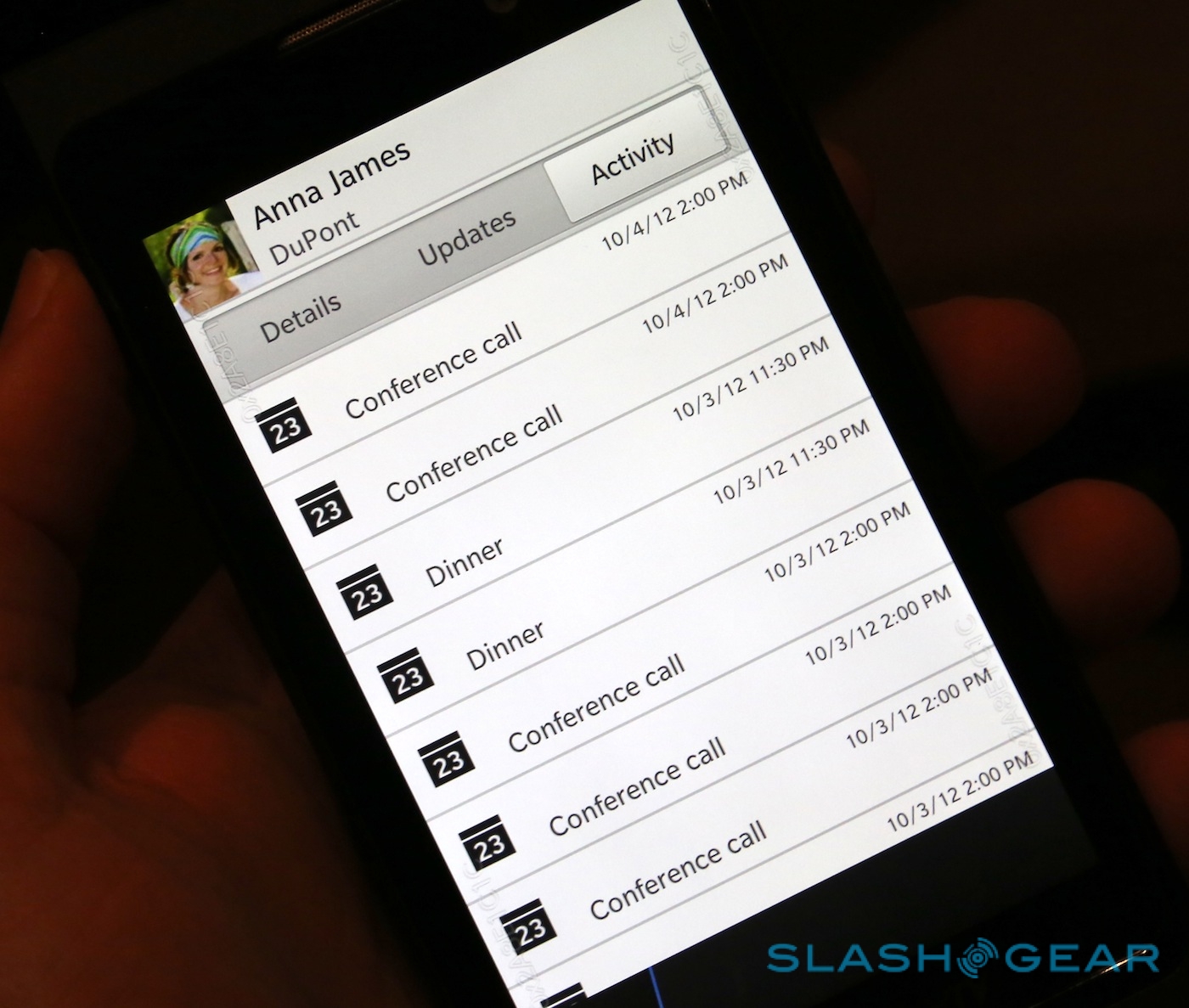
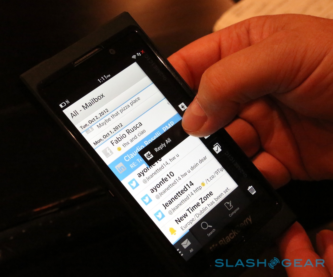
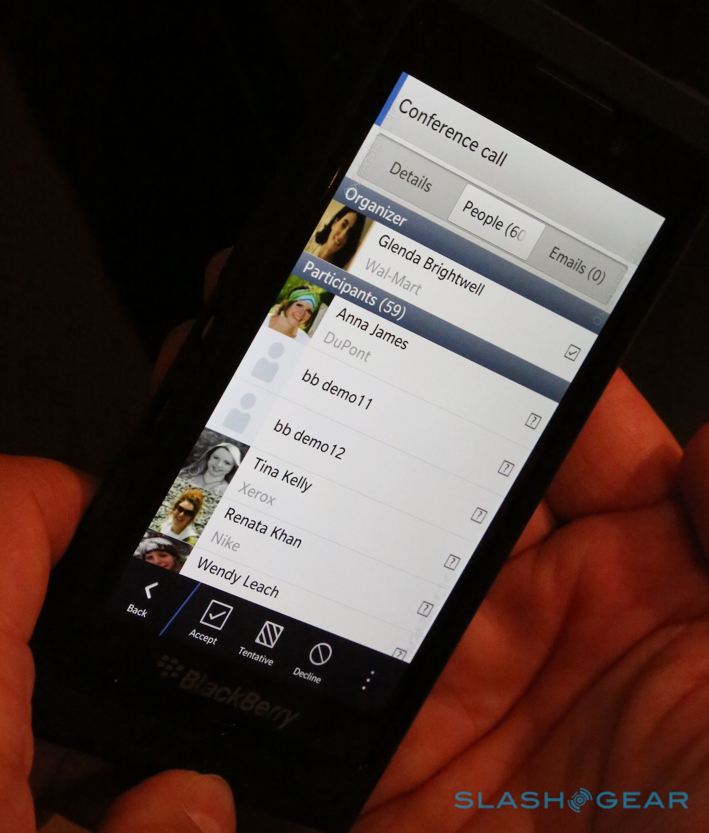
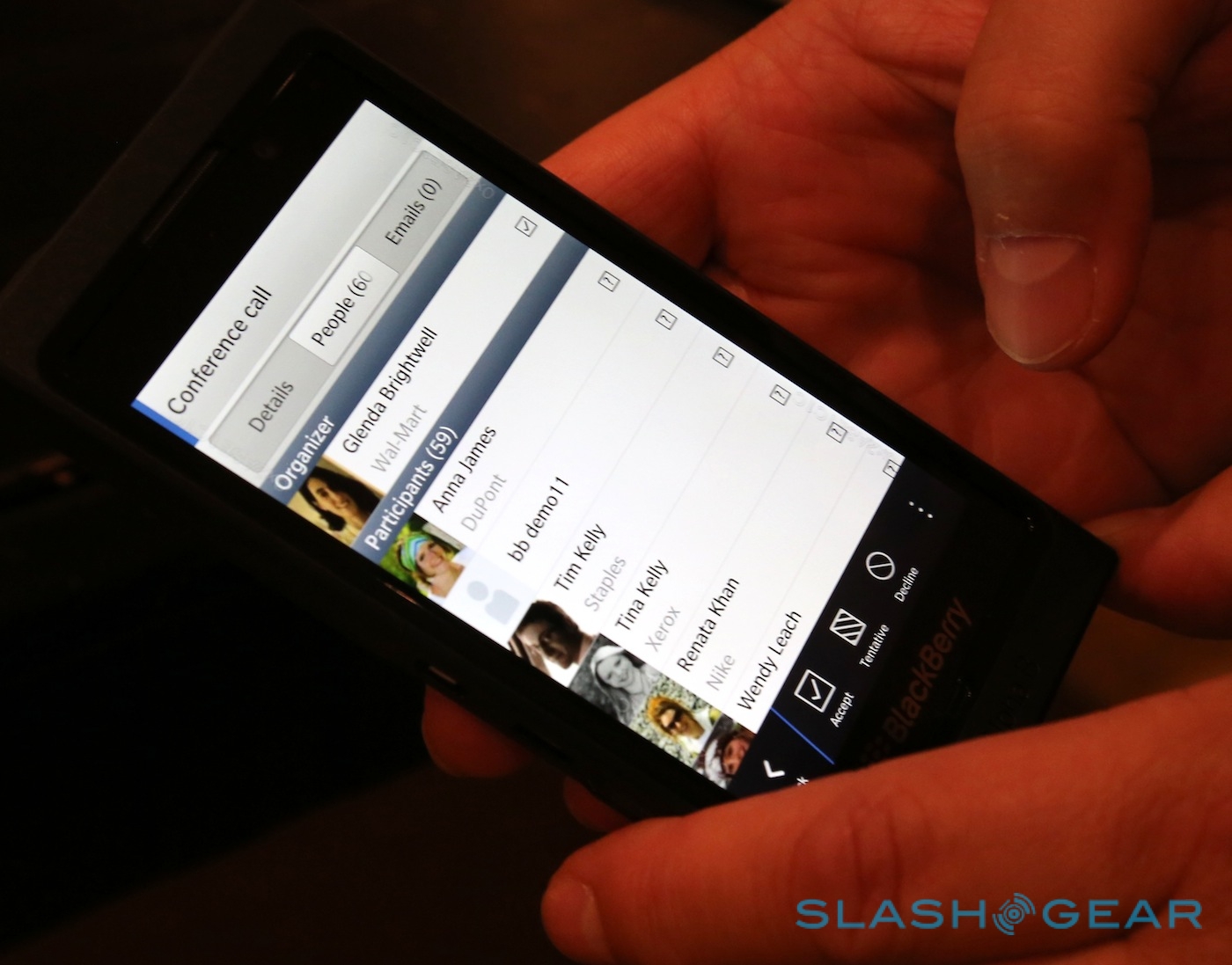
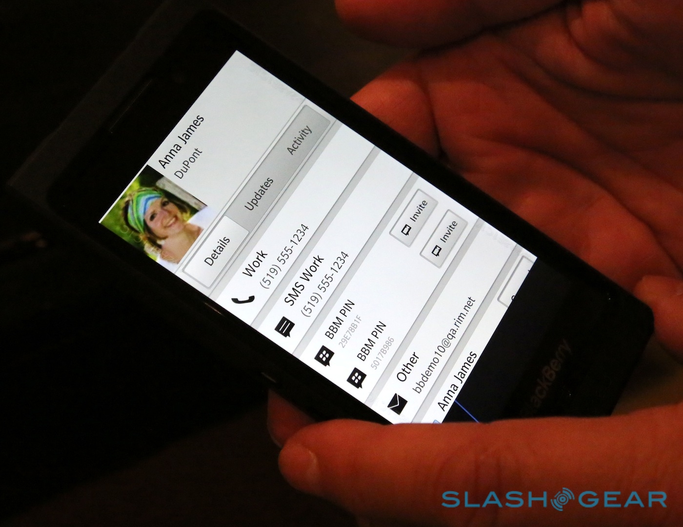
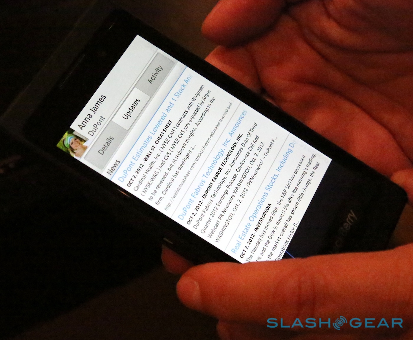
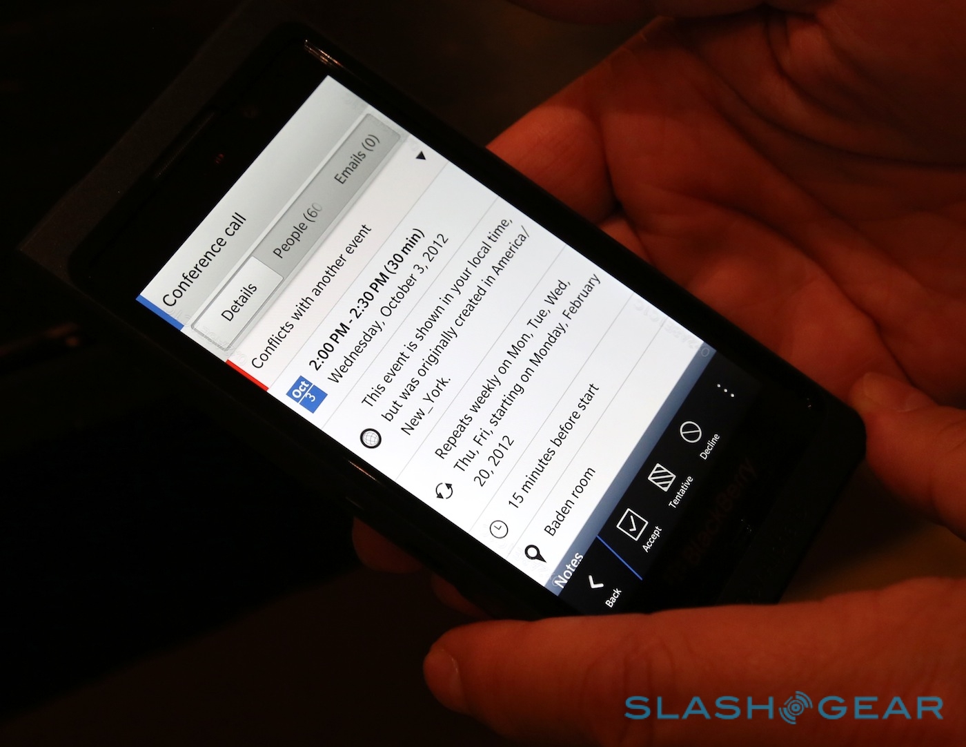
RIM's goal has been to reduce the amount of app jumping necessary to use a modern smartphone; as Orr put it, the "in/out paradigm" of navigation, dipping in and out of multiple apps in order to get snippets of information and functionality from each. Instead, BlackBerry 10 is designed to be used more fluidly, navigable with a single finger. A calendar entry shows attendees, which link to individual contact cards, which have tabs for previous overlaps – meetings and events you may have see that person before – as well as web-sourced background to help get you up to speed.
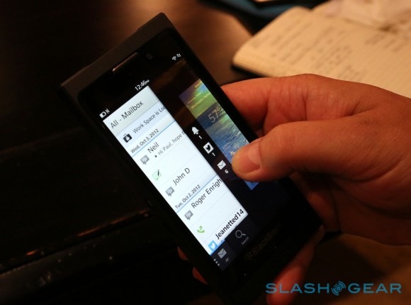
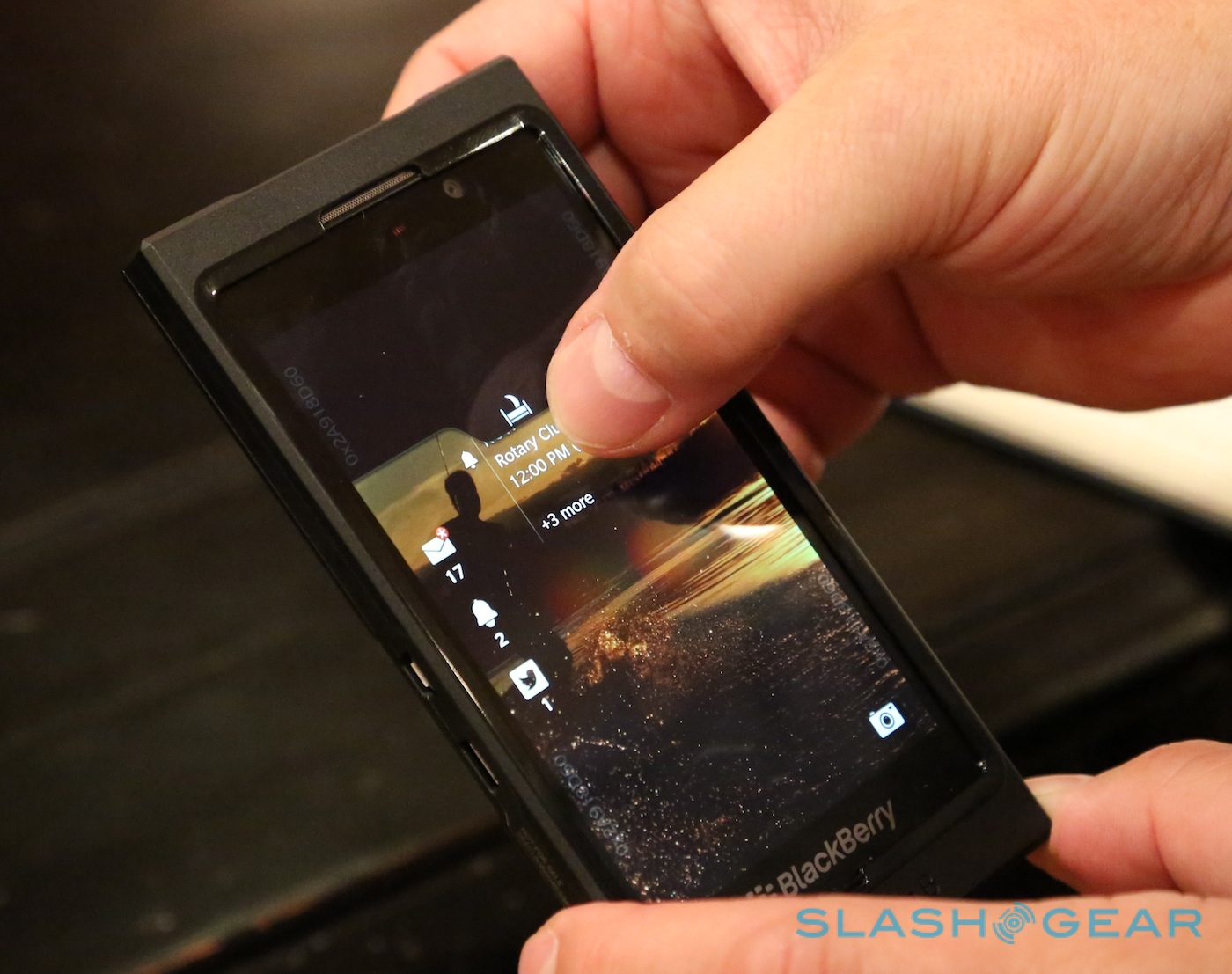
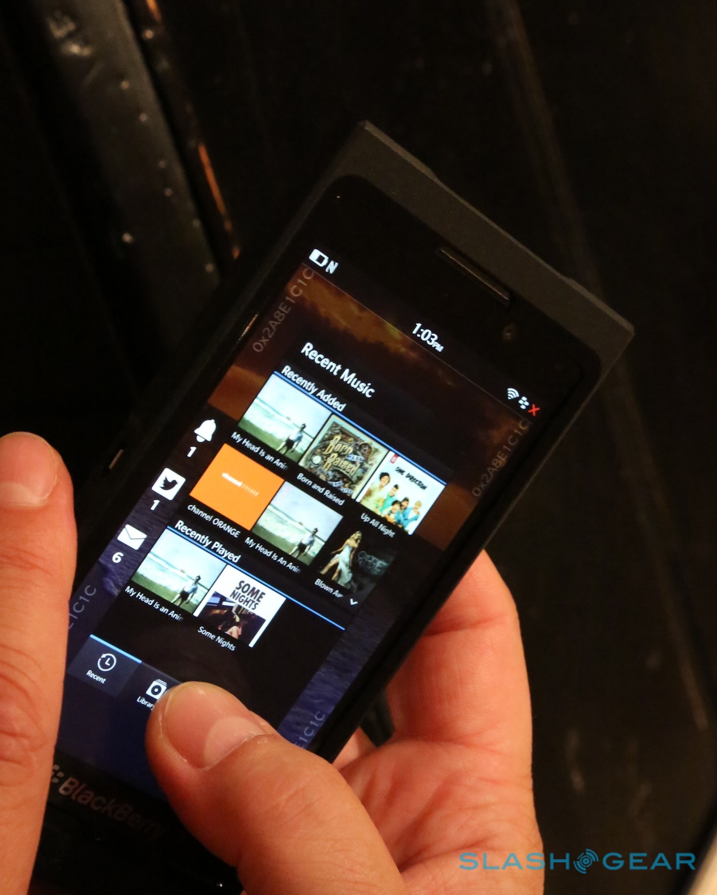
In practice, while RIM likes to portray Peek and Flow as entirely new innovations in the mobile industry, we've seen elements of each before. HTC has experimented with linking individual contacts with a history of previous communication as part of its Sense system on Android and Windows Mobile phones. MeeGo, meanwhile, took a similar approach to multitasking and notifications, splitting its homescreen into three sections: app icons, thumbnails of active apps ordered by most recent use, and a list of combined alerts.

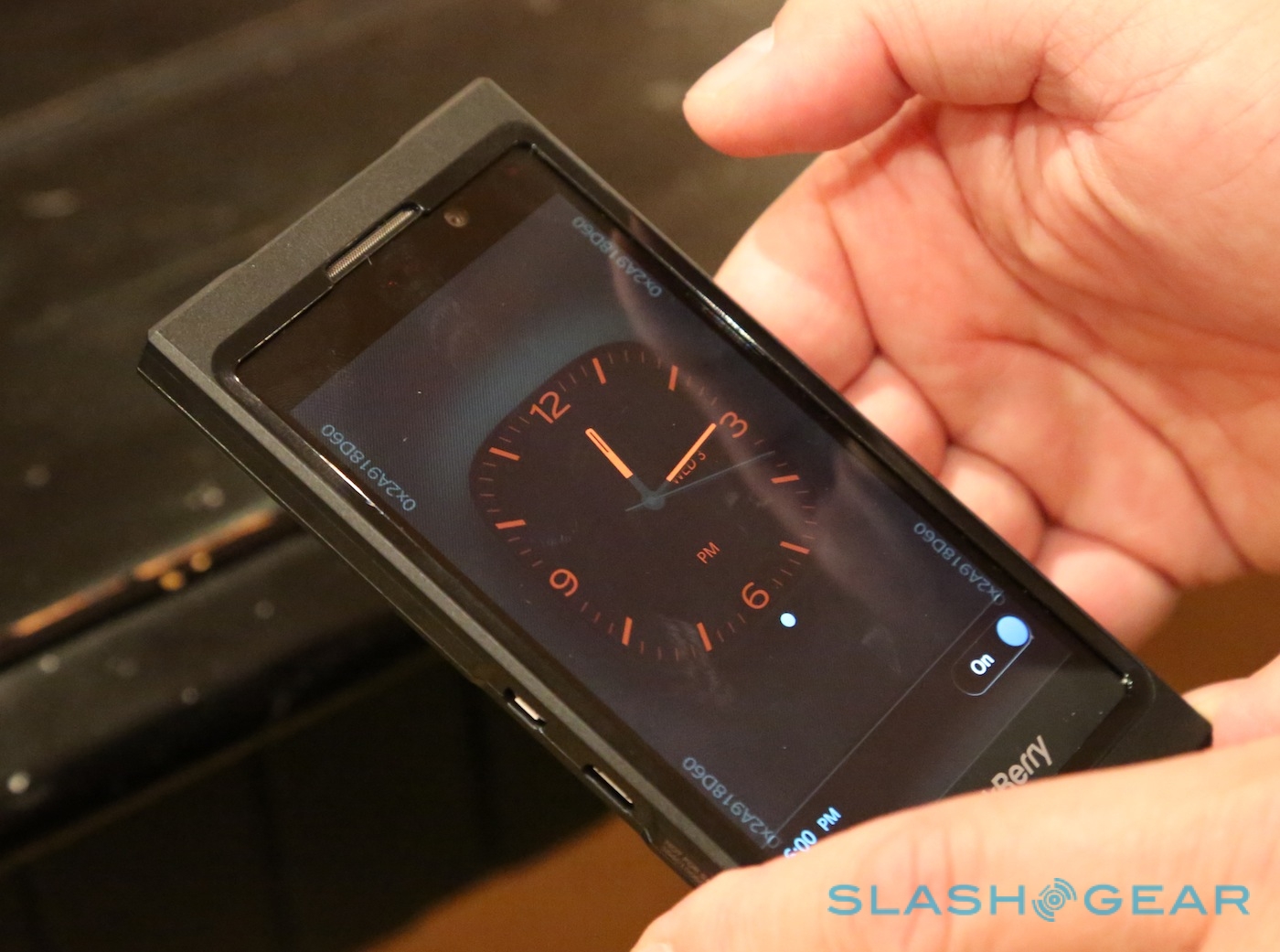
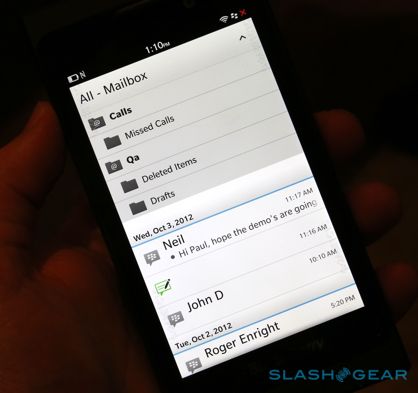
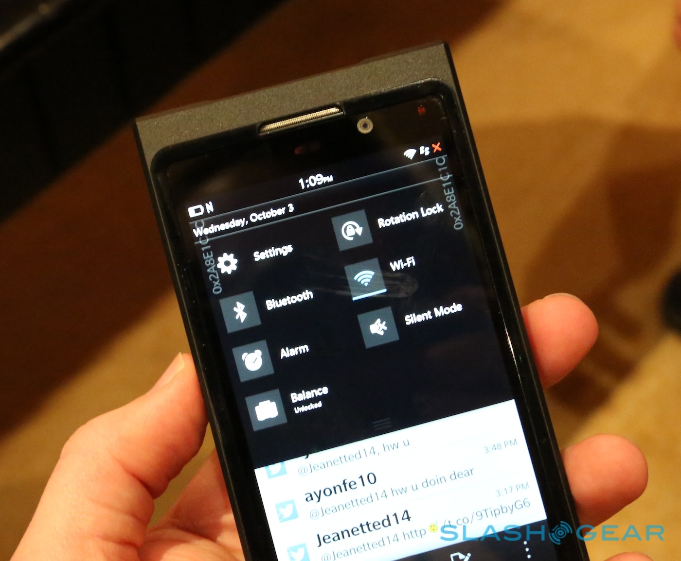
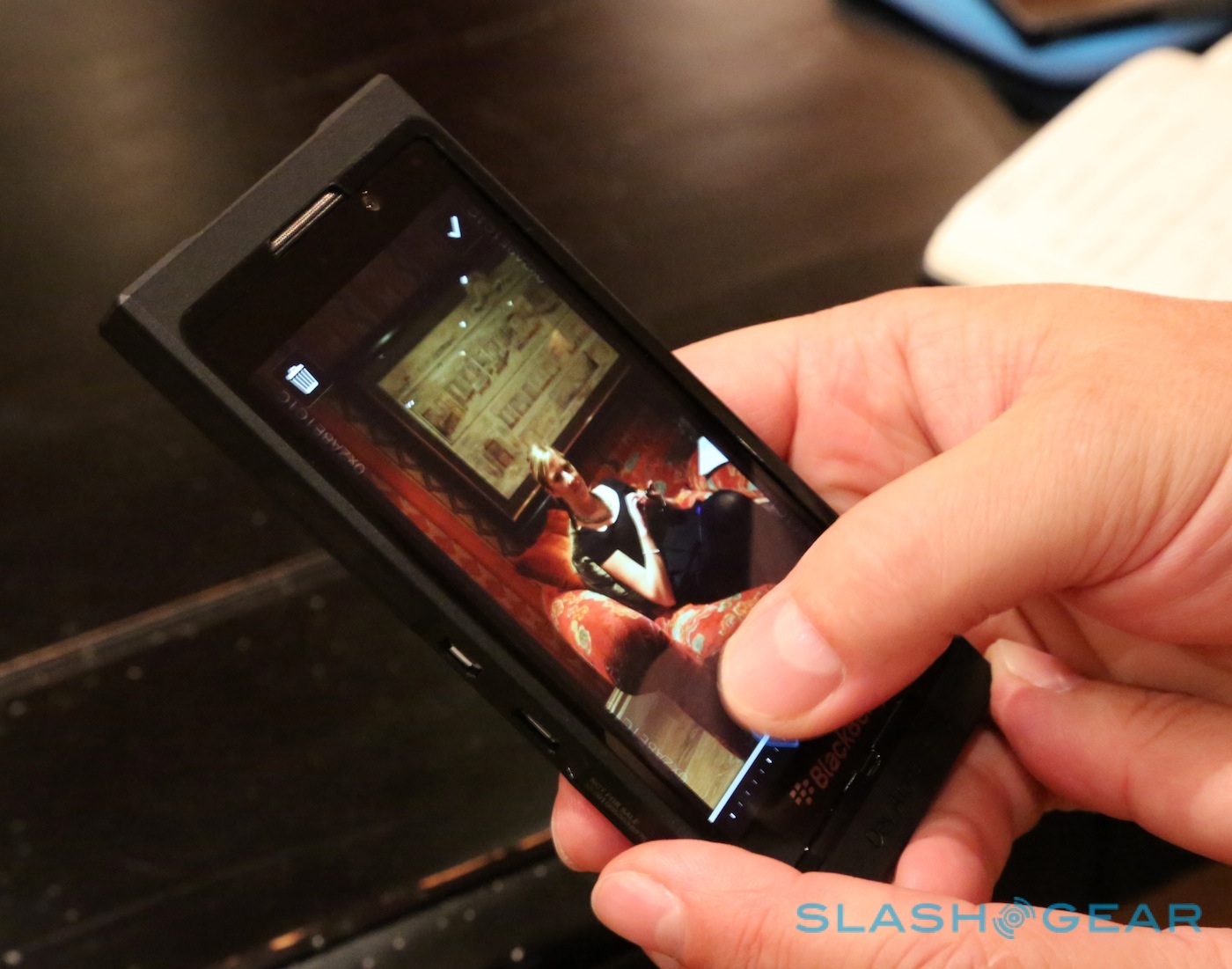
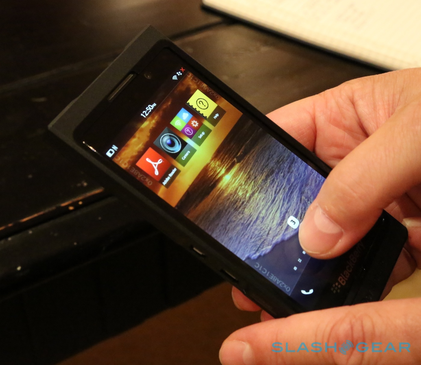
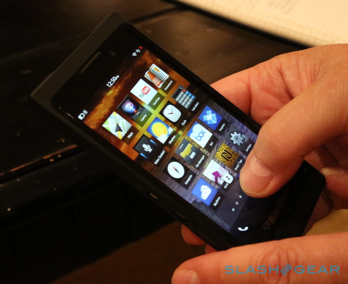
That's not to say that the BlackBerry 10 system is entirely derivative, or indeed that it suffers for not being 100-percent original. In practice, the Peek system of swiping a partial arc to see notification icons is incredibly intuitive, and the whole system worked smoothly on RIM's Dev Alpha B hardware. The unified notifications list is similarly slick, customizable to show more or less of the information from each app as you'd prefer, and even Android software wrapped to run on BlackBerry 10 will have their alerts included in the timeline.

What remains to be seen is where RIM takes BlackBerry 10 next. The concepts behind Peek and Flow are surprisingly good – RIM insists BlackBerry 7 is strong enough to keep up with the best of the rest, though it can be a frustrating affair when moving over from Android or iOS, and BB10 is leagues ahead of its predecessor – but while they remove some of the "in/out" they still rely on the user actively checking updates and alerts. There's still that Pavlovian response expected: the red LED blinks, and we leap to swipe a quick Peek at what new data tidbit has arrived for us.
The position still up for grabs, though, is for the smartphone platform that understands context too. Google has made steps in that direction, with Google Now predicting what basic information – travel, weather, etc – you might want to know next from your Android phone, and Apple's Siri is smart enough to use location and local data to educate its responses, but the smartphone as true personal digital assistant – proactive, not reactive – still isn't quite there yet.

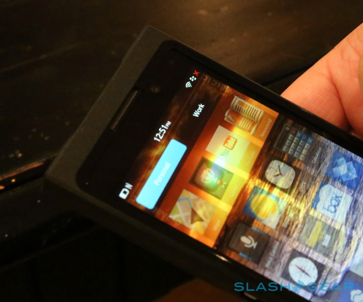
Orr played it coy when we asked about the future of the platform, preferring to talk about context as regards BlackBerry 10 fitting into work and personal life: a single device that contains functionality for both business and pleasure, with the security and remote-management demanded by enterprise, while leaving the flexibility and convenience individual users expect. RIM calls this BlackBerry Balance, and it's certainly unique among smartphone platforms: your IT department could remotely provision the "Work" side of your phone, load apps that can't be accessed by your "Personal" account on the same handset, and then delete it all (leaving your own data, apps, and settings untouched) when you leave the company.
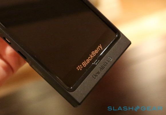
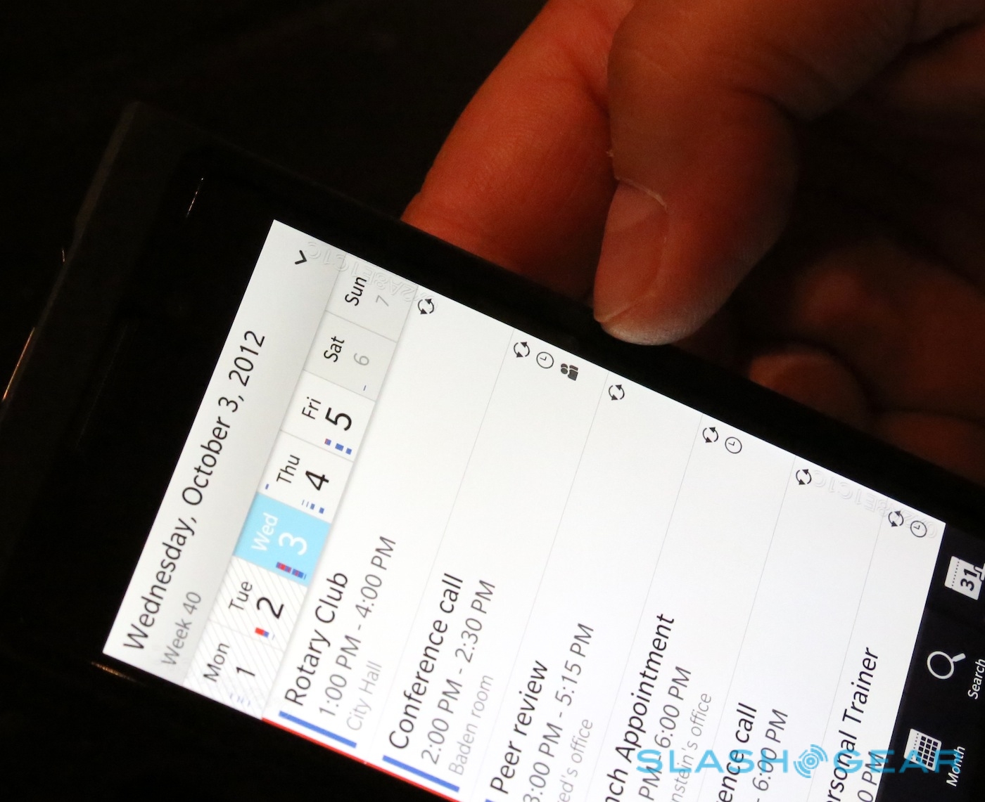
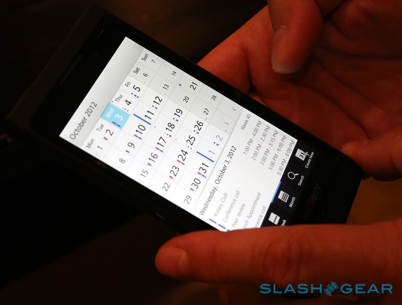
BlackBerry 10 is a solid start, but it comes to the market behind three rivals that are at the very least equal in their polish. Android and iOS are the obvious leaders; RIM is left to target the distant third place Microsoft would like to hold on to with Windows Phone. Peek and Flow, as well as the clever virtual keyboard and thoughtful touches like a calendar view which makes the date numbers bigger the busier your schedule that day, show there's still a spark among the BlackBerry OS team, but RIM needs to pull something particularly innovative out of the bag if it wants to regain its momentum. Tackling the context question in a compelling way could be enough to do that.
