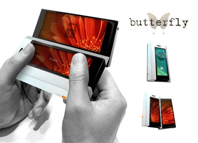
Butterfly Concept Cellphone Design Is Sign Of Early Talent
If there's one thing I hate more than kids, it's kids who are so damn talented that they make me want to strangle myself with the nearest USB lead because my own puny skills pale in weak comparison. Latest to inspire thoughts of bus-powered suicide is Andrew Kim, a 15-year-old aspiring designer who posted concept images of a very clever cellphone design he calls Butterfly to the Product Design forums, only to be overwhelmed by the amount of praise from some of the more seasoned pen-toters there.

Butterfly is a horizontal slider with dual AMOLED touch-screens, which opens biased to an angle so as to give the familiar Nokia Communicator-style format. The lower screen then acts as a keypad for dialling and messaging, while you've got a broad top screen for web-browsing.
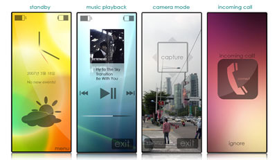
Andrew also envisages a user-replaceable li-ion battery, QVGA camera, SD slot and WiFi, and has even gone so far as to craft screenshots of the UI. It's no afterthought, either – a beguiling blend of iPhone, Helio and PSP interfaces that uses taps and drags.
Thankfully Andrew is looking into design schools, so hopefully all this natural talent won't go to waste!
Click the following images for full-size
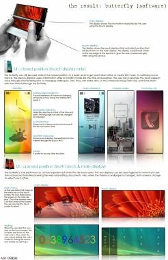
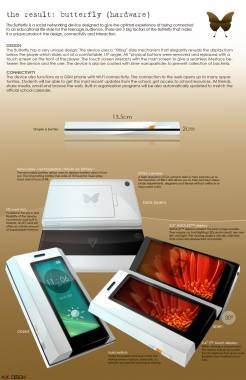
ProductDesignForums [via electro^plankton]
