Brydge Pro+ Review: The Best iPad Pro Keyboard Doesn't Have An Apple Logo
- Sleek design
- Responsive keys
- Solid trackpad
- Long battery life
- No three-finger trackpad gestures
- Thicker screen protectors may not fit in the hinges
- Not all of the trackpad supports physical clicks
- Requires more effort to detach than Magic Keyboard's magnets
Happy harmony is the new iPad Pro and Brydge's Pro+ keyboard, arguably the purest and best accessory out there for Apple's laptop-replacing tablet. If you want the simplest form of a keyboard attachment for the iPad Pro, I recommend skipping the review and heading straight to Apple.com to purchase the Magic Keyboard. If, however, you're looking for the best typing experience available that happens to have an integrated trackpad and looks damn sleek, then keep reading my review of the Brydge Pro+. I promise it'll be worth your time.
If you're truly using the iPad Pro for everything from consuming media content to processing images and massively-sized videos, then your best option is to go with nothing less than 512GB or 1TB. Among the main reasons I'd opt for the iPad Pro over a MacBook Pro or Air right now is the integrated LTE capability. I'd go so far as to say it's crucial for anyone that travels a lot for work, and needs the convenience of an always-connected device.
My 12.9-inch iPad Pro 2020 review unit from Apple came with both 1TB storage and LTE, which – with tax – comes in at a whopping $1,790.81. There's no doubt that that's a lot of money for a tablet. Then again, if you've read my review of the new iPad Pro, you'll already know it's more than just a tablet or a laptop replacement. Nonetheless, every additional dollar you consider spending on accessories, whether it's the second generation Apple Pencil or a keyboard, might seem like an undue burden on your bank account.
The Brydge Pro+ is priced at $199.99 and $229.99 for the 11-inch and 12.9-inch iPad Pro, respectively. That makes it great bang for your buck compared to everything else out there; Apple's Magic Keyboard, for example, is significantly higher at $299 and $349 for the 11-inch and 12-inch iPad Pro.
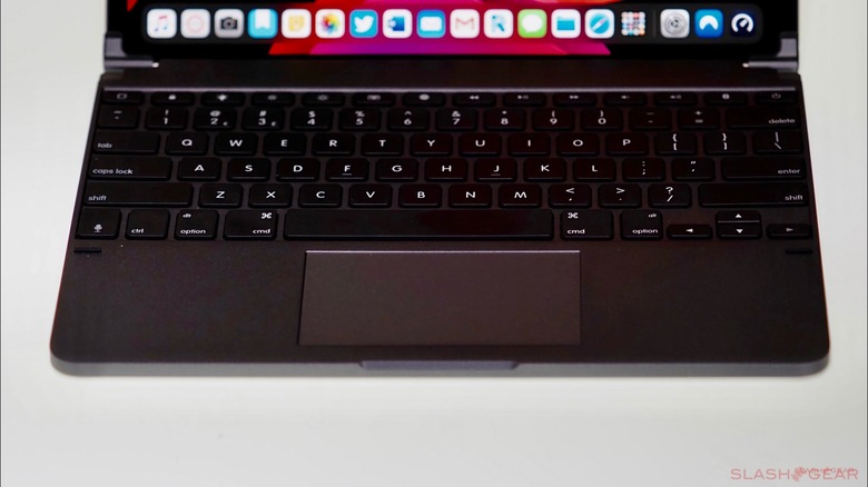
Brydge retained much of its core design principles from previous keyboards for the iPad and iPad Pro lines, while the Magic Keyboard does the same by retaining similar design elements as the Folio Keyboard. However, both of these keyboards are worlds apart in how they attach to each other.
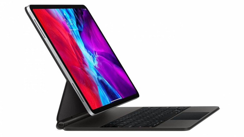
Before I continue, it's worth noting that the best solution is up to your preference and if money was no object, owning both is still the best option.
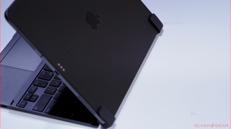
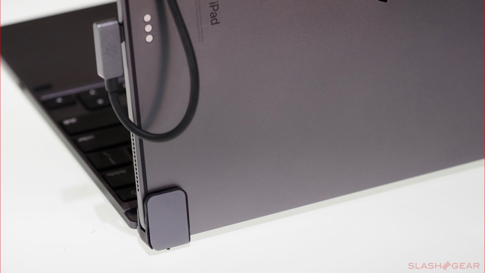
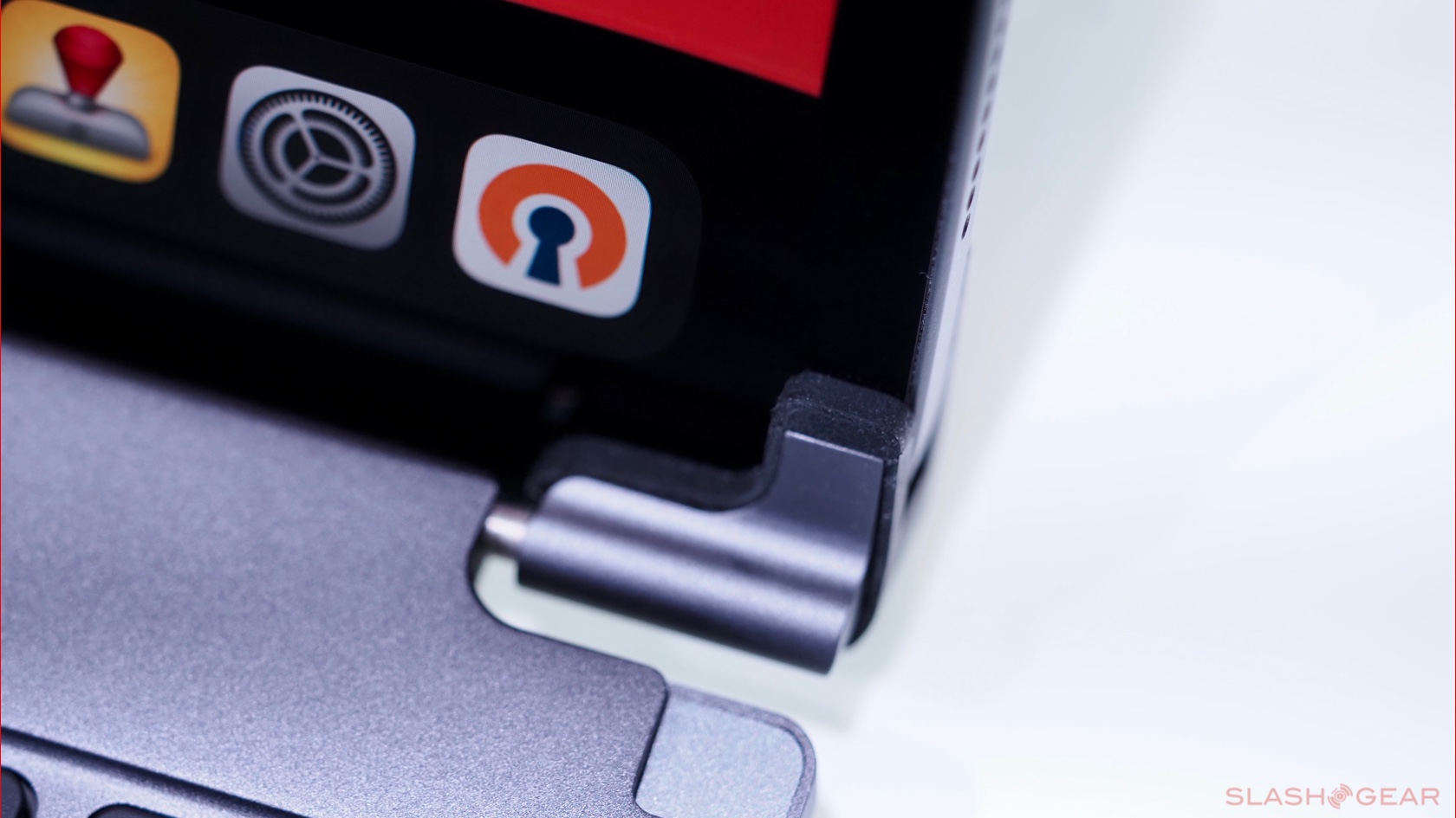
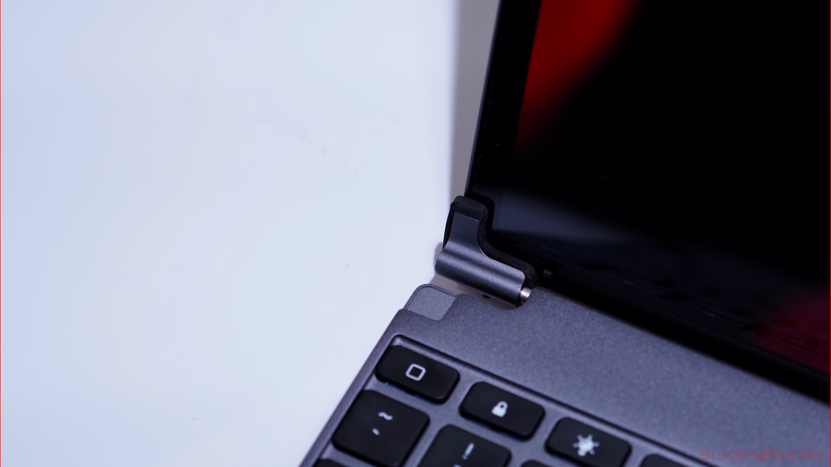
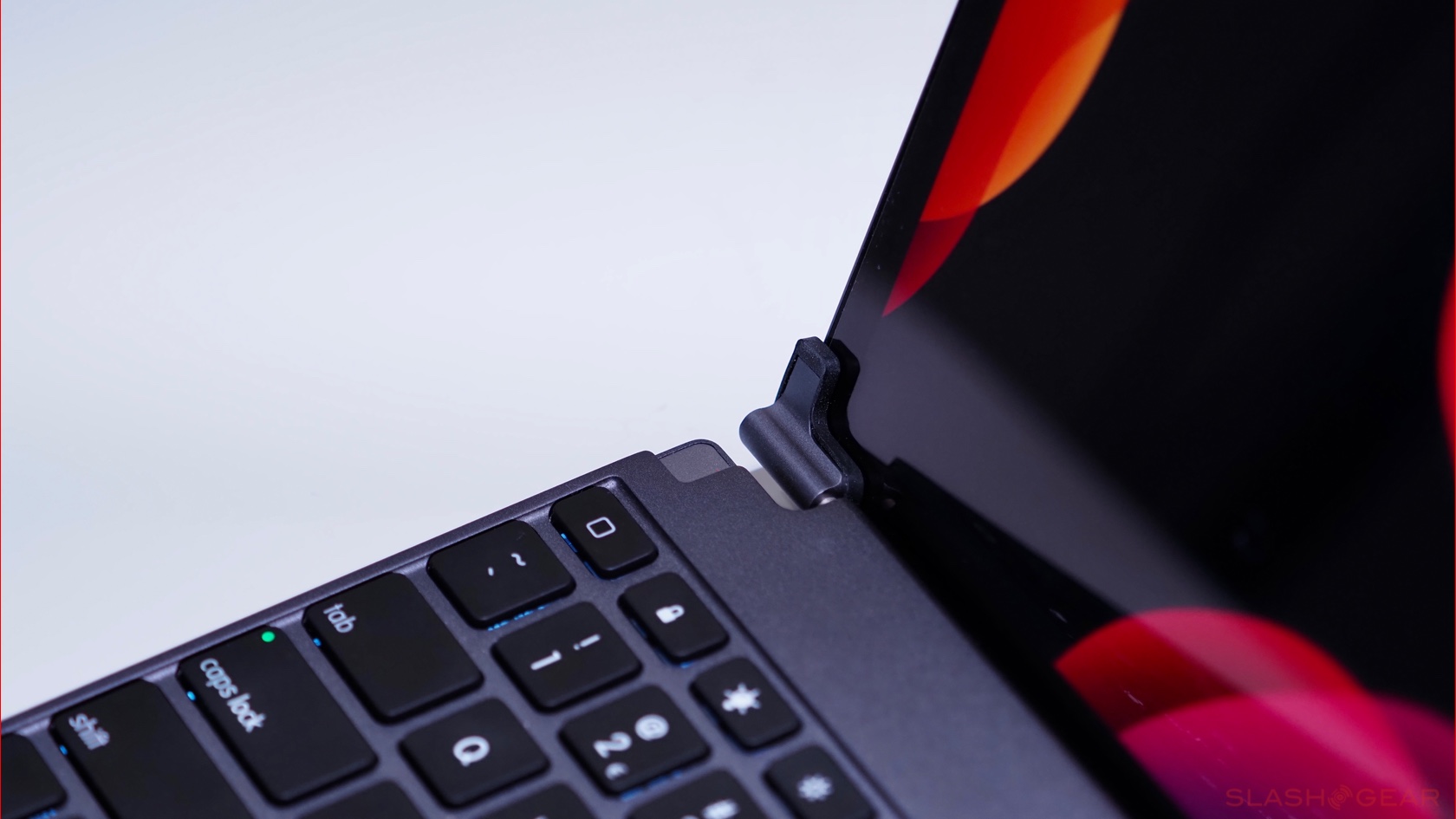
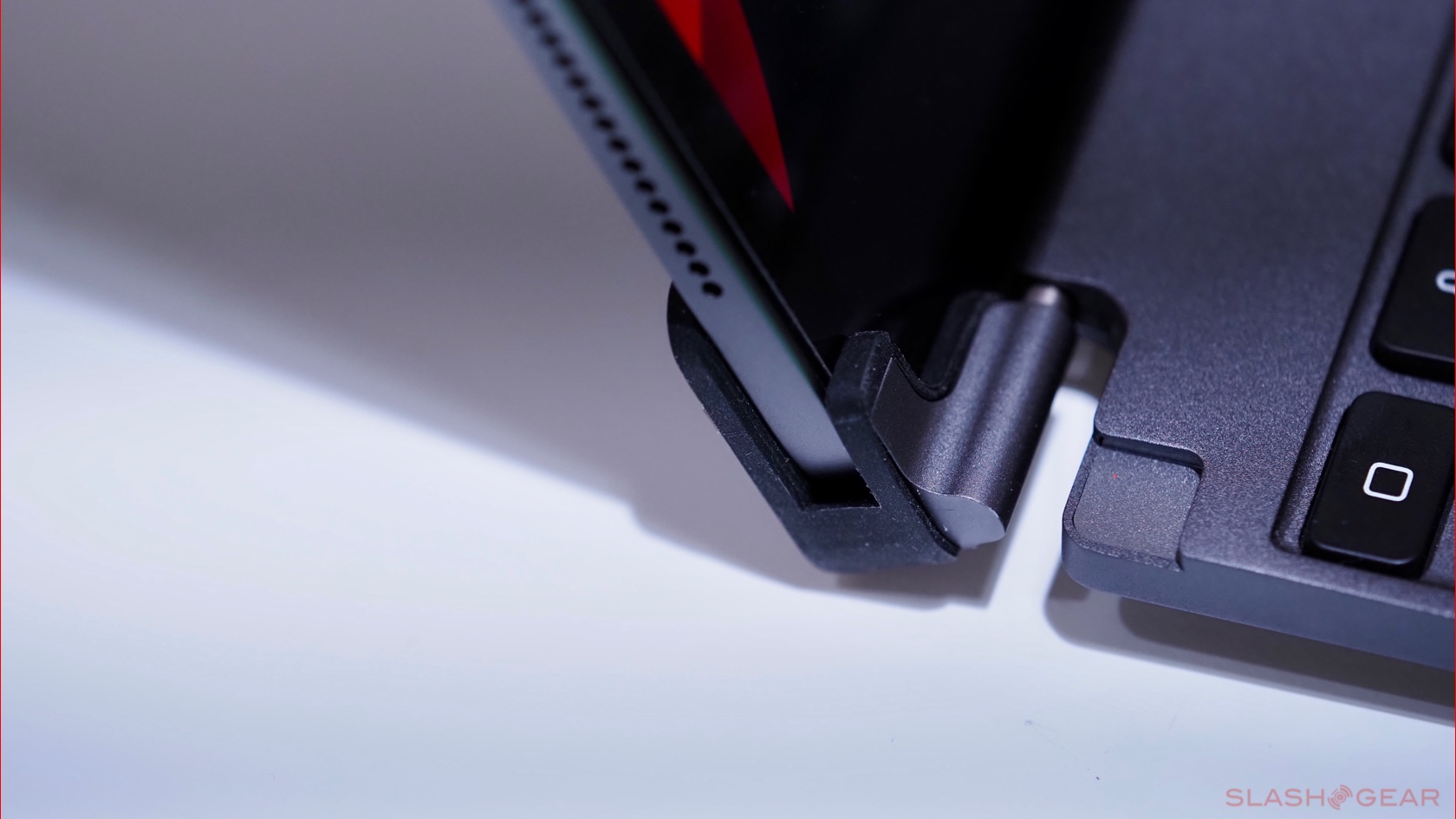
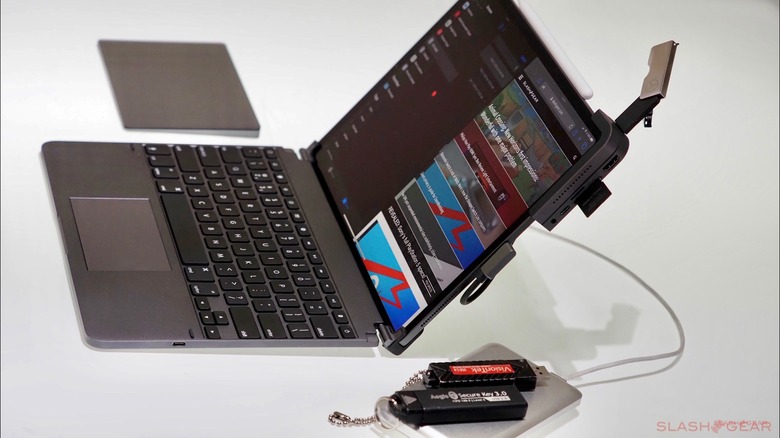
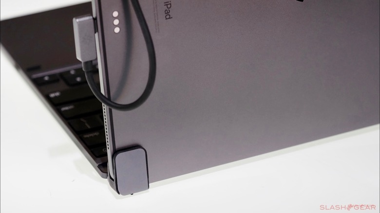
The iPad Pro physically attaches to the Pro+ keyboard by way of sliding it into the left and right hinges hanging out of the top of the keyboard. It's not as elegant as Apple's magnetic solution, nor is it as easy and efficient. You do need to use both hands when attaching and detaching the iPad.
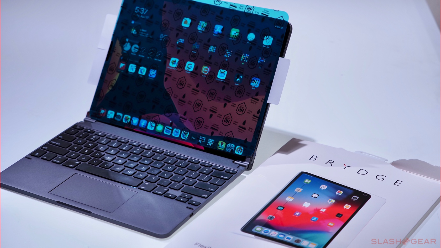
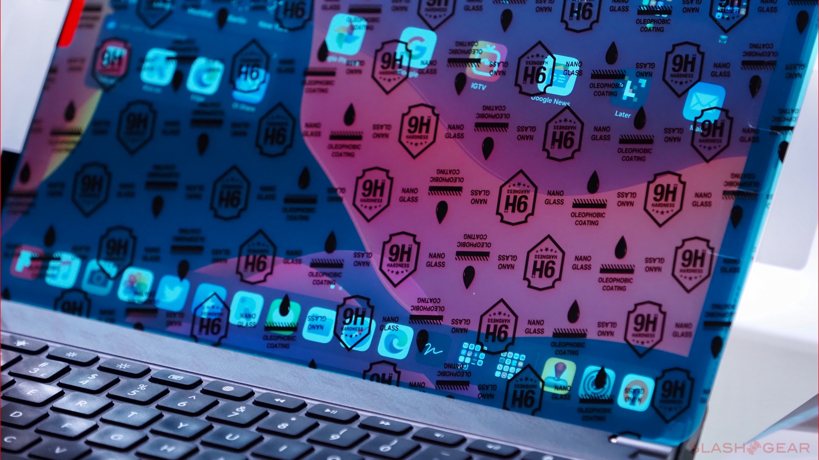
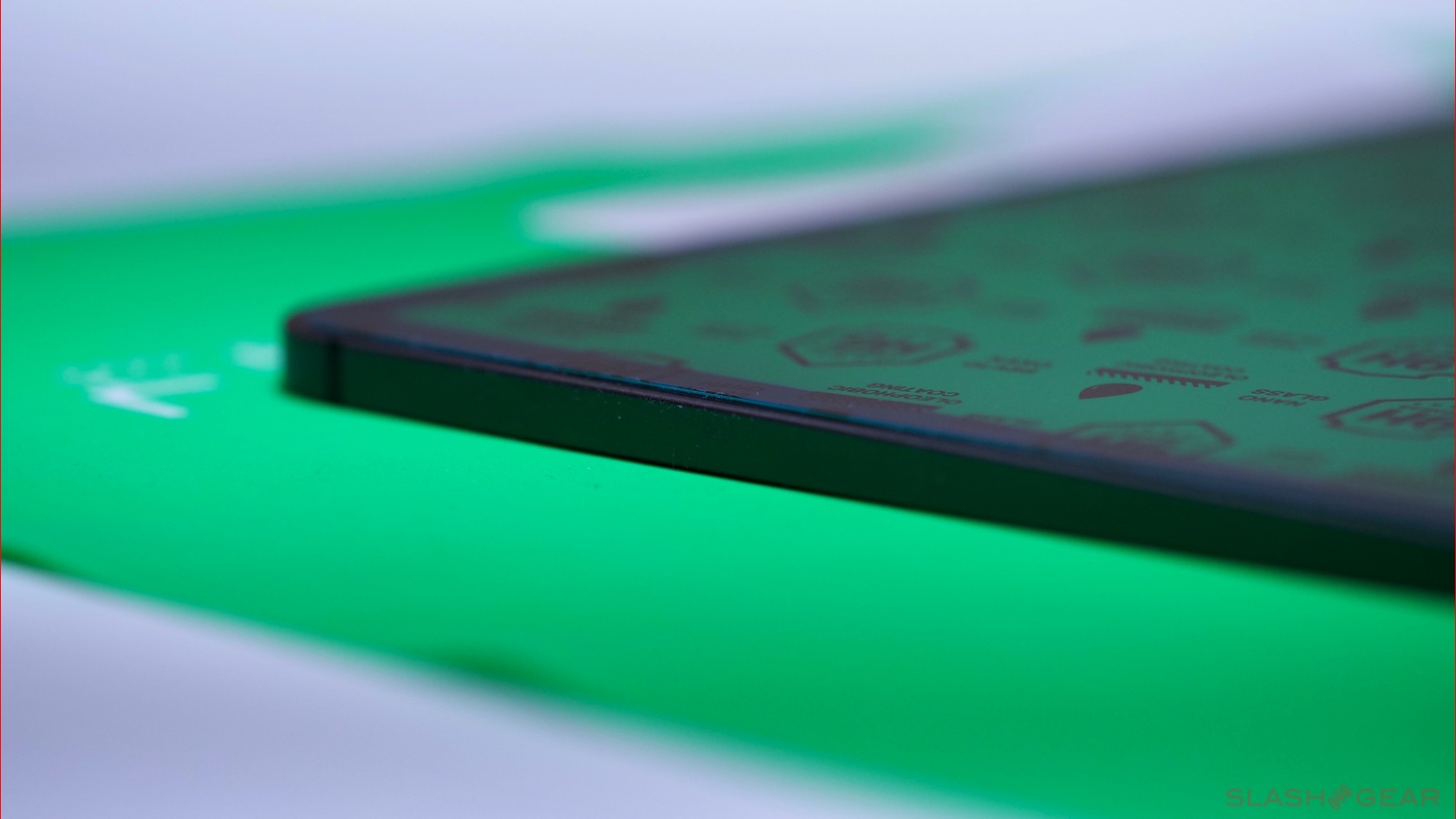
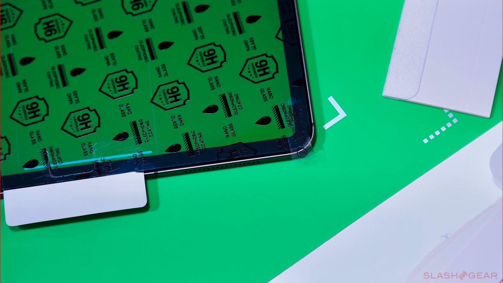
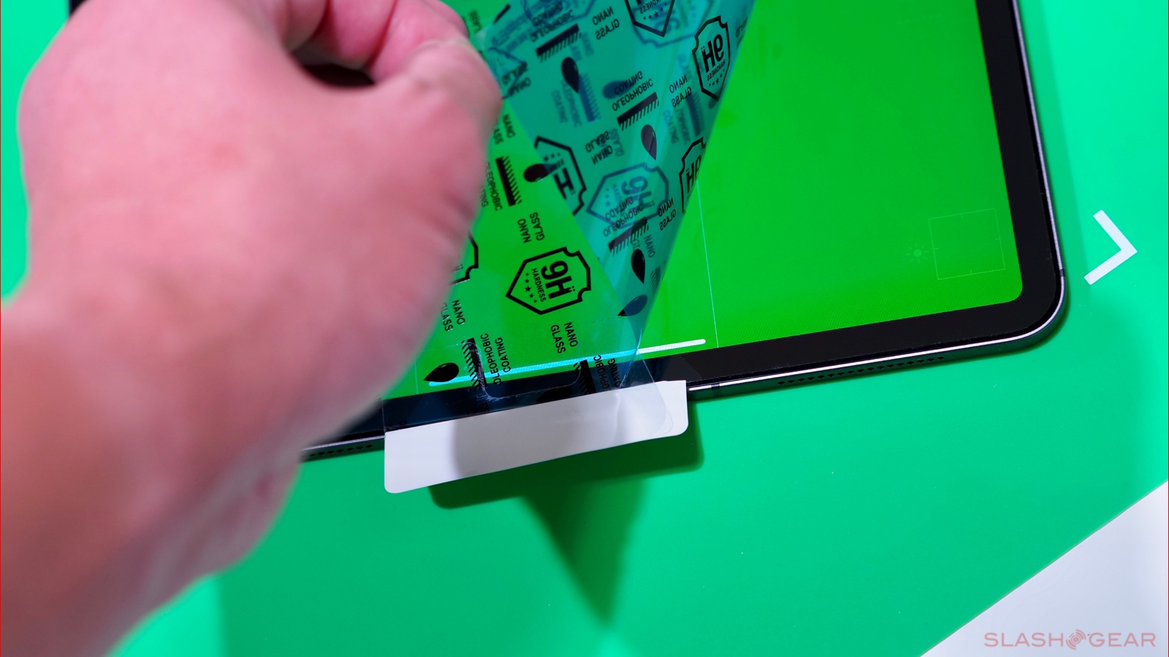
One immediate drawback I've experienced with previous Brydge Pro and Pro+ keyboards comes down to using screen protectors. The slots into which you slide the iPad are a fixed width, meaning that any screen protectors with a thickness of over 0.03mm will have issues fitting, and can even cause the rubber attachments to peel off. I shared my concern with the team and was offered Brydge's own screen protector to test for myself; I'm happy to report that the fit is near-perfect, but you'll need to budget another $29.99.
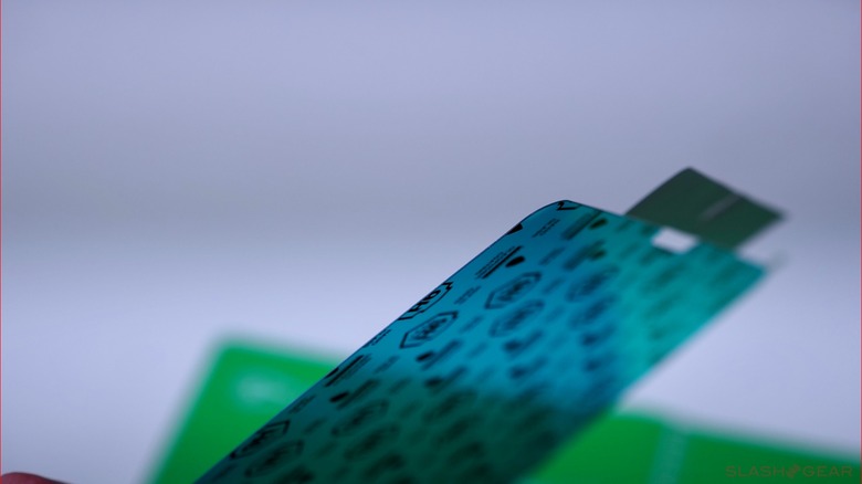
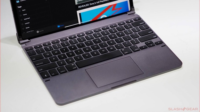
There's no denying that the Pro+ and iPad Pro combo look amazing. To my eyes, it's as if Apple were to make a MacBook touch laptop, this would be what it would look like. The overall dimensions and finish match the tablet perfectly, right down to the Space Gray.

The Brydge Pro+ for the iPad Pro 12.9-inch measures in at 11.04 X 8.46 x 0.27 inches compared to the tablet itself at 11.04 X 8.46 X 0.23 inches. The thickness of the Pro+ is ever so slightly greater, then, by 0.03 inches; it's also slightly heavier, at 1.51 lb (690g), compared to the while the 12.9-inch iPad Pro Wi-Fi + Cellular's 1.42 lb (643g). Together, they total up to 2.93 lb, which lines up with what you'd expect from a MacBook Pro or Air.
If you're thinking, man, that's heavy, I might as well buy a laptop, then this is where the iPad is the best of all worlds. After all, you can't detach the screen from your MacBook and carry that around by itself.
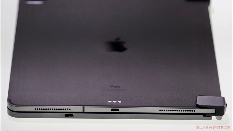
In real-world usage, I've had zero issues of the iPad Pro unintentionally sliding out of the hinges. I can carry it around from room to room, or run through an airport, with little worry of an accident. That's not the case with the Magic Keyboard: its magnets are more convenient if you frequently attach and detach, but not as reassuring in their grip.
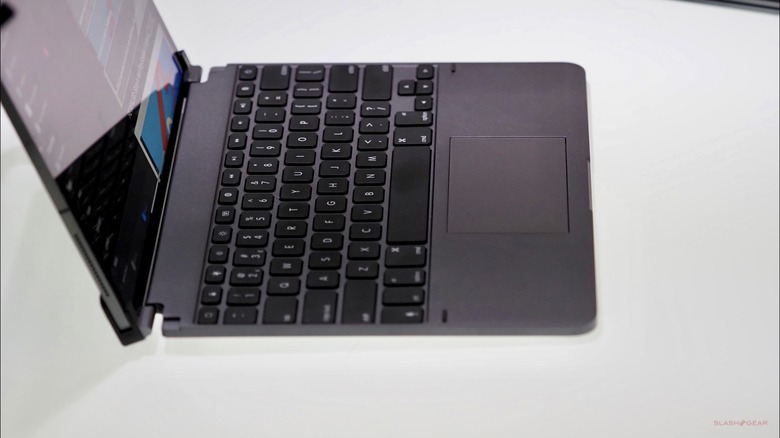
Using the Pro+ on my lap is just as you'd expect from using a laptop. The biggest benefit here? Due to the design of the hinges, the viewing angle can go from 0 (closed) to 180-degrees. It's hard to beat this design, hands down. I'm still waiting on my review unit of the Magic Keyboard to test it for myself, but early reviews are in and everything I'm reading is that the viewing angle is still limited, particularly in how far you can tilt the screen back.
So does the iPad Pro topple over if it's tilted more than 150-degrees back? Nope, not at all. If like me you're used to being able to quickly get work done – whether you're in a car, on an airplane, or back at your desk – having that flexibility helps a lot. It's also a godsend when you're trying to cut down on glare from the sun, or indeed angle the screen to keep prying eyes from seeing what you're working on.
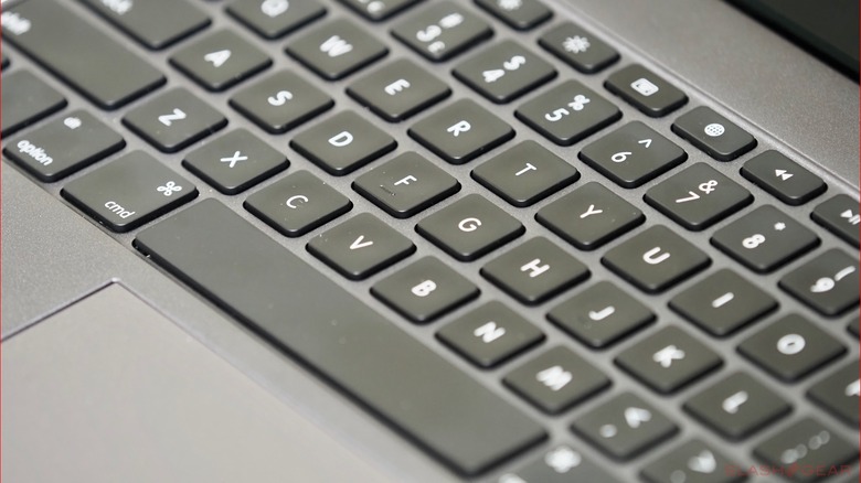
Why Apple didn't include the row of function keys on its official keyboards is a mystery to me; it's not like there isn't enough space above the number row. Here's another +1 for the Pro+, then. It finds space for home, lock, keyboard backlit, brightness up and down for the iPad, the virtual keyboard on/off, emoji keyboard, multimedia switches, volume up/down, Bluetooth and power buttons for the keyboard.
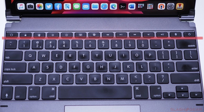
So why's this important? For me, reaching up with my left pinky finger to go back to the Home screen is much faster and more convenient than swiping down twice on the trackpad. It's the same as having direct access to pausing and skipping music or video I'm listening to or watching.
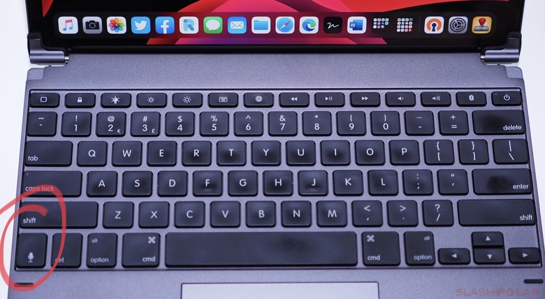
What's mercifully the same as you'd expect is the main keyboard layout. That's basically standard, with the exception of a new key on the far left of the bottom row for Siri. Each key feels solid and the travel is 1.5cm compared to 1cm on the Magic Keyboard. The typing experience is nothing short of great – which says a lot for a third-party keyboard accessory.
While the backlit keys are useful at night, there's definitely some light bleeding out from underneath. It's not a major issue but worth pointing out if this is something that bothers you.
Two pieces of rubber on the far edges, off the side of the trackpad, prevent the display of the iPad from touching the keyboard. There's nothing worse than smudges or key prints on the display, this is something that drives me absolutely bonkers on laptops.
Finally, let's discuss the trackpad. It works as expected: after all, it's like every other trackpad available on a laptop. There's little to zero lag when scrolling around, and its surface is smooth thanks to an all-glass top layer. Sadly, unlike the Magic Keyboard's trackpad, only the bottom 80% of the trackpad is actually clickable. Anything above that is just there for show. Again, this isn't a showstopper for me, but it's worth noting.
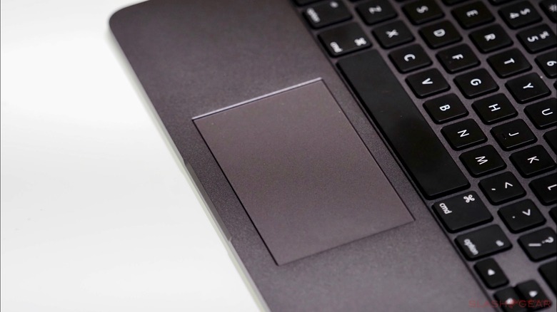
The physical click is satisfying, but I rarely use it when taping the surface serves the same function. As for multi-gestures, most two-finger gestures work fine but anything with three fingers does not work. This is due to how iPadOS sees the trackpad, unfortunately, and it leaves Brydge's trackpad falling short of what Apple provides with its own Magic Keyboard trackpad.
It means no three-finger swipe up to switch apps, go home, or switch back and forth between apps. There's a minor workaround under Assistive Touch where you can create a custom three-finger tap to bring up the list of apps opened. That would be fine, were it not for a bug with iPadOS which constantly brings up the virtual keyboard even when there's a physical keyboard attached. I just ended up flipping Assistive Touch off. Without the finger gesture, it takes a whole three swipes down just to bring up the app switcher. If you're inside another app, the first swipe brings up the row of apps at the bottom, the second swipe takes you home and, finally, the third brings up the list of open apps.
Happily, it doesn't matter if you're using Apple's own keyboard or a third-party 'board: holding down the Command key will allow for certain shortcuts depend on the app and where you are within iPadOS. Similar to the Home button, for instance, you can press Command + h to jump back to the homescreen. The most often used key combo for me is Command + Spacebar, which allows me to perform a universal search on the iPad.
Finally, other iPadOS gestures work as expected. Swiping straight up towards the middle of the display and over to the left drops down notifications, while swiping up towards the right and then pushing further pulls down the shortcut panel.
All in all, the Brydge Pro+ keyboard is one of the best and most-used accessories that I own for the iPad Pro. It has a simple design that securely attaches the iPad while still allowing you to quickly and easily remove it; the typing experience is just as good as any other laptop keyboard. Finally, the design truly complements the overall aesthetic of the iPad, while the additional weight balances it out whether you're using it on your lap, a table, or even the drinks tray on an airplane. Touchpad frustrations aside, I highly recommend it for any iPad Pro owner looking to take text entry seriously.
