BMW Z4 Concept Design Interview: Deceptively Simple Lines
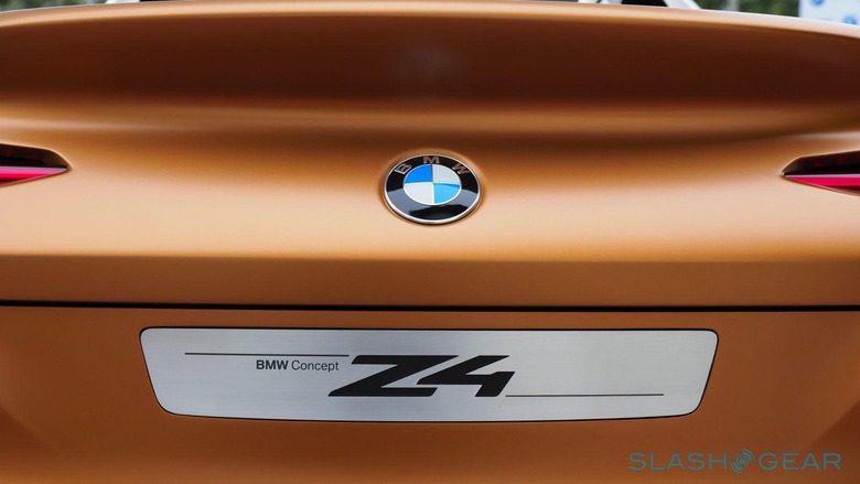
We've definitely seen our fair share of concept car designs, ranging from mundane to the almost improbable. The BMW Z4 Concept, which was teased in renders just a week ago, seemed to dance between those two extremes, with a design that is both ahead of its time yet still completely doable. And when BMW finally revealed the real thing, it took us a few moments to pick up our jaws from the floor. Fortunately for us, we got the chance to sit down with Adrian van Hooydonk, BMW's head of global design and the man behind the Z4, to pick his mind about the thinking that went into such a breathtaking design.
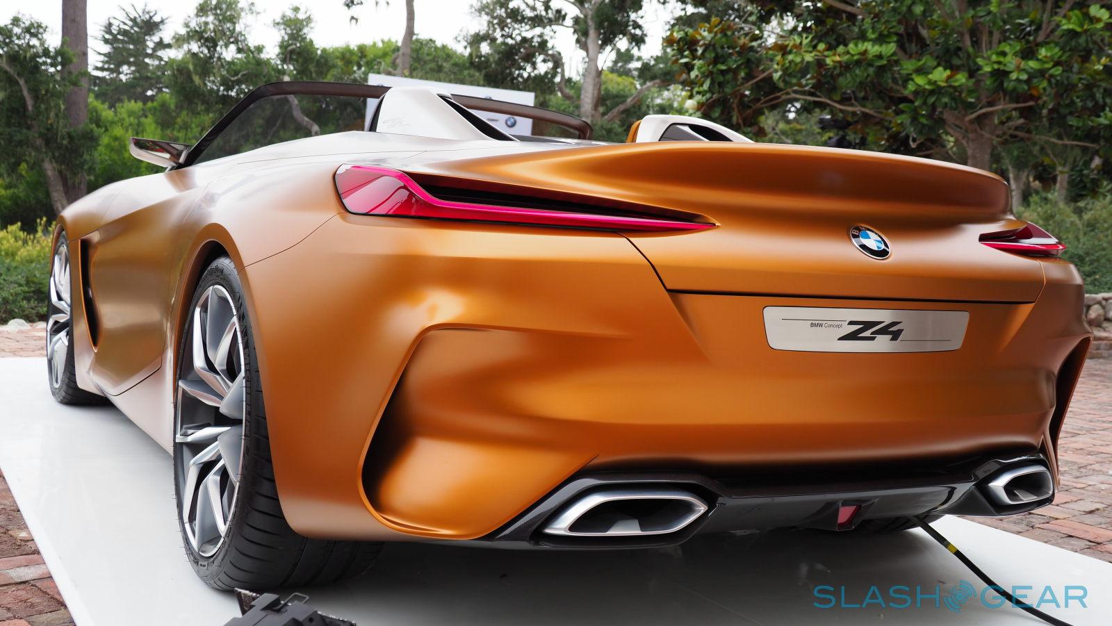
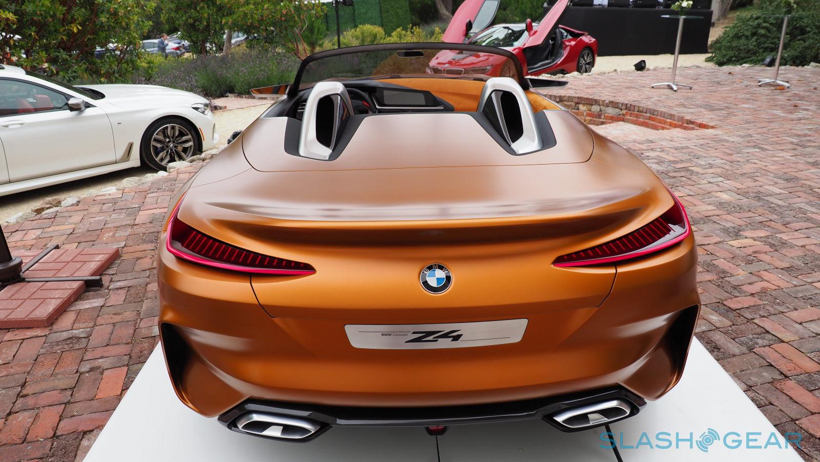
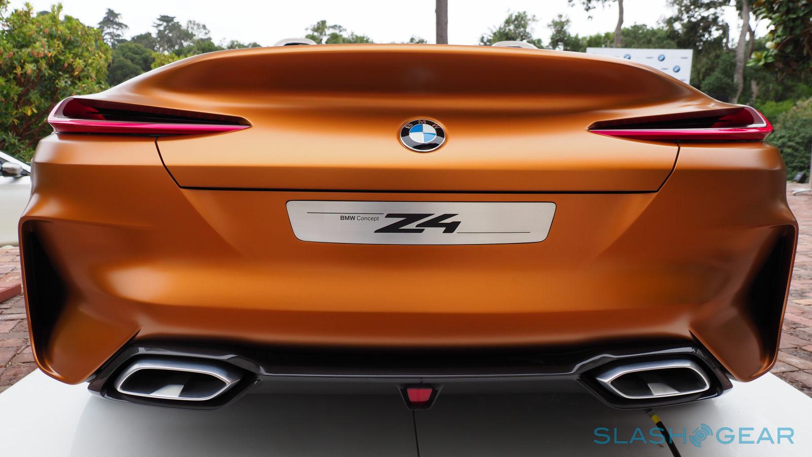
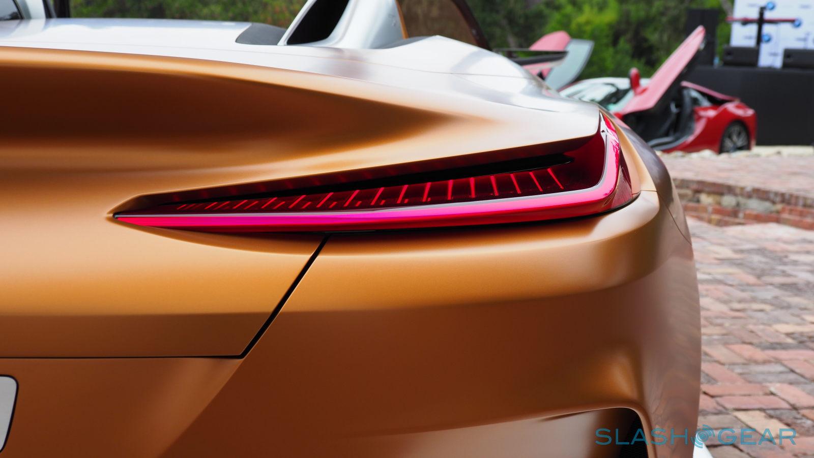
Usually when taking photos of cars, you have to look for just the right angle to show the vehicle at its best. But try as we might, we couldn't find a bad angle for the BMW Z4 Concept. Every angle, every vantage point, and every part of the car seems to be oozing with detail and complexity. But it's all an illusion made with the use of a very few lines.
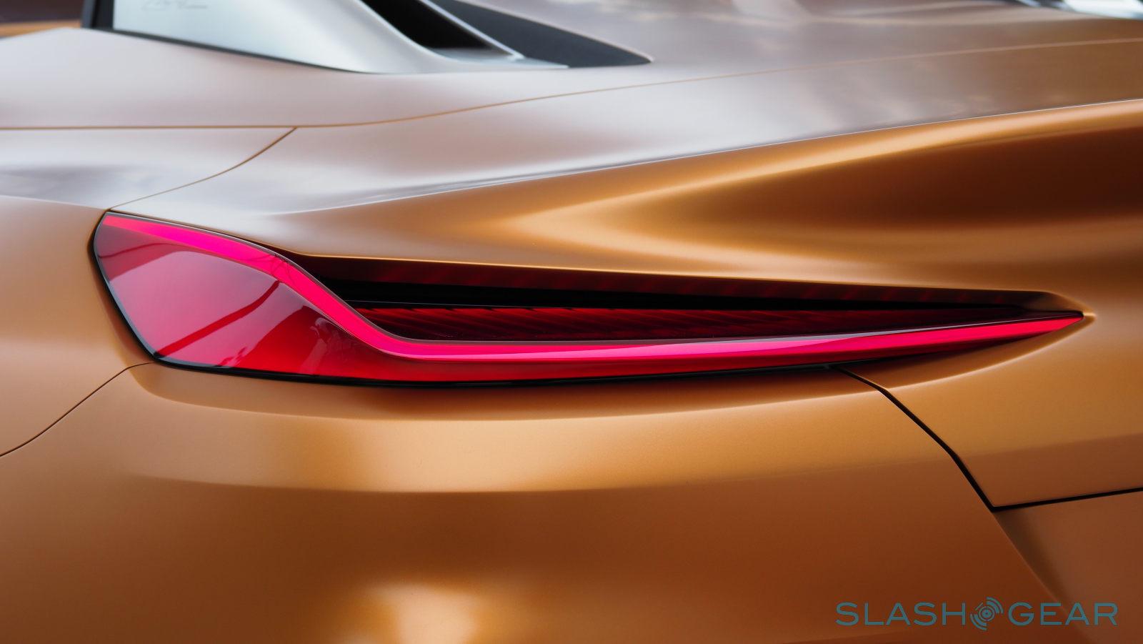
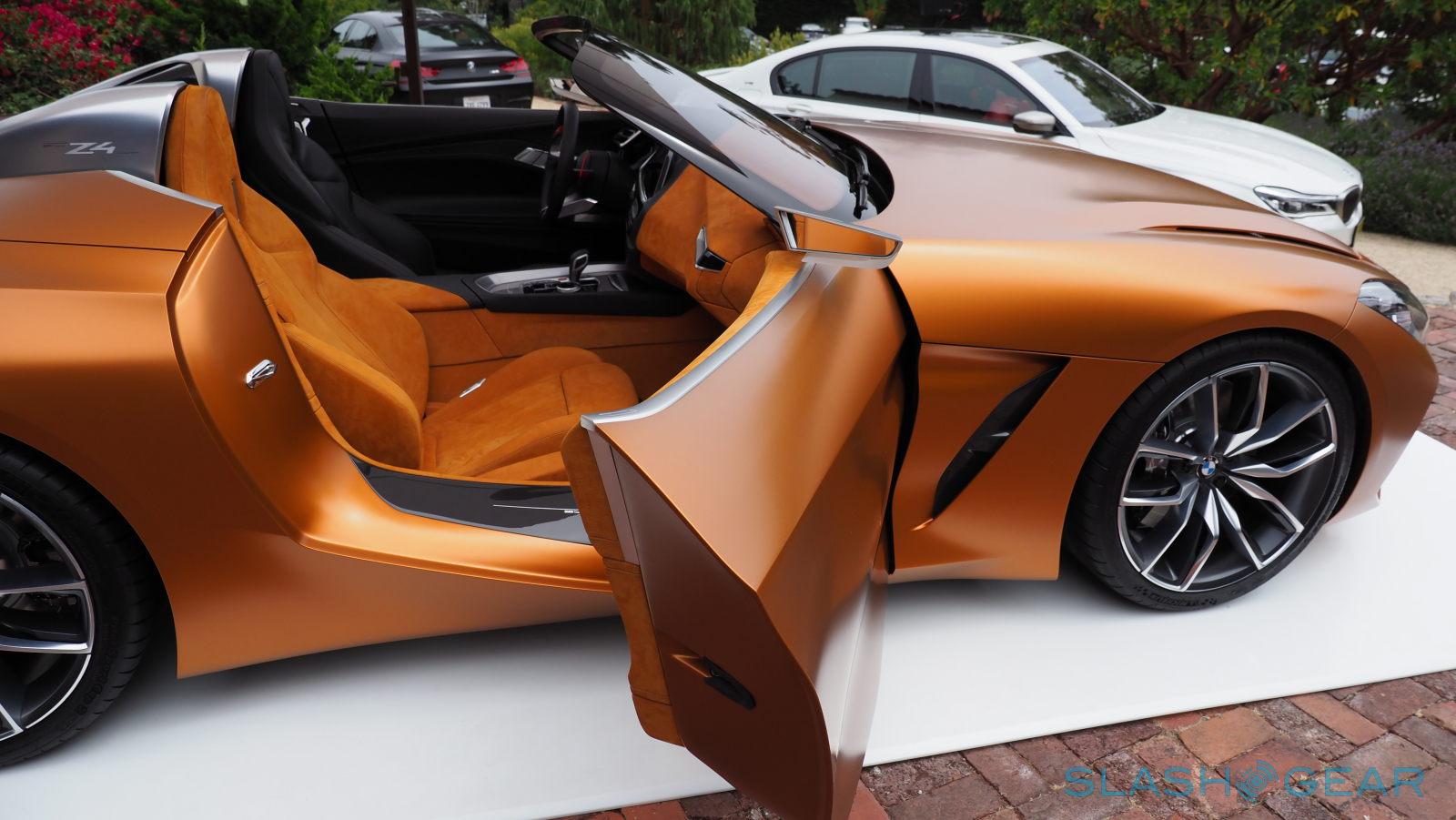
Take, for example, the BMW Z4's key line in profile. It starts out as a shutline from the bonnet, from behind the front wheel, and then goes up and over to the rear, carrying with it a lot of tension. This produces a play of light and shadow that adds an impression of flow to the body of the car. That same line creates a wide shoulder and strong muscle when seen from the back, a nod to BMW's race cars. With "Very few lines", says van Hooydonk, "can communicate power, dynamic, speed, movement."
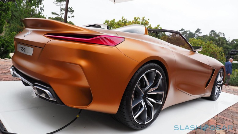
This is all part of BMW's new design language, a language that adheres to the adage of "more with less". Each line on the car is intentional, not a single one out of place or in excess. It is a philosophy that BMW plans to carry throughout its new range, one where they will "reduce the amount of lines but the lines we will have will be very precise, very thought out, and very sharp."
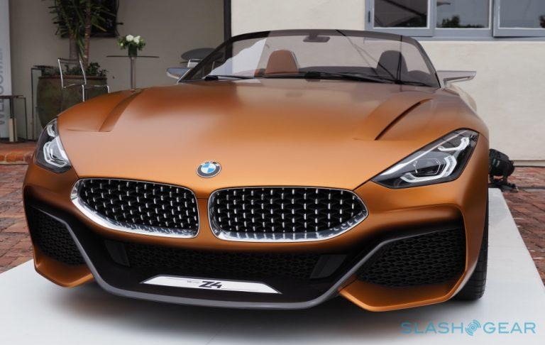
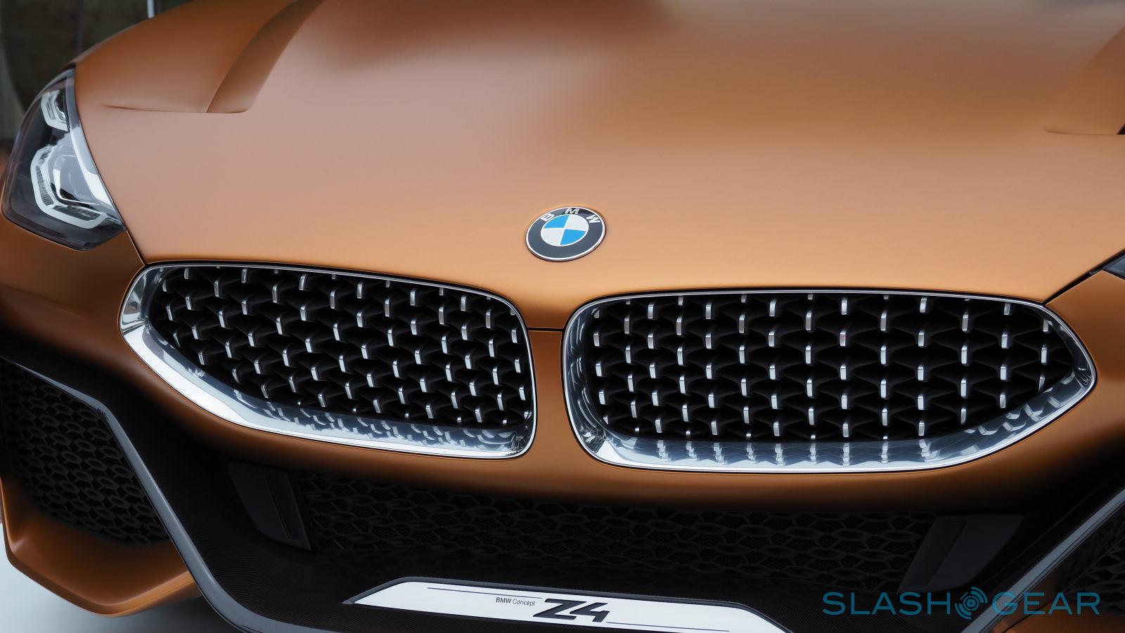
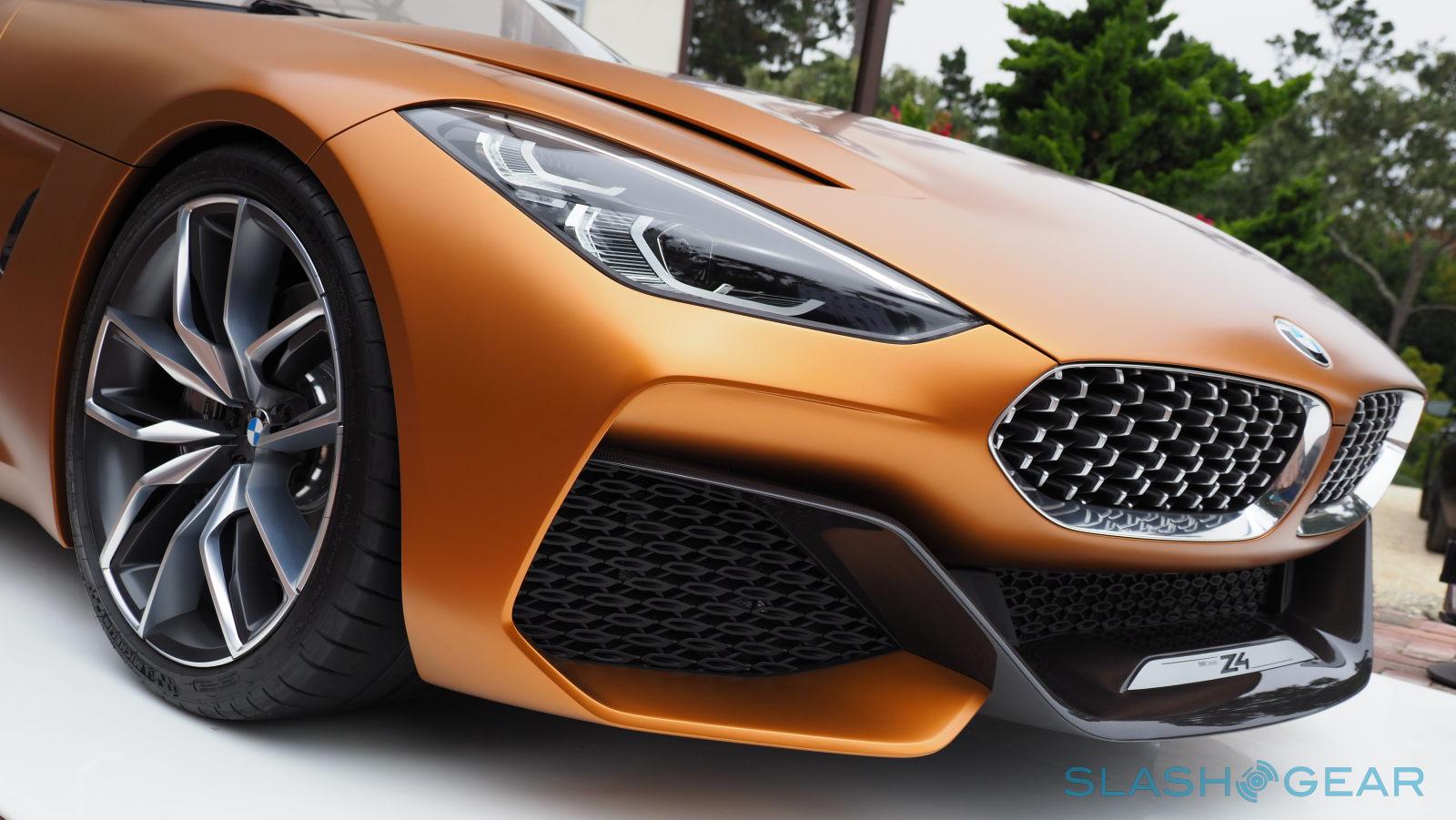
It isn't just the overall philosophy that's new. As a concept, the BMW Z4 has to push for changes never before or rarely seen in existing models. Or, in some cases, mix them to for something new. The fascia of the BMW Z4 is one example. The familiar kidney-shaped grilles are there, though lower and wider to give the car a sporty look. But upon closer inspection, one will notice that the traditional vertical slats have been replaced with a new mesh design that retains their full functionality as the car's main air intake.
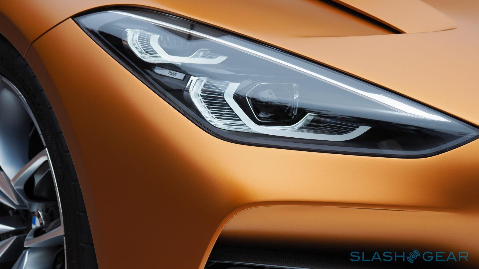
BMW has been known to change its headlamp design every so often, and the Z4 is no different. BMW has given the car vertically stacked lamps, which, again, contributes to the Z4's overall dynamic character. Together with how the grilles slant backwards, the BMW Z4 sports what van Hooydonk refers to as a "shark nose", in contrast to the usual tiger's nose used to describe some cars.
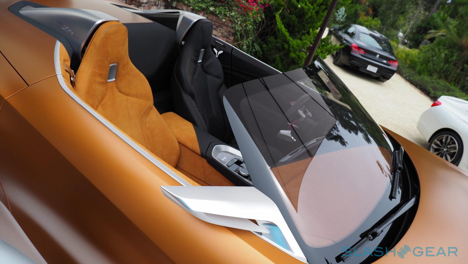
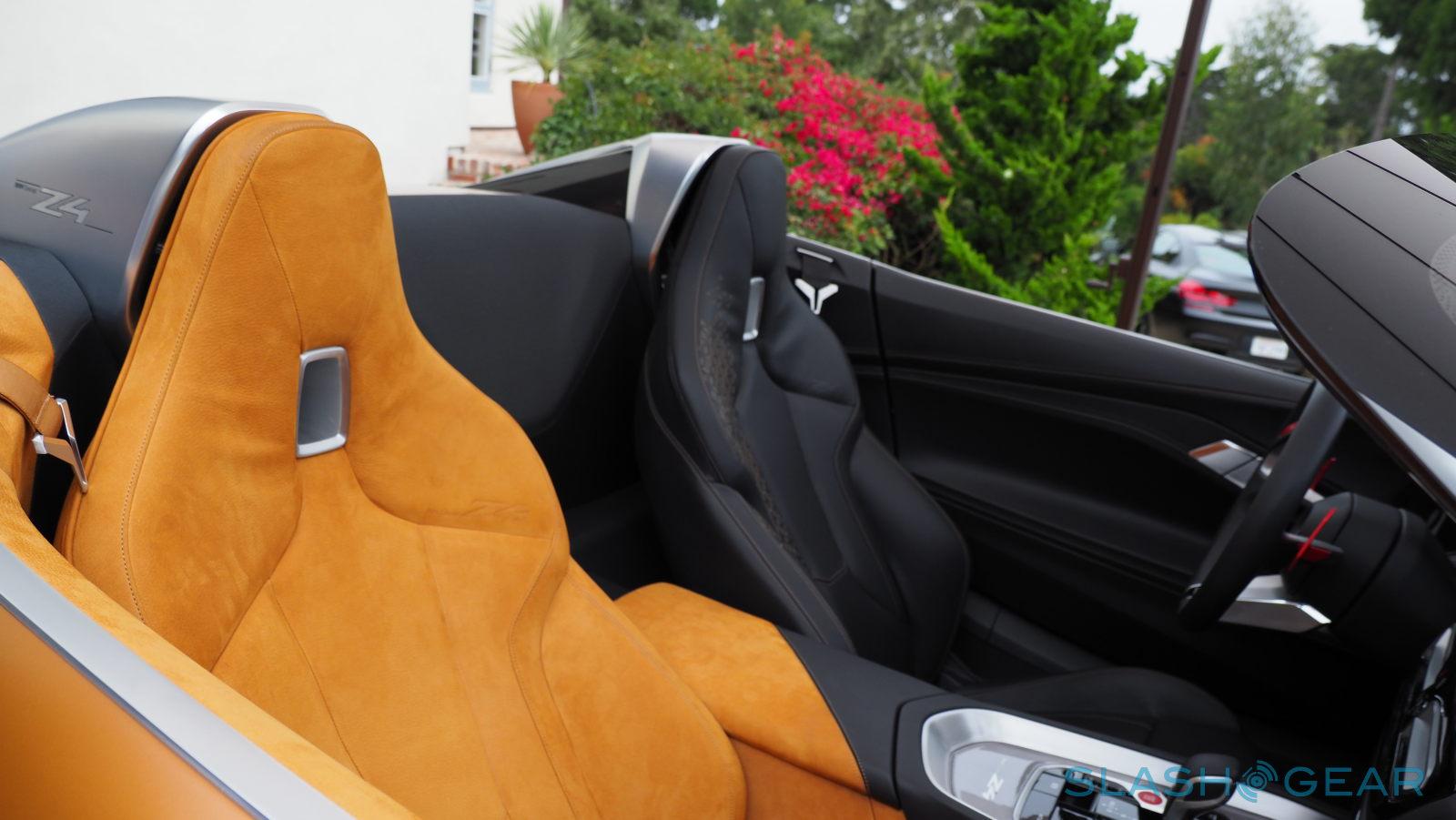
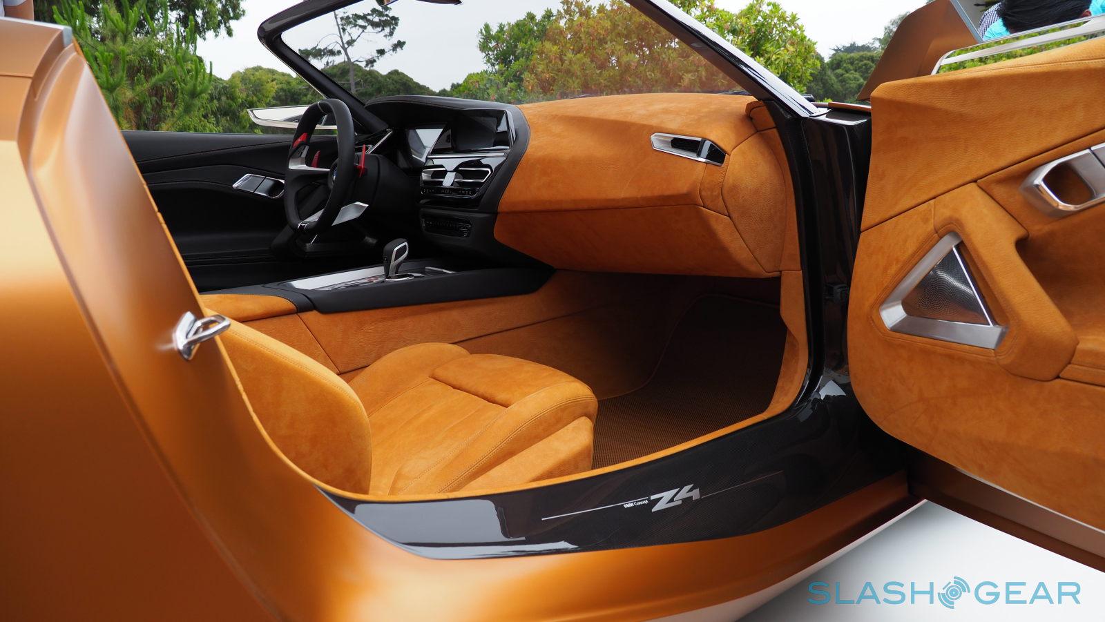
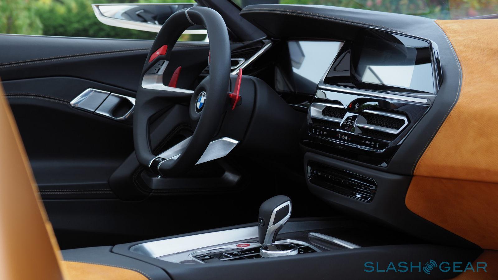
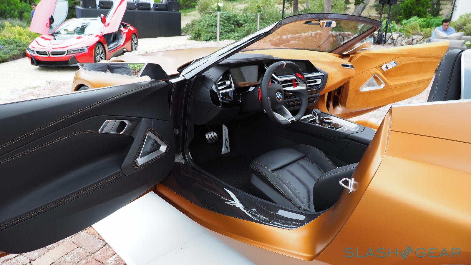
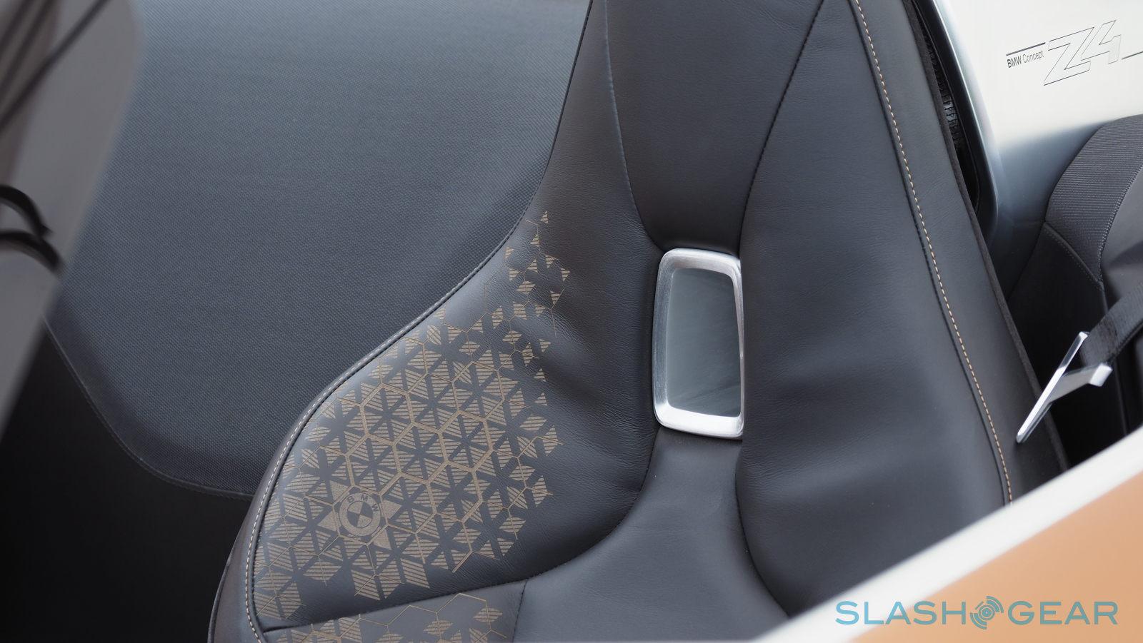
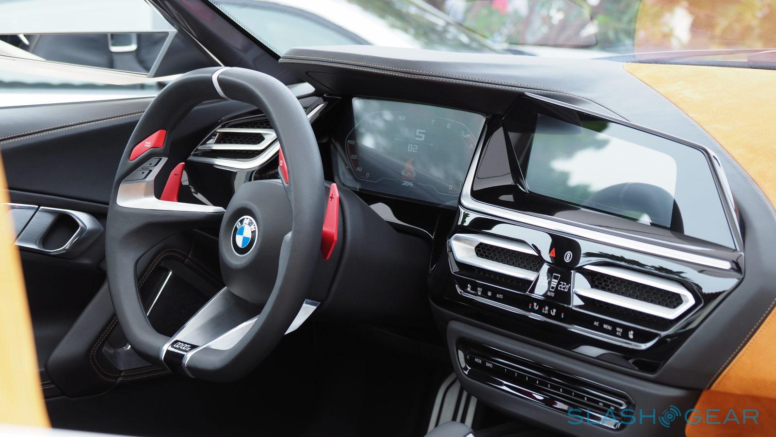
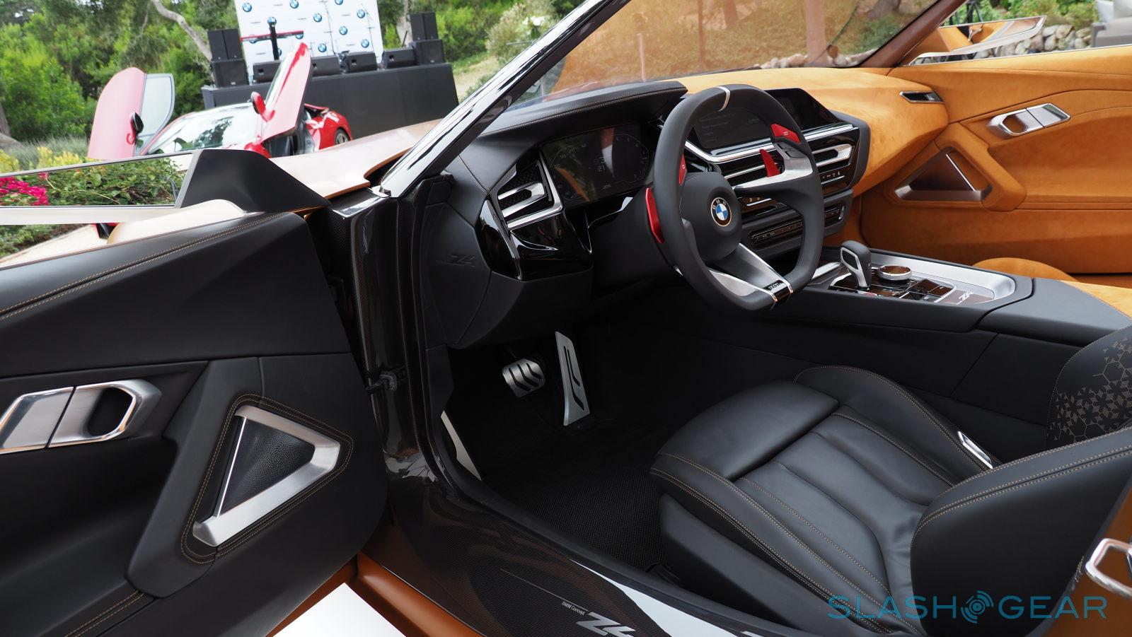
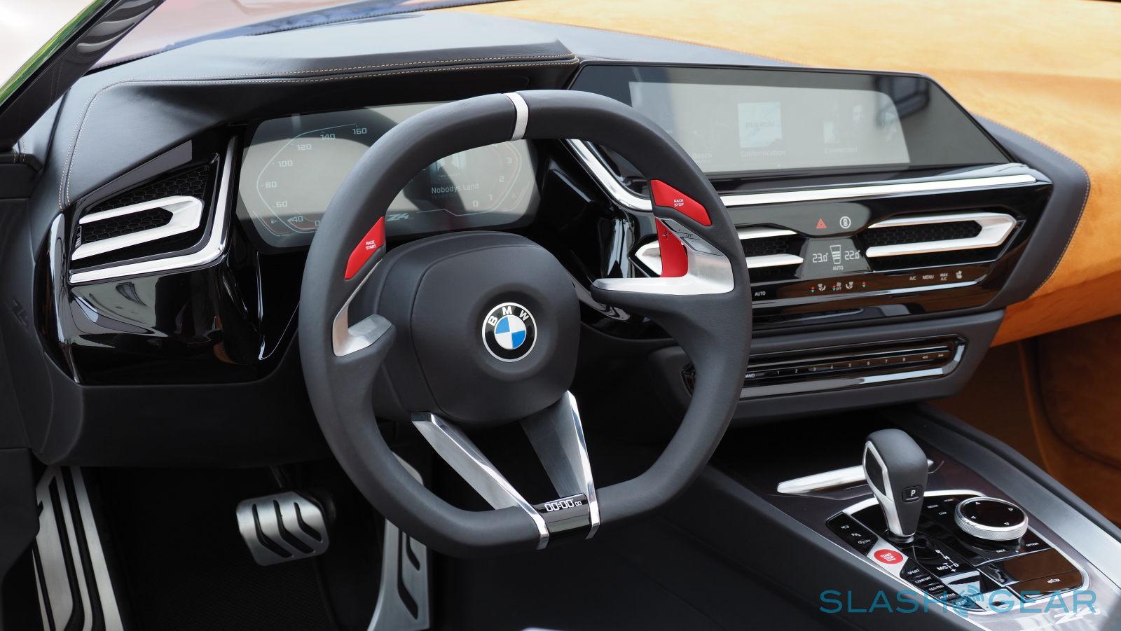
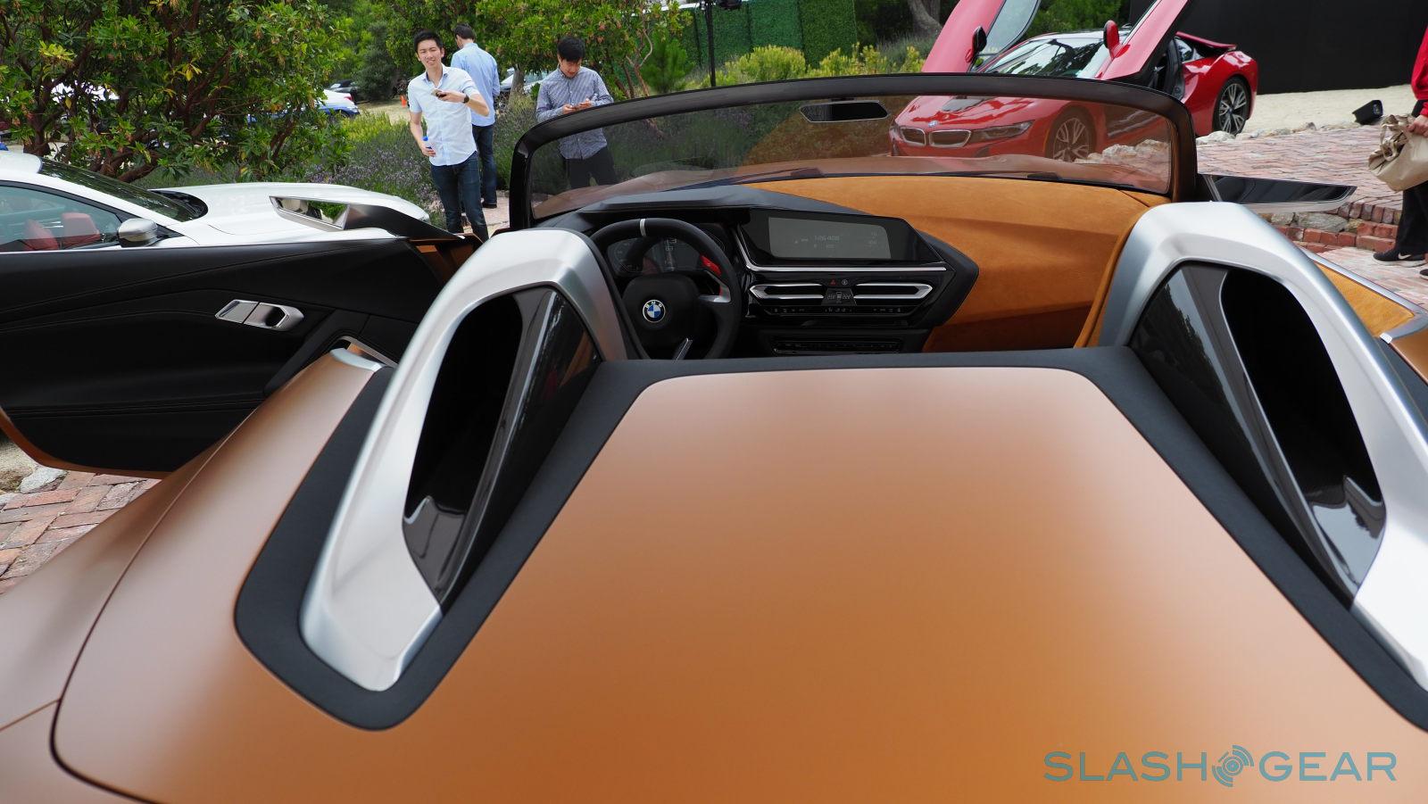
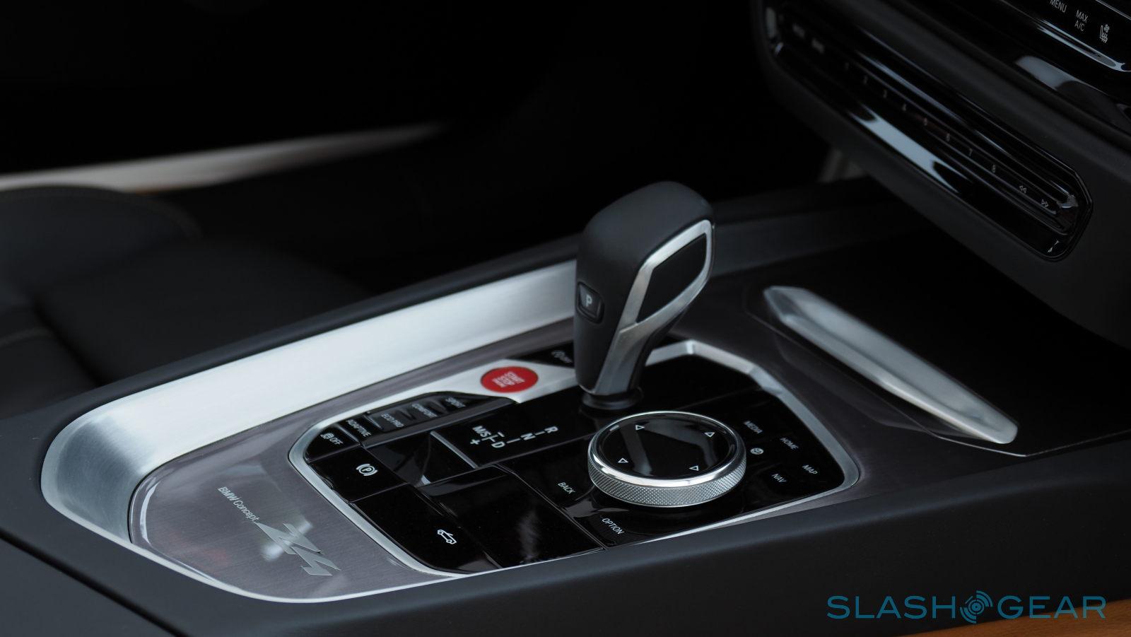
But nowhere is the Z4's bold new direction better seen than in the duality of its color and materials. While majority of the car sports an Energetic Orange hue, the driver's side and dashboard abruptly switches to black. Not only does it make for a visually interesting design, it also places visual emphasis on the driver.
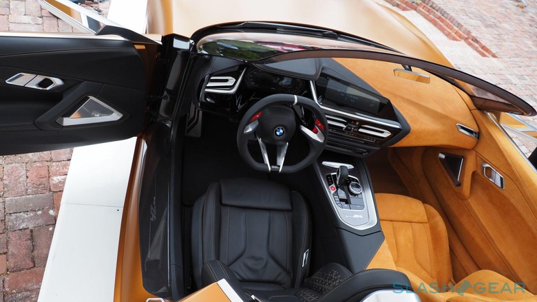
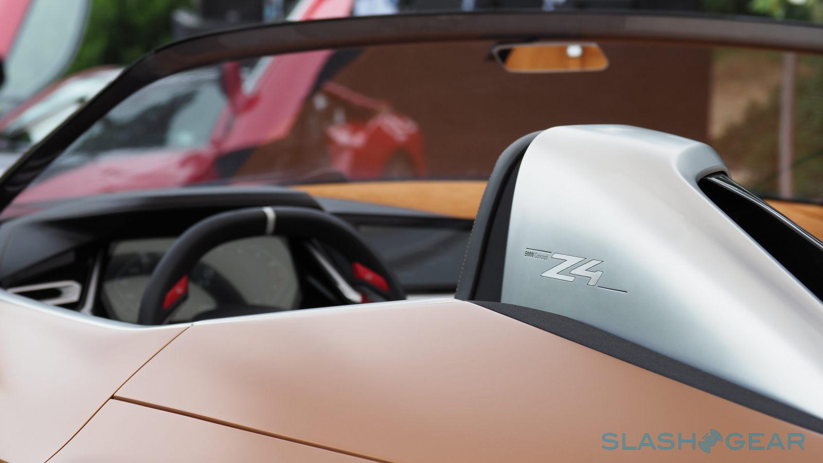
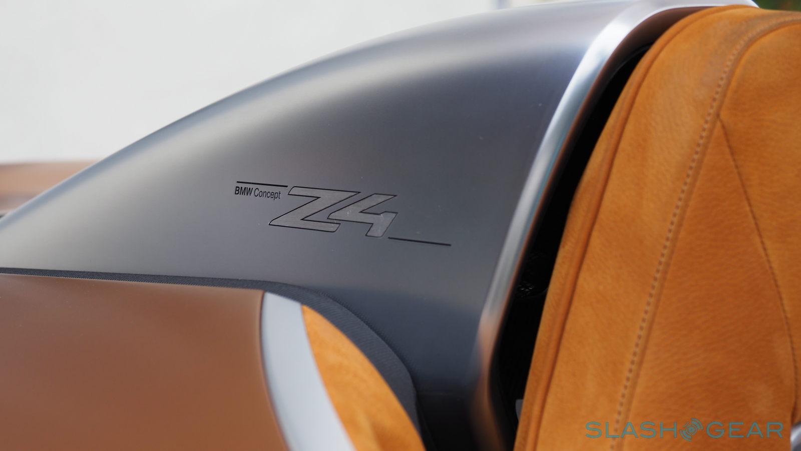
The BMW Z4 has a lot to show, even by just using simple, almost subtle elements. But as a concept car, it points to what may be, not what has already been decided. The two-tone scheme is something the car maker is still soliciting feedback for and the rather unfamiliar roll over bars are more of a design exercise than a planned feature. Whichever features do make it to production models, they will be made to reflect BMW's new design philosophy: "clean and simple but actually complex."
