BlackBerry Storm For Verizon Review Part 1
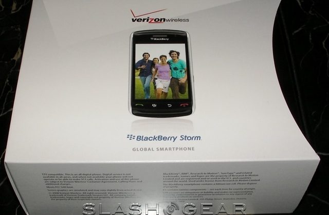
This year has seen potentially game-changing devices from HTC, Apple, Samsung and Sony Ericsson, and now it's the turn of RIM to show us they can do more than just email. The BlackBerry Storm marks a significant first for the company: it's the only BlackBerry to have a touchscreen and no hardware keyboard. In the first part of our Verizon BlackBerry Storm 9530 review, we'll cover the hardware – including the unique ClickThrough touchscreen – the preinstalled software and our initial impressions, together with some preliminary battery feedback.
If the 480 x 360 touchscreen wasn't enough to make the Storm special, the wireless bands it supports are the finishing touch. Verizon heralded the Storm as a true worldwide handset, and for once they're not joking: as well as being dual-band CDMA 800/1900 with EV-DO Rev.A support, for use in the US, it also has 850/1900 GSM/GPRS and 2100 UMTS/HSPA support, for use in Europe and Asia. What that means is that Verizon users no longer have to leave their phones switched off if they travel abroad.

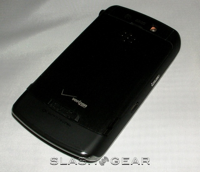
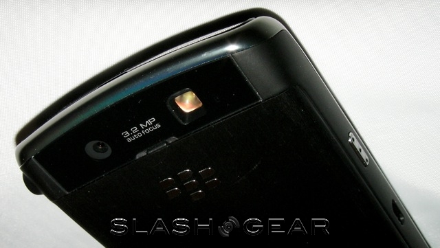
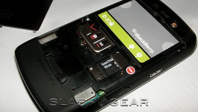
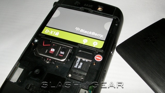
Elsewhere, the Storm is equally capable. Internal storage amounts to 1GB, expandable via microSD card, plus there's 128MB of flash memory. While there's no WiFi (thanks to Verizon's veto) you do get Bluetooth 2.0 supporting the mono/stereo headset, handsfree, phone book access and serial port profiles. A standard 3.5mm headphone jack is a happy inclusion, as is the 3.2-megapixel camera with flash that, although lacking in megapixels compared to the HTC Touch HD, at least exceeds that of the iPhone 3G. The Storm also has integrated GPS.
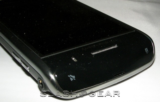
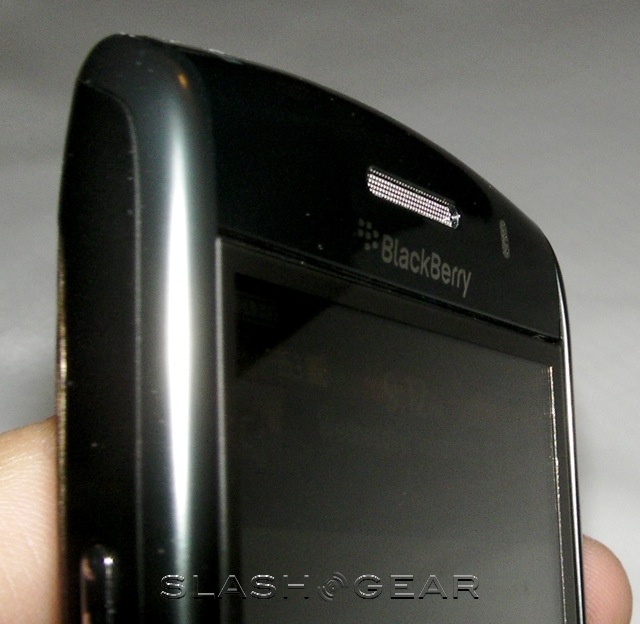
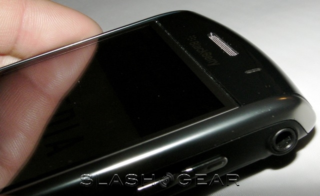
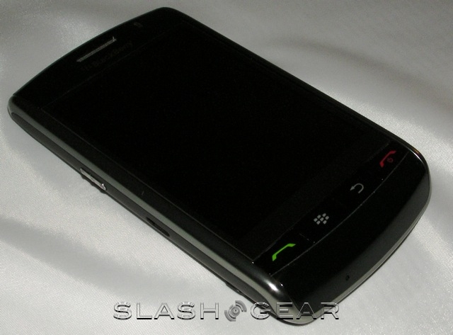
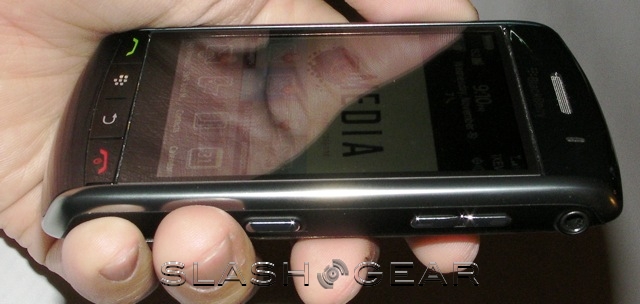
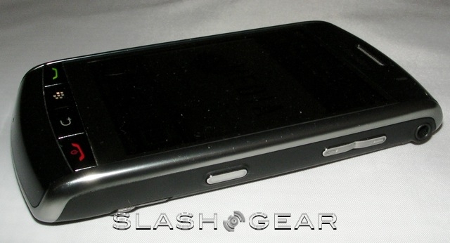
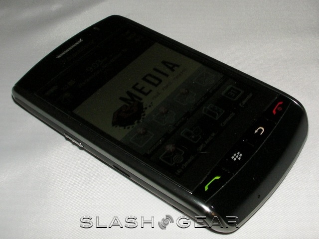
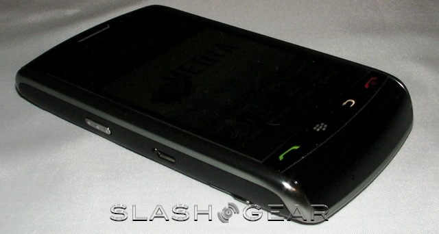
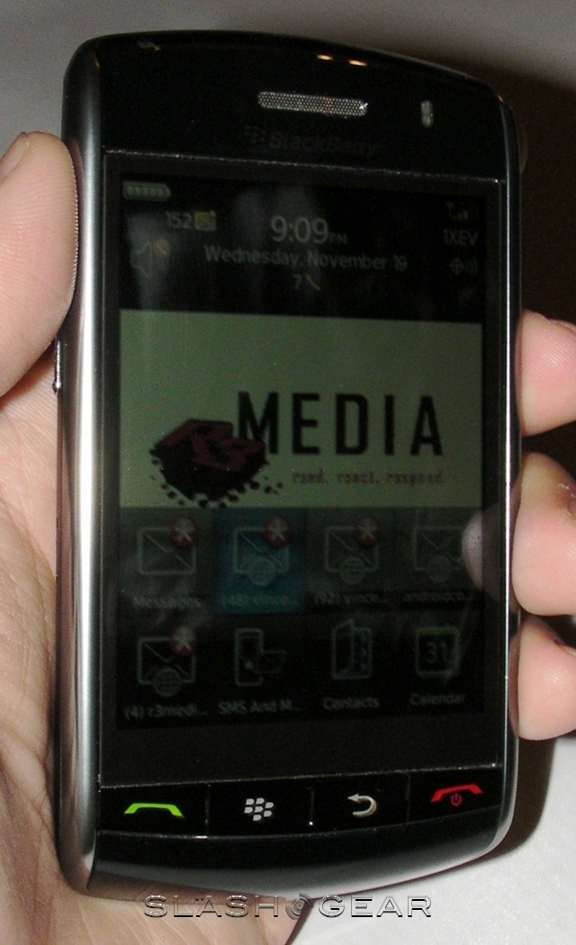
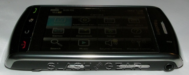
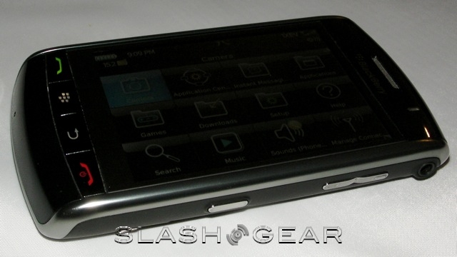
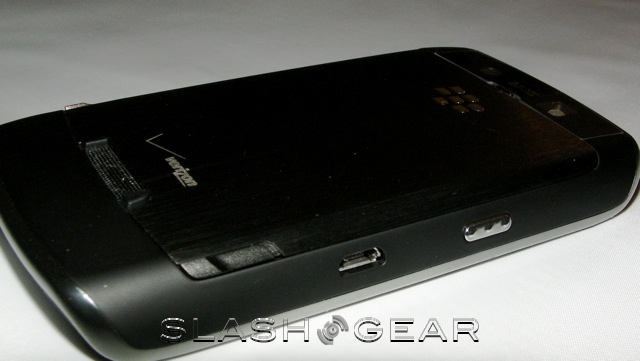
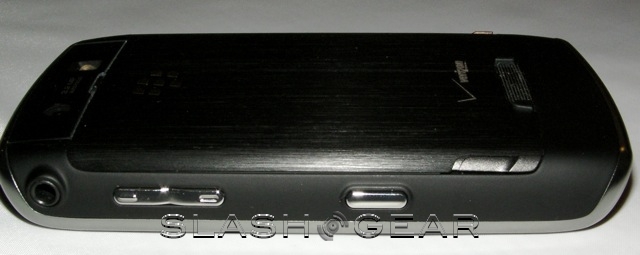
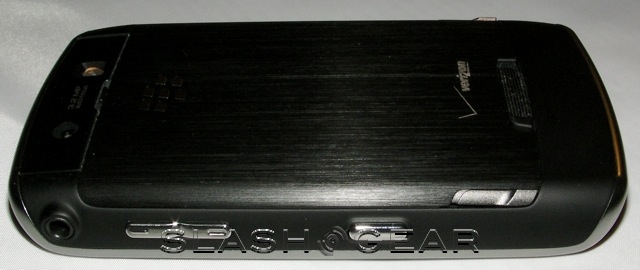
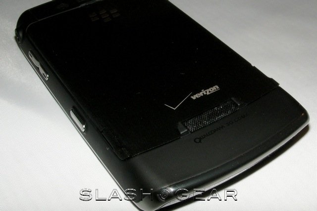
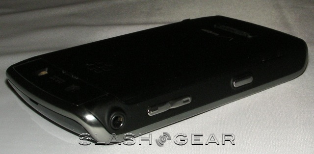
Moving around the device, on the top there are the lock and mute buttons on the top left and right sides, respectively, hidden as capacitive controls in the black screen surround. On the left there's a dedicated voice-dial button, while on the right there are volume up/down keys and the camera shortcut key. The headphone jack is also on the right side. Finally, from left to right on the front, there are call, menu, back and end-call buttons. Holding down the menu key brings up a task list from which you can switch between running apps. The Storm measures 4.43 x 2.45 x 0.55 inches and weighs 5.5oz.

Persuading loyal business users that they can be just as productive with a touchscreen as with hardware keyboard takes some doing. RIM's answer to this is ClickThrough: developed with Synaptics, it's a brand new type of interface, a hybrid of haptics, capacitive touch and tactile sensors that mimic physical buttons while still offering the infinite flexibility of onscreen controls. ClickThrough works on two levels: to highlight a menu option, say, you give the sort of light tap that you might on an iPhone. To press a key, or select an option, you press down harder and the haptic sensors "click" to give physical feedback of your press.
That might sound complicated, but in use it's a straightforward concept to grasp. Gestures, scrolling and highlighting are just as smooth as on the iPhone, but there's also the physical feedback from the rest of the BlackBerry range. If anything, we'd compare it to the click of the BlackBerry trackball, it really does feel as though there's a layer of hardware buttons just beneath the display. The Storm also supports multitouch input, including simultaneous input for two-finger typing.

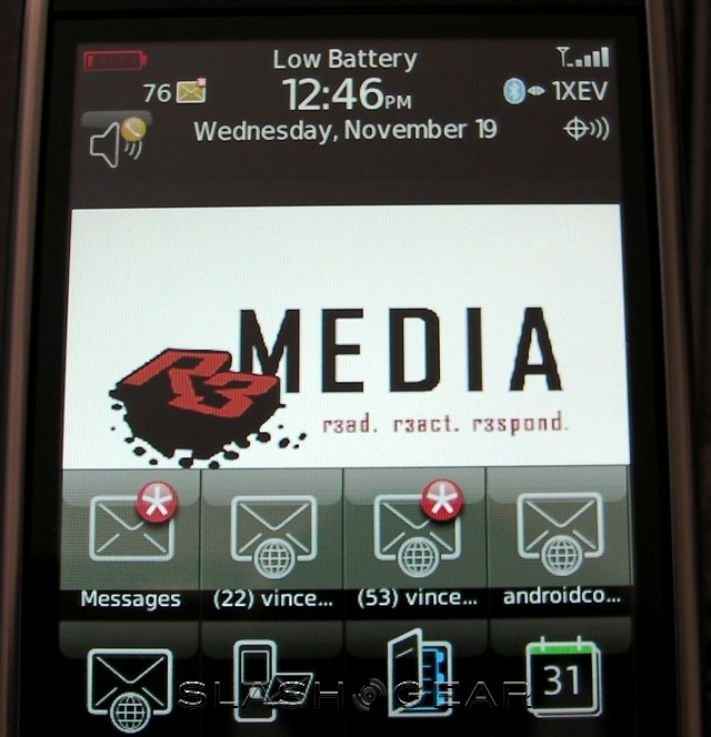
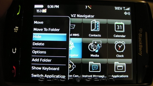
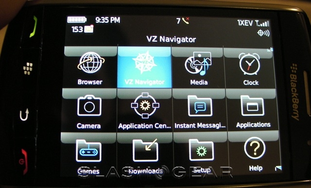
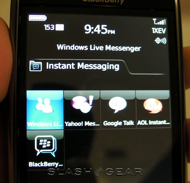
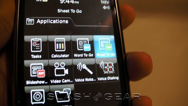
OS is RIM's latest, v4.5, with the new BlackBerry GUI and the same updated iconography and menus as seen on the BlackBerry Bold. The controls have had a slight size update, however, to better suit them to finger input, and the general layout is predictable and straightforward. As with the Bold, the hardest thing to get used to is the reworked icons; if you're a long-standing BlackBerry user, factor in some time to get used to the new, streamlined pictures. Ironically, new users will probably find it easier than the old OS, to whom the massed menu pages full of tiny detailed icons could be intimidating.
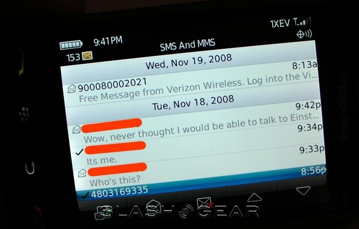
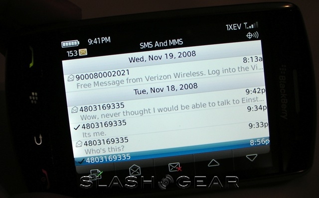
Preloaded applications include RIM's usual messaging suite, here with support for HTML email, attachments and inline images, their organizer and SMS/MMS. Much of the email rendering is done off-handset on the BlackBerry email servers, and while we say HTML it's not exactly full support. Still, basic formatting (such as bold, italic and underline) and included images are arguably all you need on a mobile device, and the rendering speed benefits are pleasant.
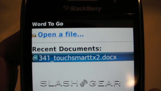
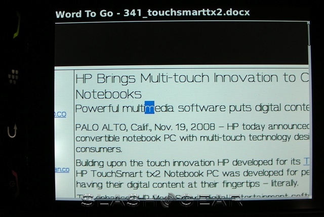
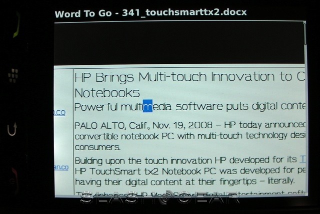
Attachment handling is courtesy of Documents to Go, from DataViz, offering compatibility with Word, Excel and PowerPoint files. RTF and PDF files are also supported, though only as attachments, but all can be edited on-device. The Professional edition of the app, a roughly $70 upgrade, offers spellchecking and advanced formatting options, among other things, but we can't exactly see ourselves doing major editing on any smartphone.
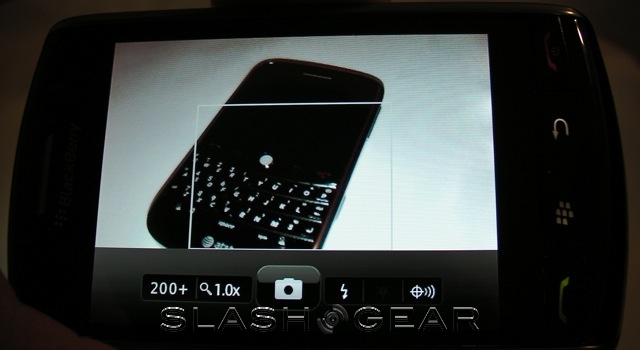
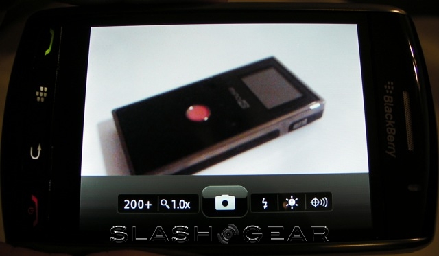
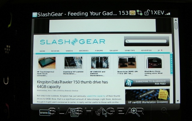
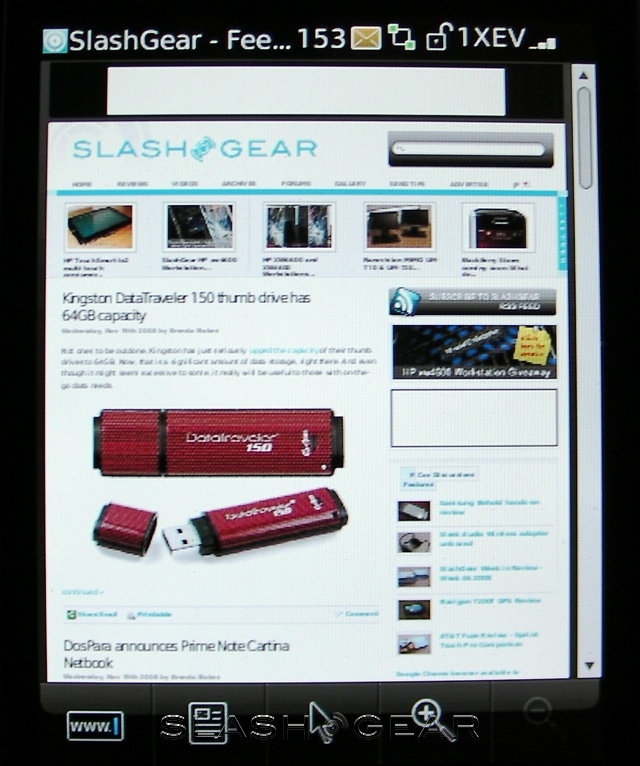
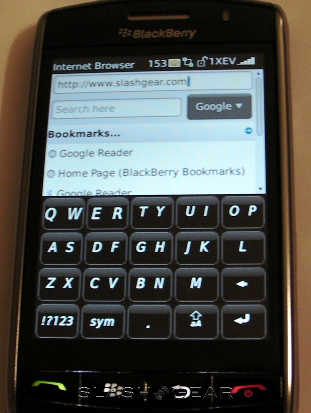
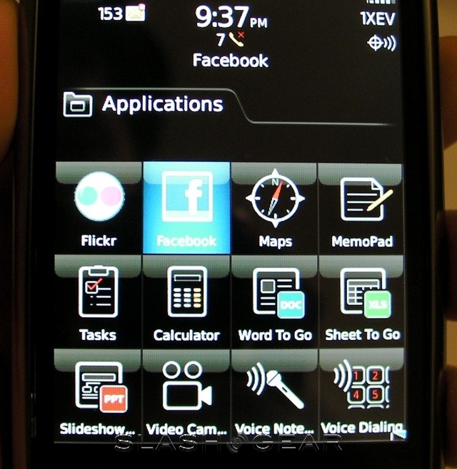
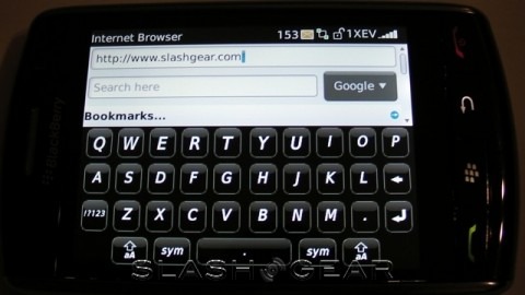
The browser is also the same as on the Bold, with a dedicated search box to query Google, Wikipedia and Dictionary.com, and better access to bookmarks. Navigation is certainly more straightforward than using a trackball, but to be fair we're still playing with the browser and will come back to this important feature in part two of our review. Right now, though, we're less than impressed with the accelerometer responsiveness: it takes 2-3 seconds to transition between portrait and landscape orientations. BlackBerry Maps, the new media player and the camera/video app are all present, together with a new Facebook for BlackBerry program and a Flickr browser. We'll also be covering these applications in part two, but we can say now that the Facebook app doesn't seem as comprehensive as that on the iPhone, and the Flickr software is very much bare bones in terms of features.
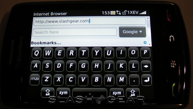
What we do want to touch on now is, ironically, the touchscreen. More importantly, our key concern with it: text entry. Our issue is in maintaining accuracy using ClickThrough; in landscape mode particularly, it can be difficult to both aim at the correct key and simultaneously press straight down on it without your thumbs sliding to the left or right. After typing pretty much consistently for the first fifteen minutes or so, we found our accuracy was slipping; down, perhaps to 85-percent. Compounding that, the auto-correction suffers from being less stringent and responsive than that on the iPhone.
In short, it's proving to be an acquired taste. While ClickThrough does make sense for those familiar with hardware keyboards, having to physically press the whole screen simply to confirm an URL or dismiss a dialog box gets tiring. At this early stage – and we recognize that we could get better used to things over the next couple of days – we find ourselves wishing that RIM had given us the option to turn ClickThrough off, at least under certain circumstances.
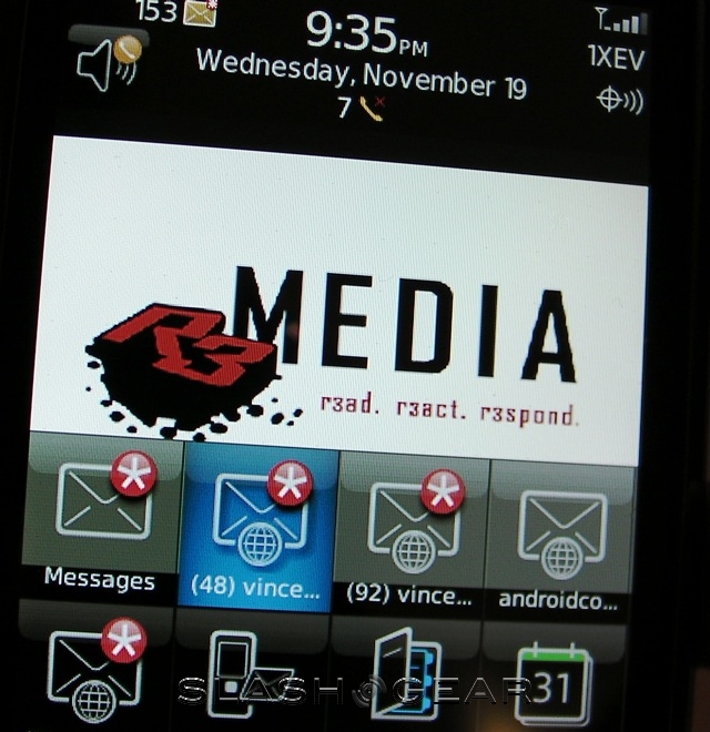
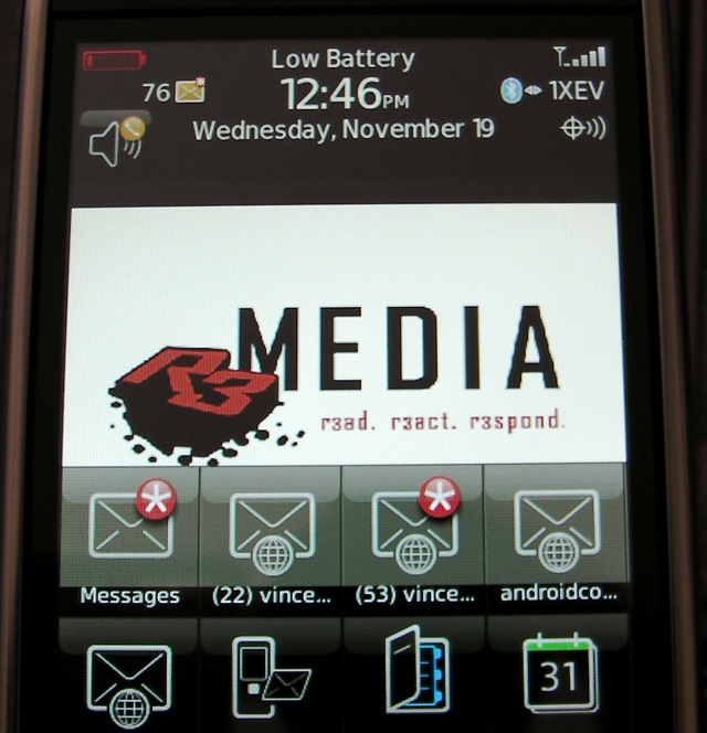
Where the BlackBerry Bold scored well on battery performance, it looks as though the Storm could be a victim of its beautiful display. Having unplugged it from the charger at 7.30am this morning, it's been receiving email all day, used for a tiny amount of surfing and no instant messaging, and for two or three short phone calls (all of great quality); the battery meter is already down to a single bar. To be fair, Bluetooth has been switched on throughout, but considering it's now a staple of business life that doesn't exactly fill us with confidence. We're hoping that a few more charge/discharge cycles – which at this rate will happen soon! – will stretch some more life out of the battery.

In part two of our Verizon BlackBerry Storm 9530 review look at the media functionality, including the music and video players, together with camera and GPS performance. We'll also been exploring the browser and comparing it with that other multitouch marvel, Safari on the iPhone 3G. Finally, we'll be looking at how the Storm performs as a phone, in voice calls and general sound quality. You can find part two of the SlashGear Verizon Wireless BlackBerry Storm 9530 review here!
