BlackBerry PlayBook Review
Until today, the consumer tablet market has been defined by the battle between iPad and Android. Apple's best-selling slate has set expectations for mobile utility and usability, managing to persuade users that – despite years of Microsoft Tablet PC promotion – the company pretty much invented the tablet segment. Google's Honeycomb (review) has launched its offensive against the iPad titan, and now it's the turn of RIM and the BlackBerry PlayBook. Initially billed as the enterprise-focused slate a BlackBerry phone toting business person would covet, the PlayBook's scope has gradually grown to encompass the consumer market too. Has that spreading focus left RIM with the jack of all trades or the master of none? Check out the full SlashGear review after the cut.
Hardware
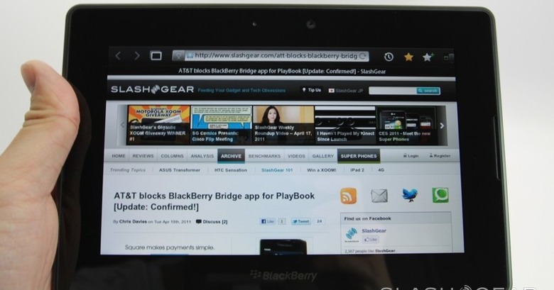
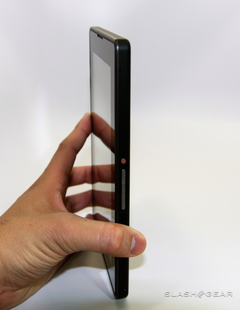
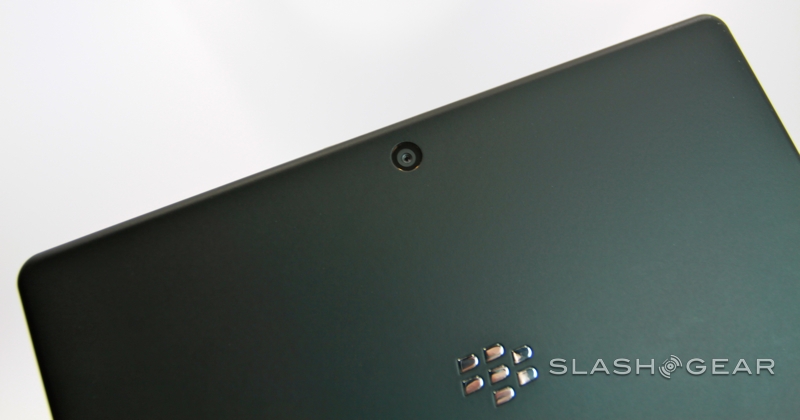
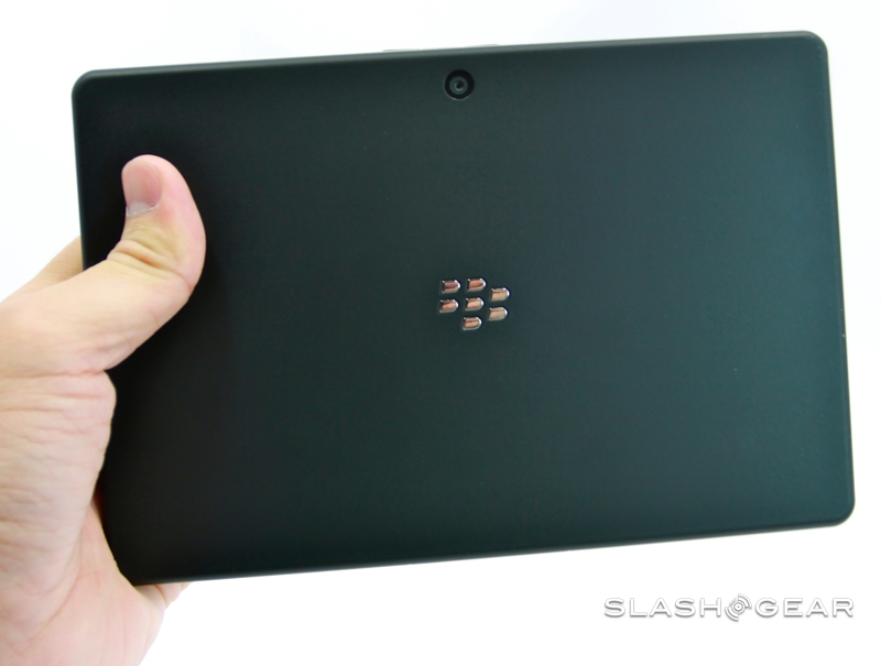
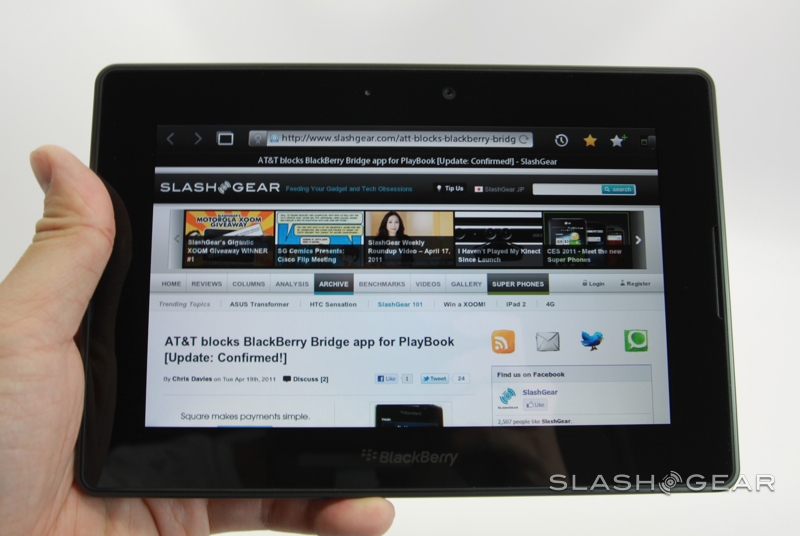
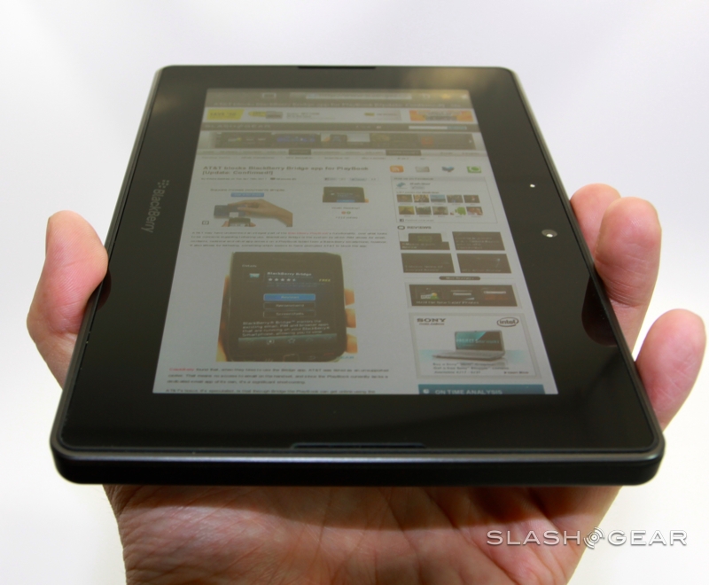
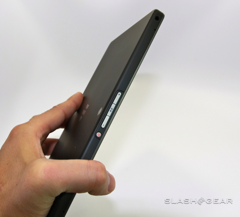
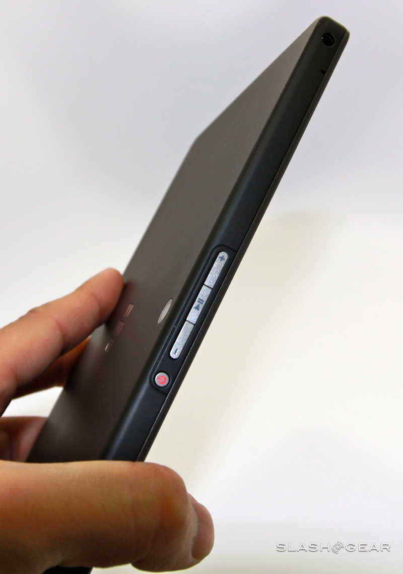
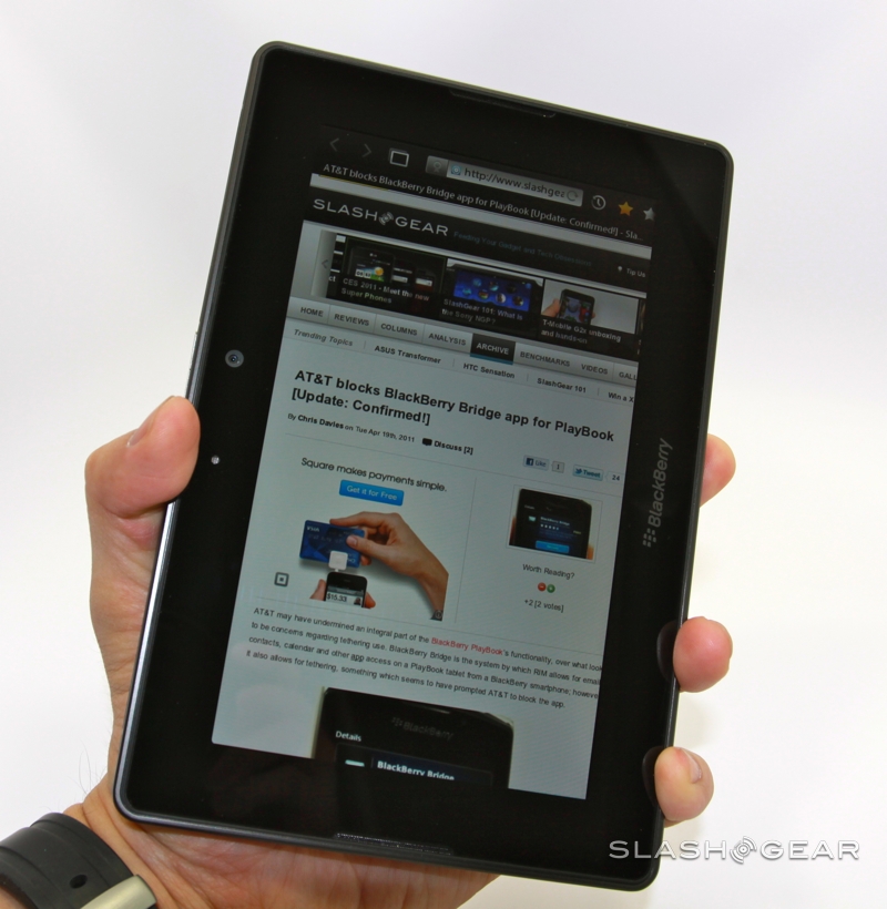
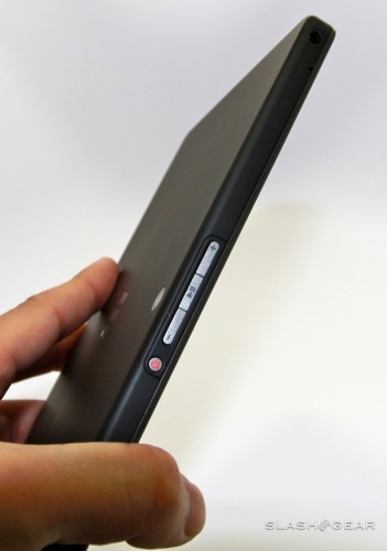
A nondescript black slab measuring 7.6 x 5.1 x 0.4 inches and weighing 0.9lbs, the PlayBook is a combination of the very glossy and the pleasingly matte. The whole front is a slab of glass hiding a 1024 x 600 WSVGA LCD touchscreen, the touch-layer of which extends – Palm Pre style – off into the bezel around the panel itself. The sides and back are metal with a rubberized coating for easier grip. Ports and controls are minimal, which makes it all the more frustrating that the one button you'll probably be spending the most time tapping, the power key, is such a frustration. Tiny, recessed and overly-sprung, it's hard to find without looking and hard to press without jabbing the tip of your finger at just the right angle.

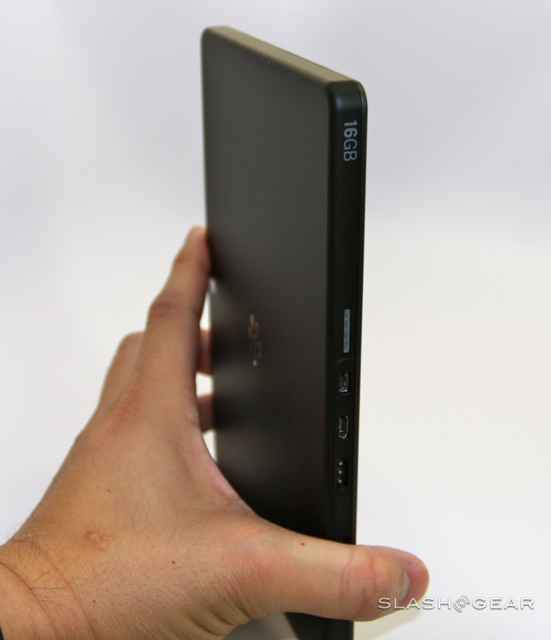
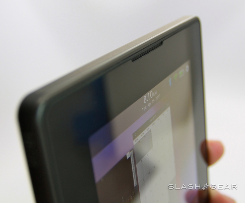
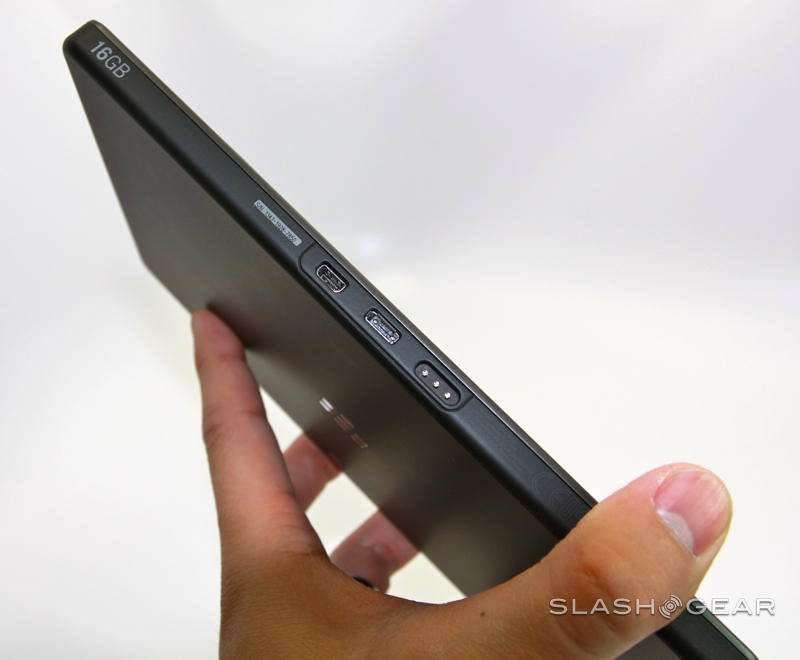
Next to it there are volume up/down keys flanking a play/pause button, and the 3.5mm headphone socket is on the top edge as well. On the bottom there's a microHDMI port, microUSB port, and a proprietary charging connector for the PlayBook's docking station. Rather than integrate the speaker grills into the sides or rear of the tablet, as we've seen other manufacturers do, RIM has sliced narrow gaps in the edges of the front glass, and slotted the speakers neatly behind them. The end result is solid audio performance.

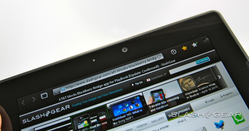
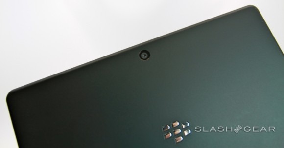
Two cameras – 3-megapixels up front, 5-megapixels on the back – comfortably outclass those on the iPad 2, both on the spec sheet and in the stills and video they're capable of shooting. There's no flash on either side, but you can record Full HD 1080p in MPEG4 format and, in well lit environments, there's minimal noise to be seen.
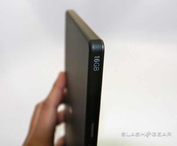
Inside, RIM has bypassed the Tegra 2 familiar from recent Android tablets, and instead opted for Texas Instruments' 1GHz OMAP4430 processor and PowerVR SGX540 graphics. They're paired with 1GB of RAM and a choice of three storage variants: 16GB, 32GB or 64GB. Choose wisely as, like with the iPad, there's no microSD memory card slot.
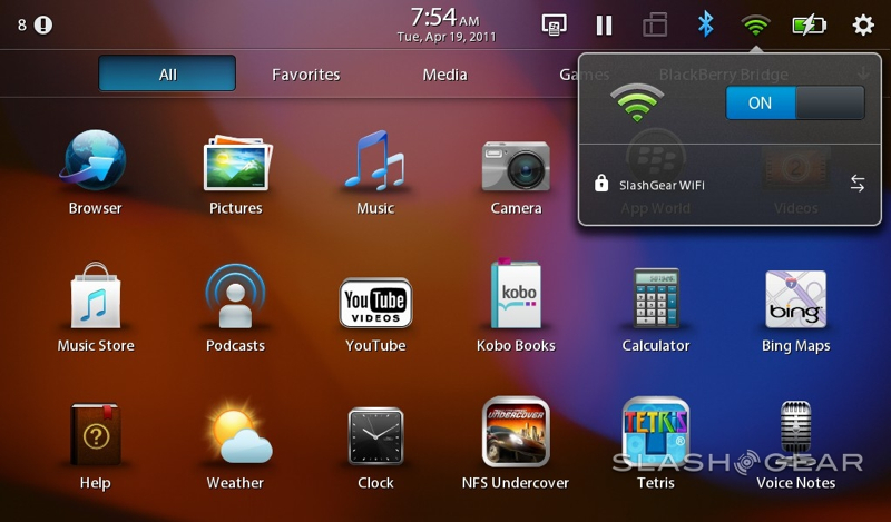
Connectivity includes WiFi a/b/g/n, Bluetooth 2.1+EDR but – on these first models at least – no integrated 3G or 4G. Cellular wireless won't arrive until later in the year, with RIM talking about LTE, WiMAX and HSPA+ versions depending on carrier. Of course, the company expects most PlayBook buyers to tether their slate with their BlackBerry smartphone in order to get online (and access some of the key apps; more on which later). There's also the usual array of GPS, an accelerometer, 6-axis gyroscope and a digital compass.
Software and Performance
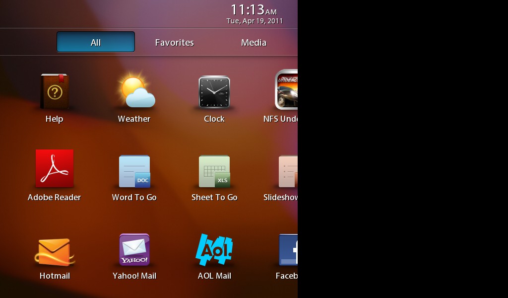
The PlayBook runs QNX, a Unix-like OS which RIM acquired a little over a year ago. It's a well-established platform that's more commonly found in embedded devices. To QNX, RIM's software engineers have added a splash of UI magic that borrows at least a little from some of our favorite software platforms of the moment. There are webOS-style swipe gestures, including the ability to power on the PlayBook by swiping all the way across the display from bezel to bezel, and iOS style icons which are rearranged by tapping and holding them until they animate.

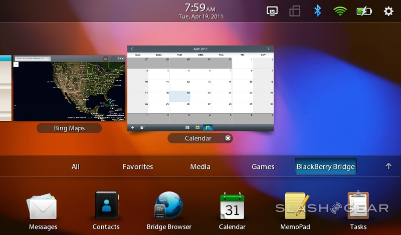
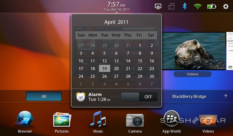
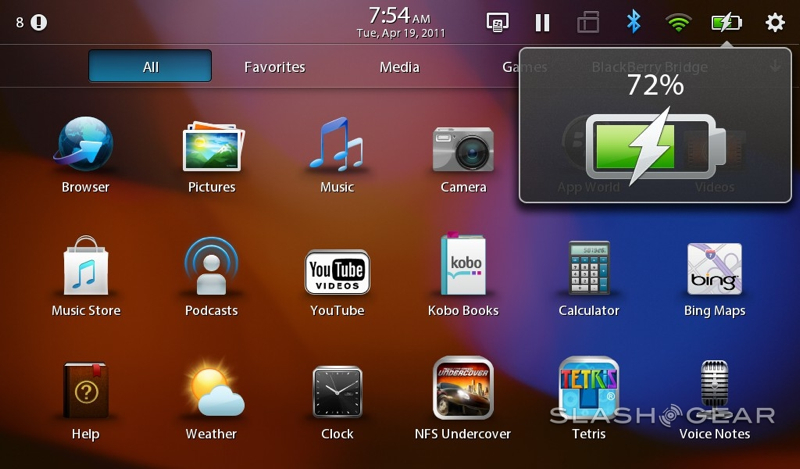
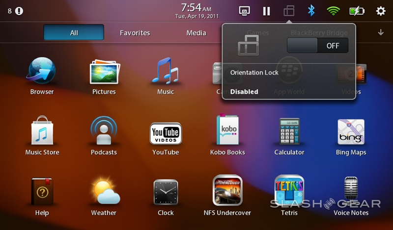
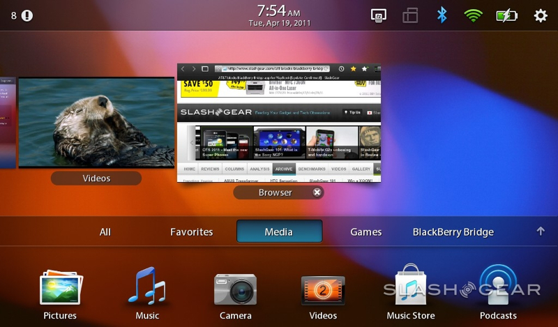
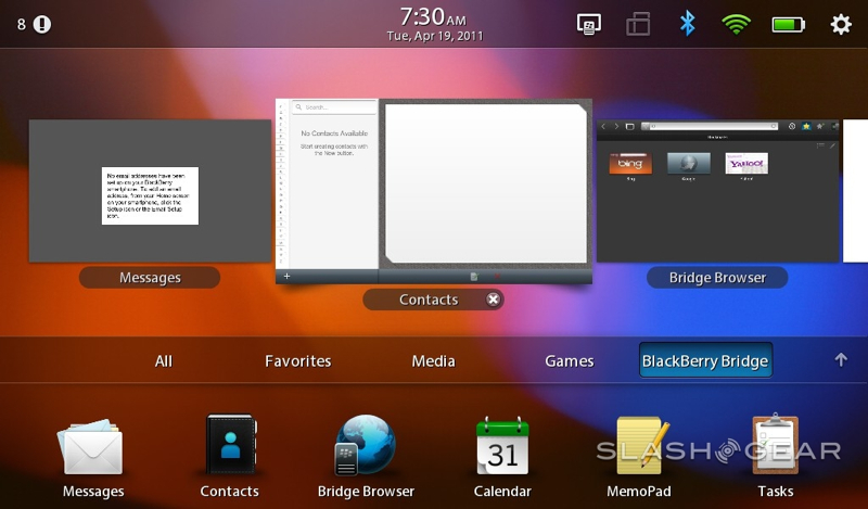
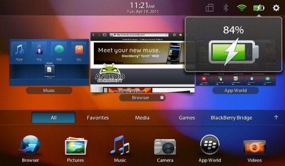
The gestures are welcome additions, working well on the 7-inch form-factor. Swiping up from the bottom bezel shows you all the currently running apps – each still quietly doing its thing in the background – as webOS-like tiles, and you can then swipe up on each tile to force-close it. A swipe from the left or right bezel moves between running apps, while swiping down from the top bezel opens a context-sensitive menu bar for whichever app has focus. Finally, a swipe from the top corners pops open the status bar, with battery and wireless reports, date/time and quick access to the settings page.
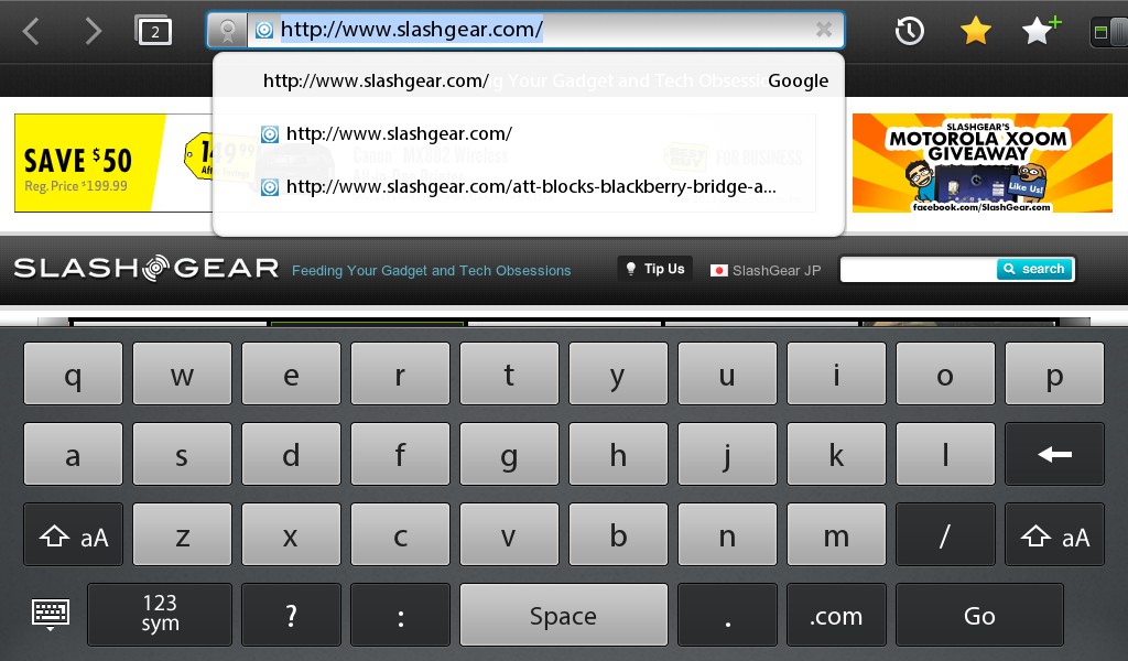
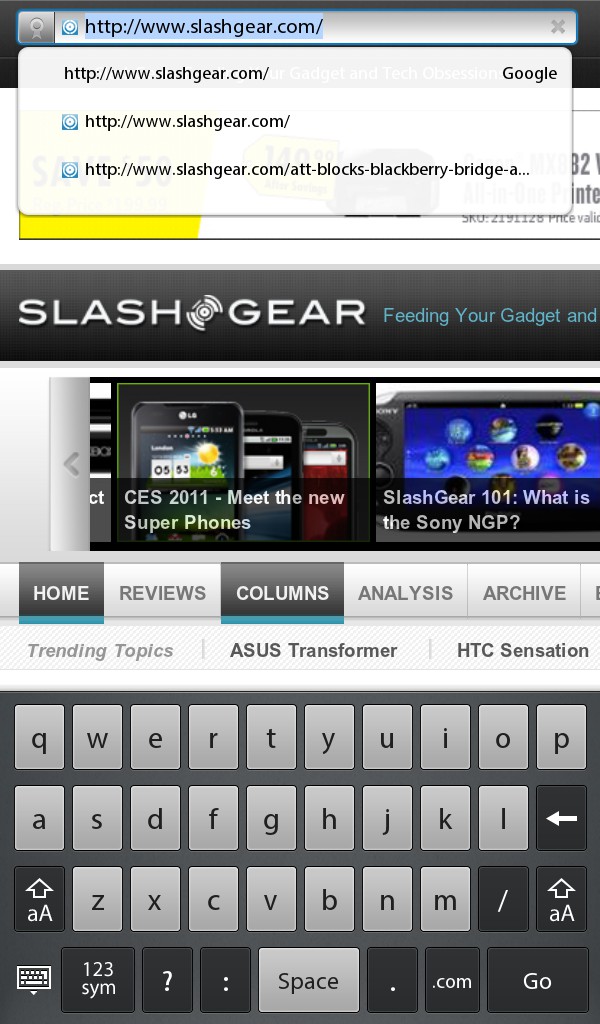
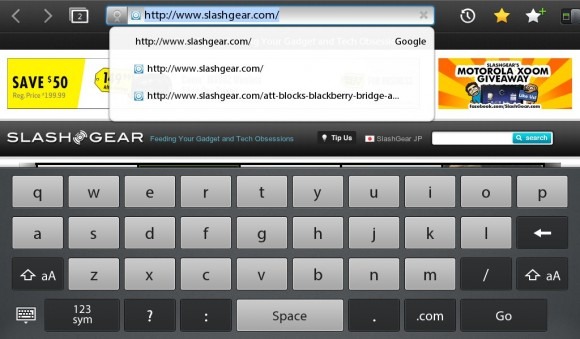
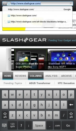
The QNX keyboard could do with a polish, however. As on the iPad there's no dedicated number row, and punctuation keys are limited to comma and period before you have to dig into a second layout. There's also no provision for long-pressing a key and getting a pop-up menu of alternative letters and symbols. More frustrating is the inconsistent auto-correction, which sometimes fails to do simple things like insert apostrophes in "I'm."
Multitasking is one of those things which sounds straightforward but which has spawned a few different methods of handling simultaneous apps. On the one hand there's Apple's strict limitations in iOS, with only a few APIs allowed to stay active no matter what, and apps "frozen" when they don't have focus; on the other, there's Android with its more lackadaisical approach. RIM has settled somewhere in-between, with QNX offering a choice of two multitasking modes. Users can either take manual control over what apps are running, closing them from the card view as they see fit, or they can allow QNX to handle it all, freezing apps as it deems appropriate to keep the system moving slickly.

And slickly it does move, the TI processor proving adept with the native QNX apps and the separate GPU able to handle recording and playback of 1080p HD video. RIM's party trick with the PlayBook is setting several system-intensive profiling tools – testing things such as video frame-rates and polygon generation – running simultaneously, and then showing that each is concurrently active in the multitasking cards view. It's not exactly something the average user will do, but it's evidence of the power on tap: apps load without hesitation, switch rapidly and are generally lag-free, and there are neat animations and graphical flourishes along the way that thankfully don't introduce any delay.
Apps and Functionality
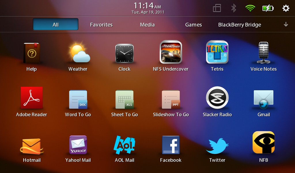
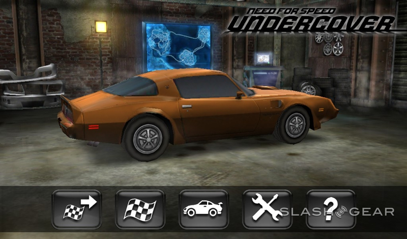
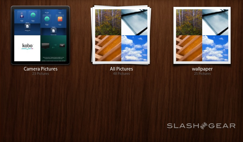
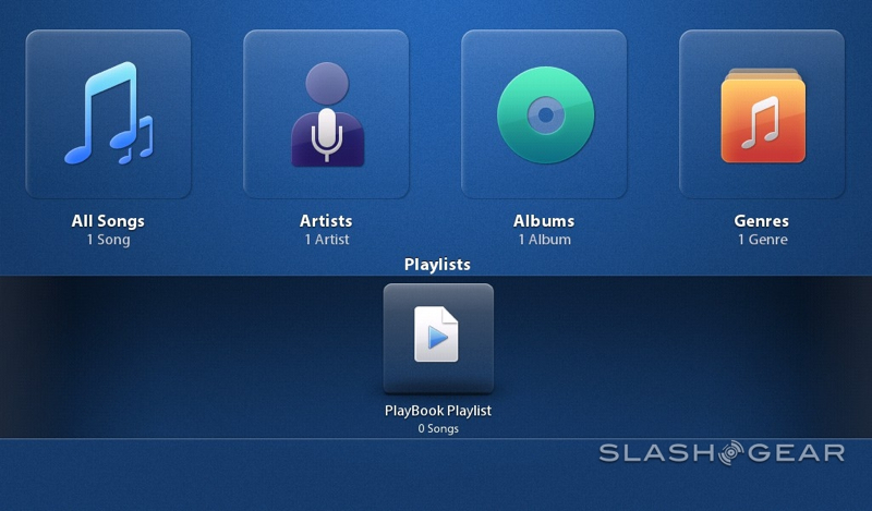
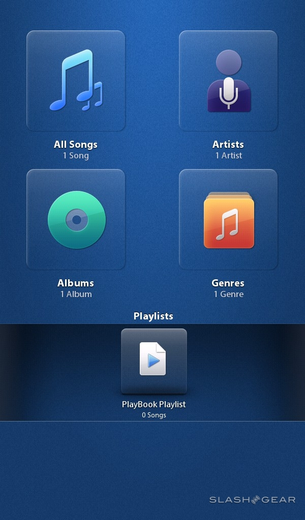
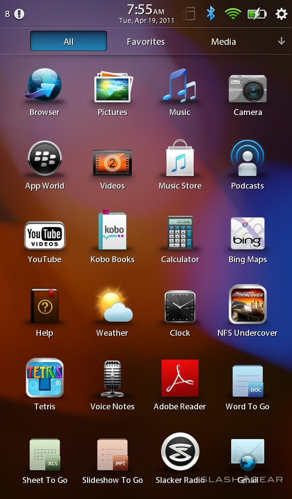
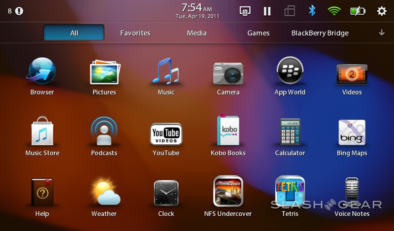
Unfortunately, the actual range of apps to take advantage of all that power is pretty limited. The PlayBook's software selection is its biggest drawback today, and it's one that RIM has tacitly acknowledged (but which we'll have to wait until later in the year to see addressed). Out of the box you get a browser, music app, video app, Adobe Reader, pictures app, calculator, Documents To Go and Kobo Books, along with access to the BlackBerry App World download store.

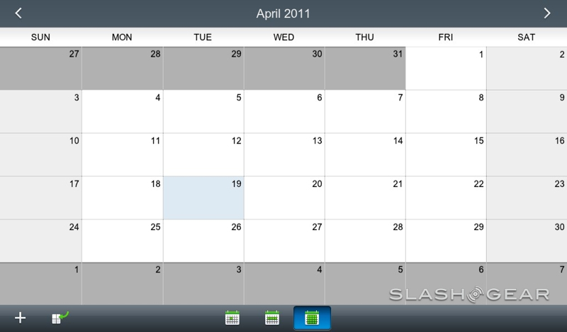
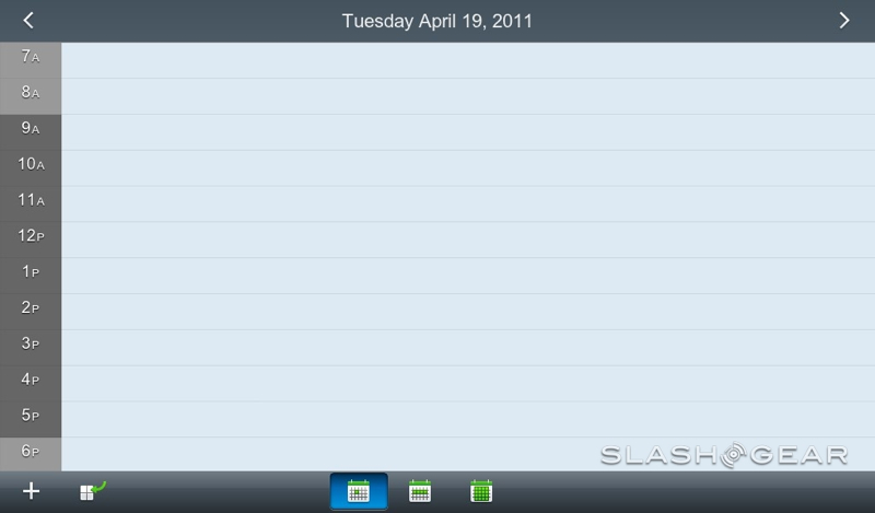
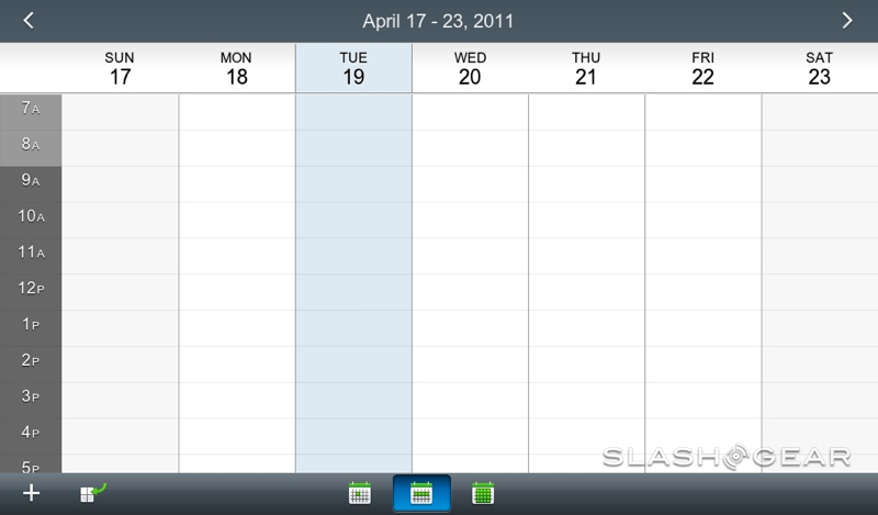
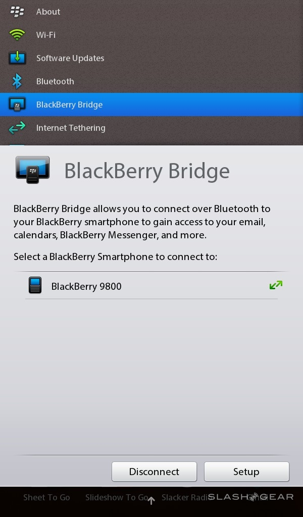
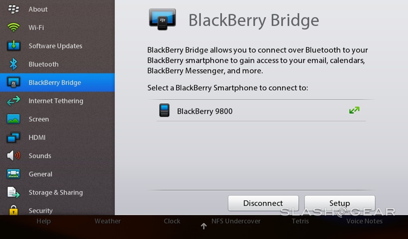
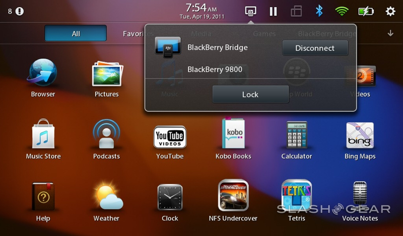
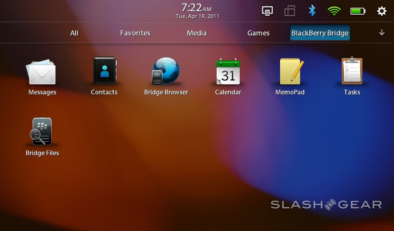
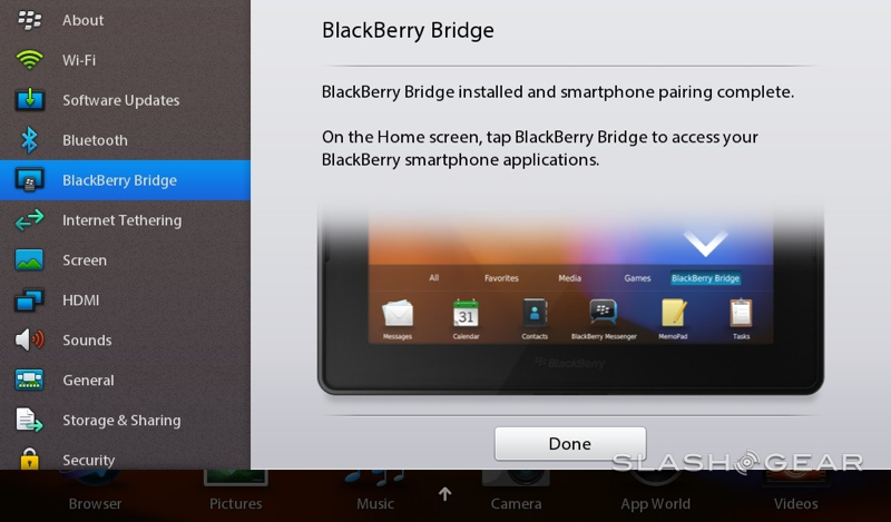
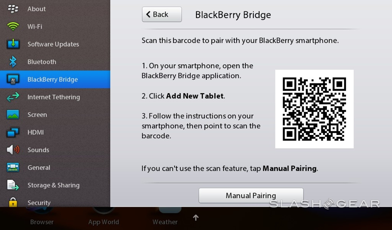
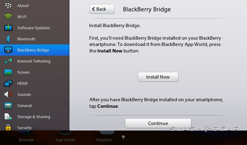
If you've noticed a few obvious omissions, like email, contacts, calendar, tasks and memos, then you've spotted RIM's most unusual software decision. Rather than having standalone apps for each of those features on the tablet, the PlayBook relies on its BlackBerry Bridge application to pull the content over from a Bluetooth-tethered BlackBerry smartphone. The handset needs to be on OS 5 or OS 6 and running the Bridge app, and once that's done it's just like using your BlackBerry phone but on a 7-inch screen (and with a UI to suit). The benefit to this, RIM argues, is that enterprise users needn't worry about securing a second device for each newly-tablet-equipped employee: the phone is secure, and the PlayBook just borrows its content for a while.
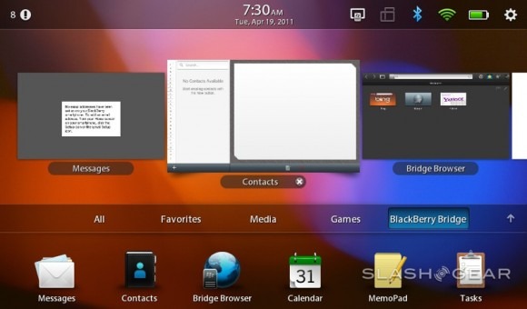
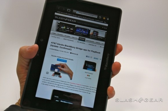
When connected, new email and appointment reminders are flagged up in the status bar, and you can – with a little lag from the Bluetooth link – use the apps as normal. Problem is, disconnect the phone and you lose all the Bridge functionality: the apps disappear and all the data is gone with it. If you don't have a BlackBerry to start with then, in its present state, the PlayBook is probably not the tablet for you; RIM says it will be adding native apps later in the year, but right now the slate feels decidedly half-baked without a phone to play with. AT&T is also yet to approve the BlackBerry Bridge app for its devices, which means that, for the moment, the carrier's subscribers are out of luck (unless they're willing to install the app unofficially).

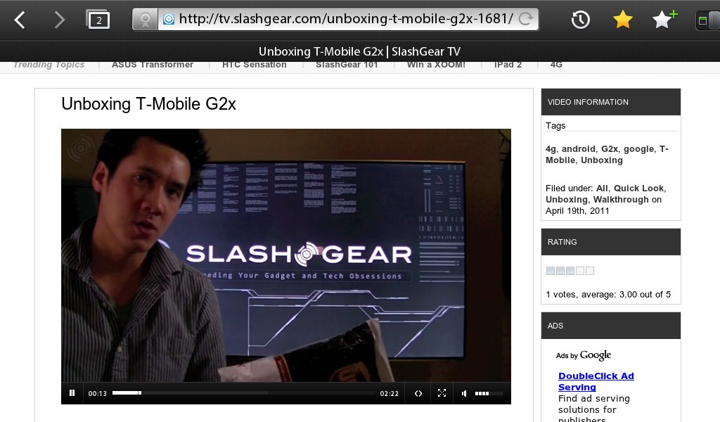
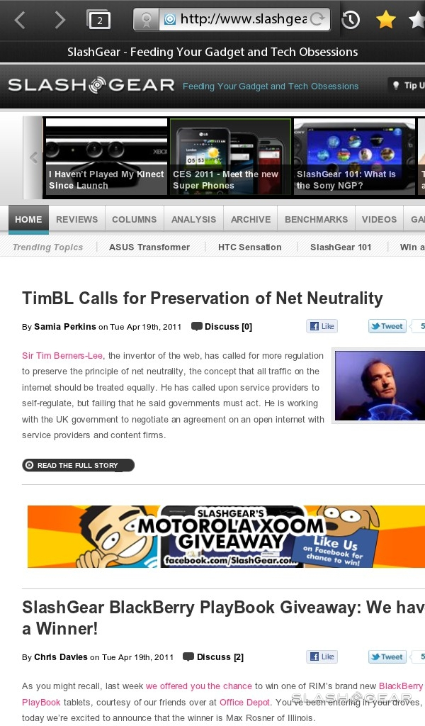
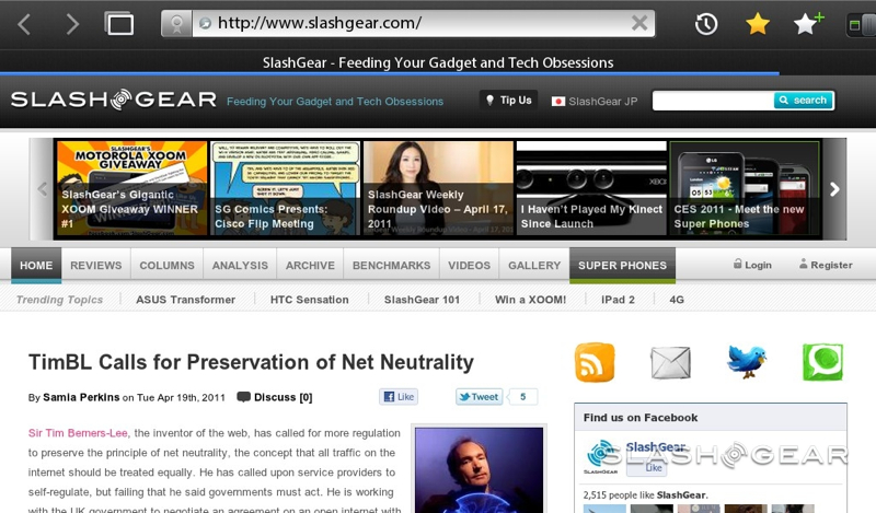
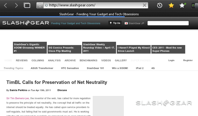
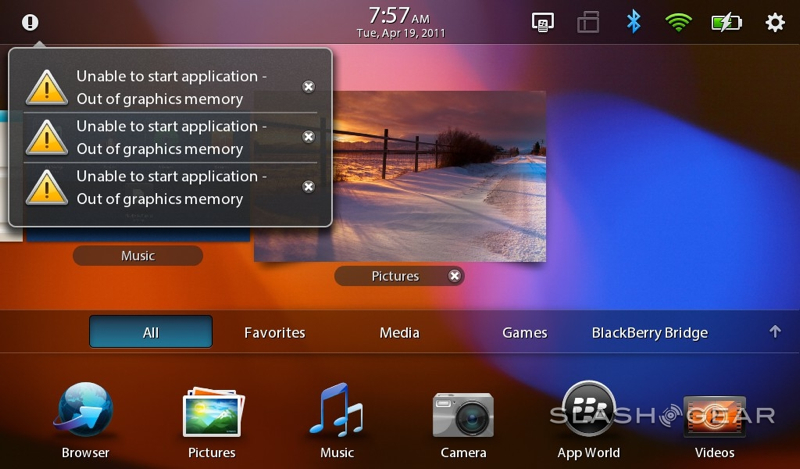
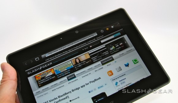
The patchy experience continues into the browser. WebKit based and with Adobe Flash support out of the box, the end experience should be desktop-like but suffers occasional rendering glitches, sluggishness in pages with more than a little Flash content, and tends towards memory hogging. QNX shows low memory status with glowing red in the corners of the display, and all too often we'd find that the browser would simply shut down of its own accord. To be fair, a similar thing can happen with the Safari browser on the iPad, but either way it's a jarring experience on what's arguably meant to be a web-centric device. We also had issues with navigating between pages, with overlapping icons and a tendency to get confused if we allowed our fingers to touch the bezel while holding it.
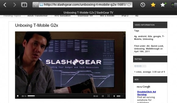
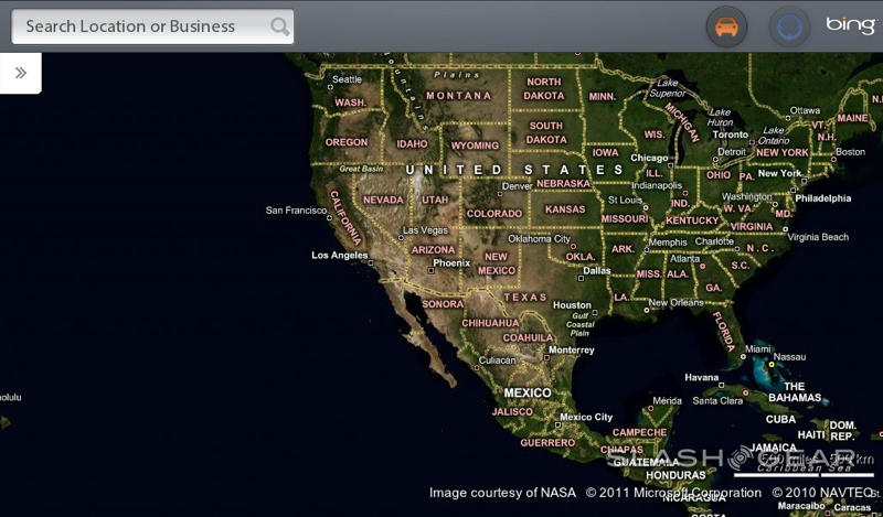
It's doubly annoying when you consider that key functionality that we're used to seeing handled by native apps is instead handled by the browser. Although there are Twitter and Facebook icons on the PlayBook homescreen, they take you to the relevant sites in the browser, and the Bing Maps app does little more than frame the regular site in a standalone way. There's no turn-by-turn navigation as you get on Android tablets, and nor is there a video calling app (or, indeed, Skype in the BlackBerry App World).
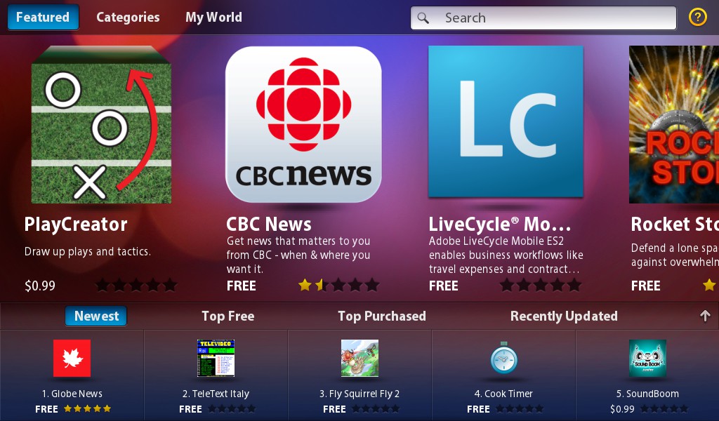
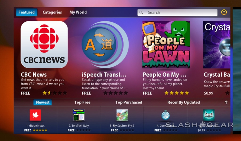
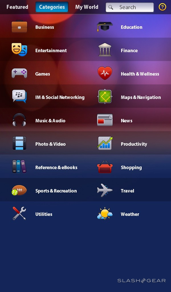
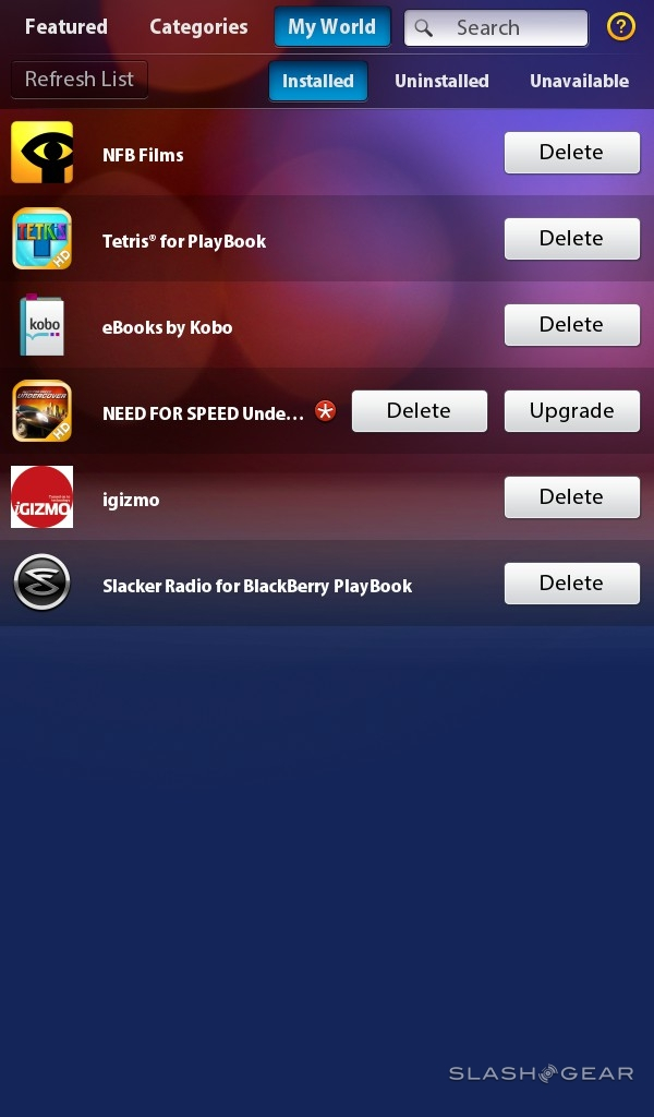
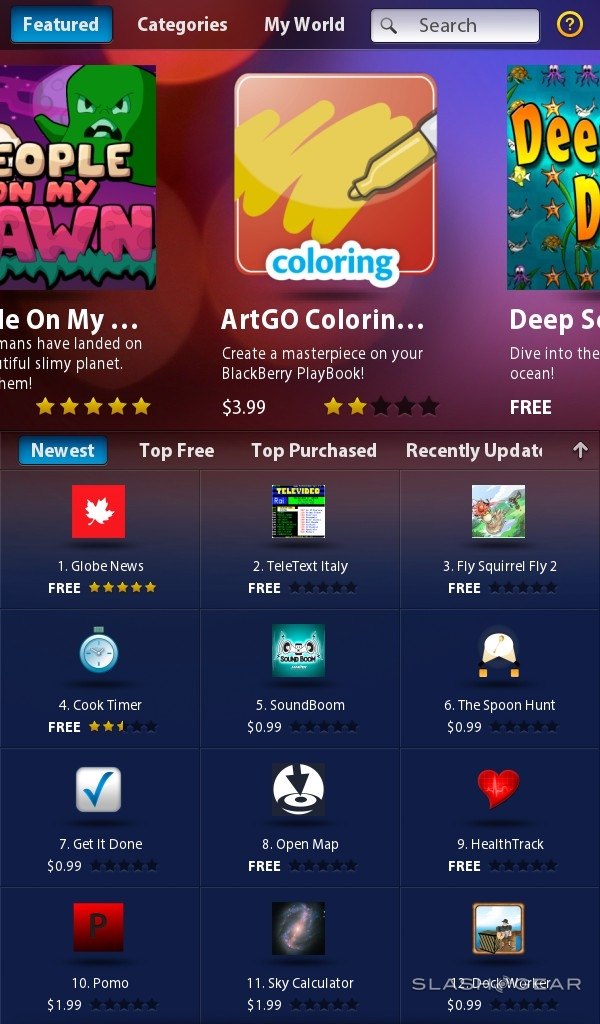
In fact the BlackBerry App World is looking pretty barren in all. RIM says 3,000 submissions of PlayBook-specific titles have been made, though the range has been conspicuous by its absence over the week or so we've spent with the tablet. Hopefully that should change as retail units arrive with real buyers. Unfortunately, while there are plans to bring both Android app and BlackBerry smartphone app support to the PlayBook, neither are ready at launch.

It's a shame, because when the PlayBook gets things right, it works very well. The HDMI output is particularly useful: if can show different things on the tablet screen and the TV it's hooked up to, rather than just mirroring the display. That means you can be outputting 1080p HD video (in H.264, MPEG4 or WMV formats) and simultaneously surfing the web on the PlayBook itself, or alternatively run a PowerPoint presentation on the big screen and see your presentation notes on the slate.
Battery
RIM is vague about the sort of runtimes users can expect from the PlayBook's 5300 mAh battery, though in our testing we've found it's easily capable of getting through a full day of heavy use. That's with some HDMI output, plenty of browsing and media playback. Scale down your ambitions and you could easily go through several days.
Pricing and Value
Rather than make the same mistake carriers did with the Motorola XOOM, and Samsung did with the sluggish release of the WiFi-only Galaxy Tab, RIM has kicked things off with WiFi-only PlayBook models that match the entry-level iPad 2. That means $499 for the 16GB PlayBook, $599 for the 32GB and $699 for the 64GB.
Relative value is a more difficult proposition. The PlayBook is obviously smaller than the iPad 2 and XOOM, a positive for those who want a more pocketable tablet but something that can make for a more cramped browsing experience. The enterprise security of keeping key data locked up on a user's BlackBerry smartphone rather than on the tablet makes sense in some ways, but it also artificially limits the potential audience considerably. Lots of people don't have a BlackBerry handset but might want a PlayBook tablet, and right now they're getting half the software experience out-of-the-box that Android or iOS slates offer.
The fact that the BlackBerry App World store is so sparsely populated, and that BlackBerry app and Android app compatibility is still somewhere on the unspecified horizon, means there are plenty of glaring gaps where other platforms have software choices. RIM may have matched the iPad 2 on price, but it falls well short on functionality.
Wrap-Up
Make no mistake, the BlackBerry PlayBook has plenty of potential. The hardware is fast, the design soberly striking (annoying power button notwithstanding) and the QNX OS pulls many of the best aspects from rival platforms into a stable, generally well thought out environment. With the right BlackBerry handset to pair it with (and assuming you're not with AT&T, at least at the moment) the unusual Bridge system works surprisingly well.
Unfortunately there still too many rough edges for us to comprehensively recommend the PlayBook – or, indeed, for it to entirely take on the iPad 2 as RIM might hope. The underwhelming app situation may change in the near future, but right now the PlayBook's core apps – including, most troubling, the browser – err on the flaky side a little too often in comparison to the more solid iOS experience. Yes, RIM may be primarily targeting its tablet at enterprise users, but the iPad has also made in-roads into that segment and expectations are set accordingly. Bridge crashes simply won't be acceptable in either enterprise or to regular consumers.
The future for the PlayBook looks distinctly different to the tablet it is now, however. Android app compatibility, more native software, the ability to use email, calendar and other core apps without a "Bridge" to a BlackBerry phone – they'll all change the PlayBook hugely. RIM is pushing out firmware updates at a rate of knots, almost daily in the run-up to launch, and each has tweaked the overall user-experience toward greater stability and functionality. All but the most ambitious of early-adopters should hold off until the PlayBook reaches the tipping point where ability matches promise.
BlackBerry PlayBook hardware and OS walkthrough, BlackBerry Bridge setup and demo video:
[vms 716b02ec0da35256a998]
