BlackBerry KEYone Review: With QWERTY Comes Compromise
- Physical keyboard to satisfy QWERTY die-hards
- Sturdy and high-quality build
- Excellent battery life
- Admirable focus on security
- Expensive
- Display is small considering phone's size
- Do you really need that keyboard?
The phoenix metaphor is overused in a tech world where brand recycling has become commonplace, so let's just call the BlackBerry KEYone a QWERTY comeback. You'd be forgiven for dismissing it for not one but two reasons, after all. First, for packing a physical keyboard in an age where more flexible, programable touchscreen interfaces are the status-quo. Second, for its attempt at resurrecting a nameplate that long ago lost its shine.
This is, however, a BlackBerry that is not really a BlackBerry. Though it may bear the name of the once-mighty Canadian phone company, that's now licensed out to TCL, the same Chinese company which is now behind the Alcatel brand. Lest you close this tab in disgust, don't let that worry you: the KEYone does indeed feel like the BlackBerry devices of old.
Design and Hardware
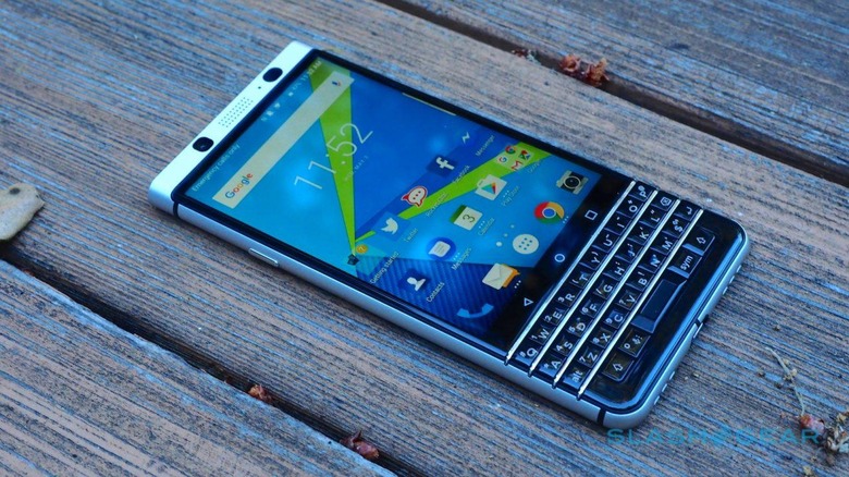
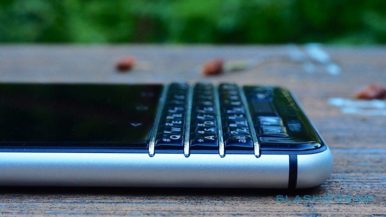
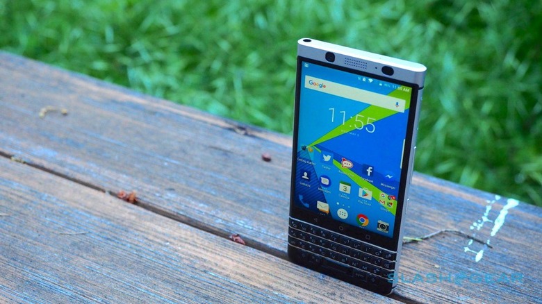
At a time when most smartphone manufacturers are doing their level best to shrink devices down into narrow, sleek slabs, more wraparound display than anything else, the KEYone is very obviously different. It's absolutely not a small phone – 5.87 x 2.85 x 0.37 inches and, with its aluminum frame it's reasonably heavy, too.
If a little heft in the hand is what you're looking for in life, there are worse ways to acquire it. The KEYone's style is knowingly "BlackBerry", with its mixture of metal, soft-touch rubber, and shiny plastic, even if the underlying DNA is different. It certainly feels like a quality device.
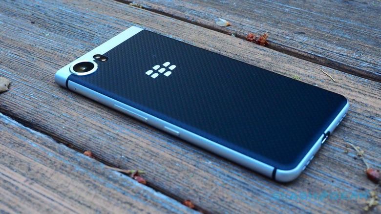
Most of the front is still dominated by the touchscreen, a 4.5-inch IPS LCD running shy of Full HD resolution at 1620 x 1080. It has an unusual 3:2 aspect which, in comparison to the increasingly tall-and-skinny ratio we're seeing on devices like the Galaxy S8 and LG's G6, takes a little getting used to. It's topped with Gorilla Glass 4, while underneath is the keyboard, which I'll cover in more detail in the section that follows.
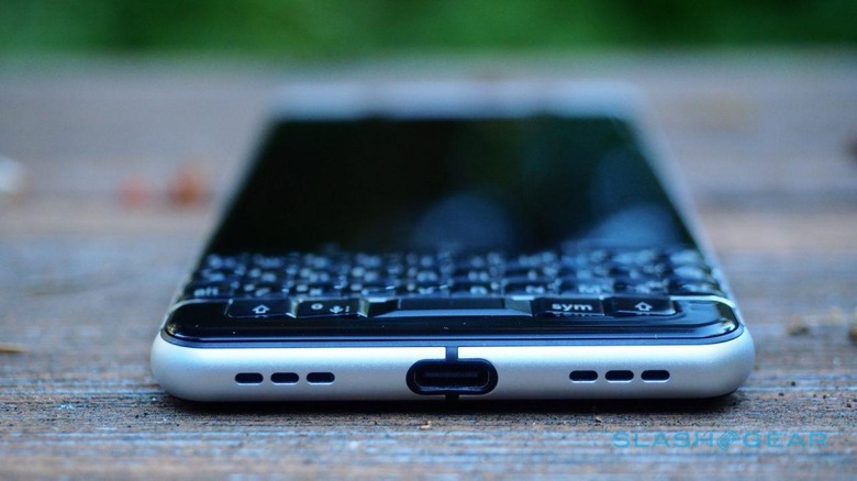
On the left edge is a single button for power and to lock the screen. Over on the right there are volume controls as well as a shortcut button: that can be programmed to the app of your choice. When in a call, it doubles as a mute key. A combination SIM and microSD tray is also on the right side – the latter used to expand the 32GB of internal storage – and there's a 3.5mm headphone jack on the top edge and a USB Type-C port on the bottom.
BlackBerry's decision to go with the Snapdragon 625 2.0 GHz oct-core and 3GB of RAM is a calculated one. No, it's not the fastest chip in Qualcomm's catalog, but it's more frugal and thus makes better use of the 3,505 mAh battery, or so the argument goes.
As for connectivity, there are two versions. One – dubbed "US V1" – has broader LTE support but lacks Verizon and Sprint capabilities; "US V2" has a few fewer LTE bands but throws in CDMA support. Either way, you get HSPA+, WiFi a/b/g/n/ac, Bluetooth 4.2, NFC, and an FM radio. As of writing this, no US carrier has confirmed they'll be ranging the KEYone, though it'll be sold unlocked and SIM-free for $549.
Keyboard
If you want a physical keyboard on your smartphone, you don't have much in the way of choice. We're long past the days of sliders – though Motorola is flirting with a keyboard Moto Mod add-on – and though Samsung offers a clip-on keyboard case for the Galaxy S8, it's more of a workaround than anything else. What used to be seen as an essential has been eclipsed by the flexibility of on-screen keyboards that can adjust their layout according to app and input.
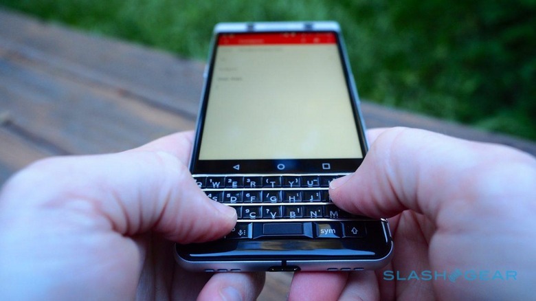
Those who want actual buttons under their actual fingertips are, presumably then, in the minority. Yet they're a small, vocal cohort; enough, clearly, for BlackBerry – or, really, TCL – to consider the KEYone worthwhile. So, is the phone's dinky keyboard any good?
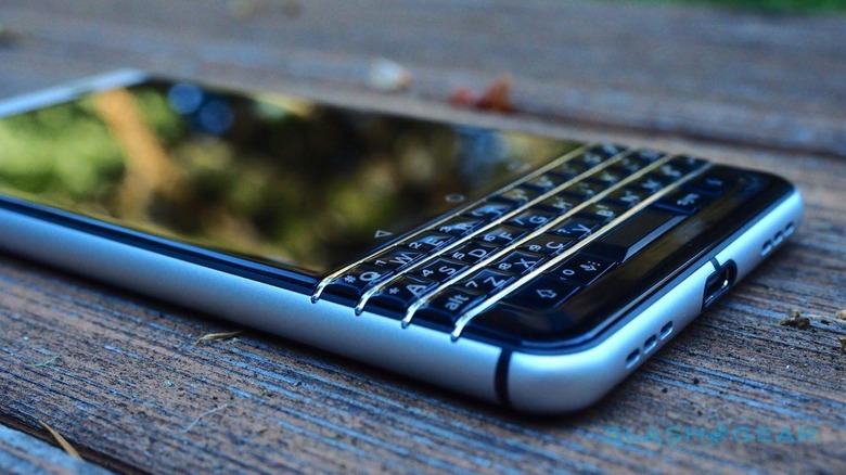
I confess, I was frustrated at first. The KEYone may be a large phone, but squeezing in 35 keys means they're each very small. It's one of a few ergonomic issues, and it requires a fairly conscious typing style: stabbing down with the very tips of your fingers and, if you have them, your fingernails. Trying to use the pads of my thumbs usually meant I ended up smushing across multiple buttons at once.
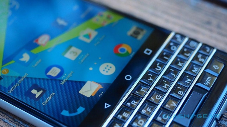
Adding to the frustration is the proximity of the touch-sensitive buttons for home, back, and Android's app-switcher. It's far too easy to overshoot the top row of letters and inadvertently graze one of the navigation buttons, or to trigger one accidentally when you're intending to reach up and tap a suggested word.
The keyboard does have some extra uses beyond core typing, mind. The space bar doubles as a fingerprint sensor – small lights at each end illuminate to let you know when you can use it for that – and, aside from the fact that I often went to press it to head back to the Android home screen, it works swiftly. The 'board as a whole, meanwhile, doubles as a gesture pad: you can swipe your finger gently up across its surface to accept a typing auto-suggestion, for instance.
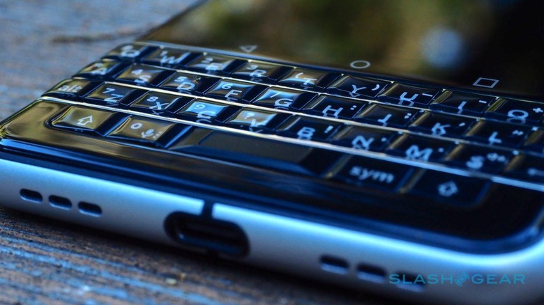
You can also use it as a navigation pad for scrolling through webpages and documents, and it works surprisingly well. Each of the keys can act as a shortcut when long-pressed, with a total of 52 shortcuts supported. Honestly, I suspect I'd lose track of which was set to what long before that point, but it's nonetheless useful being able to hold down "M" and have the mail app spring up, or "I" to quickly load Instagram.
The weight balance of the phone means typing one-handed is so close to precarious as to effectively be a non-starter. Unless you have the long fingers of a pro basketball player, the keyboard is simply too low down on the body to simultaneously support its weight and type with any degree of speed or accuracy, all with one hand.
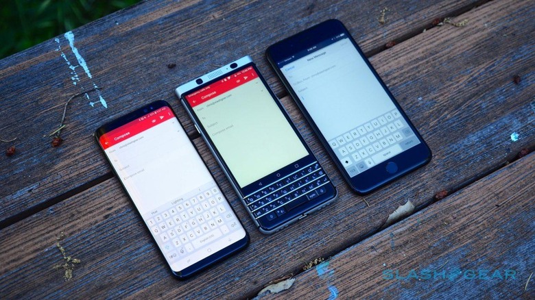
I don't want to sound too pessimistic. When I forced myself to set aside the iPhone 7 Plus and Galaxy S8 I've been carrying, and work through my inbox on the KEYone instead, I eventually started to pick up speed. I suspect it would take a couple of weeks or so before my fingers retrained themselves and got sufficiently familiar with the physical keys to approach the typing rates I can hit on a virtual keyboard.
Software
This is not the first BlackBerry-branded phone to run Android, and that experience shows. Under the hood it's Android 7.1 Nougat, in fact, though TCL throws in some BlackBerry special sauce to raise the productivity and security game. Some of that works, and some of it is less useful.
What you'll interact with most frequently is the BlackBerry Hub. Effectively an attempt to recreate the unified inbox that the original phones were known for, it's essentially a single location where your emails along with messages from Facebook, Twitter, text messages, Instagram, Snapchat, Slack, and many other services all congregate. You even get a red blinking light and the BlackBerry "splat" red dot to show there's something new on the Hub icon.
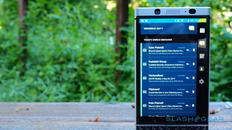
How much you like the Hub probably comes down to how comfortable you are at having your entire digital messaging life folded into one place. Admittedly, it needn't quite be that way: you can filter the flow down as granularly as to a single account if you so wish. Still, I'm a person who likes the separation of different inboxes for work and personal, and so it took a little getting used to overall.
There are definite advantages, though. The unified compose button – which allows you to pick which service and which account you'll send a message by – is more convenient than jumping into a specific app. The Hub's location as a persistent tab to be swiped in no matter where you are in the OS is handy, too. Less welcome is the tendency for message read status to take a while to propagate across services, which can mean even if you've read and replied to, say, an email in the BlackBerry Hub, the same message can look unadressed in Gmail until everything synchronizes up.
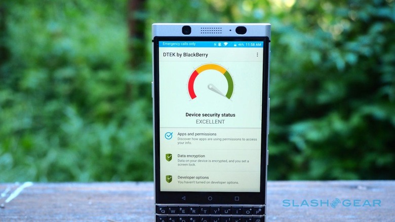
The other BlackBerry legacy is security. TCL is hoping to reclaim some of the enterprise customers that once were counted among the BlackBerry faithful, but who have since defected to Apple and Samsung. Its route is DTEK by BlackBerry, a hardened Android kernel that checks security keys embedded into the processor itself, and standard encryption.
You can think of DTEK as a daily watchdog. Yes, it can give you an on-demand report as to the security of any one app you've installed, but it's probably more useful for spotting potentially nefarious deeds going on in the background. Should an app try to turn on the camera surreptitiously, activate the microphone, send a text, or access your contacts or location, it'll flag up a warning.
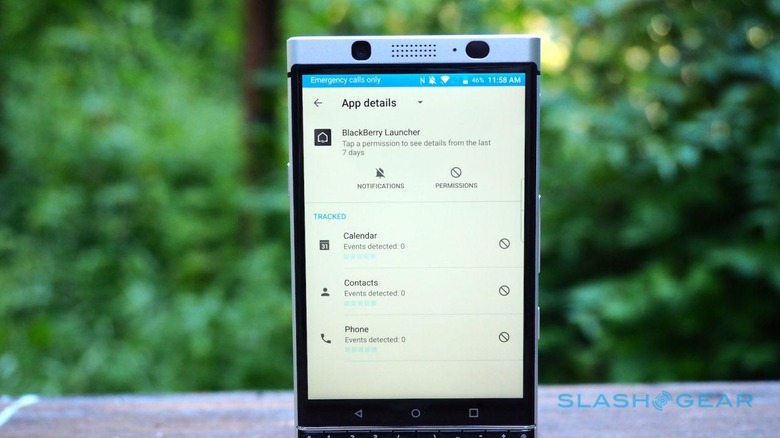
In addition, there's the promise of monthly Android security updates. It's a little depressing that, even in 2017, timely security patches are a selling point, but it's a solid nod to the BlackBerry reputation of old. Whether consumers will appreciate it remains to be seen.
In the final hours before this review went live, BlackBerry pushed out a new software maintenance release. It's been described to me as "general refinements" and I've not noticed any specific changes; I'll update this review if I see anything more, positive or negative.
Camera
BlackBerry phones weren't much known for their photographic abilities; even Kim Kardashian, probably their most famous fan, carried an iPhone too for her selfies. With the sensible realization that most users aren't so willing to double-up, TCL made sure the KEYone had a decent sensor.
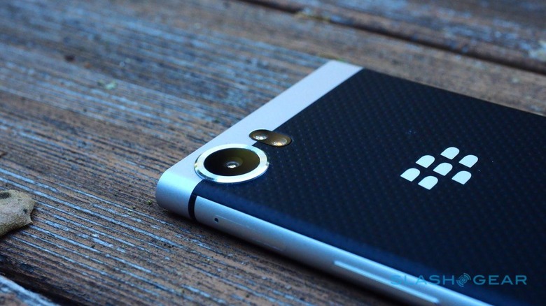
In fact, it's the Sony IMX378 which Google used to great effect in the Pixel and Pixel XL. Before you get too carried away, mind, what's produced by its 12-megapixels aren't the equal of what the Pixel pair can capture. After all, half the magic these days is in the processing and algorithms, and there Google's engineers still have the edge.
Nonetheless, it's a welcome step up from any previous BlackBerry device. Colors are accurate and contrast levels decent, and though stills lack a little of the vividness other phone cameras offer, they're clean nonetheless. If there's a shortcoming it's a slight sluggishness in locking focus, particularly exacerbated by low-light conditions, which meant some of my indoor shots turned out a little blurry. A mild tendency to yellower tones than pure white is easily corrected if it's something you particularly notice.
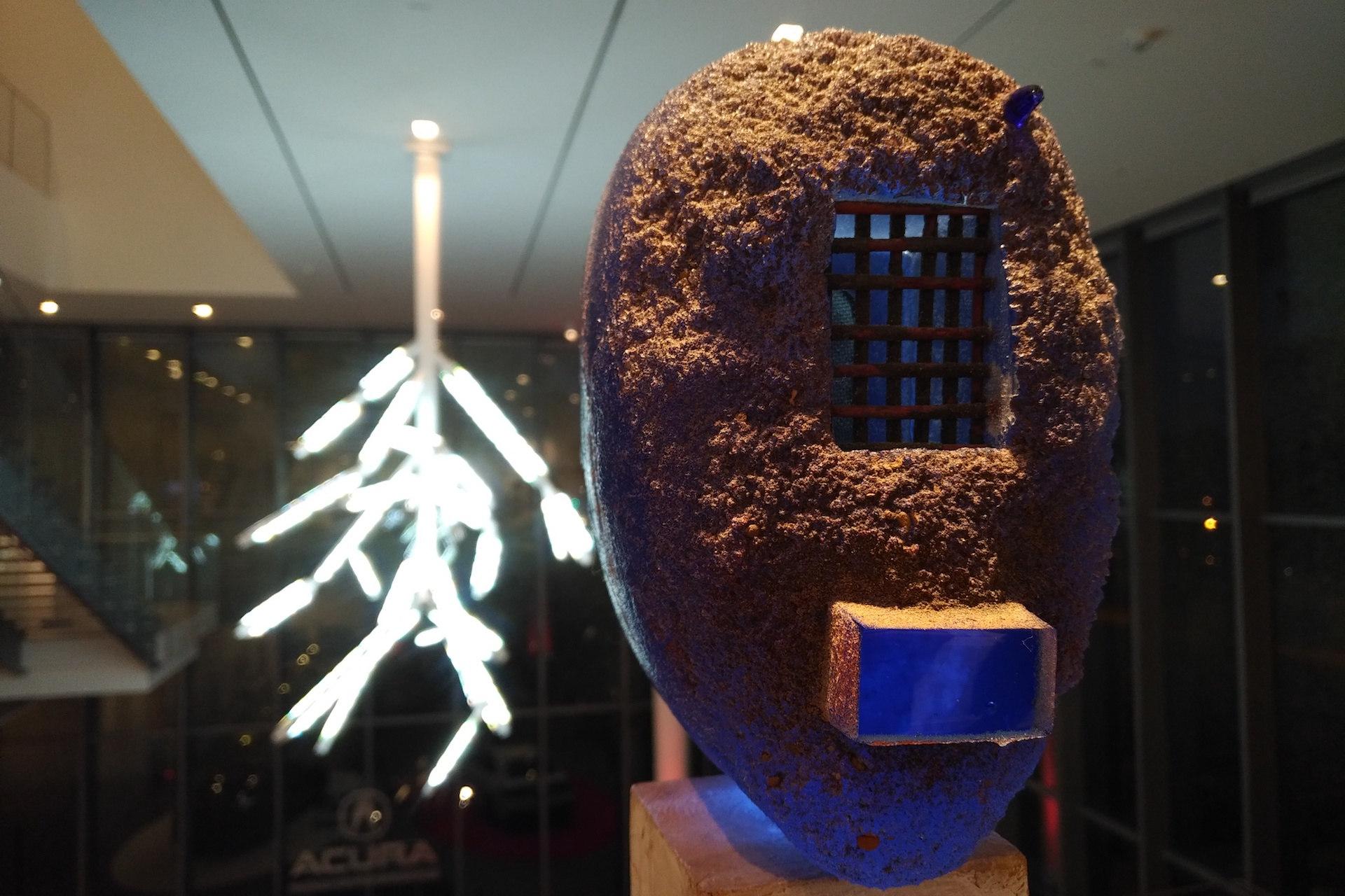
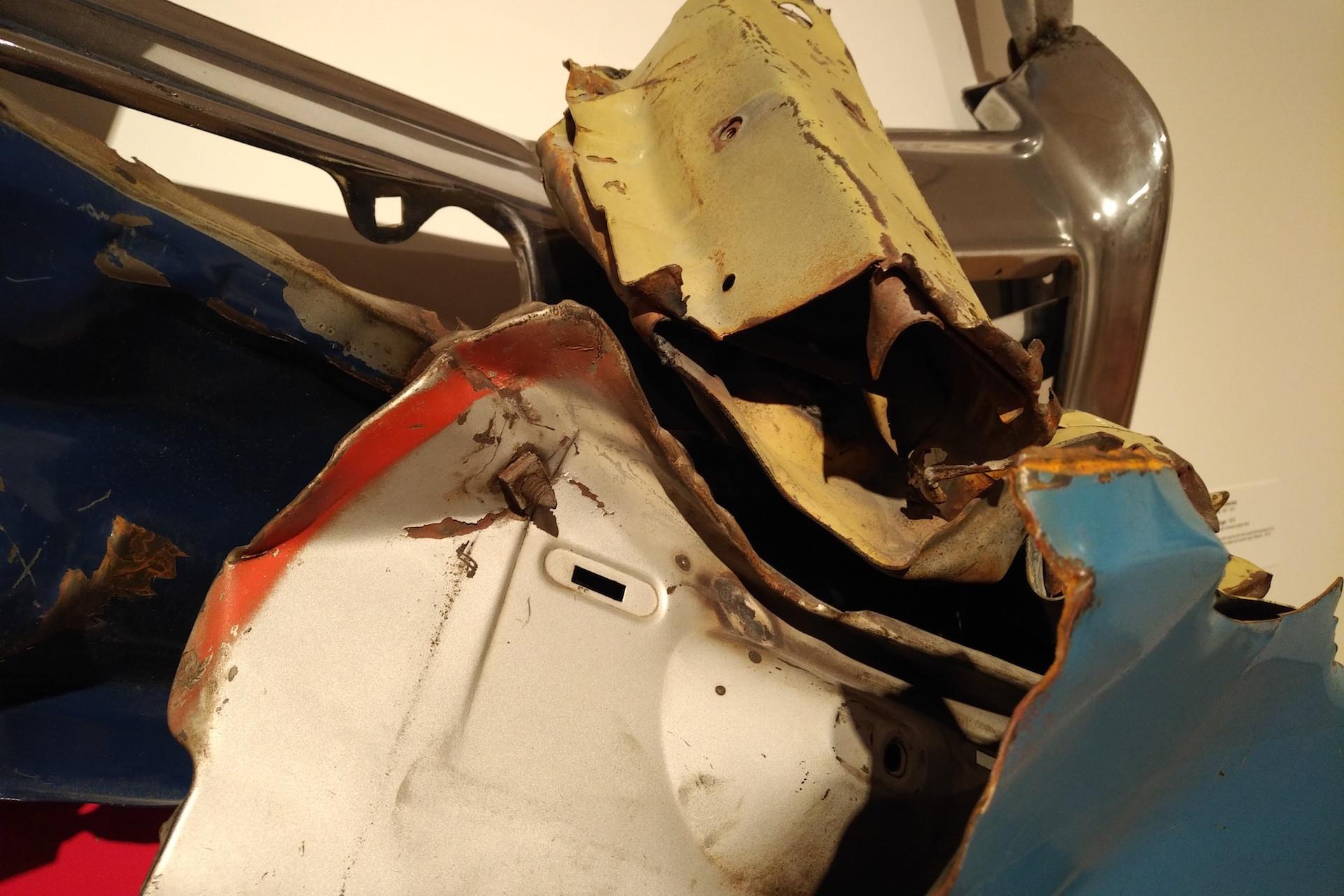
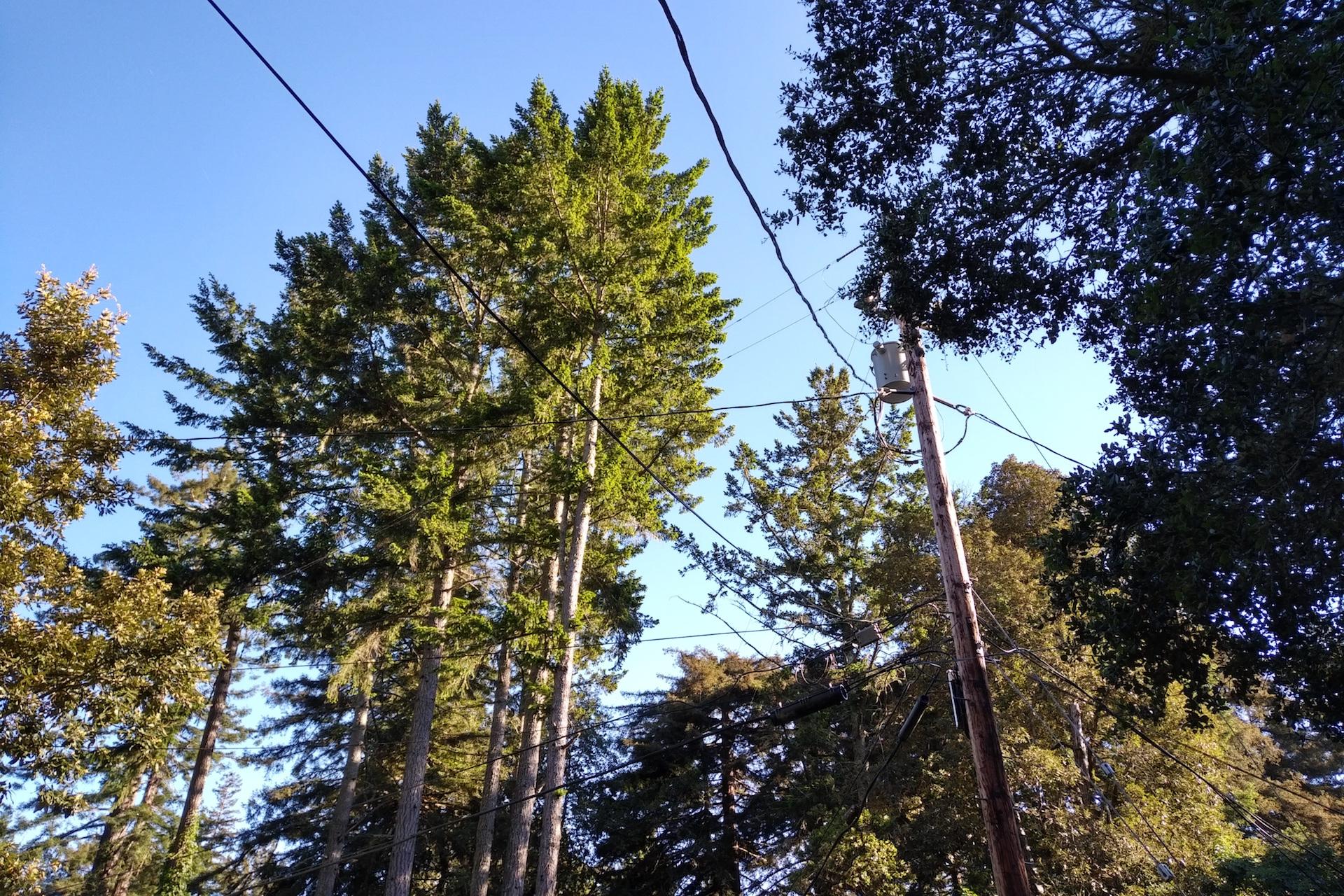
There are more sample shots in the gallery linked below
Battery
TCL's Snapdragon 625 gambit paid off: the KEYone offers some serious longevity. In an age when most high-end smartphones are lucky to last you a day, this newest BlackBerry will run for two typical days with regular use. The quote is 26 hours, and though your "mixed use" may not be the same as the "mixed use" that estimate is based on, you should still be able to spend plenty of time away from the USB-C charger.
When you are connected, courtesy of Quick Charge 3.0 you'll get about a half-battery of power in just over half an hour. That's assuming you're using a compliant charger, such as the one included in the box with the KEYone.
Wrap-up
Opting for a smartphone with a physical keyboard requires accepting a few not-insignificant compromises. The KEYone's primary argument is that, compared to an on-screen keyboard, its physical buttons take up less space: side-by-side with a full-touch 5.5-inch device, you end up with more visible screen remaining on the BlackBerry when typing on each.
That may be theoretically true, but I do think it misses the point. The bigger buttons of a virtual keyboard help raise my accuracy; they can change to show different characters, emoji, and more. When I'm not typing, meanwhile, they disappear altogether, freeing up the display for whatever else I might want to see. In short, buy a phone with a physical keyboard if you want that, but do it because you simply prefer the tactile feel of it, not for any stab at screen efficiency.
More fundamentally, the KEYone isn't a cheap phone. You're looking at $549 for the unlocked handset in the US, and that seems a lot for a Snapdragon 625 you'd commonly find in a midrange device. Of course, you're also paying for the more unusual design, the physical keys, and, to be frank, the fact that this is a niche phone for a smaller audience than, say, the S8 or iPhone 7.
That audience, I suspect, will find plenty to like. The KEYone does away with much of the weirdness of recent BlackBerry phones – the oddball Passport is best forgotten, frankly – and instead mixes the strengths of the classics with excellent battery life and a solid Android customization. What I'm not convinced by is the idea that this strategy will win users back from their Galaxy or their iPhone. For all TCL's arguments that hardware-QWERTY has a place in our pockets, the BlackBerry KEYone only serves to underscore just how firmly embedded we are in the age of the touchscreen.
