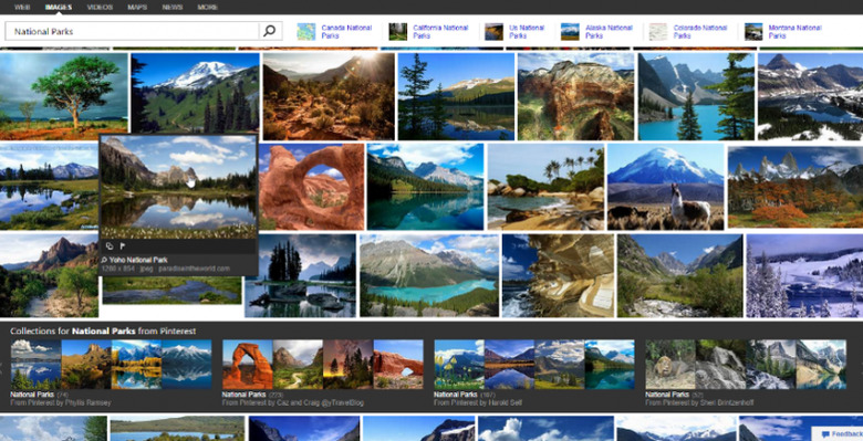
Bing Details Improved Image Search Ahead Of Rollout
Microsoft has updated Bing's Image search again, this time improving the experience as a whole with the intent of giving each individual user the best odds of finding the image they want. This is done by taking into account many things, including how the user browses through images, and will be rolling out to users across the globe over the new couple of weeks.
Things are kicked off on the Bing Blog with Microsoft explaining how it looks at search habits, breaking users down into two groups called "hunting" and "exploring", using things like search filters to determine what group a user is in. With the new user experience, as Bing calls it, Image search adapts to the user's needs.

The Image search page fills the complete width of the user's display, and suggestions are made tailored towards the monitor's resolution. Microsoft says this results in less clutter, among other things. The entire interface is made to be touch-friendly, with swiping and carousels being heavily involved.
Microsoft is light on the details about this right now, saying it'll have more info next week, and that Android and Kindle users won't be seeing them quite as soon. The interface presented on desktop and tablets are now unified. Beyond this, Bing has added what it calls a mini-header that follows the user as they scroll.
Through this mini header, the user can continue to refine their search as they browse images via suggestions. This is all wrapped up by the newly introduced "hover experience" that displays a search icon and link for images related to one that catches the user's attention.
SOURCE: Bing Blogs
