Bezel Vs Notch: Which Is The Lesser Evil?
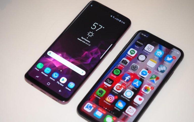
There's not stopping the notch. Not unless Apple, who can be credited/blamed for it, does as rumored. Even Google seems to be making provisions for a future where the notch will be more than just a thing. Discussing the notch, however, is impossible without discussing the problem it's supposed to solve: bezels. But are bezels really the bane of smartphone existence that OEMs seem to paint them to be? Or are we becoming too obsessed with pushing them out that we have resorted to tricks like notches?
Notch so fast
Apple really has to take the credit/blame on this one. The idea of a bezel-less phone predated the notch and OEMs like Xiaomi, Samsung, and even LG back then seemed content with leaving some bezel while they figure out how to properly solve this conundrum. Apple's design sensibilities, however, may have prevented it from accepting a compromise. It was either bezel-less or scram. And considering it hasn't had the time to figure out a proper solution for sensor placements, it went with what will now forever be known as The Notch.
It didn't matter to some OEMs whether that design ultimately made sense or not. Just the fact that Apple did it is enough incentive to do it too, often with a slight variation. Ironically, Apple might be ditching the notch next year, which would only prove it wasn't exactly a long-term solution to a problem. And that problem is also one of our own making.
Bezel-be-gone
The desire to have bezel-less screens has always been a matter of aesthetic rather than practicality. Bezels are, for the most part, ugly and their blankness seems to make some people uncomfortable. "Wasted space", they might think. Science fiction is partly also to blame for our obsession with all-glass phones. We are often presented in media with phones that seemingly blend into the background, sometimes translucently even. While they are indeed good to look at and can inspire R&D, they're called fiction for a reason.

(From Microsoft's Productivity Vision concept video)
But removing bezels doesn't come without a price. You'd have to find room for hardware that has now been evicted from their homes. Some, like the fingerprint sensor, is easy enough to relocate unless you're Apple. Others are possible to hide beneath the glass. Not all of them, however, that simple and create a lot of headaches that may make you wonder whether it's worth all the hassle in the first place.
Bezels are good (somewhat)
Bezels aren't pretty but they're not useless. At one point, they provided the necessary space to hide components beneath them. Though many of those can now be conveniently kept underneath the display panel, the bezels still house sensors, like the camera. Even Apple's notch doesn't exactly get rid of that. But bezels still have other benefits that might have been thrown out with the bathwater in the rush to give phones a prettier face.
Ergonomics
Not all blank spaces are bad. Imagine a world where there is no whitespace to keep words and paragraphs from running into each other. For tangible objects, empty spaces give us something to hold on to, and that's the same with screens. Bezels give our fingers and palms something to rest on without fear or worry of accidentally pressing the screen. Just ask any owner of curved Samsung Galaxy phone, and that has some bezels at the sides even.
Protection
Bezels also provide an additional level of protection to the display panel. While the glass is the first line of defense, the extra material that goes around the display serves to delay any damage that would otherwise render the screen completely useless. The bezels offer additional structural integrity, giving plastic buffering something to cling to in addition to the glass. The plastic helps to diffuse the force of impact that would otherwise also crack the screen immediately.
Simplicity
Displays with notches aren't easy to produce, at least not compared to regular whole ones. They have additional production costs, they risk lower yield, and they design and assembly workarounds. In other words, these fancy cutouts result in more work and expenses than just leaving some space at the top or bottom or both. That's not even taking into account the changes that have to be made to the operating system and the apps that need to take an uncommon display into account.
Notch so bad
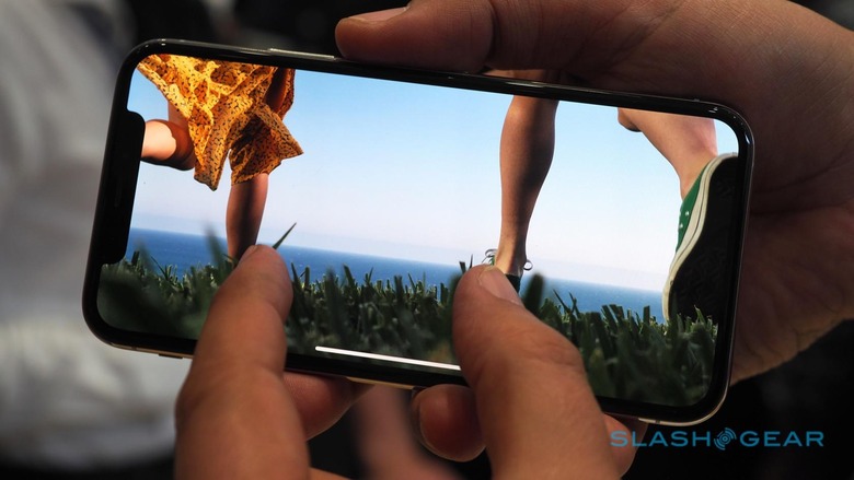
That's not to say that Apple's notch is a complete waste. Apple hasn't gone completely nuts. There is actually one, and probably just one, benefit to having a notch, and it's actually more of a side effect. It takes the notifications and status icons out of the main display. These icons take up rows of pixels on the screen, where the middle part is often unused. By shoving them to the sides, which is the only use you'll have for those empty sides of a notch, you leave more room for actual content. Unfortunately, the side-side-effect is that the notch, in turn, will eat into full screen content.

Wrap-up
The notch is a stop-gap, temporary solution to a long-term problem of relocating components out of the bezels. It was a necessary solution but only for Apple, not for other smartphone makers. And it wasn't even a proper solution if Apple's U-turn is to be believed.
There are ways to solve that problem. Ways that won't come back to haunt us in the future. Unfortunately, this whole notched trend highlights how the industry as a whole is prepared to throw out all reason, and all bezels, just to look hip, whether that makes sense in the long run or not.
