Apple Watch Review - Controversially Compelling
To call the Apple Watch polarizing is to do the splenetic depths of online argument around it an injustice. For the past few weeks I've been living in the eye of that storm, the contentious wearable on my wrist. I've worked with it. I've traveled with it. I've exercised with it. I drew the line at showering with it, though Tim Cook says that's okay too. And all along the way – well, perhaps not in the shower – people have asked me that one question no other Apple product has faced to quite the same extent: is the Apple Watch really worth it?
Unlike a lot of people trying the Apple Watch, or smartwatches in general for that matter, I did wear a watch before. I say that not to position myself as some sort of horology expert – far from it – but because I'm already familiar both with having something on my wrist all day, and with the glance-to-check-the-time gesture that has for many been eclipsed by checking the time on their phone.
Apple Watch builds on that glance – a glance+, perhaps – with a combination of features both familiar from earlier wearables and new functionality. It's not the first smartwatch that works with an iPhone, but it promises to be the best integrated.
Hardware and Bands
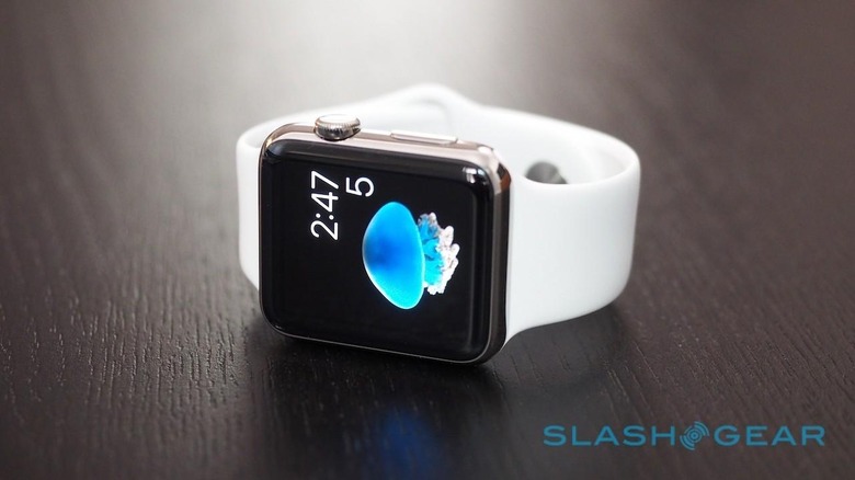
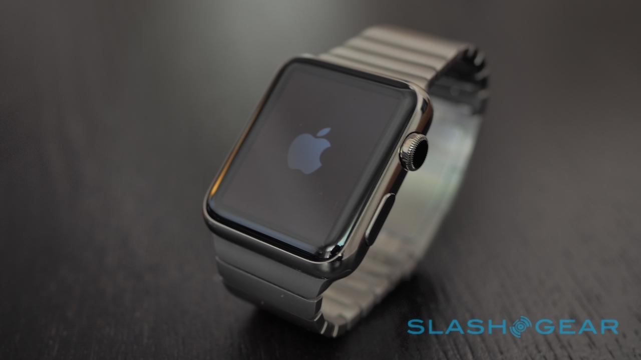
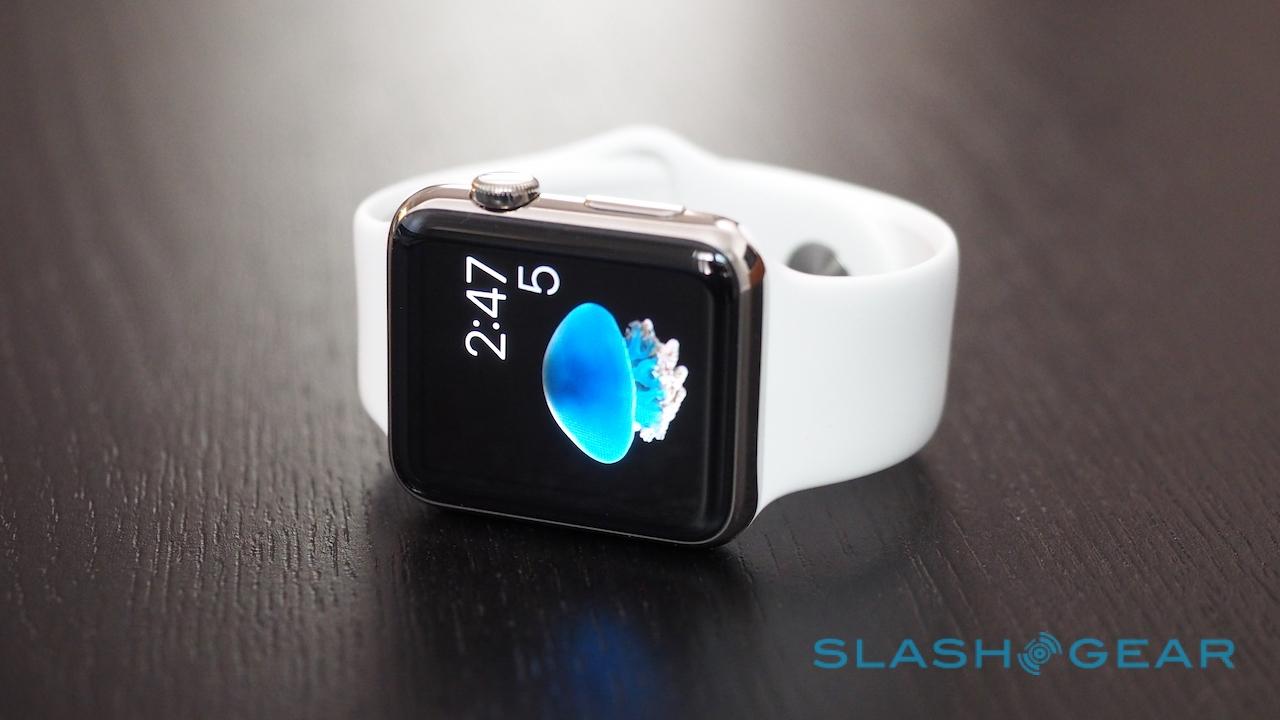
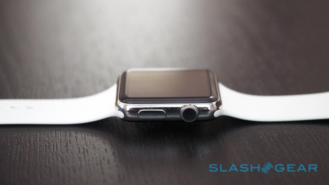
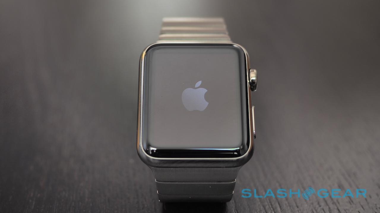
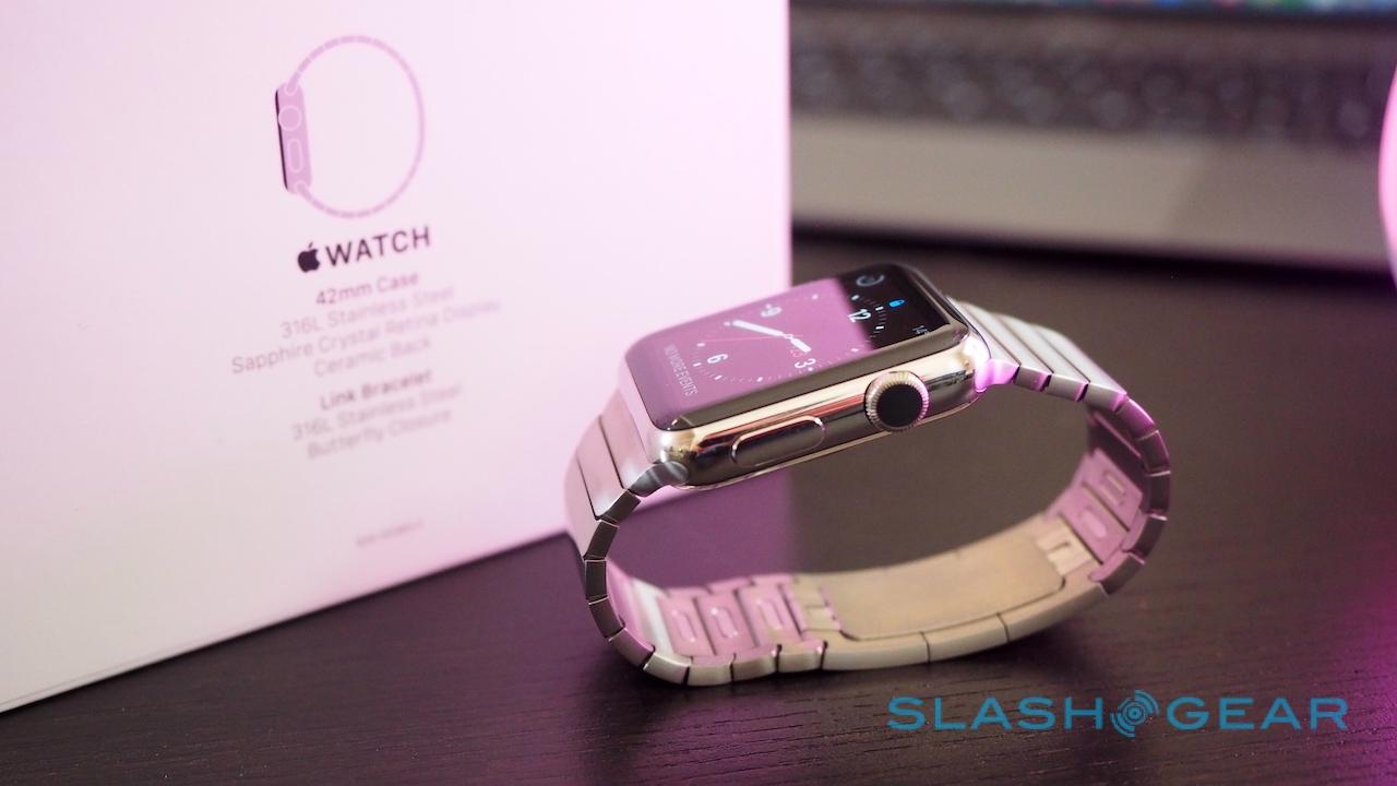
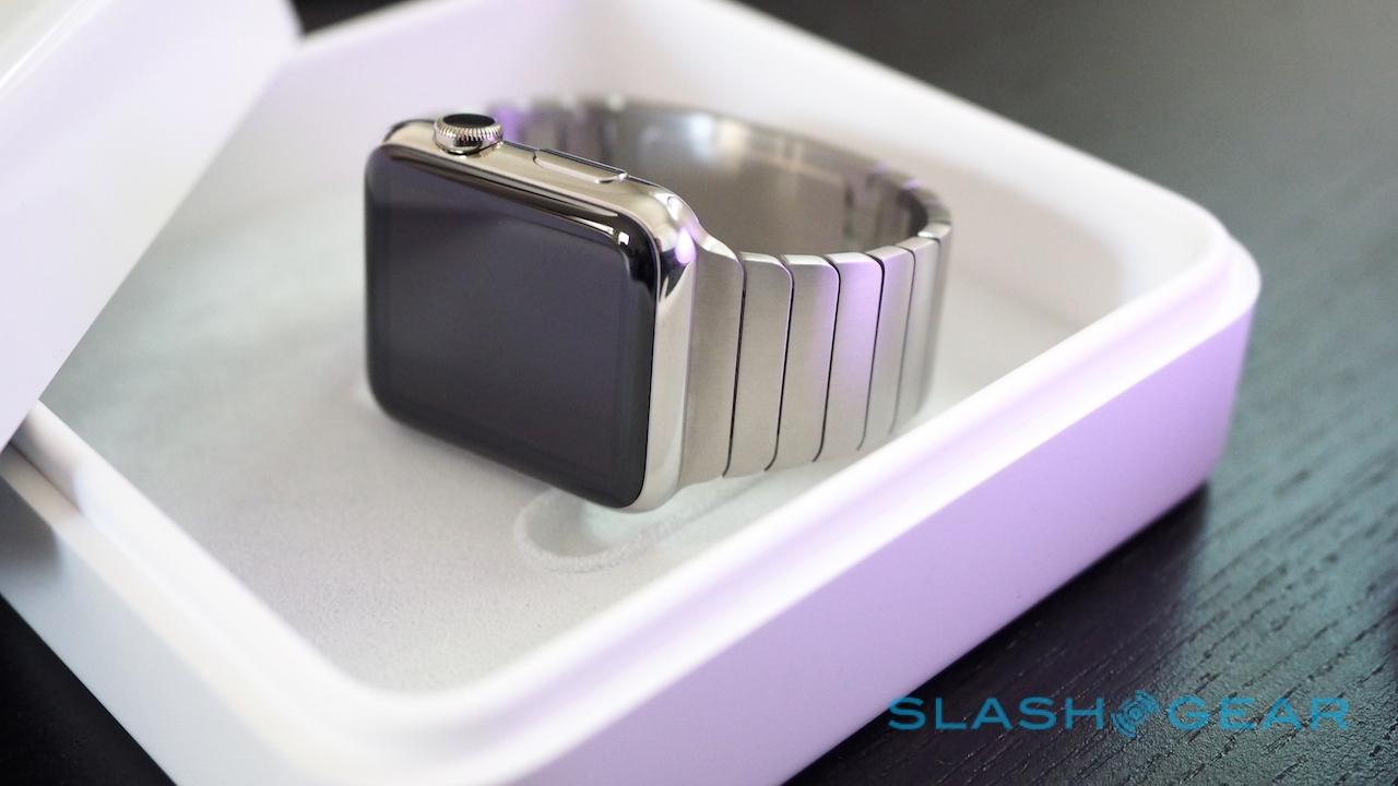
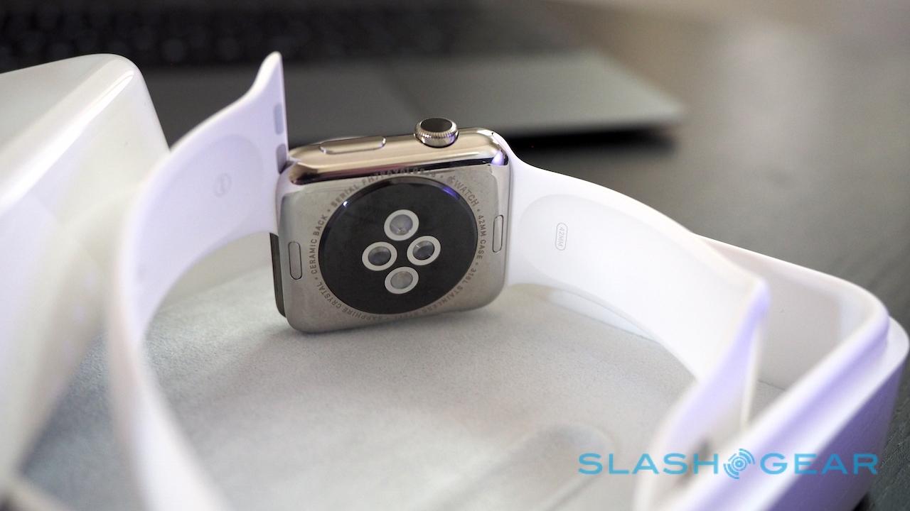
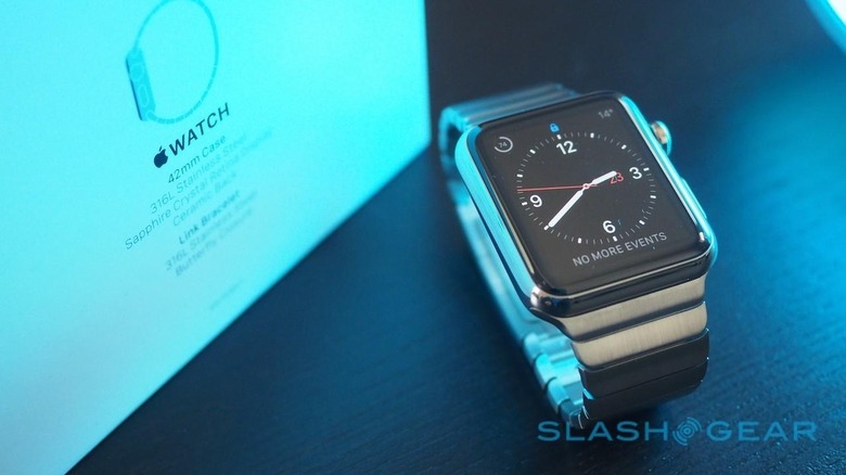
I can't knock Apple's attention to detail. The Apple Watch design may be relatively straightforward – a pillowy square of metal and glass, with a couple of controls on one side – but it's incredibly well constructed. Unlike most smartwatch manufacturers, Apple opted to have two sizes of Apple Watch from the outset. The smaller is 38mm, while the larger comes in at 42mm.
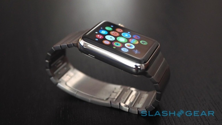
Both have an OLED touchscreen, running at 340 x 272 on the smaller model and 390 x 312 on the larger. Either way it's crisp and bright, with Apple's predominantly black color scheme not only playing well to OLED's strengths but blending smoothly into the surrounding bezel so that graphics look like they're floating in the glass.
Inside, Apple isn't talking specifics when it comes to processor, preferring to leave the homegrown S1 chipset something of a mystery. For the user, the most important things to know are that it has 8GB of storage, of which up to 2GB can be used by music and up to 75MB for photos.

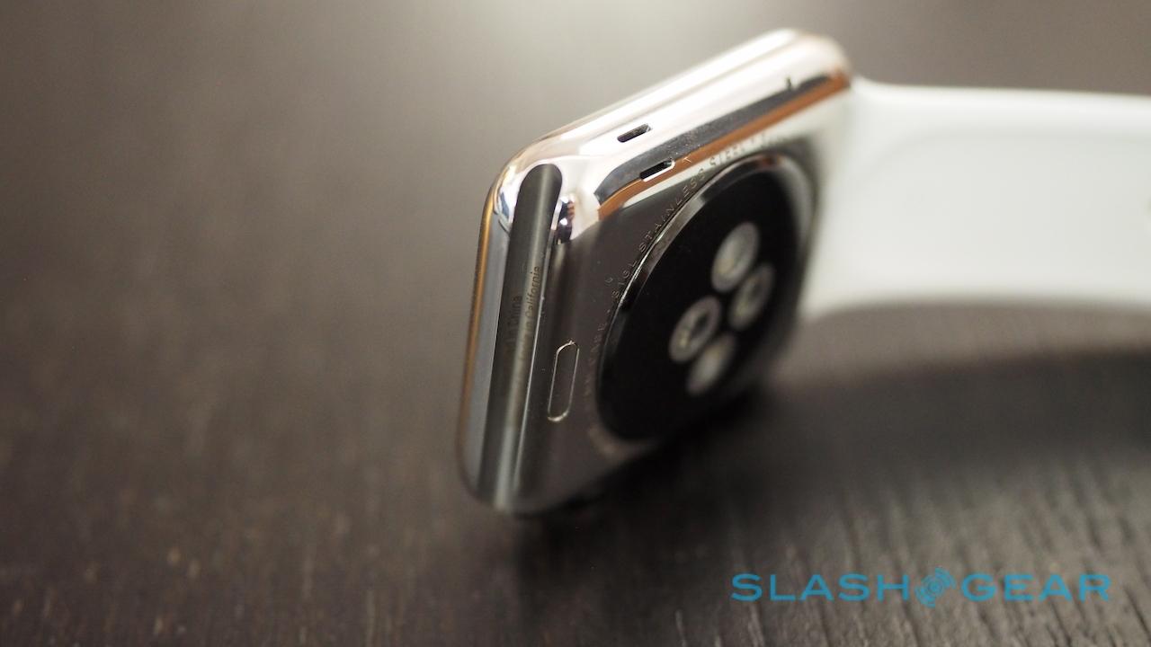
There's a little chunk to the casing, at 10.5mm thick for the smaller Apple Watch and 10mm for the larger, but that has allowed for IPX7 waterproofing. Apple says swimming is out of the question, however, so think more along the lines of up to a meter of submersion for 30 minutes at most: showering, washing your hands, or getting caught in the rain shouldn't be an issue.
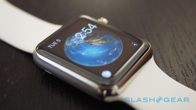
Apple has three tiers of Watch, though for most of us there are really only two. Entry-level is the Apple Watch Sport, priced from $349 for the 38mm and from $399 for the 42mm; it comes with a brushed-silver aluminum case and a sport band made of flurorelastomer.
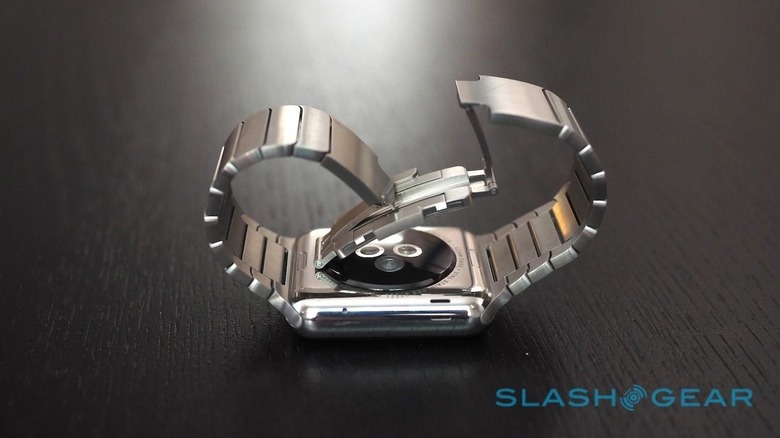
Midrange is the Apple Watch, from $549 for the 38mm and from $599 for the 42mm. It's finished in polished stainless steel and has a sapphire coverglass, unlike the regular toughened glass of the Sport model. As standard it comes with a sport band too, but there are also a variety of other leather and metal options, including the distinctive Milanese Loop with its fine mesh band and magnetic clasp.
Top of the range – and out of the reach of the majority – is the Apple Watch Edition. Kicking off at a heady $10,000 for the 38mm or $12,000 for the 42mm, it's offered in rose gold or yellow gold. Functionally, it's worth remembering, it's also the same as the Apple Watch Sport.
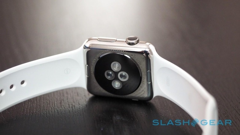
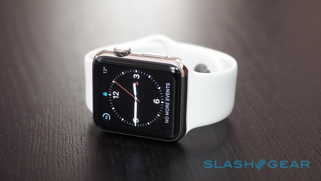
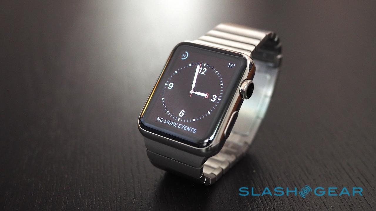
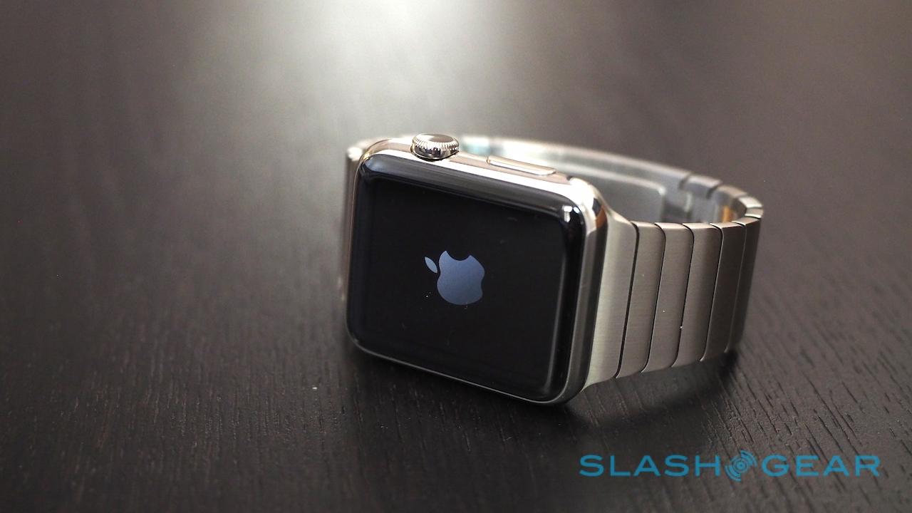
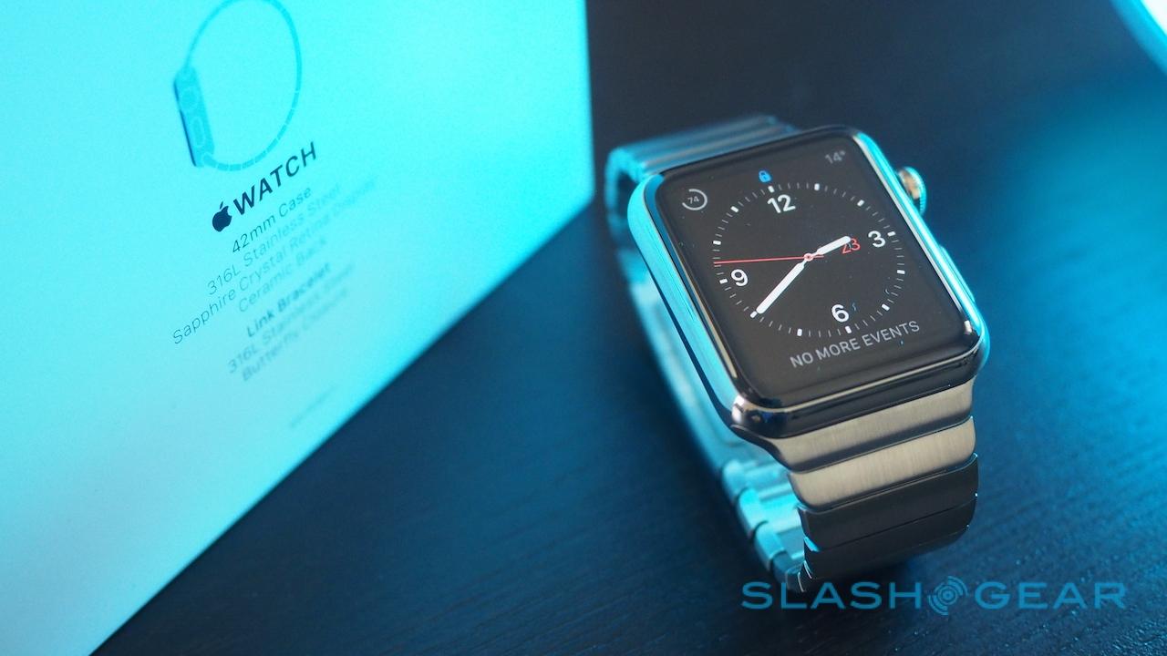
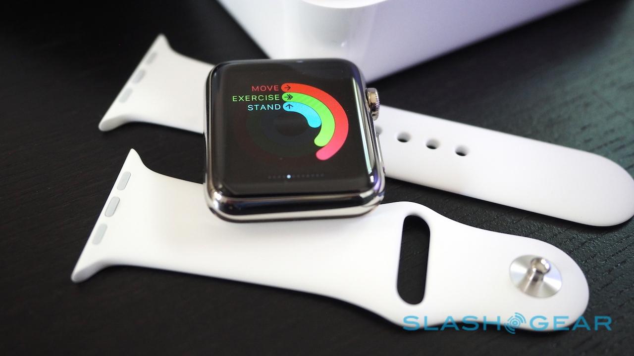
Apple provided me with the 42mm Apple Watch, along with a white fluroelastomer strap and the Link Bracelet. Individually, those straps can be bought for $49 and $449 respectively; a Milanese Loop will set you back $149, as will one of a number of leather bands in various colors.
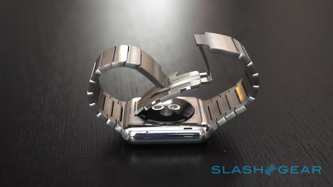
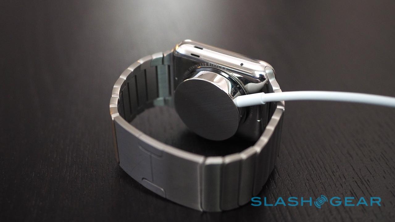
Swapping them is a whole lot easier than with most watches: jab a thumbnail into the small buttons on the inside edge of the casing, slide out the existing strap, and then click a new one into place. Even adjusting the Link Bracelet – normally a style which would require either a jeweler or some fiddly work with a screwdriver yourself – is straightforward, the segments having quick-release buttons of their own so that they can be resized entirely without tools.

I have several straps for my "regular" watches but can seldom be bothered with the rigmarole of changing them. In contrast, it takes just a couple of minutes to switch out the sport strap for the Link Bracelet.
Setup and iPhone app
Setting up Apple Watch requires the companion iPhone app which arrived as part of the iOS 8.2 update. Pairing is a matter of squaring the on-screen animation the Watch is showing in the gaze of the iPhone's camera, and then waiting anything from 5-10 minutes for the two to become friends.
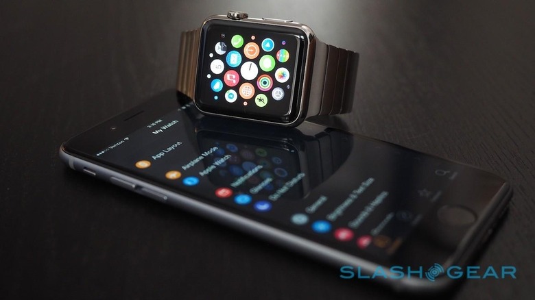
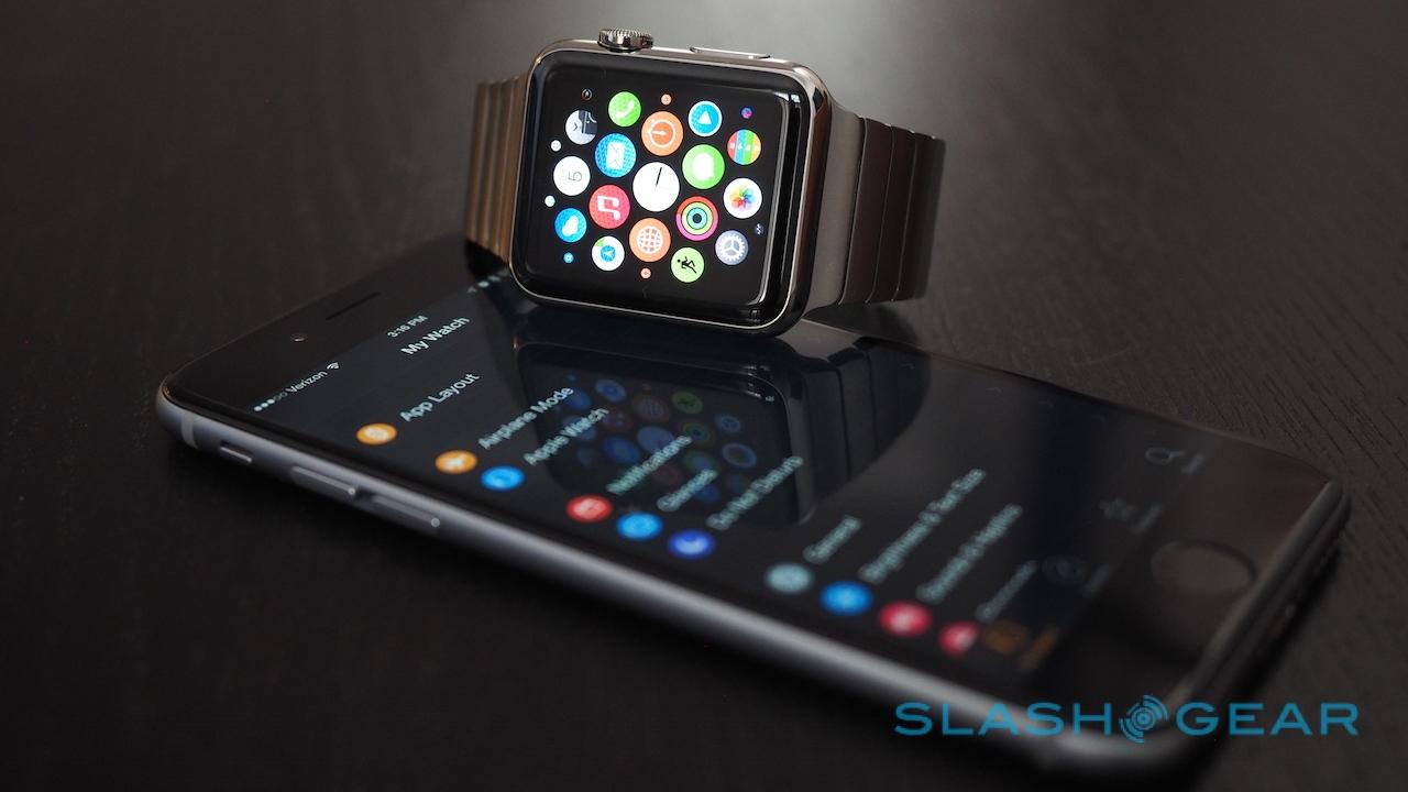
While that's happening, you can dig into the other settings in the iPhone app. As well as links to Apple Watch applications in the App Store, it handles all the ways the wearable integrates with content on your phone. It's also where you push apps from iPhone to Watch: just because a developer has added Apple Watch functionality, it doesn't mean you need to have it active, and it's up to you whether you install it across.
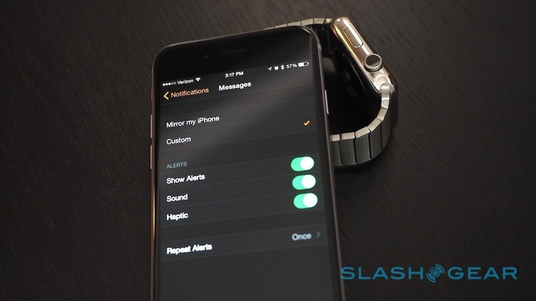
The Watch uses Bluetooth to communicate with the iPhone, though if you're out of range then it can switch to WiFi as long as both are on the same network (which the wearable cribs from your iPhone's settings). However, in that situation the functionality is a little more limited: you'll be able to send and receive iMessage and Digital Touch Messages, and use Siri, but other network-dependent tasks won't be possible.
Interface
For years, the iOS interface has been effectively the same: a homescreen of app icons, a physical button to return to it, and more recently a pull-down notifications pane from the top of the screen, and a pull-up settings pane from the bottom. Apple Watch, though, is different.

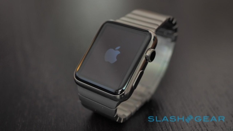
To begin with, you get two physical controls: the Digital Crown which can be turned and clicked, Apple's reinterpretation of the winding knob on a traditional watch, and a lower-profile button alongside it. What each does depends on how many times you click them and where in the interface you are currently.
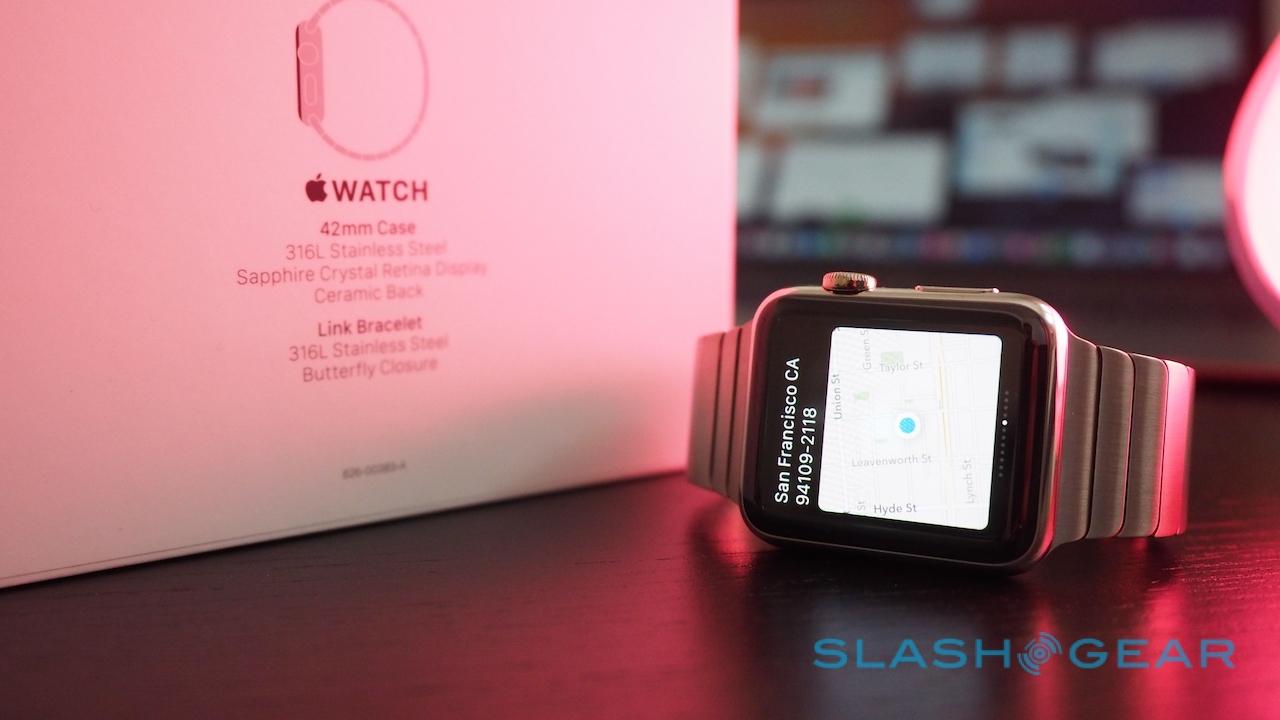
You start from the watch face. Swiping down from the top opens up any recent notifications – a small colored dot tells you whether you have any waiting, though not of which type they might be – while swiping up from the bottom opens the Glances carousel. That's where a shortcut settings "card" lives, for toggling airplane mode, do-not-disturb, and making your iPhone bleat when it's lost down the back of the sofa cushions, along with a number of other app-specific cards that pull out the single salient fact they believe you'll be most interested in.
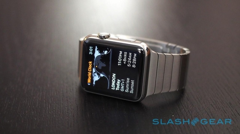
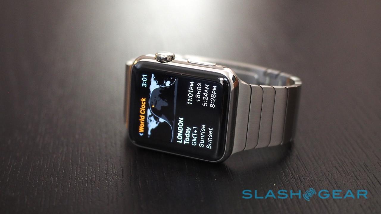
So, the Apple Maps card shows you a thumbnail map and your current position on it, while the Activity card shows a summary of how active you've been that day. There are cards for the Calendar, and the Music player (which can control any currently-playing track on your iPhone, whether it's from Apple's own app or a third-party one like Spotify), and third-party apps can optionally be allowed to add a card of their own, too.
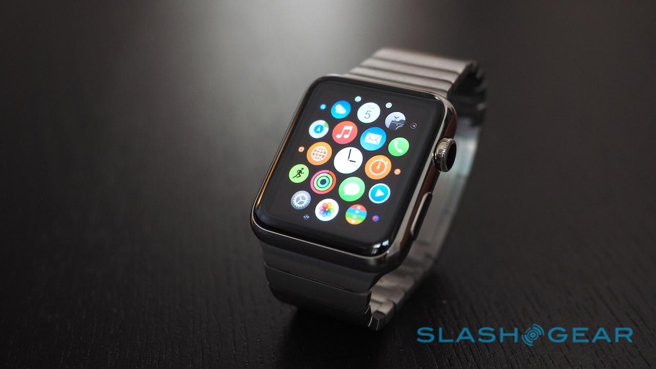
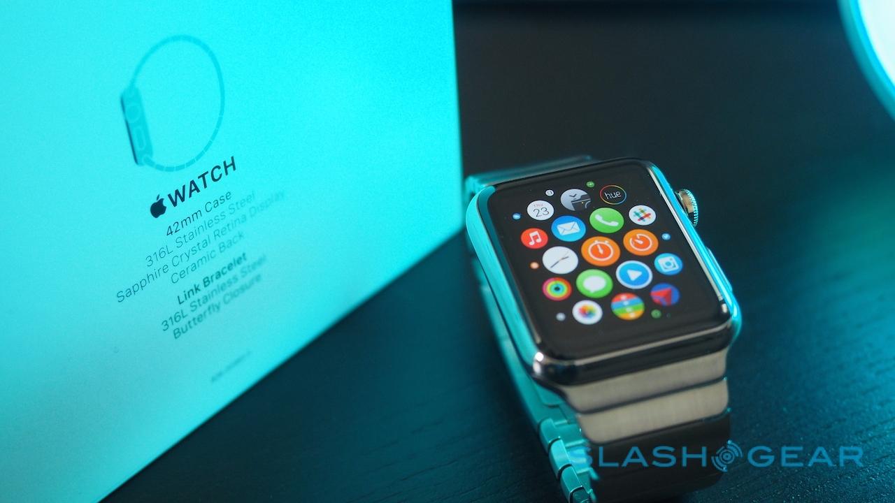
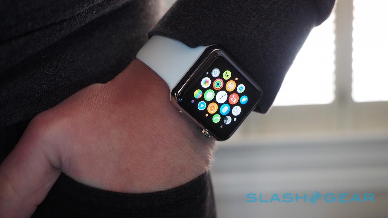
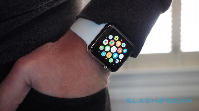
Clicking the Digital Crown takes you back to the watch face, and another click opens up the app launcher. It's a honeycomb of small circular icons, around which you swipe to navigate, use the Digital Crown to zoom in or out, and then tap to open. By default, Apple's core apps are clustered in the center and any you load later are sprinkled around the edges, but the layout can be manually organized in the iPhone app.

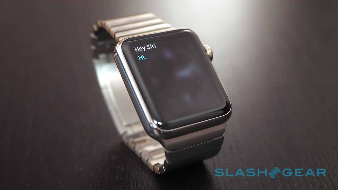
As you load more software, this screen is undoubtedly going to get more confusing. There's no app labeling, so it's a matter of recognizing the icon or perhaps remembering where it was located. Alternatively, you can long-press the Digital Crown – or just say "Hey Siri" when the screen is on – and ask for an app to be launched.
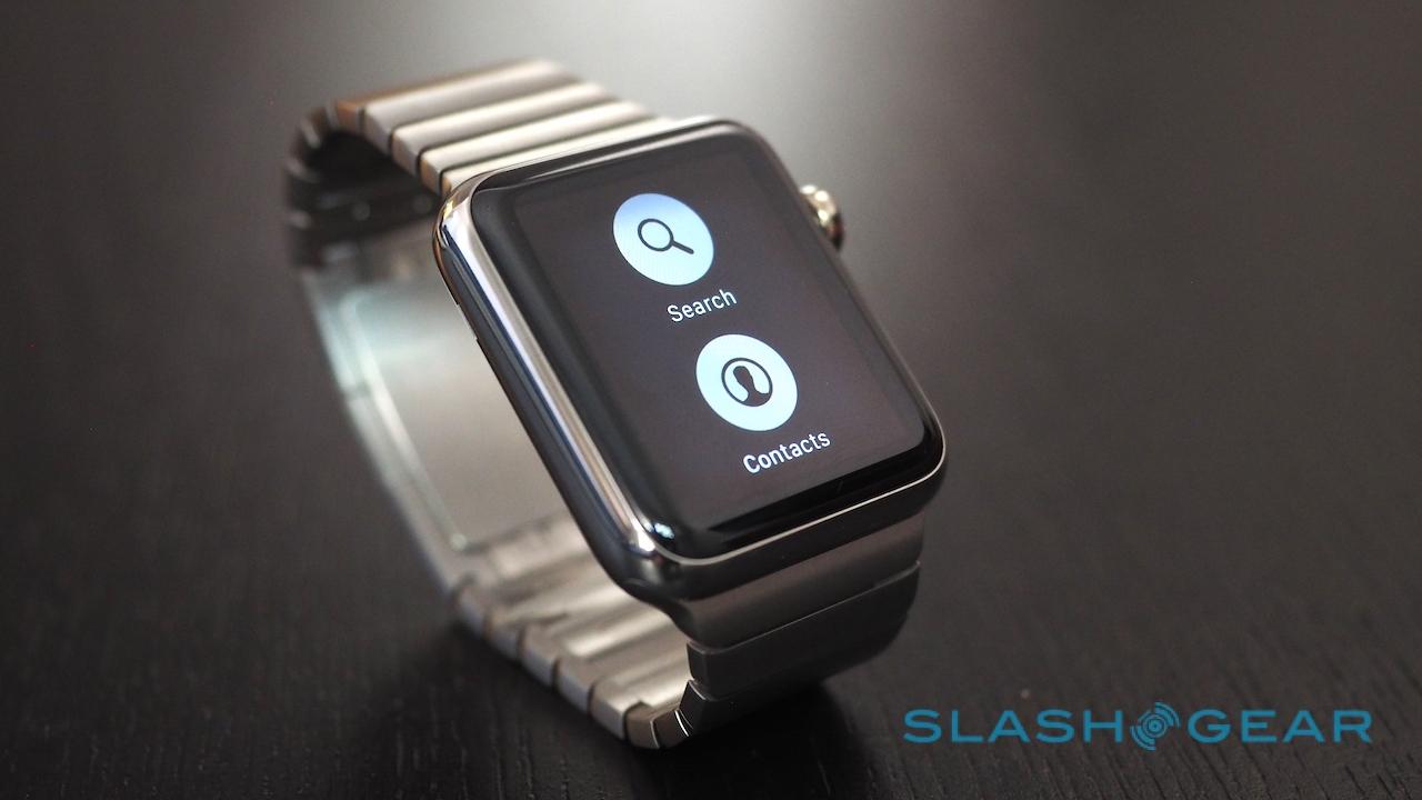
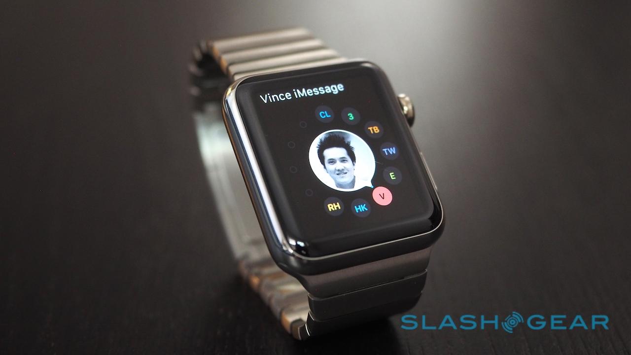
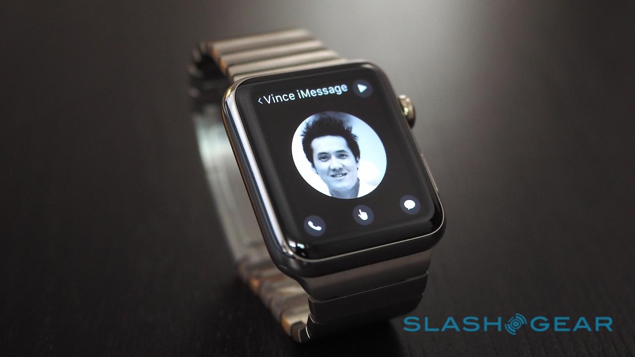
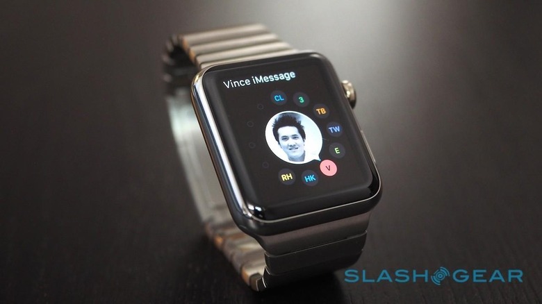
Clicking the second button opens the contacts screen, a circular dialer for your twelve favorite people from which you can call them, message them, or use some of the Apple Watch's more unusual communications methods like Digital Touch. A double-click opens up Apple Pay to your default card.
The final – and perhaps most poorly-explained – part of the interface is Force Touch. Apple Watch can measure not only a tap but the pressure with which it's applied, using it as a sort of long-press only without the wait. Press more firmly on the list of notifications, for example, and you get the option to clear them. What makes it confusing is that there are no indicators of when Force Touch might be supported: you just have to try it and see.
Watch Faces
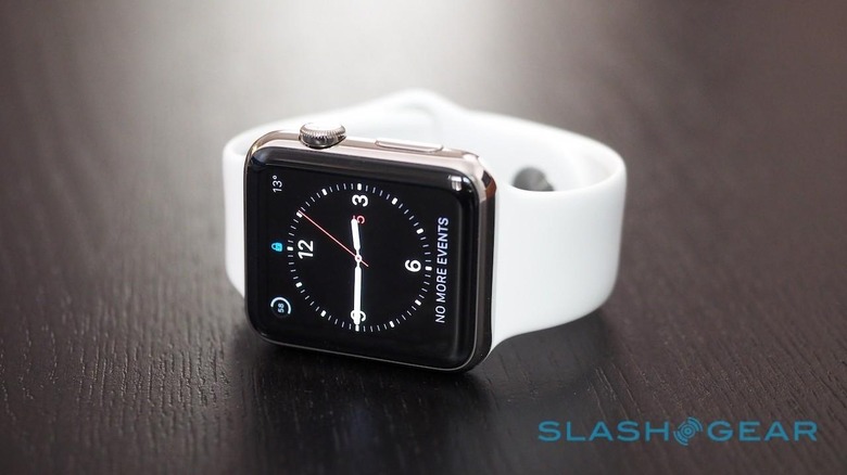
I'm of the opinion that any smartwatch has to primarily be a good watch: you want it to tell the time quickly and reliably. Apple Watch wakes automatically when you lift your arm, and for the most part it's been pretty consistent at spotting that gesture. It does require a definite tilt of the wrist, though. There have been times when I've had my arm on the desk in front of me and wanted to check the time, but a discrete flick hasn't been sufficient to wake it. Tapping the display will wake it up too, if you don't feel like moving your arm.
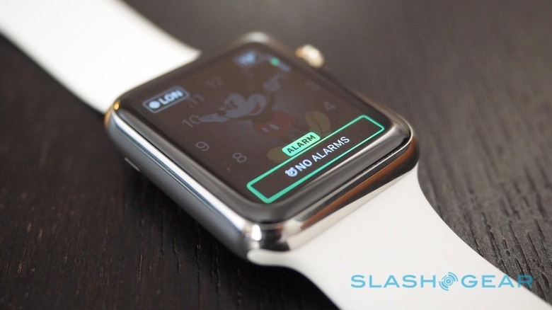
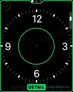
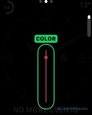
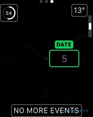
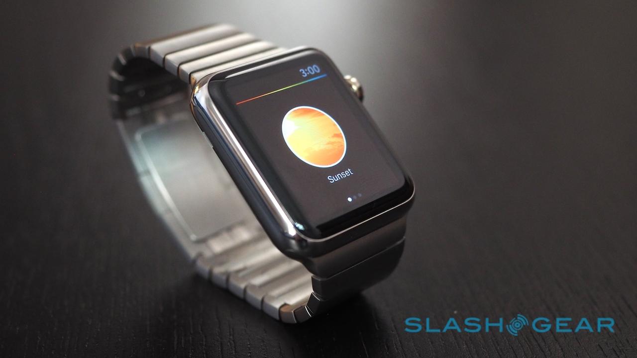
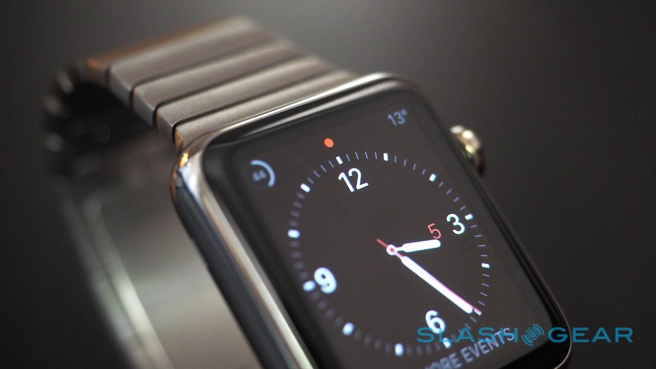
Apple includes ten watch faces, with varying degrees of customization supported. They range from the traditional, either digital or analog, through more typical smartwatch fare, to the Mickey Mouse face and ones with animated solar phases or jellyfish.
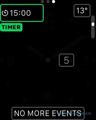
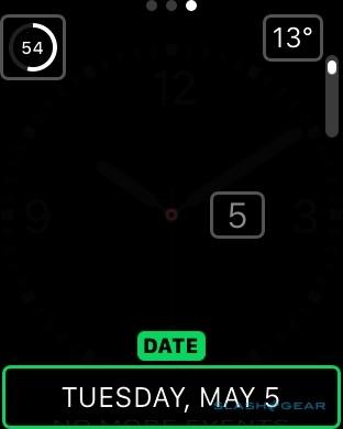
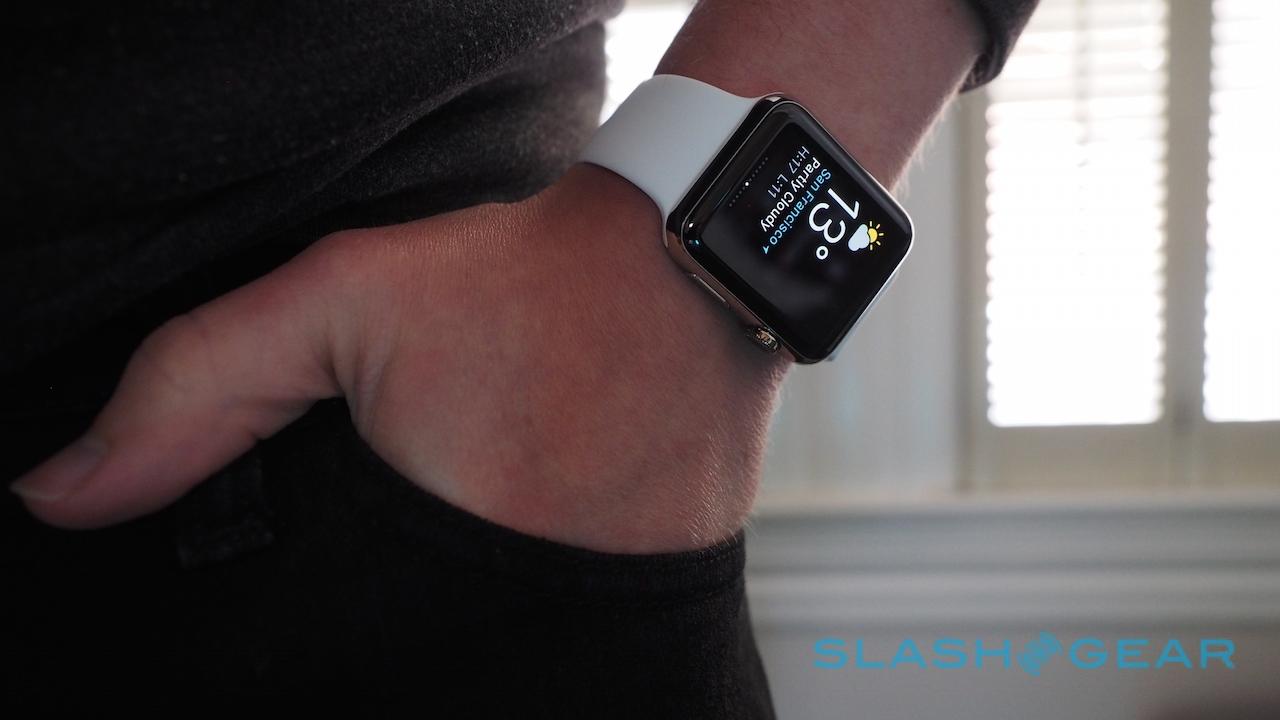
Depending on the face you choose, you may have one or more "complications" to set. That might be a battery gage, or the next appointment pulled from your calendar, or the current temperature; tapping them opens up the respective app on the watch. Right now, you can save your customized creations but there's no way to create or load a new watch face altogether.
I'm hoping that changes, since we've seen how creative Android Wear developers can be when they get the keys to your watch face (admittedly, Google's smartwatches didn't launch on Day 1 with that support either). In an ideal world, the tools would be so straightforward that programming novices could tweak their own layout in a manner similar to the complications: adding another hand to the analog face, for instance, that counts steps.
Notifications
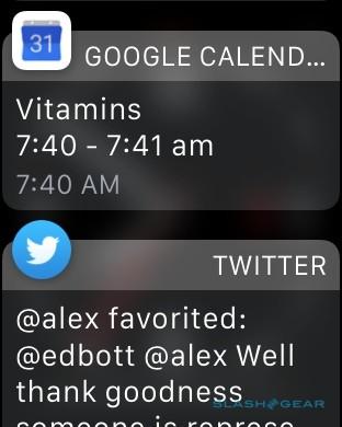
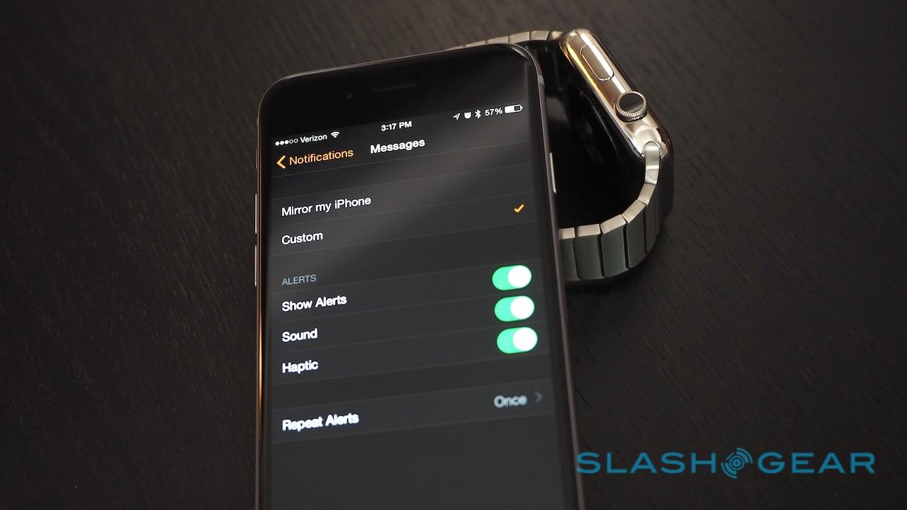
If you're anything like me, your days – and your nights, if you foolishly forget to turn on "Do Not Disturb" – are regularly punctuated by bleeps and buzzes from your phone. The Apple Watch can decant all of those to your wrist, if you really want it to, but I found it works far better if you get strict about what makes it through.
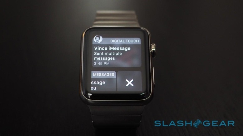
That's all done from the iPhone, and you can toggle on and off notifications on a per-app basis. Some only directly mirror what would normally pop up on your phone, while others can be customized to include only sound, only haptics, or both.
At the core of the Apple Watch is its Taptic Engine, a linear actuator rather than a simple vibration motor. It doesn't matter if you don't know what a linear actuator is: you'll tell the difference on your arm.
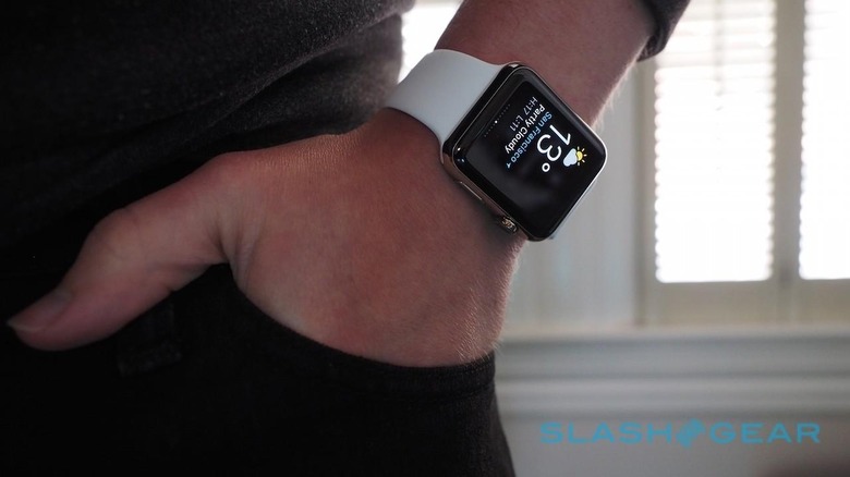
Basically, the feeling is more like a tap than a buzz. It's an odd sensation initially, more of a tightly-sprung robotic finger patting you on the wrist than a human finger (assuming you can imagine what that might feel like), but not an unpleasant one, and it allows for more refined differentiation between the various haptic alerts.
Some of the improvements over other smartwatches seem relatively commonsense, though are no less welcome for that. I've worn plenty of Android Wear watches, and I wish that they – like Apple Watch – didn't automatically light up with every new alert. Apple's wearable instead waits for you to actually lift your arm and, combined with the fact that the Taptic Engine is much quieter than a traditional buzzing vibration, those around you needn't even know you got a notification if you keep your poker face.
Apple has also been sensible with how it handles double-notifications: namely, it doesn't give them. If you're using your iPhone already, the Watch stays silent and alerts come in as normal on the phone. If your phone is in your pocket or bag, however, only the Apple Watch will ping with your notification.
Exactly how one-handed Apple Watch is when it comes to alerts depends on how quickly you react, I discovered. If you lift your arm as soon as the notification arrives, not only will the display turn on but you'll get a splash-screen showing the type of message – whether email, Twitter, Slack, or something else – and then the notification itself.

Ignore the buzz however, and lift your arm later, and you have to manually pull down the notifications pane from the top, even if there's only been one alert since you last checked. The Apple Watch won't automatically show you what you've missed.
Annoyingly, even after you've done your prep work and figured out exactly what you want to tap you on the wrist, what you can do in response to those notifications varies considerably. It's not entirely Apple's fault. If I were entirely wedded to the Cupertino ecosystem things would've gone smoother.
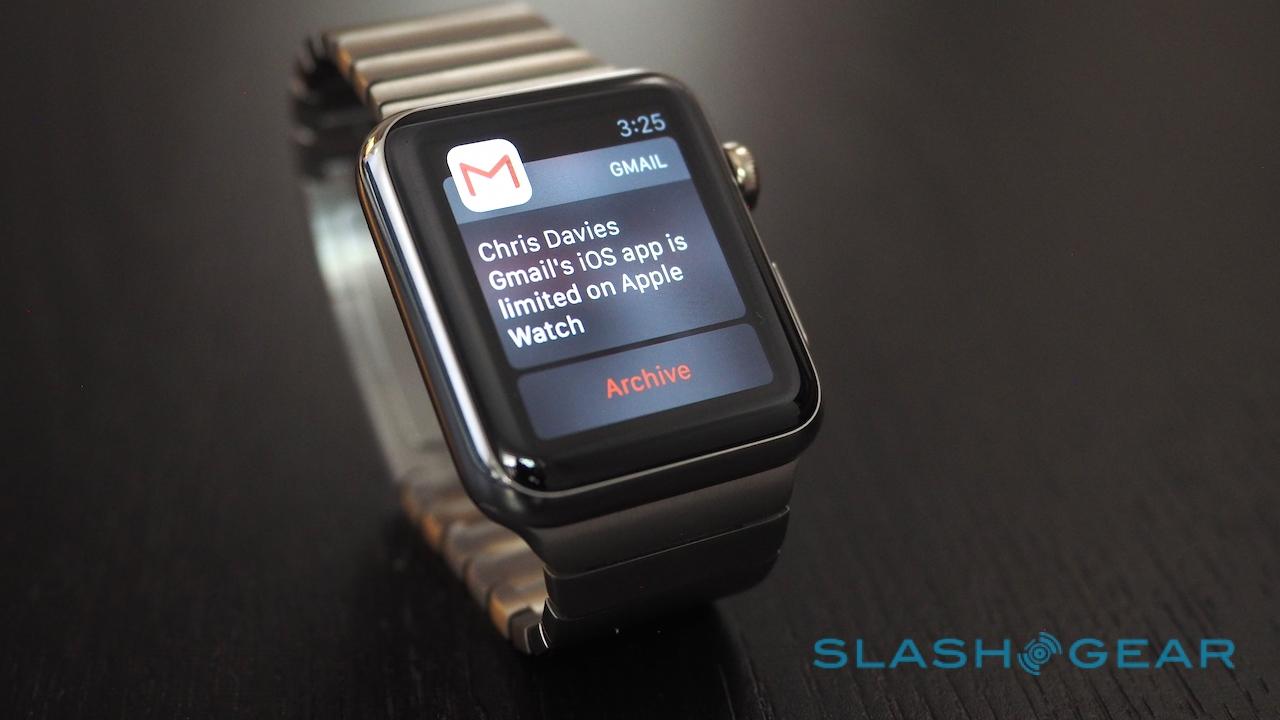
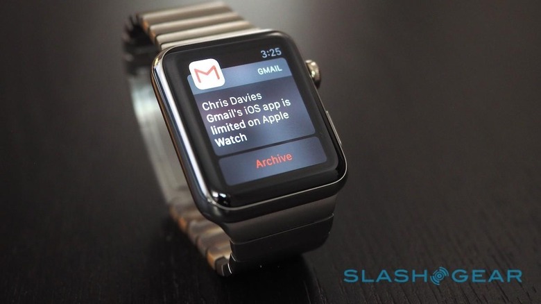
Had my email been handled entirely through the Mail app, for instance, I'd be able to reply to new messages, flag them, mark them as read or unread, or trash them. Instead, I was using the Gmail app for iOS, which meant I only saw a brief excerpt of the email and then could only archive it; if I wanted to do anything more, I needed to open it on my phone.
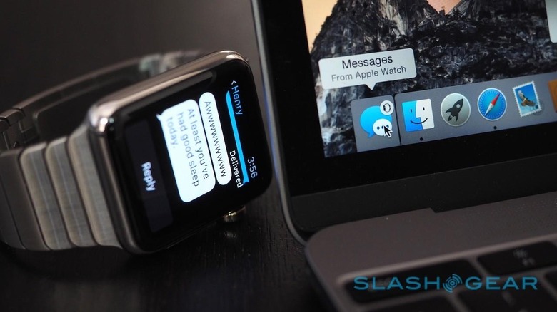
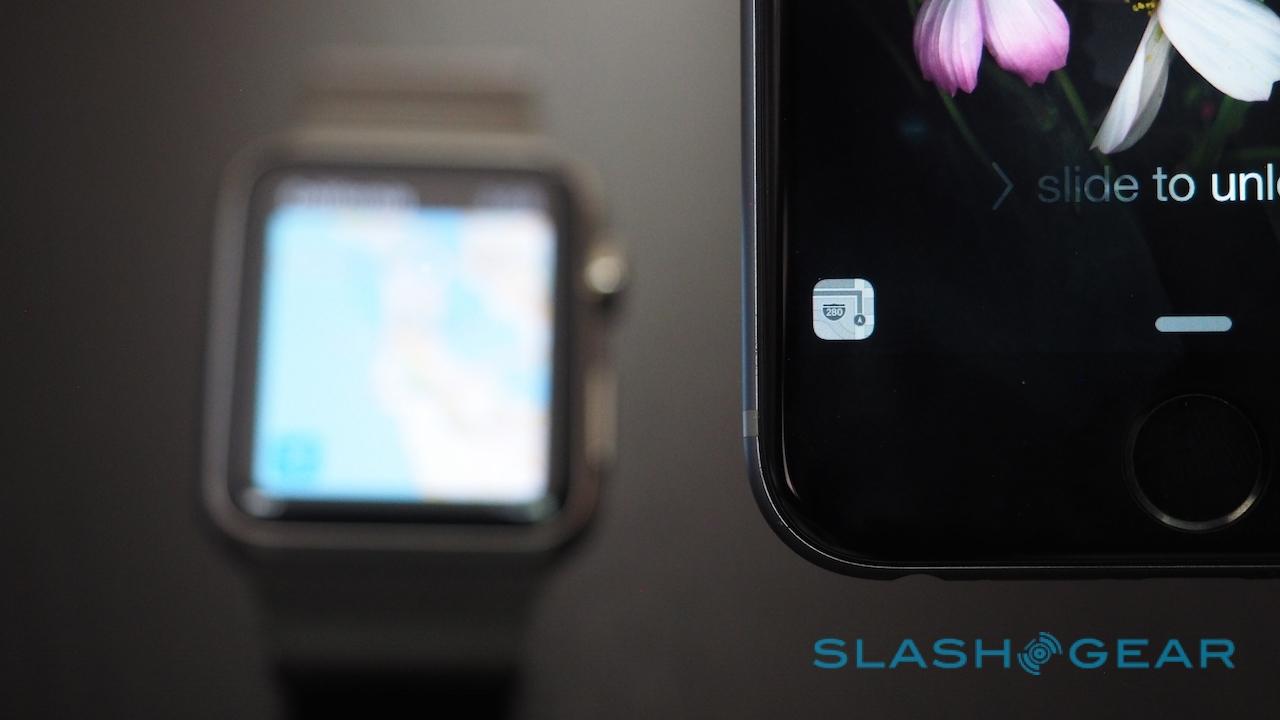
Making that process easier is Continuity: swipe up on the Gmail icon that appears in the lower right corner of the iPhone lock screen when you're looking at a Gmail notification on Apple Watch, and the same message automatically opens in the full app. It works on OS X, too, with an Apple Watch icon showing up on the far left of your dock.
Similarly, though Google Maps popped up notifications on the wearable when I had a turn coming up, it didn't give me the discrete tapped directions that Apple Maps could. Expect twelve steady taps if you need to make a right, or three pairs of two taps to go left, but not if you're using any other navigation app than Apple's own.
Apps
Right now, there are effectively two breeds of apps for Apple Watch: Apple's own, and those from third-party developers. The former – as you might expect – work best, assuming you're already using their counterparts on the iPhone.
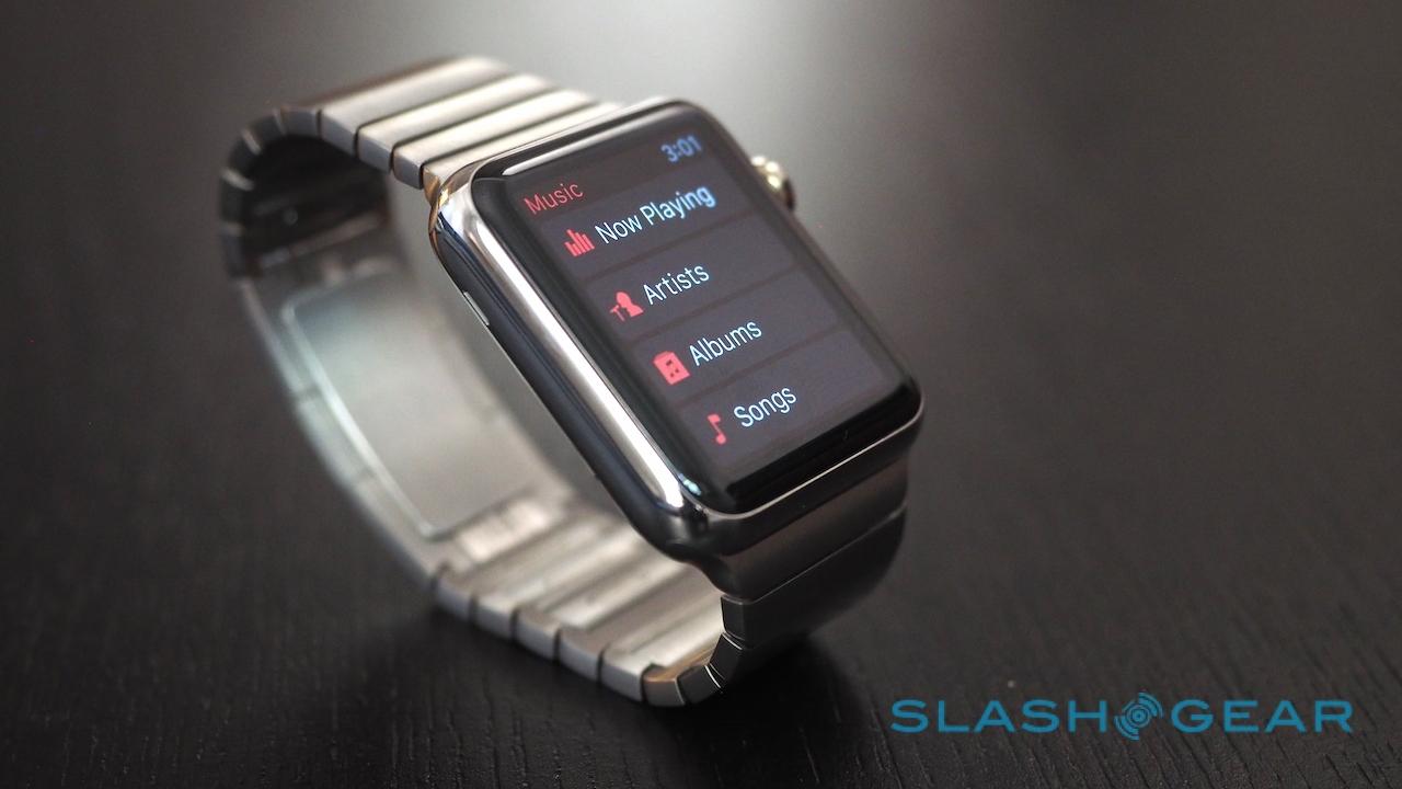
So, you can answer calls on the Watch and use it as a speakerphone, or call your favorite contacts (though there's no regular dialer). Your calendars come through, along with any photos you've saved to your Favorites folder on your iPhone, and there's the usual alarm, stopwatch, and timer functionality.
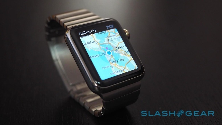
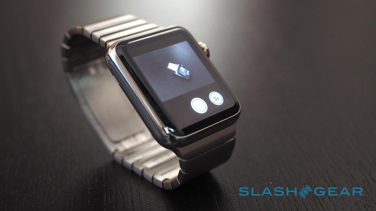
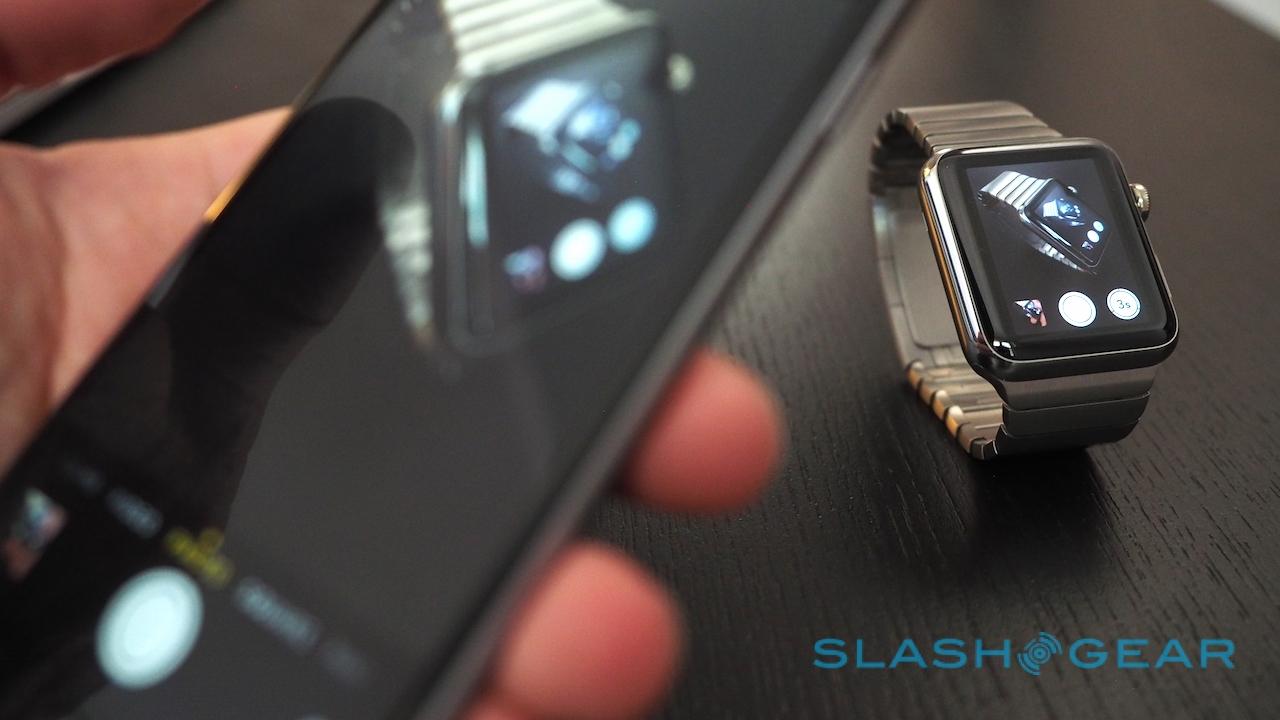
If you've set a timer on the phone, it'll sound on both devices, too, while the Camera Remote app gives a live preview of what your iPhone's camera is pointing at and allows you to take shots or set the timer (though there's no way to switch between front and rear cameras from the watch). Should you have an Apple TV, you can use the Apple Watch to remotely control it.

Unfortunately, the same smooth performance isn't carried over to third-party software. Whether from only recently having actual hardware to develop on, the limitations of WatchKit currently (third-party apps actually run on the iPhone not on your wrist, shuttling data across via the wirless link), or a more intrinsic lack of understanding how Apple Watch works best – or, most likely, some combination of all three – the experience can often be underwhelming.
The best apps for Apple Watch do only a little, but they do it very well, predictably, and with a minimum of drama. Those less successful try to do too much, or leave you uncertain what exactly they're doing, or simply don't work well at all.
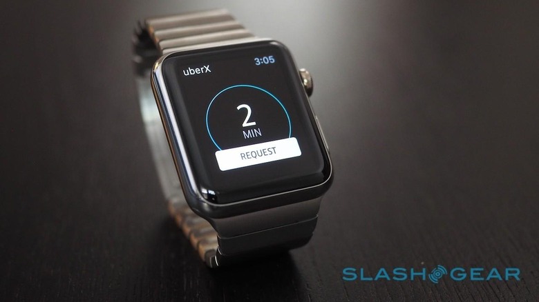
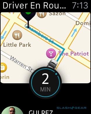
Uber certainly has the right idea, putting its "call an Uber" button front and center and assuming sensible defaults like guessing you'll want UberX if that's what you last used in the iPhone app. However, I found it also demanded a little too much trust, not showing me the location it called a car to until after I hit the button. I'm familiar enough with the vagaries of positioning services to assume there'll be a little repositioning required, and so generally reached for my phone instead.
Philips' hue app is another mostly-success. Rather than offering control on a bulb-by-bulb basis, you can choose a number of lighting scenes to have available on Apple Watch, as well as an "All Off" master switch. It's certainly neat to be able to toggle the living room into movie mode with a few swipes and taps, though I wish there was a way to see which scene was active from the watch UI rather than just blindly changing it.

Still, both hue and Uber are better than many others. In general, third-party apps load slowly – presumably a Bluetooth bottleneck of data coming over from your iPhone – and some take so long that the screen times-out before you see anything useful.
This will presumably improve, either as developers get better acquainted with WatchKit or as Apple loosens its grip on what can run on the Apple Watch itself. The fact that the wearable arrived with around 3,000 apps under its belt demonstrates there's more than a little interest there, after all.
Messaging and Digital Touch
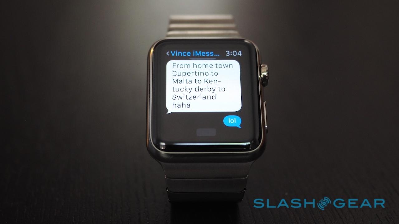
Messaging is a core part of the Apple Watch, though without the space for an on-screen keyboard it's not the same experience as on your phone or tablet. Incoming messages through Apple's own Messages services can be read and replied to, attached photos and videos watched, and you can summon the entire conversation with a tap and scroll through it with the Digital Crown.
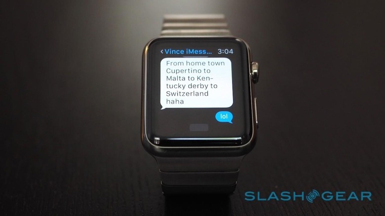
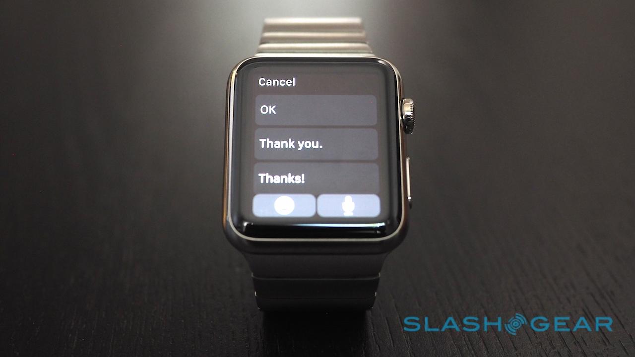
The terse get a selection of canned replies and emojis with which to respond, though the list is a little smarter than the usual "Yes", "No", and "BRB". If you're asked to pick between two options, for instance – "Is the dress white or blue?" – then "white" and "blue" will be among the prompted replies.
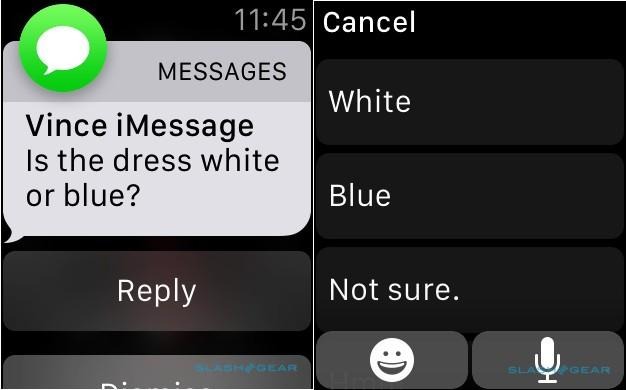
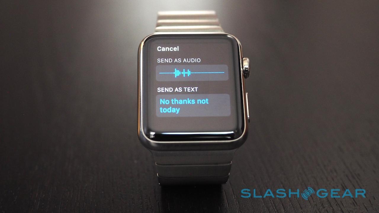
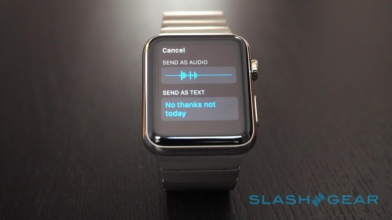
Alternatively, you can hit the microphone icon and dictate a message. It works surprisingly well, the Apple Watch's microphone picking my voice up at conversational levels even when out in public, and you can choose to have it either transcribed into text or sent as an audio clip.
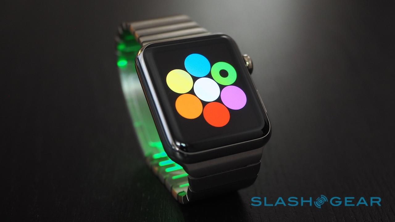
Building on Messaging is Digital Touch, and I'm still not quite decided on whether it's a gimmick or not. Combining the ephemerality of Snapchat with the paint-with-fingers simplicity of Draw Something, it's basically a way to sketch out simple pictures or handwritten text on your Apple Watch's touchscreen and send that to another Watch wearer. Multiple colors can be picked between – though only one per drawing – and after a few seconds they simply evaporate away on the display.
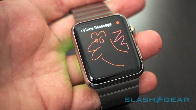
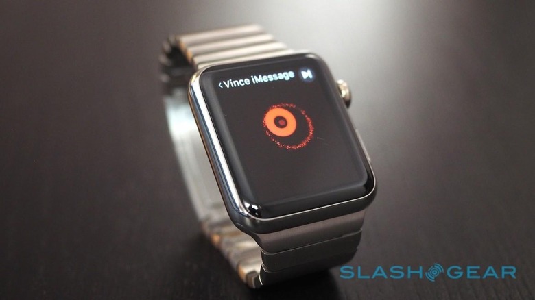
The unartistic, meanwhile, can simply tap the display and send a sequence of vibratory pings, a little like Morse code. Finally, pressing down two fingers sends your heartbeat, complete with a neat animation of a Hallmark-style organ, beating in time.
It can be fun, but it can also be frustrating. The small size of the display makes anything but the simplest of sketches effectively impossible, and short of taking a screenshot – by briefly pressing the two side buttons simultaneously – there's no way to archive anything you receive. It's also Apple Watch-only: you don't get a regular Messages notification on your iPhone that a Digital Touch has landed. I found I'd inadvertently ignored someone's best attempts at art because of that.
We'll have to wait until other companies catch up to match the convenience if you're not solely reliant on Messages, meanwhile. SMS to my Google Voice number, for instance, gave me a notification but no option to reply from my wrist, and while some services – like WeChat – have Apple Watch versions, others like WhatsApp and Facebook Messenger do not. You'll get the notification, but you'll have to whip out your phone to respond.
Health and Fitness
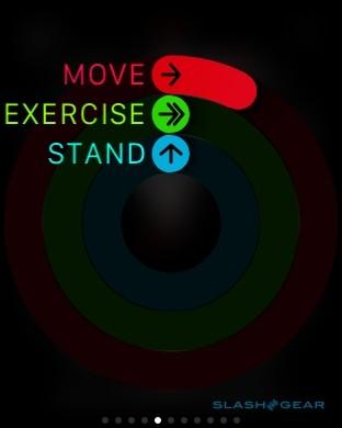
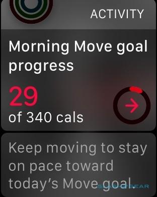
Fitness tracking is the bread & butter of the wearable world, though that's not to say every device gets it right. Apple breaks it down into three core components, Move, Exercise, and Stand, and gives you various nudges through the day to meet your goals in each.
After you've set your gender, age, weight, and height, your target each day is automatically calculated and represented by three concentric circles. For me, that meant a 340 calorie burn goal for Move, a 30 minute stretch of activity for Exercise, and getting up for at least a minute every hour for hours in Stand.
You can manually adjust the Move goal, and the Apple Watch will suggest new targets each week depending on your performance over the past seven days.
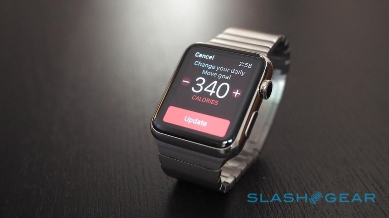
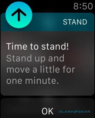
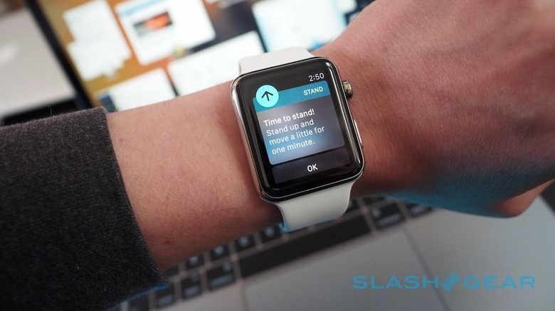
Periodically, Apple Watch will alert you if it thinks you need a little help keeping active. That might be a reminder to stand up, or a warning in the afternoon that you're well behind on your calorific burn that day. It's nothing too pestering, but it's a useful nudge if you've become engrossed at your desk.
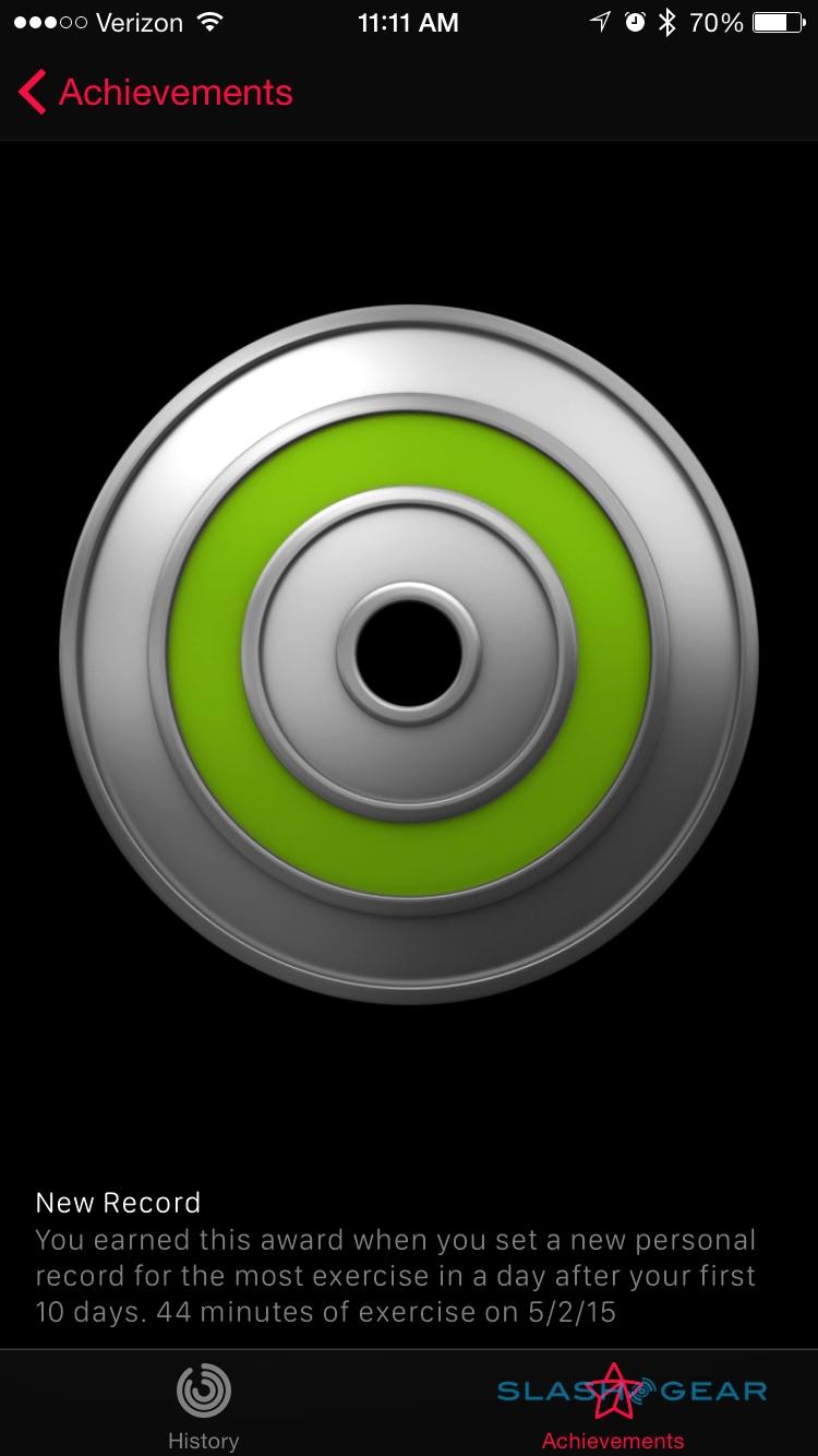
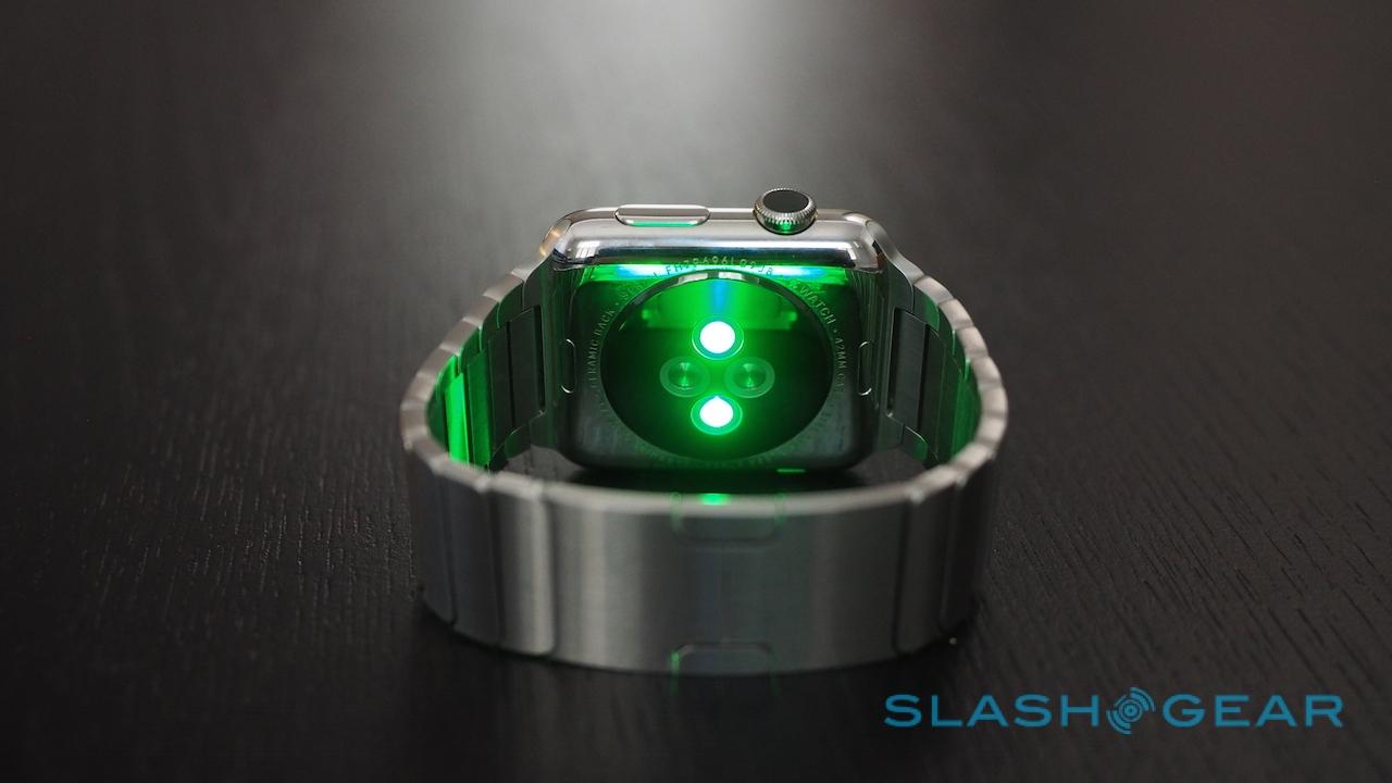
All of your records are automatically synchronized with an Activity app on your iPhone, as well as with HealthKit, together with periodic heart rate measurements.
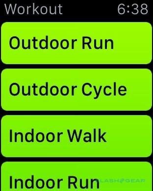
A second Watch app, Workout, offers a more focused way of tracking fitness data. Choose from a number of different activities – running, walking, cycling, rowing machine, or others – and then a goal – such as calories, time, or distance, or no goal at all – and it will not only keep track of you through the wearable's sensors but the positioning in your iPhone to figure out how far you've gone.
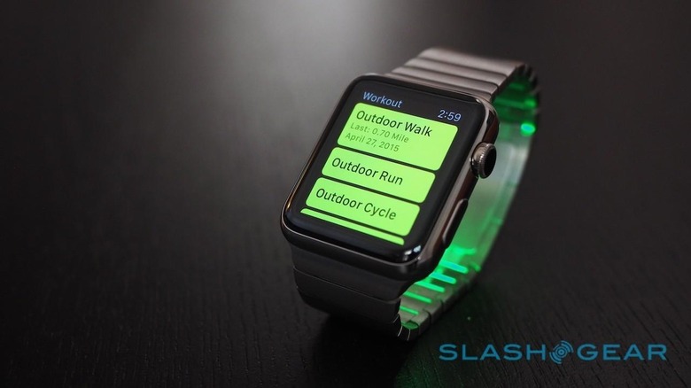
You don't need to take your iPhone, however. Workout tracking works independently (though you miss out on the location tracking), and you can even stay entertained with up to 2GB of music stored locally on the Watch and played through Bluetooth headphones. It's worth remembering that Workout mode is a little harder on the battery: after tracking a 15 minute walk, the Watch had dropped 4-percent.
One thing notably absent is sleep tracking. Personally, I struggle to wear a watch while I'm sleeping, but I know that many don't have the same issues and would like the various phases of their rest to be measured. It's possible we could see third-party apps doing that in future.
Apple Pay and Passbook
Apple's mobile payments system is one of those things that makes perfect sense on the wrist, and happily the experience is pretty much as you'd hope it would be. After you've set up your cards of choice – you have to do it separately, even if you've already registered them to your iPhone, for security reasons – a double-click of the lower side button opens up the Apple Pay payment screen.
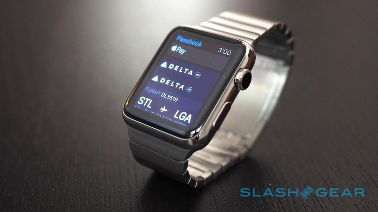
Swiping sideways flicks through the cards you have saved, and then holding the Apple Watch to the payments terminal makes the payment.
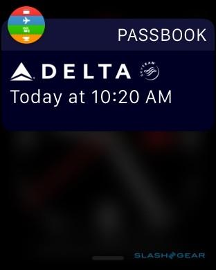
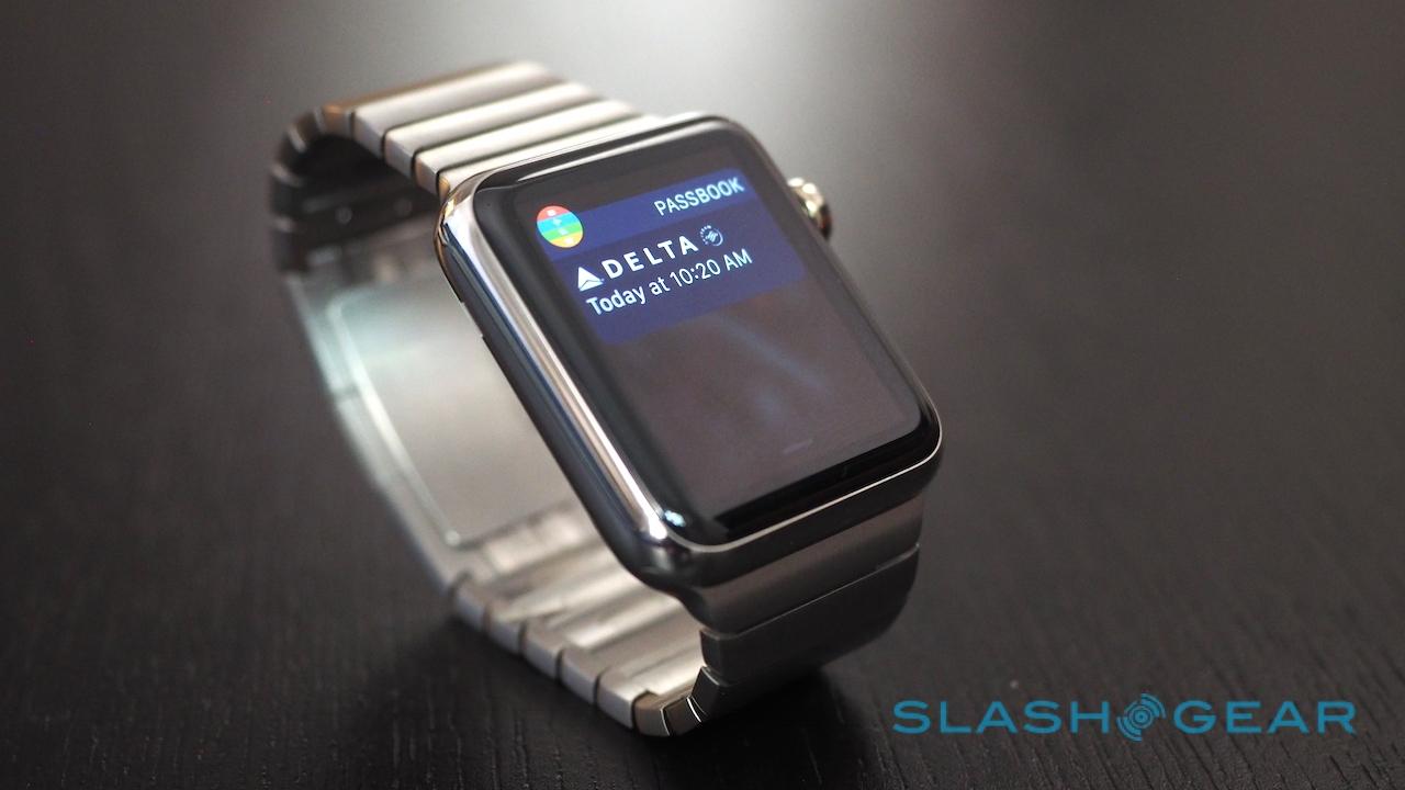
As for Passbook, just as on the iPhone you can store things like loyalty cards and boarding passes inside, and pull them up for easy access when you're at the store or ready to board your flight. I was able to save a boarding pass to Passbook through the Delta app on the iPhone, whereupon it automatically showed up in the notifications pane on the Apple Watch (even if I cleared all other notifications). Cleverly, when the QR code is on-screen the display doesn't turn off even if you rotate your wrist to scan it.
Battery
I was concerned when Apple suggested Apple Watch wearers should get used to the idea of recharging their wearable every night: I'd come to associate that with a device that only scraped through a day at best. In practice, though, I've basically been able to forget about the Apple Watch battery.

That's because it readily runs through a full day with juice to spare. Sure, if you wanted to go two whole days without a charge then you'd probably run into issues – unless, of course, you switch on Power Reserve mode, also activated automatically when the battery drops to 10-percent, which turns the whole thing into nothing more than a digital watch and runs for around 72hrs – but I've consistently ended the day with 30-40 percent left on the gage.
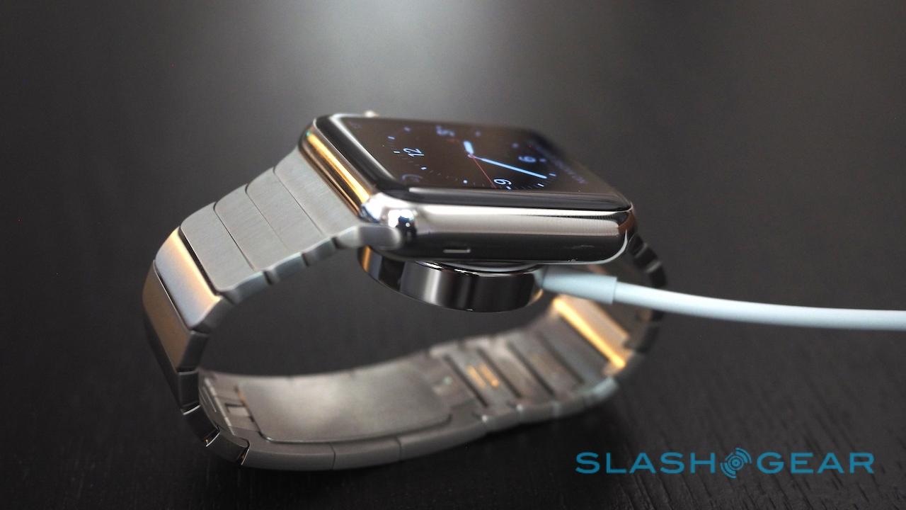
Charging, meanwhile, is a matter of snapping the magnetic puck onto the back of the Watch, and plugging its admirably-long USB cable into an outlet. Apple includes a regular USB adapter, but I wish they'd gone one step further and bundled one with two USB ports so that you could charge both phone and wearable.

There's a second battery to be considered, though, and that's the one in your iPhone. On the one hand, doing more triaging on your wrist should mean that your iPhone can stay in standby in your pocket for more of the time. Conversely, however, a persistent Bluetooth connection could have a negative impact.
I've found nothing conclusive either way. Typically, I find my iPhone 6 needs a top-up mid-evening; since pairing Apple Watch, that's pretty much been the same. It's worth noting that I also use a number of other Bluetooth devices with the phone, and as such the radio is seldom idle.
The Competition
This isn't a war between Apple Watch and Android Wear, at least for the moment. The fact that each smartwatch platform is locked to its counterpart smartphone platform means there's more than just sizing up Apple Watch against, say, LG's Watch Urbane on a store shelf and taking your pick.
Instead, you'd need to jump platform altogether, and whether wearables from either camp are good enough to prompt that is a question only individual buyers could answer.
So which are Apple Watch's actual rivals? Pebble Time, with its color display, is probably the most notable and should best Apple on battery life, but it's not on the market yet. Samsung's Gear S has more standalone functionality than most, given its integrated 3G radio, though it's bigger than Apple Watch and still requires an Android phone be paired to get the most of it.
Wrap-Up
If I have a smartphone in my pocket and a tablet in my bag, and perhaps a laptop too, do I really need a smartwatch on my wrist as well?
Like every smartwatch I've tried, Apple Watch is imperfect. Much of that – like underwhelming third-party apps – is likely to be addressed as developers come to terms with how the wearable functions and how people interact with it. Nonetheless, some iPhone users may opt to wait out the teething pains, either for the first software update or simply the second generation of the hardware. I can't blame them for that, though in the meantime they're missing out on a product that's already very capable.
A watch is one of the more personal objects we buy and wear: what's right for my wrist may not be right for yours. Even if you're an iPhone-addict, beyond flexing your artistic talents with Digital Touch you're not really missing out on functionality if you don't strap on an Apple Watch. It's a useful adjunct to your smartphone, beautifully made and certainly not inexpensive, and I'm sure even Apple would admit it's more of a luxury than an iPhone would be.
Still, a reason for buying something really can be "because you want it," despite what naysayers might scream.
I get a huge number of notifications every day, so I like being able to stem the tide of distractions from my wrist. I travel a fair amount, so being able to navigate through my watch rather than pulling out my phone every other block (and looking like a tourist and potential mugging victim in the process) is great. I've a tendency toward spending too much time sat at a keyboard rather than being up and active, so anything that jolts me from my lethargy is probably going to help my health.
It's hard – impossible, probably – to make the case that the Apple Watch is a necessity. That's not to say that things not entirely necessary can't also have features that are hugely beneficial. In the weeks I've been wearing Apple Watch I've spent less time digging my iPhone out of my pocket, and found myself less readily sucked into that spiral of diversions, where you look at your phone for one thing and then find yourself automatically tapping over to Twitter, to Facebook, to tumblr, or any of the other hundreds of apps that vie for your time.
I've spent a little more time in-the-moment, something a self-confessed digital obsessive like myself can't help but appreciate. There's a cost of entry to that if Apple Watch is the path you choose to achieve it but, for those who can afford it, the tight integration with iOS on your iPhone and the – growing – capabilities of the apps mean many will undoubtedly find it's worthwhile.
