Apple Watch Diary - Getting To Know You
iPhone was hotly-rumored before 2007; iPad a frequent topic of debate prior to 2010; but it's hard to argue that Apple Watch, reaching consumers' wrists today, is the most controversial of Apple's recent line-up. Even before Tim Cook & Co. announced the wearable in September last year, the pros and cons of an iOS-powered companion for your iPhone were splitting party lines, and that debate hasn't eased any in the months between then and release. Now, though, the waiting is over. The preorders are arriving. And Apple Watch needs to prove to us it's worth a spot on our arm.
I've been living with Apple Watch for a short while now, though not long enough to wrap up my feelings about the wearable in a neat review. Instead, with arguments still raging over whether it's a legitimate productivity tool or simply a fashionable gizmo, I thought I'd take you with me as I figure that out for myself.
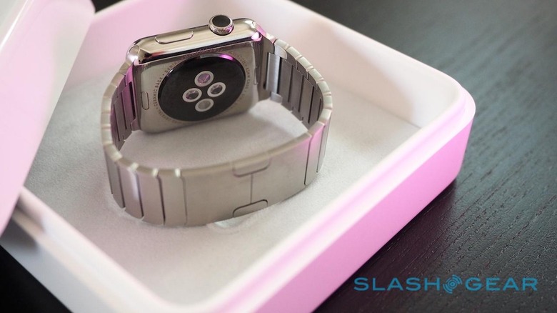
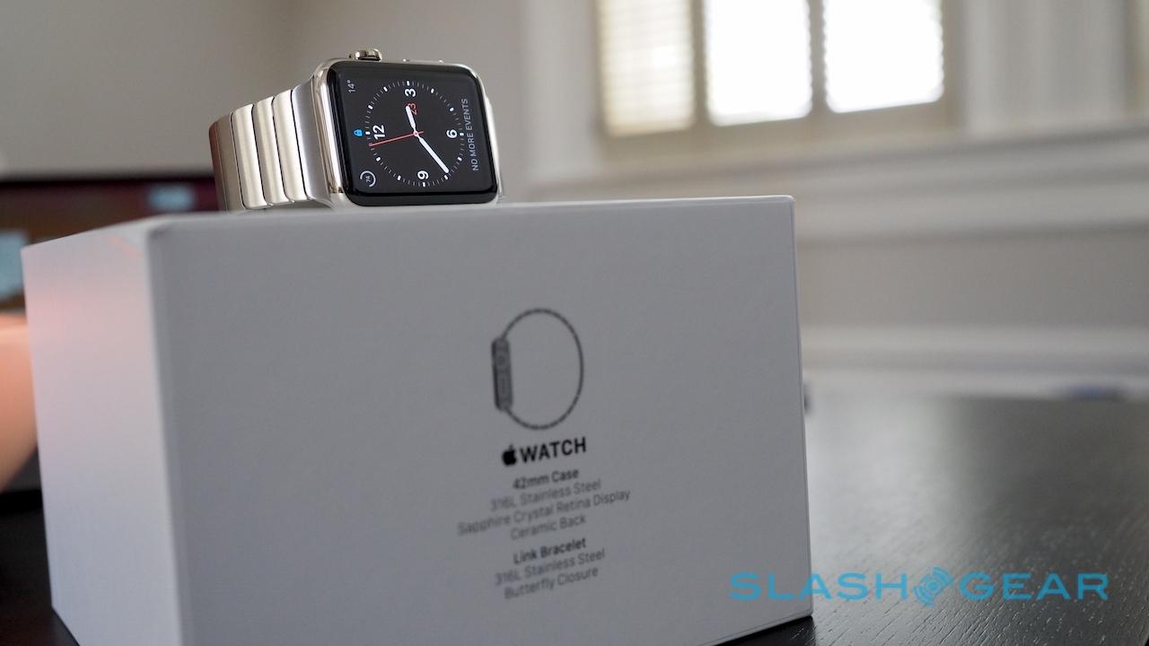
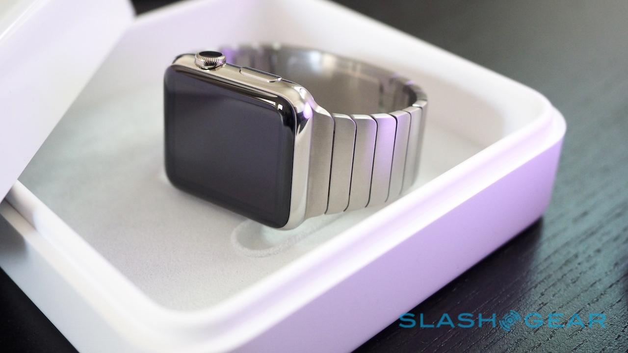
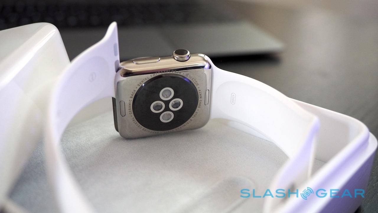
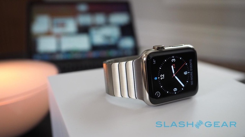
First impressions are already positive, from the lined, white plastic box that the Apple Watch comes in (the Apple Watch Sport comes in a rather more humble long, thin box; those who splash out on the Apple Watch Edition get a box with a built-in charger) through to the elegant way of pairing iPhone and wearable. Yes, you might only be scanning the equivalent of a QR code with your smartphone's camera, but the shifting pointillistic cloud that ripples across the Apple Watch's screen while swapping Bluetooth details is far more elegant than any 3D barcode.
Do you ever see it again, beyond that initial moment of setup? No. Is it an aesthetic frippery, the purpose of which that could easily have been done by something far more straightforward? Certainly. Yet it underscores the Apple Watch experience in a way all of its own.
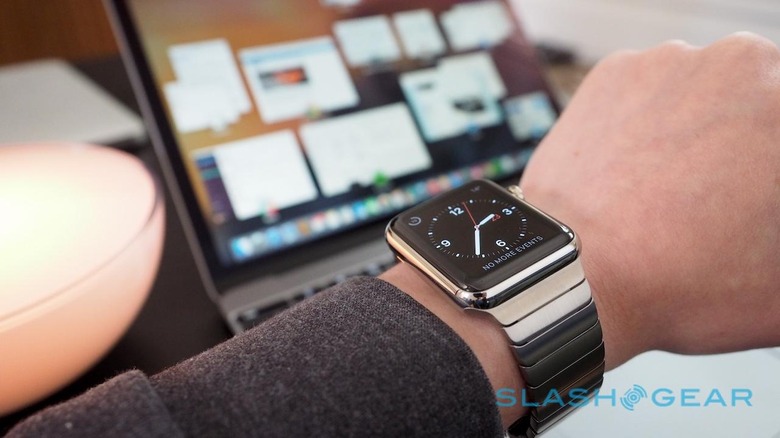
The incredibly saturated colors on the inky black backdrop of the pixel-dense display, for instance – something a static black and white barcode could never illustrate – and the smoothness of the movement, as reassuringly in its promise of quality as the gliding waft of a stepless seconds hand.
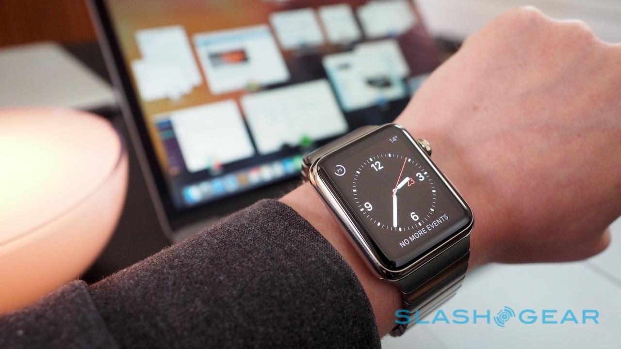
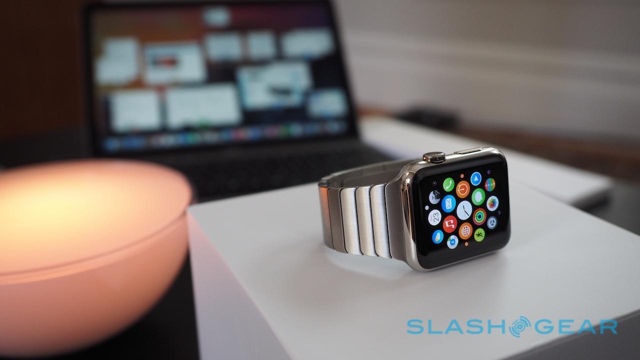
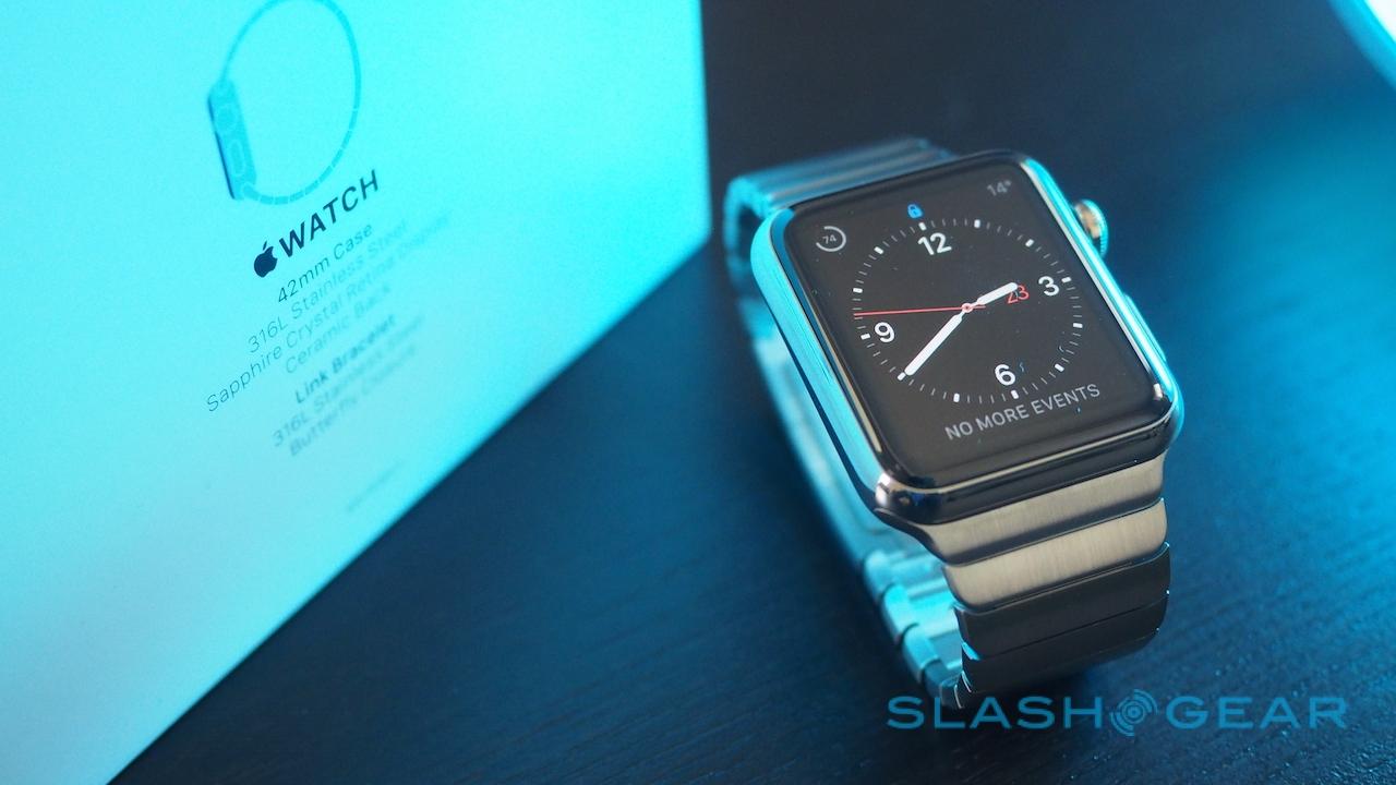
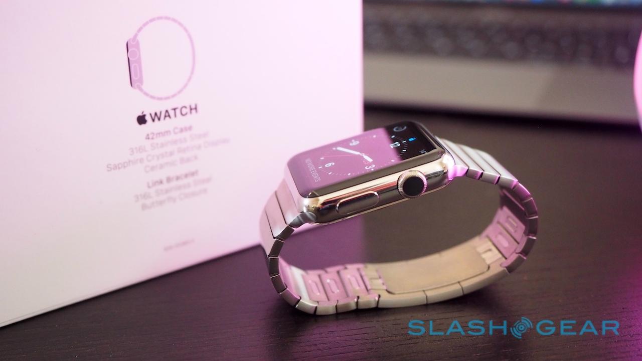
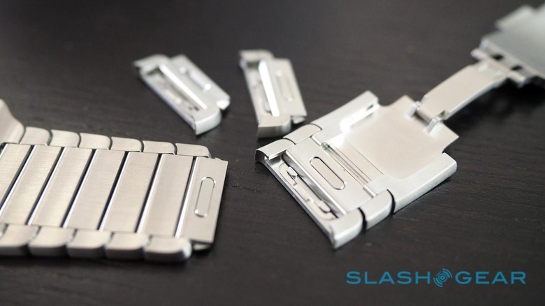
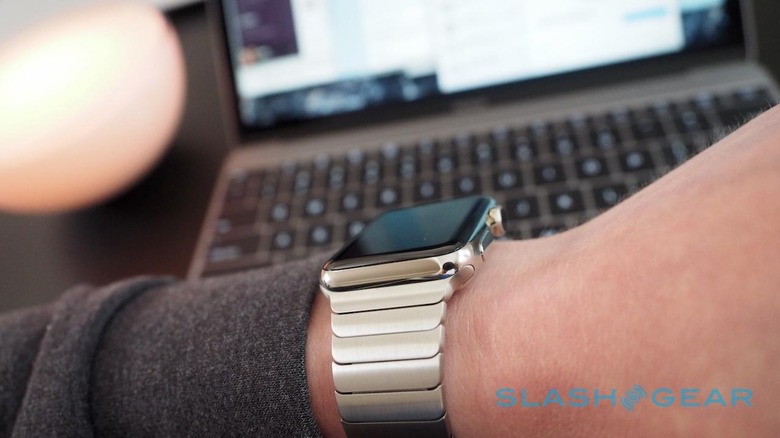
It's not the only detail of note. The fact that the straps can be so readily removed – jab a fingernail against a small button and slide them out – is near-astonishing if you've been used to wearing a traditional watch, which generally require a fiddly process to switch straps around. The link bracelet's ease of adjustment in the same manner is similarly impressive, though is likely to give jewelers nightmares over lost business.
While you're then waiting for an initial sync to take place, which in my case took around five minutes, you can busy yourself with the Apple Watch app that comes with iOS 8.3. That's where you set things like which wrist you wear it the watch on, your weight, height, and gender in the Health app, and which twelve of your friends you want in the quick-access dialer.
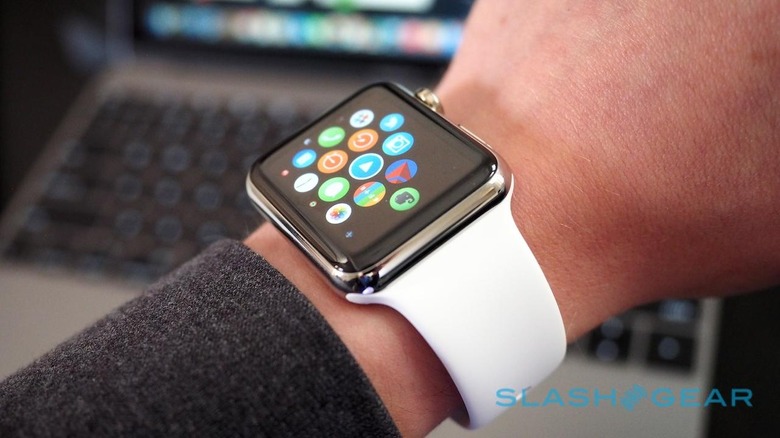
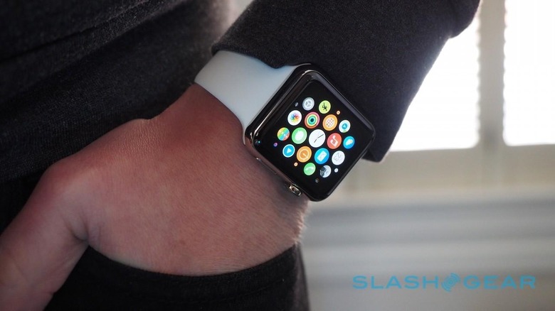
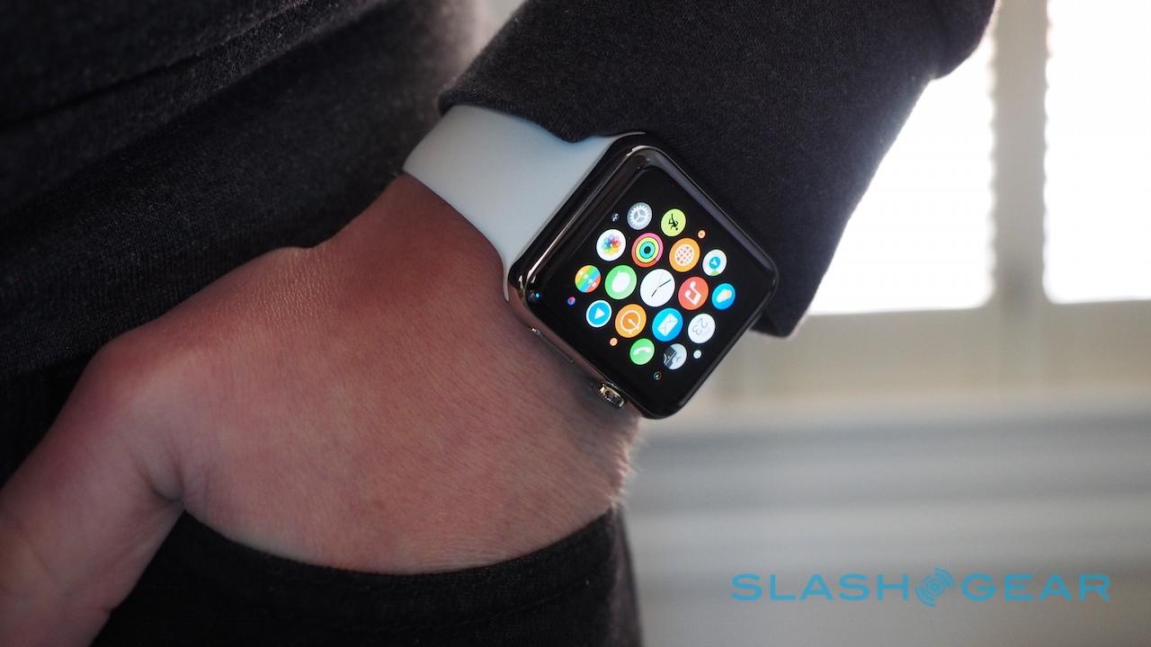
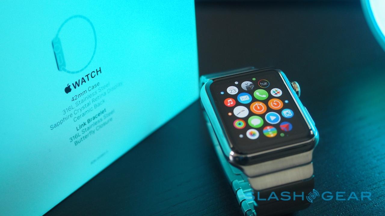
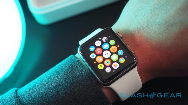
It's also automatically populated with all of the Apple Watch-compatible apps already on your phone, though there's a link into the App Store to see others you might have missed too. Notably, even if they're Apple Watch-friendly, they're not installed to the wearable until you explicitly request it. Some have two installation options, too: both installing the app itself – so that it shows up in the bubble cloud of app icons in the watch's launcher – and adding it to the Glances "widget" gallery that pulls out a snippet of information when you swipe up from the watchface.
Part of the setup process concerns how Apple Watch works when it's apart from your phone or your arm. Up to a gigabyte of music can be synchronized straight to the watch's internal storage, for instance, and played through Bluetooth headphones (though not the integrated speaker) when you're out running but don't want to take your phone. Happily, the music card in Glances controls not only Apple's own Music app for iPhone, but third-party offerings too, like Spotify.
If you're an Android user, I can sense your fingers poised over the keyboard, flexing as you prepare to decimate my logic in the comments.
"Android Wear has had that for months!"
You'll be right, a lot of the time, but here's the thing: Android may have had it, but given the silo'd state of the smartwatch segment right now, iPhone users haven't.
My typical day involves a combination of sitting at my desk and working, and heading out for meetings and events. I use a combination of public transport and the occasionally driving, and I'm more often than not going to a new place, rather than the same office day after day.
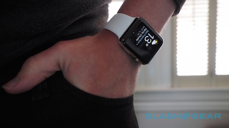
Location services are important to me, and I'm usually found checking Google Maps multiple times through the average day. Cleverly, Apple Maps tried to show its worth from the outset, with a Glance card automatically knowing where home was and telling me how long it would take to get there. Pedestrian and driving navigation instructions are on offer, and the watch will fire off a series of taps against your wrist to indicate whether you should turn left or right at the next junction.
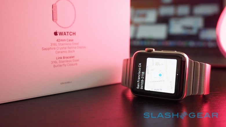
While I was out, I also used Citymapper, which has shortcut buttons to show the nearest bus, train, and other public transit options around you, along with upcoming departure times. Admittedly, I had to go looking for them – the nearest wasn't automatically served up, as Google Now will do – but the information on offer was far richer once I'd tapped through a couple of buttons.
This sort of rapid interaction – 8-12 seconds perhaps – is, I feel, going to be one of the deciding factors about whether you get on with Apple Watch. The whole engagement model feels at odds to that of the iPhone and iPad: brief blasts of highly-specific information that serves a very immediate purpose, rather than the more idle distraction allowed by a bigger screen.
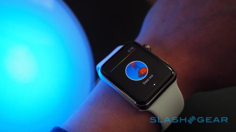
In the Hue app, you don't get the time-consuming pick of an entire color wheel, just a few pre-racked presets to different color schemes. Amazon doesn't try to give you the entire catalog to browse through, instead allowing you to bark out a product, price check it, and then either 1-Click purchase it or add it to your Wish List.
Those sort of interactions should help work around what's by necessity a relatively small battery. Off the charger at 6am, and then on my wrist all day, by 11pm I still had 23-percent left.
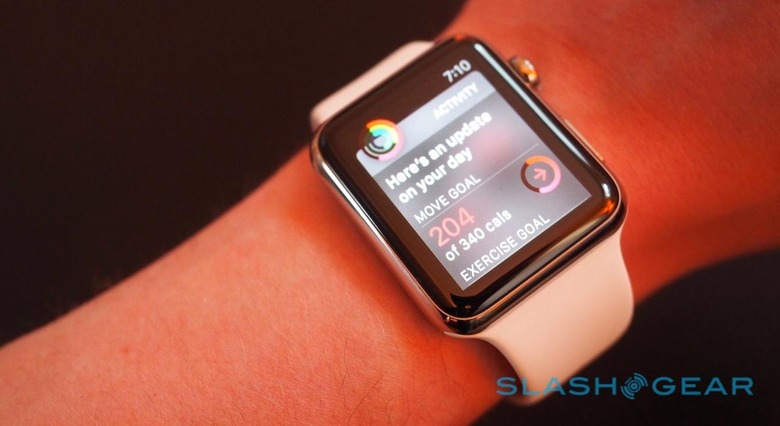
There may already be 3,000 apps for Apple Watch in the App Store, but I'd be curious to know how many of the developers involved had access to hardware to actually try them out. We're still clearly at an early stage when it comes to figuring out how much is too much information for a wearable (and how much is too little); twice, I accidentally ordered an Uber while trying to tap, swipe, and Force Touch around the minimalistic interface, attempting to find a map to see if it had correctly intuited my location.
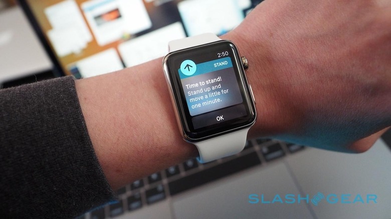
The biggest element of setup, however, is curating exactly what you do – and don't – want pushed to your wrist. Notifications are the core of the Apple Watch experience.
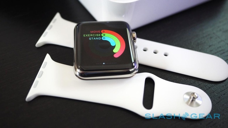
I've been wearing Withings' Activité and Jawbone's UP3 most recently, neither of which demand or facilitate the same degree of interaction as a touchscreen smartwatch. As such, I'd forgotten how one-handed use is pretty much a non-starter for a smartwatch of any particular complexity: you always have to bring your hands together, one with a wrist sporting the Apple Watch, the other to tap at it.
It means one-way interactions – where a notification pings, and you lift your arm to check it – are most common, particularly when you're on the move. I almost launched myself across a crowded bus because I foolishly let go of the grab-handle to tap out a swift reaction to a message. Ironically, I could probably have fumbled a response single-handed on a phone.
Admittedly, sending a reply by voice is often an option. Perhaps it's because I'm British and self-conscious, though, but speaking out loud into my watch (or my phone or tablet, for that matter) still feels uncomfortable in public, even if Apple's dictation system has proved fairly accurate so far.
If I've concerns, it's in how certain third-party apps and services don't yet play entirely nicely with Apple Watch. Were I living in an all-Apple ecosystem, doing all my communication by iMessage, or Apple Mail, and managing my time with Apple Calendar, and my navigation through Apple Maps, the experience would undoubtedly be a whole lot smoother.
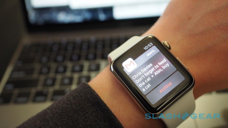
Like many, however, my digital life is fragmented across various providers, with a fair amount of it residing on Google servers. Gmail for my email, along with a combination of iMessage, Google Hangouts, and regular SMS – through Google Voice, along with calls – for my IM needs, then Google Maps for navigation. Slack for work communication; Twitter, and Facebook, and Google+ for social.
Notifications for all of them will show up on Apple Watch, but how I can react to them varies widely. Ping me on iMessage and I can fire back an emoji, or record a voice message, or even dictate a custom reply; a Hangouts message, however, or a Google Voice SMS are read-only.
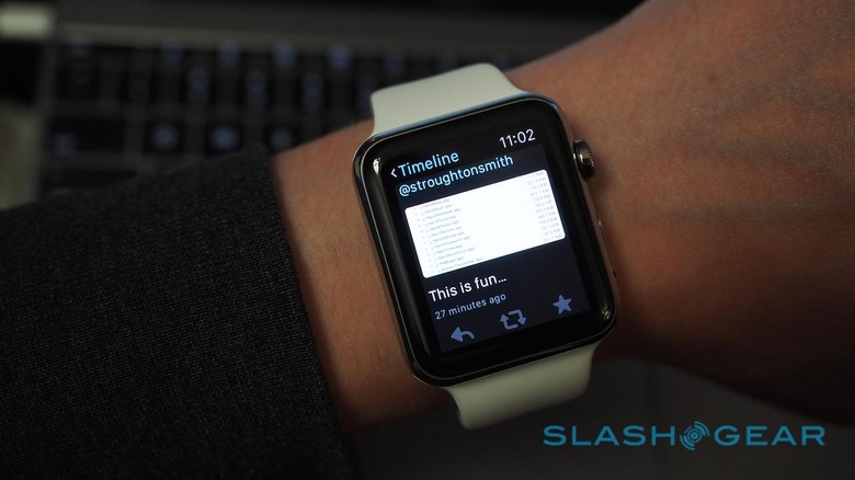
Scroll down to the bottom of a Gmail notification and you can archive the message or dismiss the notification, but not reply to it or delete it entirely. New Twitter notifications may give you a little thumbnail of any attached image, but they don't give you the option to reply or retweet them (even though, if you open the Twitter app on the Apple Watch, you can do so there).
Sometimes, as with Force Touch, what you can achieve from Apple Watch and what you need to grab your iPhone out of your pocket to accomplish is a matter of trial and error. Long-pressing, and swiping, and tapping, with the assumption that the developers will have probably hidden some sort of extra functionality, if only you can find it.
Again, Apple's software is fairly consistent, and you get used to their invisible UI scheme with minimal delay, but whether it's from a lack of hardware to test it on or a more cavalier attitude to the interface, the same can't be said for every third-party app.
Over the coming days I'll be taking the Apple Watch traveling, something of a trial of fire. In my experience with other smartwatches, I rely on them for digital triage far more when I'm on the move.
I'm also curious whether eye-catching features like "digital touch", which allows you to send a finger-sketched graphic, a Morse code-like sequence of taps, or even your heartbeat, will turn out to be of real use or just a gimmick. That's going to have to wait until more Apple Watch units are in the wild, however.
Meanwhile, if you're still on the fence – or just waiting for your Apple Watch to ship – and you have questions, head on down into the comments and I'll try to answer as many as I can.
