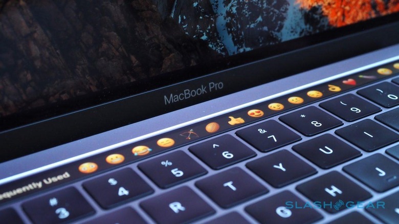
Apple's Touch Bar Needs To Grow Up
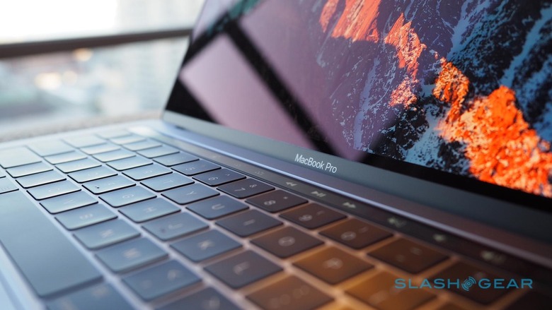
Apple's biggest changes to its MacBook range in 2018 may be focused on overhauling the processors inside its notebooks, but it's making the most of one of its most misunderstood features that I really hope changes this year. I was one of what seemed like only a few people – outside of Apple, at least – upbeat about the Touch Bar when it first arrived on the MacBook Pro in 2016, though even then it was clear there was room for improvement. Apple's concept of a contextually changing array of shortcuts placed within easier reach of your hands on the keyboard had potential, but its first implementation felt cautiously tentative.
Unfortunately, since then there's been no blooming of the Touch Bar adventure. For all Apple has been pushing the envelope with near-bezeless displays and gestures in iOS on the iPhone X, macOS still makes only rudimentary use of its touchscreen. Meanwhile, the growing normalization of touchscreen displays on Windows PCs, not to mention tablet users of iPads, increasingly leaves Apple's Touch Bar direction looking ill-conceived.
I'm not sure that has to be the case, though, and it needn't even involve a huge shift from what the Touch Bar does today. My core complaint centers on the misconception that Apple seems to have had with the MacBook Pro's touchscreen strip, and the lesson it learned from the success of the iPhone.
Back when the first iPhone was launched, Steve Jobs heralded the touch display for its infinite flexibility over a physical keyboard. Everything you could do with a hardware button, you could do with a touchscreen. All the features you had from a dinky QWERTY on your BlackBerry, you could replicate with an on-screen keyboard, and more.
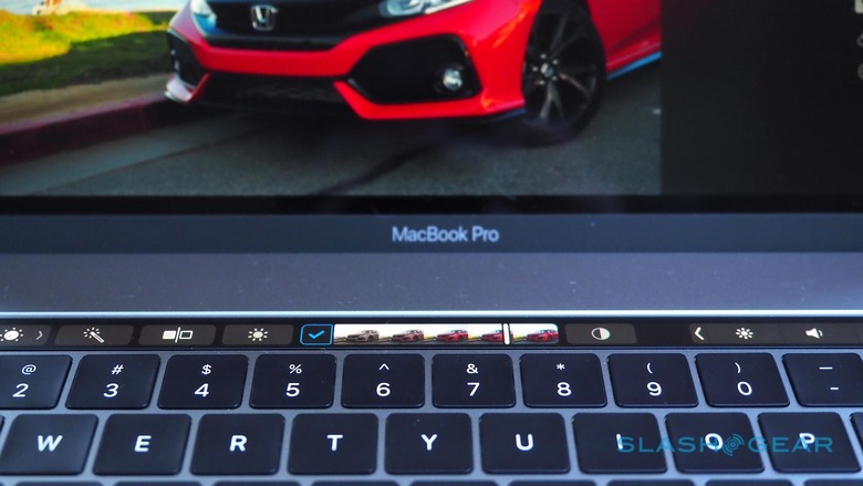
That was straight up replacement, though. The Touch Bar in its current form, however, gives only an alternative, in this case to the keyboard shortcuts most MacBook Pro users are well versed in. When it comes down to speed, though such shortcuts may seem clunky in relation to a well-labeled, dedicated touch control, it's not an even fight: the muscle-memory for the former has already long been stored.
Today, when I'm writing a document in Pages, I still press cmd+b for bold rather than tapping the "Bold" Touch Bar button. If I'm editing a video, I hit the keyboard shortcut for trim rather than the razor-blade icon the Touch Bar offers. Indeed, sometimes it seems like the only thing I really use the touchscreen strip for is the auto-suggestion of email recipients in Mail.
The difference there is that those contacts don't have shortcut equivalents: there're not duplicating a keyboard combination. It's the Touch Bar offering something over and above the controls I'm already comfortable with. That said, here are three ways I'd like to see Apple evolve the Touch Bar so that it augments, not replaces, what's already on hand.
Encourage macros to use the Touch Bar
Apple's popularity among pro-users wasn't a mistake, it was cultivated by capable apps and embracing efficiency improvements like Automator. The macro-creating app is capable of generating hugely powerful shortcuts that can seriously supercharge your macOS workflow. Even if you're a more mainstream user, being able to make simple macros to resize and convert images, and construct multi-page PDFs out of various source files is a boon.
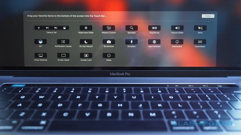
Unfortunately, you can't then pin those Automator macros to the Touch Bar. In an ideal world, I'd be able to select a set of image files in Finder and then tap the "Resize to 1,920" button on the touchscreen to have them automatically resized. Yet although I can put numerous different Finder functions in the Touch Bar, Automator shortcuts aren't among them.
Allow trusted websites to use the Touch Bar
Like most people, I suspect, I spend most of my time working with just a handful of local apps and a number of browser-based apps. Apple has been open to the former gaining access to the Touch Bar since the beginning, but web-apps are still treated as second-class macOS citizens. Only the browser's own controls can be placed into the Touch Bar.
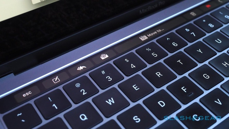
If you're a Gmail user, or have a CMS like WordPress which lives in Safari or Chrome, or even just frequently shop at Amazon, having site-specific controls added above the keyboard could be a real benefit. Now, I wouldn't want every website to be able to colonize the Touch Bar, but a white-list of approved sites – just as Apple already does for browser push notifications – is an obvious but useful improvement.
Move notifications to the Touch Bar
macOS has got better at handling notifications, particularly with the arrival of the Notifications Center and its timeline of alerts. Still, the way in which the Mac flags them up as they arrive in the top right corner seems ripe for a Touch Bar makeover.
On the one hand, the Touch Bar could act as a notifications ticker. If that's too intrusive, then just having contextual buttons slide into the side when a notification appears on-screen would be an improvement over how macOS handles them now. Rather than having to mouse up to click "Close" or "Reply" on a new email notification, for example, you could simply tap the "Reply" button that would discreetly glide onto the end of the Touch Bar. If Apple is serious about seeing its interface strip help keep users' fingers on the keyboard, then that seems much better than forcing them to reach down to the touchpad instead.
Wrap-up
It's fair to say Apple has received plenty of criticism for how the Touch Bar was implemented. The geek-appeal of a skinny touchscreen integrated into a keyboard didn't last long, at least not when the functionality it offers wasn't much greater than a handful of keyboard shortcuts.
It wouldn't take much, however, for the Touch Bar to get a new lease of life. Partly that's down to Apple trusting its power-users to make good use of it; another part is giving app developers, particularly those whose software plays in the browser not the Mac App Store, the flexibility to keep up with what local software can do. The Touch Bar itself wasn't a bad idea, but Apple needs to elevate it beyond just an alternative to shortcuts our fingers memorized long ago.
