iPad Pro Review (2018): Am I Wrong, Or Is Apple?
- Precision-crafted, elegant hardware
- Display is beautiful
- Apple A12X Bionic is incredibly powerful
- Face ID is useful and fast
- USB-C is far more convenient than Lightning
- iOS still isn't ready for pro users
- Accessories are expensive
- Cellular option now costs more than before
- USB-C port isn't as flexible as you might think
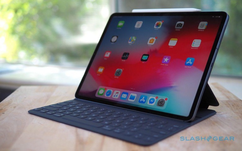
Nobody can agree on whether a tablet is a computer, or indeed what a computer really is, and Apple's new iPad Pro only pours fuel into that controversy. Faster, more flexible, and more resolutely targeting professionals who demand performance with their portability, nobody can argue with the fact that the 2018 iPad Pro is Apple's hardware expertise in full effect. Whether it's a replacement for your laptop, though, is a far more personal thing.
Apple offers two versions of the new iPad Pro for 2018, an 11-inch starting at $799, and a 12.9-inch starting at $999. Both come in Silver or Space Gray finishes, and offer from 64 GB to 1 TB of storage. You can have WiFi only, or WiFi+Cellular for a useful onboard LTE connection.
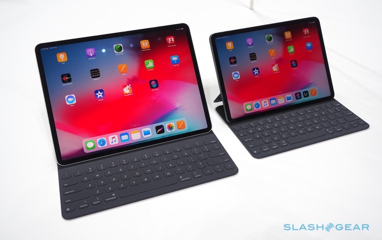
Though the starting price might be relatively low, compared to the Mac range the iPad Pro now feels like it's a part of, start checking off the options and you can soon start to dwarf even a full MacBook Pro. The 1TB iPad Pro 12.9 with WiFi+Cellular that Apple provided me for this review, for instance, is $1,899. If you want the new Apple Pencil and Smart Keyboard Folio – more on which later – too, you're looking at $2,227. That's not far shy of a 15-inch MacBook Pro.
iPad Pro design and display
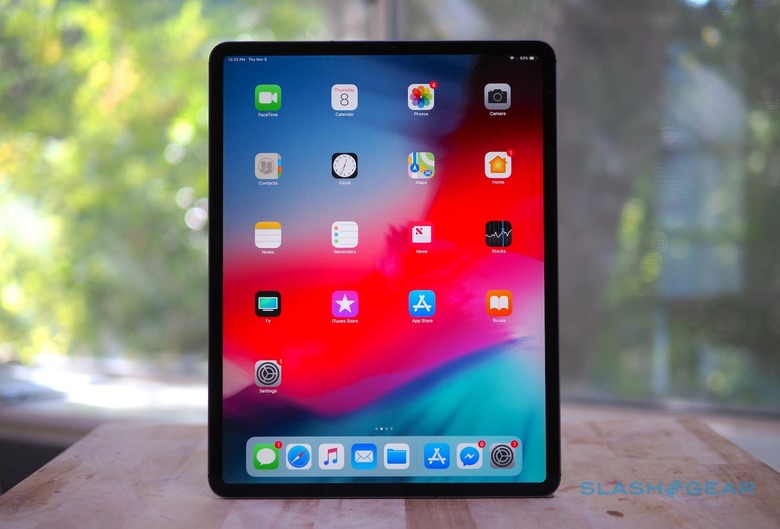
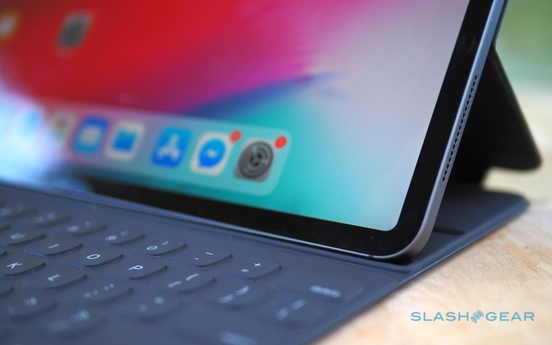
As is so often the case, Apple nails the physical design. The new iPad Pro eschews the curved edges and rounded glass of the iPhone XS: instead, it offers crisp lines and Bauhaus restraint. Some devices you just want to pick up and use, simply for the commingled pleasure of actually holding them. The new iPad Pro is one such object.
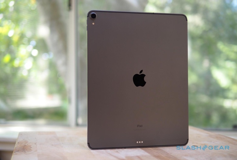
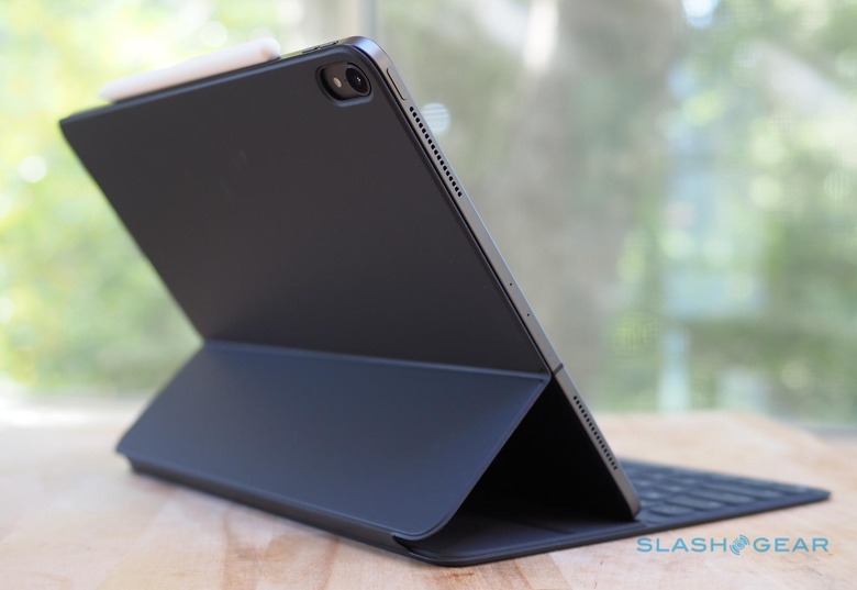
At 5.9mm thick, and 1.4 pounds in WiFi + Cellular form, it's unexpectedly comfortable to hold. Of course, add the Smart Keyboard Folio, and that thickness increases considerably. The 12-megapixel rear camera, also borrowing technology like Smart HDR and 4K video recording from the iPhone XS, protrudes slightly, though not if you have the Folio attached.
Apple nails the physical design
Screen bezels are still present, though much reduced from before. It makes the biggest difference on the 12.9-inch version, which always looked comically huge and unwieldy before. We're not quite at Apple's much-quoted goal of the tablet equivalent of a piece of paper, but we're the closest we've been so far.
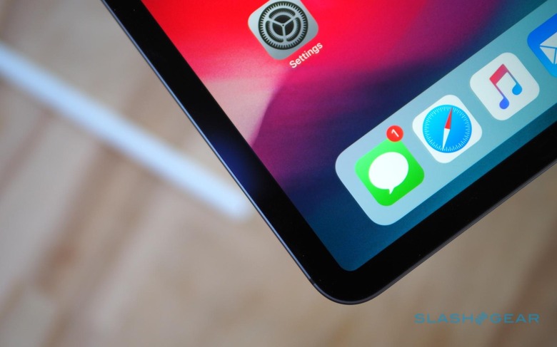
The display itself is a Liquid Retina panel, Apple borrowing the nomenclature it introduced for the LCD-based iPhone XR. Like the smartphone, the iPad Pro uses carefully masked pixels at the rounded corners of the screen, to match the curvature of the physical corners.
It's a check-list of Apple's latest display technologies. Antireflective, with a fingerprint-resistant oleophobic coating, it supports the P3 wide color space and uses True Tone to adjust the color temperature according to the lighting conditions in the room. ProMotion delivers a 120 Hz touch response rate, for a crisper reaction to your taps and swipes. It is, in short, an excellent screen, and one which holds up outdoors as well as it does indoors.
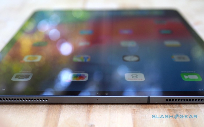
Apple has matched it with equally impressive speakers. There are still four of them, but they've been redesigned with a separate woofer and tweeter at each location. All four deliver bass; the mid and high frequencies come out of the upper speakers, with the iPad Pro automatically adjusting depending on how you're physically holding it. The result is an impressively wide soundstage, and plenty of clarity and volume.
Sadly, like the recent iPhones, Apple has dropped the 3.5mm headphone jack on the iPad Pro. If you want to use wired headphones, you'll need a USB-C adapter, or to embrace Bluetooth. My AirPods paired automatically with the tablet since it was using the same Apple ID, but I can definitely see those with high-end wired headphones being frustrated.
iPad Pro Face ID
The bezels may be skinnier, but they hide more technology than before. The TrueDepth camera array of the iPhone XS has been brought over to the iPad Pro for the first time, offering facial recognition as well as its Portrait mode photography and Smart HDR. It also means the home button and Touch ID sensor have been dropped.
It's a change I'm happy with, especially with the updates Apple has made to Face ID to acknowledge that people hold tablets in multiple orientations. An iPhone XS can only unlock from your face if you're holding it in portrait orientation. The new iPad Pro, however, is designed so that it can recognize you in all four orientations.
It apparently involved a whole lot of retraining of the algorithms working in the background to handle 3D maps of your unique facial topography, but you don't really need to understand that. What's important is that you can pick up the iPad Pro upside down, or lean over it slightly while it's flat on a desk or coffee table, and Face ID invariably spots you.
Without a notch to accommodate the TrueDepth camera, in fact, there's a good chance you won't necessarily pick up the iPad Pro the "right" way up first time. If you cover the camera with your hand, iOS drops an animated arrow on-screen to show you where you're obscuring it.
It's left me wishing all the more that multi-account support was enabled on iOS for the iPad Pro. Being able to seamlessly recognize who is holding the tablet, and have their apps, multimedia, and other preferences load automatically as a result, would make this a far more family-friendly – or, indeed, workgroup-friendly – device.
With the absence of the home button, the iPad Pro follows the iPhone XS into gesture navigation. I know there are some who aren't fans, but I'm a convert. Swiping up from the bottom of the display to first access the launcher, then return to the home screen, is quickly intuitive. Swiping left and right across the gesture bar to quickly switch between recent apps is even more convenient.
iOS 12, Apple A12X Bionic, and the new iPad Pro
If ever there was an argument for Apple dumping Intel processors in its Mac line and switching to its own A-Series ARM-based chips, the new iPad Pro makes it convincingly. The A12X Bionic that powers this newest tablet is astonishingly potent, eight cores that can work concurrently alongside seven GPU cores, and tapping into a shared memory pool. Apple says it's up to 90-percent faster in multicore performance, and I can believe it.
The result is a tablet that doesn't stumble, no matter what you throw at it
Indeed, this custom silicon can put traditional processors and graphics chips to shame, when it comes to raw horsepower. We're talking more grunt than an Intel Core i7. Apple doubles-down by throwing in a homegrown Neural Engine that focuses on machine learning, augmented reality, AI, and more.
The result is a tablet that doesn't stumble, no matter what you throw at it. No iOS app which I tried could put a dent in the iPad Pro's performance. Still, it's worth noting that apps which really do tap into the A12X Bionic – and potentially stress it – aren't here yet.
Come 2019 and we'll see Photoshop for iPad. Adobe has been demonstrating this for a while now, loudly pointing out that it's not some cut-down version of the pro-graphics app but the full software built for iPad Pro. In the demos I've been shown it handle dozens of layers and effects in real-time, faster indeed than on a regular notebook.
I'd personally be more excited, though, by Final Cut Pro on iPad Pro, but Apple is still pushing iMovie. There are well-reviewed third party video editing apps out there for iOS, but not being able to pick up a Final Cut Pro X project I started on my MacBook Pro and continue it on the iPad Pro – or vice-versa – is frustrating.
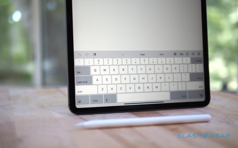
Still, some of the changes that arrived with iOS 12 have been far more useful for a pro workflow. Shortcuts, for instance, has real potential. I do a lot of batch image resizing and watermarking, something I'd previously had to look to third-party apps to do on iOS. Even then, it could be an underwhelming, buggy experience.
With Shortcuts, I can now bypass third-party apps for tasks like that. While creating your own workflows can be a little complex, there are plenty of preexisting ones being shared that pick up some of the more tedious tasks.
iPad Pro Battery and Connectivity
Despite the performance increase, Apple is still quoting up to 10 hours of battery life from the new iPad Pro. It measures that with the tablet at 50-percent brightness and used in a combination of video and music playback, and for browsing the web.
In practice, I've had no problems using the iPad Pro all day with my typical workflow of writing, browsing, instant messaging, and some Spotify playback in the background. Turning to more system-intensive tasks, like video editing, obviously invokes a bigger hit on the battery.

On the connectivity front, Apple offers both WiFi and WiFi+Cellular models. Both get WiFi 802.11.ac (2.4/5 GHz) and Bluetooth 5.0. The cellular models add Gigabit LTE, as in the iPhone XS, with both a physical nano SIM slot and an eSIM.
The latter allows you to activate data on the table across a variety of carriers, if you don't want to add the iPad Pro to an existing line. It also means you can pay for short-term data plans while traveling, and escape international roaming fees. However, there's a not-insignificant $150 price difference between WiFi and WiFi+Cellular models.
Apple Pencil 2
Apple's first-generation Pencil was functionally clever but ergonomically laughable. This second-generation Apple Pencil, therefore, keeps the pressure and tilt sensitivity of the original, but addresses things like physical design, convenience, and charging. It also nudges up the price, from $99 to $129, frustrating since you can't use the original Pencil with the new iPad Pro – or indeed this new one with the older iPad Pros.
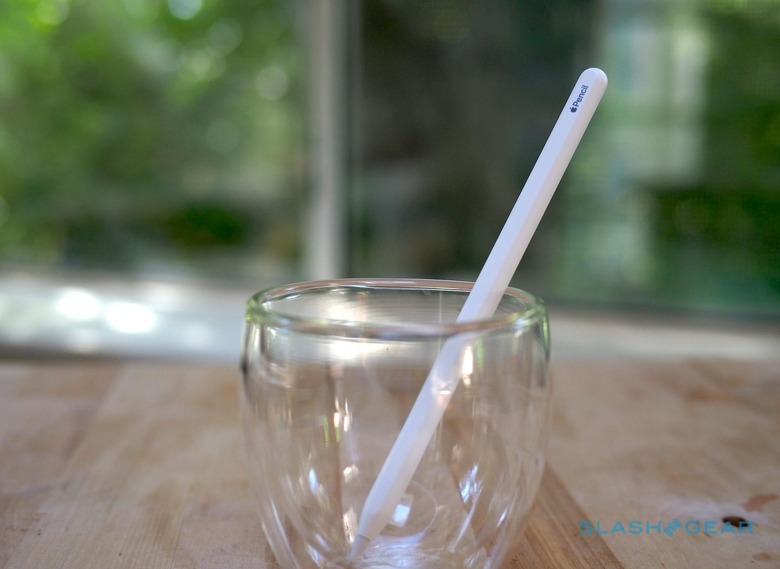
The changes are probably worth the upgrade
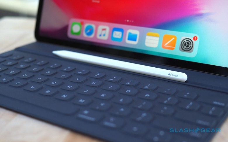
Still, the changes are probably worth the upgrade. Where the old Pencil's cylindrical body proved prone to rolling around the desk, the new Pencil has a flat side that means it stays where you put it. Most of the time, that will be on the edge of the iPad Pro, where it now clings magnetically.
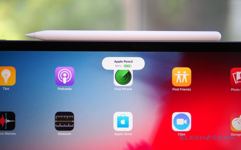
It charges wirelessly while it's there, a system far preferable to the often-mocked Lightning plug on the end of the original stylus. Snap it into place the first time, and you're giving the option to pair the Pencil with the iPad Pro – useful if you want to use the same stylus with multiple tablets. Subsequently, when you dock it you get a pop-up showing battery status. The magnetics are impressively tenacious, the Pencil holding in place no matter how hard I shook the tablet, though it can still be knocked off if you jostle it in your bag.
Apple offers free engraving if you buy the new Apple Pencil from it directly: not many characters, but enough to make it clear whose stylus belongs to who. Unfortunately, despite the price increase, you no longer get an extra nib in the box.
Generally, using the new Apple Pencil is much the same as the old one. A nice tweak, though, is the ability to instantly summon the Notes app by tapping the Pencil on the iPad Pro's screen when it's turned off. It allows you to quickly get started writing notes or jotting down sketches. Sadly you can't change which app opens by default, if you're a fan of other note-taking apps or, indeed, an art app you draw in.
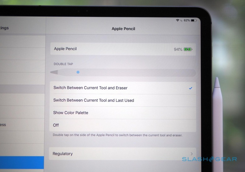
The other big change is the double-tap support. Rap your fingertip twice on the barrel of the Apple Pencil, and you can toggle between two tools: in Notes, for example, the default is to flip between pencil and eraser. In the settings you can change that to switching between the two last used tools, or to bring up the color palette.
Developers, however, can customize that double-tab behavior for their individual apps. An art app, for instance, could have it summon a quick-access menu of tools and shortcuts. It'll be up to developers themselves to decide on that – and you can turn the double-tap gesture off altogether, if you prefer – but it could be a useful improvement over the old stylus.
Smart Keyboard Folio
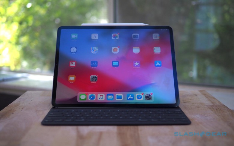
If the iPad Pro is to be a "true" laptop replacement, then it needs a keyboard, and Apple's 'board of choice is the Smart Keyboard Folio. As with the new Apple Pencil, there's both familiar and new here, if you're used to the old iPad Pro keyboard case. The new tablet is also, unsurprisingly, not compatible with the old 12.9-inch case, so you're looking at another $199.
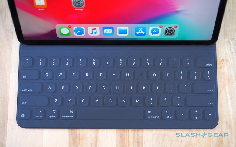
The fabric keys are basically the same as before. They're snappy and well-spaced from each other, though not as clicky as the third-generation butterfly keys on the latest MacBook Pro and MacBook Air. I'm not a fan of the slight texturing each key gets, and much prefer the smooth MacBook keys.
A large number of magnets hold the iPad Pro to the Smart Keyboard Folio – or, indeed, to a metal fridge if you're feeling daring – with the data and power connection now made with a row of pads on the rear of the tablet, not the lower edge. It means the mechanism for holding the iPad Pro up at an angle has changed, too. One angle has the tablet steeply raised, for desk use; the other tilts it further back, for lap use.
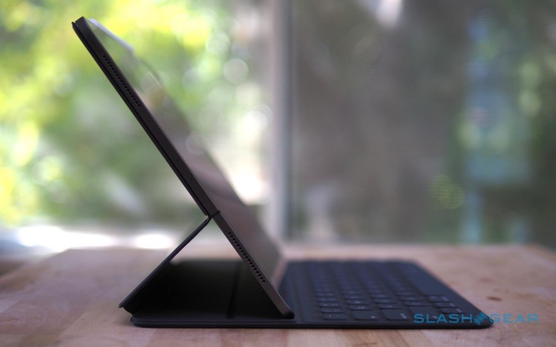
A common complaint about the old keyboard case was that it lacked stability on your lap. This new version does much better there, with a stiffer key tray that makes it far less floppy when perched on your knees. I still find that, in the more tilted position, the lower edge of the tablet is a little closer to the number key row than I'd prefer.
iPad Pro USB-C
With Apple's gung-ho embrace of USB-C on its MacBook lines, it was only a matter of time until the port made its way to the iPad Pro. Replacing the Lightning connector, it has some straightforward advantages. Not least is the fact that you can now use the same charger for your MacBook and your iPad Pro. I'm always looking for ways to lighten my bag, and not having to bring two bulky chargers is a good way to do that.
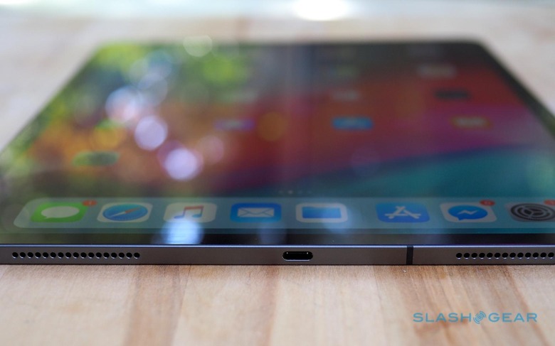
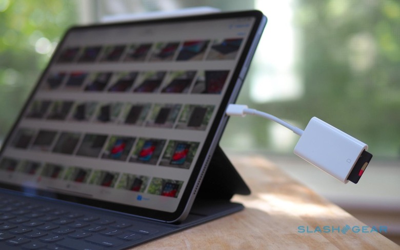
It's also considerably faster than Lightning was, when it comes to data. With the iPad Pro now supporting USB 3.1 Gen 2, it means up to 10 Gbps data rates: twice the speed of the old connector. That pays noticeable dividends if you plug in your digital camera to import photos, or use the USB-C to SD Card reader.
Most exciting for some professionals, though, is external display support. USB 3.1 Gen 2 is fast enough to drive a 5K monitor over DisplayPort, and with the right adapter you can still plug in a camera, SD card reader, or other USB-C device at the same time.
Functionally, external monitors work much the same way as they did before, with the old HDMI adapter for the previous iPad Pro. Most of the time that means mirroring what's on the tablet's display on the monitor. Some apps, which have specifically added support for it, display different things on iPad Pro and externally: iMovie, for example, shows a full-screen preview of what you're editing on the big display, while you interact with it on the touchscreen.
It means that, if you were hoping to have two different apps viewable at once, you'll still be using iOS' split-screen system – even if you have a 5K external monitor to play with. I can't imagine that's a limitation of the A12 Bionic's potency, so it comes down to iOS simply not being ready for it.
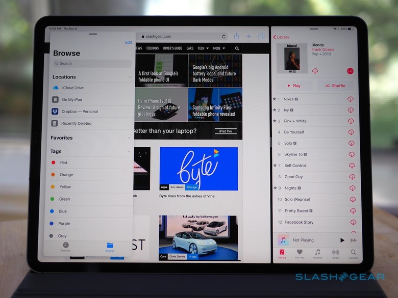
Indeed it's fair to say that the iPad Pro's USB-C port epitomizes the controversy around whether the tablet is a "true" notebook replacement. I plugged in a USB microphone, and an ethernet adapter, and they worked just fine. The USB-C port provides more power than the old Lightning port did, too – up to 7.5W – so there's more chance that external peripherals won't complain of being under-juiced. You can even charge your iPhone from your iPad Pro, with the right cable.
USB-C can muddy the water
In other ways, though, USB-C can muddy the water. Partly that's down to general confusion around the port, but Apple plays a part in that, too. The USB-C cable in the box, for instance, only supports power delivery: it's a USB 2.0 cable, not USB 3.1, and so you don't get external display support.
Apple has also taken a pretty rigid side in the USB data argument. While the iPad Pro can import photos to the camera roll, you can't just plug in any old USB drive and access the files on it. Nor is iOS set up to push media files back to your SD card or camera.
As always, there are outliers. Certain apps, designed to work with certain USB drives, can access files other than images, but you need to have the right hardware and software. That's not much use if all you need it to grab a document off a thumb-drive a colleague hands you.
Apple maintains that the cloud is the key, and that cloud storage is now so affordable – and wireless connectivity now so fast – that most files are just as accessible, and even more convenient in a multi-device world, when you store them remotely. The exceptions it will concede are raw photo and video files, hence the iPad Pro's ability to import them. Even then, though, it sees the cloud – or services like YouTube – as being the way you'd then offload your processed content.
I've tried, on many occasions, to live my digital life the way Apple envisages it. The reality always runs into a headache, though, one that's either insurmountable or which requires so many workarounds and hacks as to be just as much of a deal-breaker.
The cloud may be ubiquitous, but people still give me USB drives with documents on them. The video I just edited on the iPad Pro may be uploaded to YouTube, but I'd still like to be able to offload the original, processed file to external storage for my own backup. AirDrop is great, for an ad-hoc share with someone, but only if they're an iOS or macOS user.
iPad Pro Verdict
Am I wrong, or is the iPad Pro wrong?
Am I wrong, or is the iPad Pro wrong? It's a question I've found myself asking numerous times, as I ran into situations where my usual workflows weren't quite in line with Apple and iOS' vision of how things should work. The answer, I've come to realize, isn't a clean-cut one.
I can see Apple's argument of a cloud-centric world. I could even buy into it – my files being everywhere I need them to be, easily accessed and shared, and more cohesive regardless of the device I'm using to access them as a result – but it's too all-or-nothing. I'm reminded of Apple's wholesale switch to USB-C on its macOS notebooks, ripping off the Band-Aid in the transition from legacy ports, and forcing users to accommodate that.
Problem is, while there are dongles for the MacBook Pro and my older peripherals, the workarounds for iOS' restrictions are less easily addressed. USB-C is a welcome addition to the iPad Pro, but the flexibility of the port is undermined by the limitations in iOS 12.
Maybe using a USB drive to transfer files is less common in the age of the cloud, but certainly it still happens. What am I meant to do when someone tries to give me documents I need on a USB stick? Demand from behind my Liquid Retina display that they find a computer with which to upload them for me, or a Mac from which they can AirDrop them over?
On previous occasions, when I've tried to dump my laptop for an iPad, I've found it always comes back to a 90/10 split. 90-percent of the time, I can do everything I was doing with macOS on iOS and an iPad, with the advantages in portability and battery life that typically comes with. 10-percent of the time, though, I hit a wall.
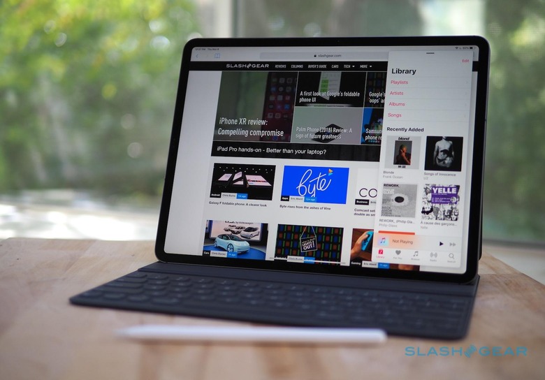
With the new iPad Pro and iOS 12, that split is maybe down to 95/5. We're getting closer all the time. Yet each remaining percent gets exponentially harder to address, that's just the nature of the game, and what limits I butt heads with won't necessarily be the same that you do as a musician, or a graphic designer, or a developer.
Perfection is impossible, that's inescapable. What I'd like to see from Apple is the acknowledgement that, though the iPad Pro can't be the perfect computer for everybody, it has the willingness to be flexible in ways that accommodate the divergent ways of working its audience arrives at the Apple Store with. That, along with a pipeline of pro software that doesn't compromise in the way that tablet apps traditional might, will turn what's undoubtedly the best tablet on the market into a candidate for best computer, period.
