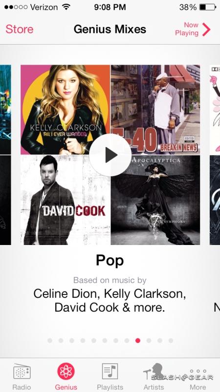
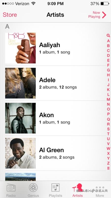
Apple iOS 7 Review
Apple reinvented touchscreen smartphones; now it's reinventing iOS. The new iOS 7 for iPhone and iPad has no small legacy to live up to, and it's pulling no punches in doing so, refreshing not only the design but going deeper, streamlining commonly used features, paring back unnecessary bloat, and polishing up things like Siri. It's the iOS update that we've been waiting for, and it's coming not only to the iPhone 5s and iPhone 5c, but a brace of older iPhones and iPads. Read on for our full review.
Design
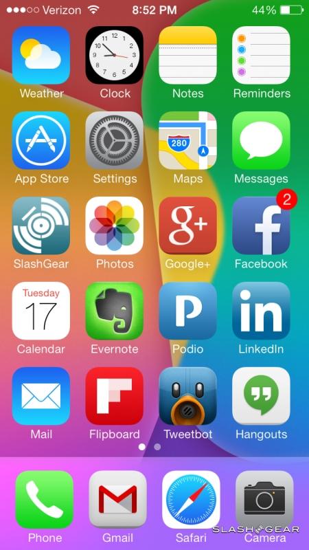
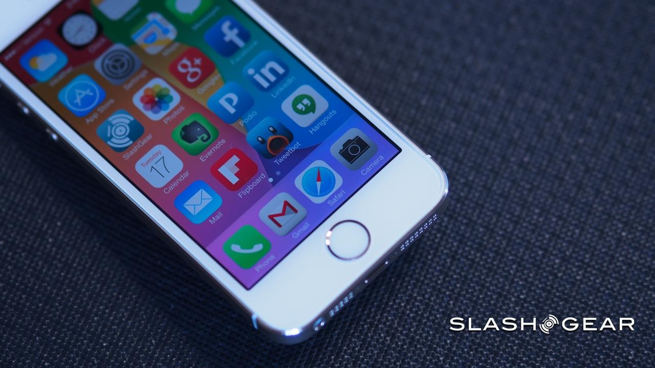
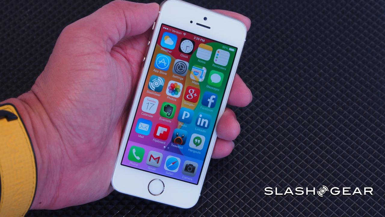
Skeumorphic no more: gone are the fake textures, the faux metals and leathers, the attempts to ape real-world date planners and calculators. iOS 7 is the most significant aesthetic refresh to the platform that we've seen, and it doesn't stint in dropping icons and UIs that had begun to look dated in comparison to Android and Windows Phone's digital honesty.
It's a good time to make that change. The familiar-but-digital approach had eased users into a touchscreen environment well, back when the iPhone first launched, but since then all-touch is commonplace. There are iOS users who have never seen a Braun calculator or used a physical address book, and while initial reaction to iOS 7's design included some shock and surprise, after a little time we find we much prefer this new look.
For a start, there's more done with transparency and color blending. The icons have been completed remade, getting less fussy in the process (and, we'll admit, giving us a couple of days of "where's that app?" confusion as we acclimatized to their new appearance), and menus and slide-out panes such as the new Control Center and Notification Center (more on which in the next section) look as though they're made of frosted glass, the vague hint of what's underneath showing through.
That's not the only visual flourish, however. As before, the homescreen icons pan left and right over the wallpaper, but in iOS 7 the icons themselves react to the angle at which you're holding the iPhone. Tilt it left and right, and the iconography "tilts" too, as if you're looking at each button askance. It's so subtle you hardly notice it initially, but it adds to the sense of the interface being in gentle motion.
Control Center and Notification Center
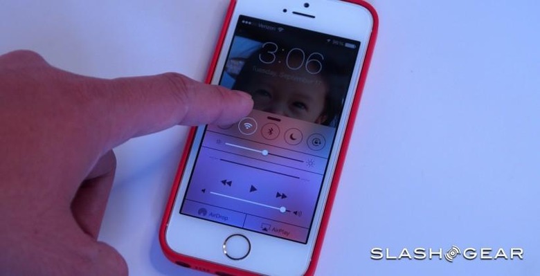
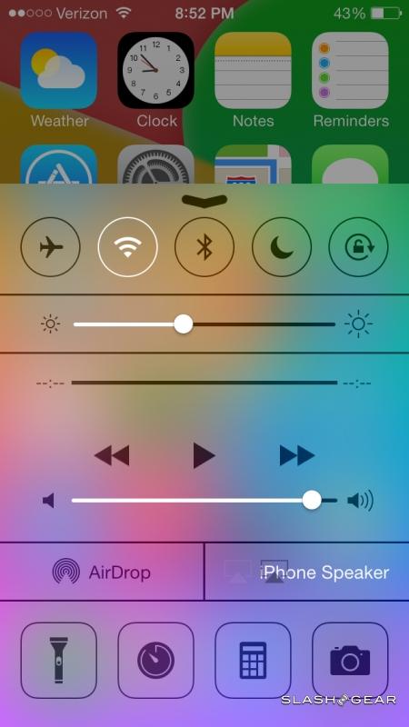
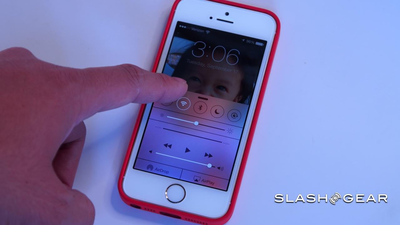
Accessing settings in iOS has traditionally meant jumping to the homescreen and then digging through the Settings menus, but Apple has changed that with a new Control Center. Summoned by swiping up from the bottom of the screen, Control Center shows up in any view and any app across iOS, including the lockscreen (though you can turn one or both of those features off), with a selection of the most commonly requested commands and apps to choose from.

Along the top you get a row of toggles for shutting on or off Airplane Mode, WiFi, Bluetooth, and Do Not Disturb, in addition to the screen rotation local. Underneath is a slider for manually adjusting screen brightness, and then under that a set of buttons for music control, including volume and details of the current track.
Below that there's an AirDrop panel which, depending on the contact, will give access to peer-to-peer file and data transfers. At the bottom there are four app shortcuts, for turning the camera LED on as a flashlight, opening the timer app, the calculator, and jumping into the camera. Unfortunately, there's currently no way to customize which four shortcuts are included.
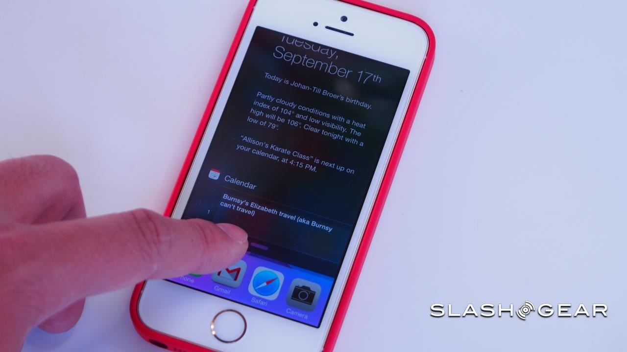
Swiping down from the top of the screen, meanwhile, pulls out the new Notification Center. Like the Control Center, it can be accessed from the homescreen, within apps, and from the lockscreen. New over the old notification drawer, however, is a Today view that effectively boils down your most pressing appointments, tasks, and travel into a single page, complete with weather information.
Alternatively, you can see all of the new notifications, with choice in the settings over which apps are included along with whether AMBER and Emergency alerts from the government are flagged up.
Our favorite feature from the new Notification Center, however, is one that's effectively invisible to the user. Notifications sync across multiple devices signed into the same Apple ID means that you no longer see the same alert show up – and needing to be dismissed – on every iPhone, iPad, and iPod you own. Instead, dismiss it once and it'll be vanquished from every other device. Given the number of people who rely on multiple Apple devices every day, it's a great addition.
Multitasking and Search
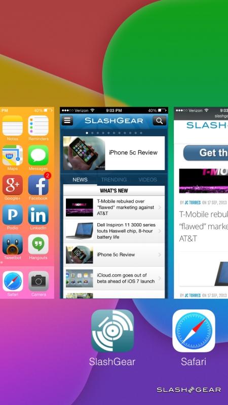
The iOS multitasking system had seemed rudimentary at best before, so we're glad to see Apple refine it some in iOS 7. Whereas before all you had were icons showing recently used apps, now you get both the icon and a preview pane showing the last state of the app itself; in fact, this preview is big enough that sometimes you can glean whatever information you need simply by looking at it rather than tapping through into the app itself, such as a date or phone number.
The press-and-hold method of force-closing apps has been replaced with a webOS-style upward flick, cutting down on button presses in the process. Even with the new previews, though, multitasking is silky-smooth like navigating through Cover Flow in the Music app. As for music controls, unlike in iOS 6 and before there are no buttons to manage playback when you swipe to the far left; they're handled by the Control Center.
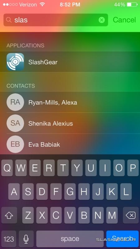
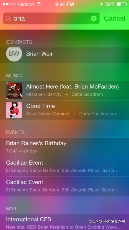
Search also moves in iOS 7, no longer getting its own dedicated homescreen pane but now summoned from any pane with a slight tug down on the icons. As before, you get results that include apps and local data on the device.
iTunes Radio
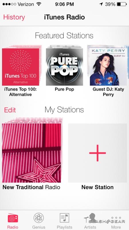
The iTunes Store may be the top destination for digital music purchases, but not everybody wants to own their audio. Following services like Pandora and Spotify Radio, iTunes Radio aims to fill that gap with streaming, in addition to helping with new music discovery.
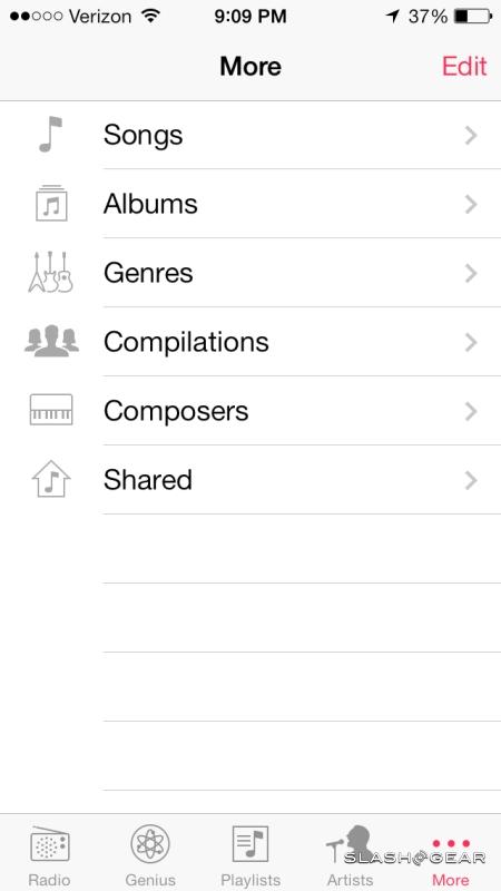
Swipe over to the right in the Music app, and you find the iTunes Radio tab. Every iOS 7 user – as well as those using iTunes on their Mac or PC, though at launch it will be US-only no matter the platform – gets access to the free, ad-supported version; iTunes Match subscribers, for their $24.99 per year, bypass the periodic commercials.
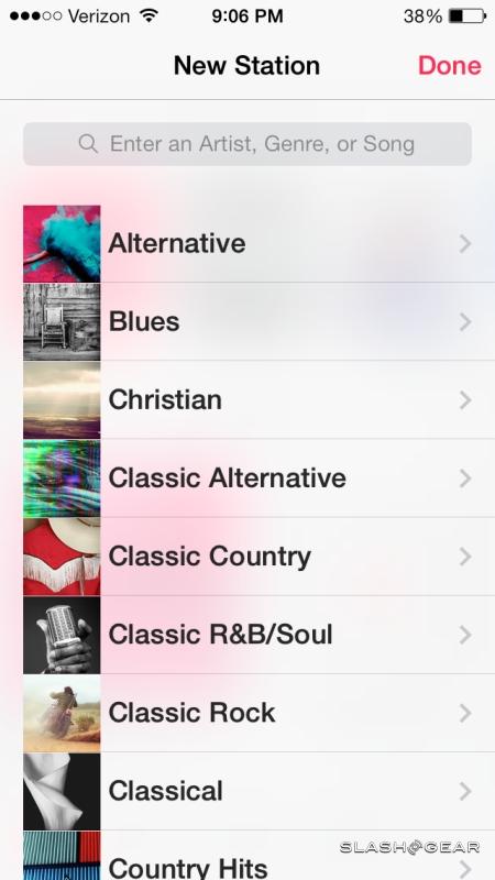
The initial offer is a choice of 250 "Featured Stations" which Apple's music team has curated, covering a range of musical styles and artists. However, you can also create your own stations, searching for a starter track or artist that iTunes Radio then builds a customized, dynamic playlist from.
As with Pandora, you can tell iTunes Radio whether you like its selection by up-voting the current track, or tell it you disapprove by down-voting. The algorithm learns from those votes and, so Apple says, picks more suitable tracks over time depending on how much you teach it. Tapping into the track gives the option to create a new iTunes Radio station from either the artist or the song, as well as to "tune" the current station as to whether it plays more hits, a broader variety of tracks, or goes into "discovery" mode and tries to broaden your audio horizons with music you may not have heard before.
A toggle allows you to turn off or permit tracks with explicit language, and there's also a sharing button to send the custom station to others.
As you might expect, Apple makes it easy to convert listening experiences in ITunes Radio into purchases. Each track gets a download button (or, if you already own it, an iTunes in the Cloud button to download it to the current device) or alternatively you can add it to your wish list.
What you don't get is the ability to directly piece together streaming playlists based on everything in Apple's catalog. That degree of control, which would more directly challenge services like Spotify, isn't supported; you have a limited number of track-skips to use per hour, and after they're used up you can't navigate through the playlist until the counter resets. Still, the fact that it's preloaded in iOS 7, and so straightforward to use, means iTunes Radio should be giving third-party rivals sleepless nights.
Camera and Photos
The iOS camera app has always been minimalistic, but iOS 7 squeezes a little more functionality in while actually demanding less menu-digging. That's mainly by surfacing the controls for HDR mode and the flash to the primary UI, with small buttons for them along the top of the preview screen.
Switching modes is done by side-swiping that preview, though the number of modes you get depends on your device. On the iPhone 5s, for instance, there's not only the regular camera and video modes, but a separate Slo-Mo video mode that records 720p footage at 120fps, a square photo mode for pseudo-Polaroid snaps, and panorama mode for widescreen shots. The iPhone 5c, in contrast, misses out on the slow-motion support.
Both phones get a new filters button in the lower right corner, with a choice of eight different effects – mono, tonal, noir, fade, chrome, process, transfer, or instant – that can be added to regular or square stills. Just as with filters in Photo Booth on OS X, there's a real-time preview to show you what you'll be getting.

None are particularly excessive in the effects they add, however, and if you're hoping for psychedelic colors or mangled faces you'll still need a third-party app to do that. Instead, you get a range of monochrome and tint options. There's also no support for filters in video recording.
Filters can be applied to both new shots and existing images viewed in the Photos app, which has also been updated in iOS 7. Apple likes to remind people that the most popular camera around today is its iPhone, and that means a whole lot of images sitting on peoples' devices; thankfully, the new Photos app has been updated to help address the management of all those shots.
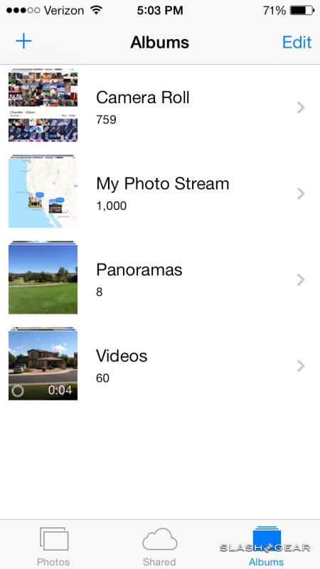
Rather than just a continuous grid, there's now support for Years, Collections, and Moments. Years is the most basic view, showing tiny thumbnails of all the photos you've taken, broken down by year. You can slide your fingertip across the thumbnails and see a larger version spring up, then tap that to see the full picture.
Collections are subsets within Years, pulling together themed images depending on when or where they were taken. So, if you snapped a couple dozen shots of Thanksgiving on your iPhone, all of those pictures will be clustered together into a single Thanksgiving Collection. If you're using the new burst photography feature on the iPhone 5s – easy to do, since you basically keep your finger mashed on the button and watch the shots rack up – the multiple copies are collated into one appearance rather than cluttering up the view with near-identical images. Tapping into that allows you to pull out a different shot from the burst, or you can simply allow iOS 7 to make its own selection based on which shows the best focus, faces, smiles, eyes open, and other factors.
Finally, Moments are the cream of the Collections crop, the best images whether from burst shots or otherwise. Tapping into each photo allows you to also access the iOS 7 editing tools which range from simple crops and rotations, through to red-eye reduction, applying one of the eight new filters, and turning on Auto Enhance.
As before, images and videos viewed in the Photos app can be shared directly with email or Twitter recipients, or uploaded to services like Flickr and Vimeo.
Safari
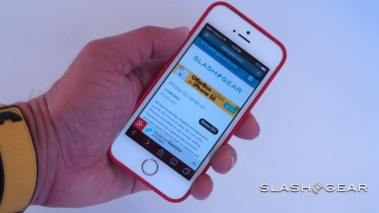
One of the most common arguments for opting for a larger-screen device than the iPhone – which usually means something Android-powered – has been the extra space for browsing the web. Apple continues to refuse to make the iPhone display any bigger than 4-inches, arguing that in doing so it preserves the ability to use it single-handedly; however, it has also finessed Safari in iOS 7 to maximize the web experience.
So, Safari now spends more time in full-screen mode, the chrome of the UI hidden away until you actually summon it. It's surprising what a difference that makes: with the top and bottom bars gone, and given the high-resolution Retina display, the screen suddenly feels far larger than the on-paper specifications would suggest.
It's not the only interface alteration in iOS 7. Gone are the separate address and search bars, replaced with a single bar that does double-duty (and cuts down on the number of mis-taps). The old tab view has been retired, replaced with a card file style array of all the windows you have open at any one time. Buttons along the bottom open up a new regular window or one in which private browsing is enabled; when you open a new tab, you get the unified search/address bar and a grid of bookmarks.
The bookmarks dialog itself has been changed, too, split into three panes. First, there's a list of favorites, bookmarks, and your browsing history; second, the Reading List of clipped articles and links you've gathered along the way. Finally, there's a new Shared Links list, which pulls URLs out of the recent tweets from the users you follow on Twitter. What you can't do, however, is retweet or reply to those friends' tweets from the Safari list view; for that, you'll have to jump over to the Twitter app, find the relevant message yourself, and do it from there.
Siri
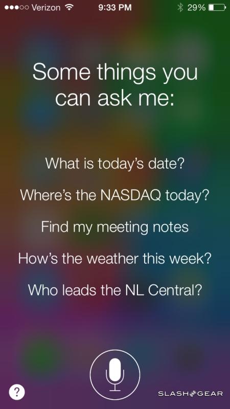
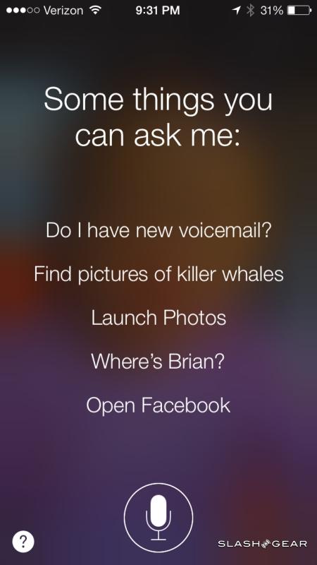
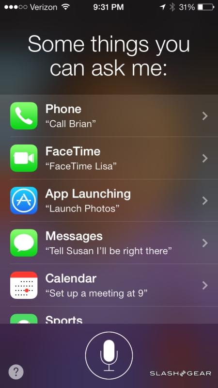
Apple's digital personal assistant has lost some of its exclusivity now – Google Now and its voice-control functionality on Android means hat both major smartphone platforms have their virtual PAs – but in iOS 7 it does get a welcome refresh. Instantly noticeable are the new voices, with fresh – and more natural sounding – male and female voices that are easier to understand and leave you feeling like you're having more of a conversation.
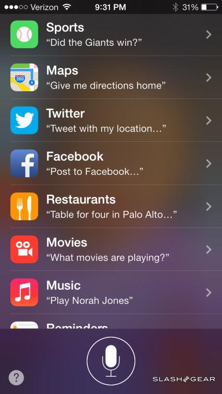
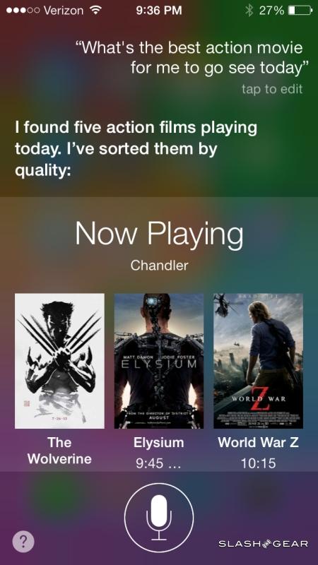
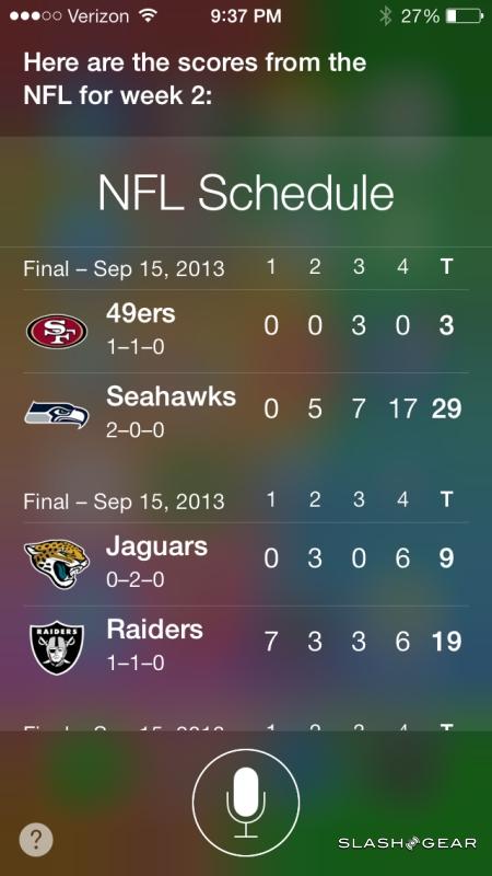
That conversation has improved, too, thanks to a raft of new functionality. Whereas before you could do relatively basic scheduling, messaging, and the like, as well as trigger web searches, now Siri can call upon Wikipedia entries, searches on Twitter, and web searches using Microsoft's Bing to better educate its responses. It means you spend more time in speech-only mode and are shunted less frequently into tapping at the display than before.
Similarly welcome is Siri control over some of the more fundamental controls and settings through iOS 7. It's now possible to change key wireless settings, for instance, like toggling Flight Mode or turning on Do Not Disturb, all simply by asking, whereas before you were left to do that manually. You can also ask to return calls, or question whether you have new voicemail messages.
There's also the ability to control the Music app, including iTunes Radio, meaning you can skip tracks, find specific artists, and even downrate a particular song, all by talking at your phone. It makes iTunes Music particularly useful when driving.
As always, there are a few limits around the Siri experience. You'll need a data connection in order to use it, since all of the voice processing is handled server-side, and the accuracy isn't, as with any voice command system, 100-percent. There's also none of the predictive-style functionality that Google Now includes, where the system guesstimates what you might want to know – whether weather, or flight information, or directions home – and prompts you with it.
Sharing, AirDrop and iCloud
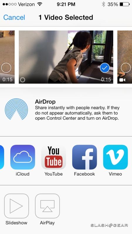
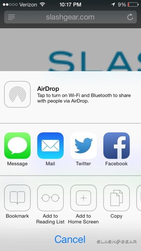
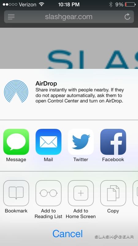
Apple's new sharing dialog is a big improvement over the old system. Tap the icon and you get a page of options for what to do with files and media: along the top, a carousel of, say, photos allows you to make multiple selections, while underneath are the various sharing options.
First is AirDrop, which we've seen used on OS X before. A peer-to-peer file sharing service, it works over WiFi and Bluetooth to send data like contacts, photos, videos, iTunes Radio stations, or anything else directly to a nearby iOS or OS X device. A list of compatible recipients shows up in the bar, and you simply tap to transfer; the exchange itself is encrypted for security
If you're not using AirDrop, there's a row of different apps you can choose between for sharing. By default you get Messages, Mail, Twitter, Facebook, and Flickr, though time will tell how flexible Apple is at allowing third-party services to add their options to the same bar.
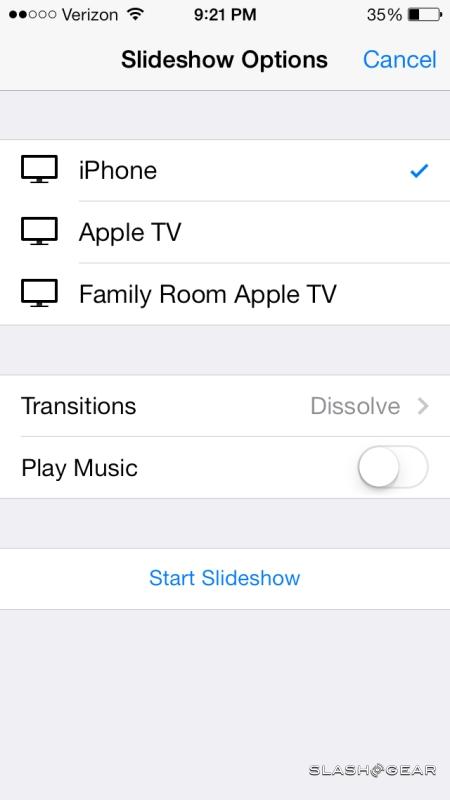
Finally, at the bottom there are local sharing options. Left to right, you get copy, start a slideshow, AirPlay (such as for use with an Apple TV), assign to contact, use as wallpaper, and print.
iCloud has been backing up iOS devices for some time now, as well as collating recent images into Photo Stream, but iOS 7 introduces iCloud Photo Sharing. Effectively, it's Photo Stream for invitation-only groups: you can add your images and videos, and they can add their own, with any new content automatically showing up on every persons' device. There's also support for commenting, allowing grandparents to voice their excitement at graduation day photos, or friends to suggest new hiking routes.
Maps
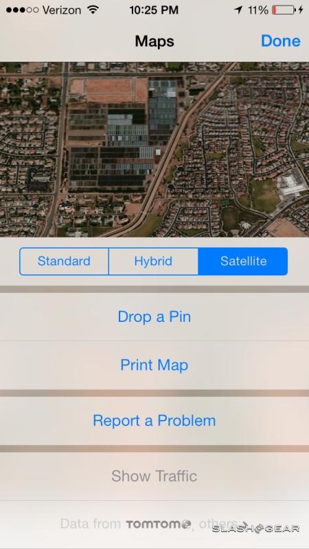
Apple Maps got off to a rocky start, but with ongoing server-side updates and this new iOS 7 version, the navigation app is a far more solid option than it was at launch. With this release, there's now support for turn-by-turn directions for pedestrians, for instance; if you have the iPhone 5s with its motion-tracking M7 coprocessor, Maps will even automatically switch between driving and walking guidance when it senses you switching transportation modes.
There's also a new Night Mode which automatically triggers based on the time of day, switching into a more visibility-friendly UI accordingly. Finally, there are bookmarks synchronized across all devices using iCloud, which means that the great little coffee shop you found on your iPad at home is logged to re-discover easily on your iPhone while you're on the move.
Is Apple Maps perfect now? Not quite; there's no bike directions option, only for drivers or those on-foot, and no way to cache or download maps offline for times when you don't have a network connection.
FaceTime
FaceTime has been offering video calls over WiFi and, more recently, over 3G/4G on certain carriers for some time now, but with iOS 7 it pares that back to just audio. FaceTime calls effectively simplify the VoIP experience for those within the iOS ecosystem, pushing audio chat over data connections rather than through the carriers' traditional networks.
We had no problems using FaceTime for calls, and indeed there were times when our data connection was too poor for a video conversation but an audio call went through. The biggest limitation over third-party services like, say, Skype, will be the fact that FaceTime is still Apple-only. There's no client for Android, Windows Phone, or any other platform.
App Store
As third-party software for all platforms has proliferated, the raw number of titles in each download store has become a less meaningful metric. Apple quotes "over 900,000" in the App Store, though the deciding factor as we see it has become the ease of which you can find the right app at the right time.
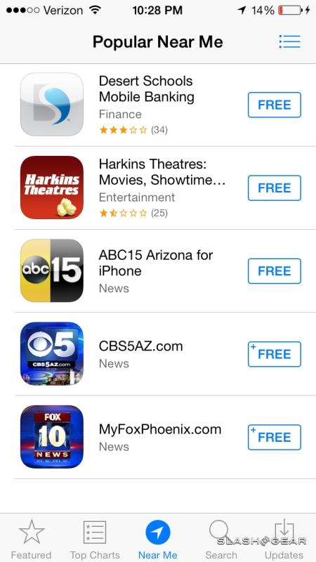
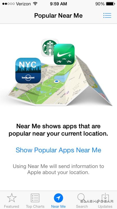
Good software getting lost in among the crowd is a problem most such stores share, though Apple has taken steps to address it in iOS 7. For instance, the App Store now has "Apps Near Me", a new category which flags up titles that have some relevance to where you are physically. So, if you're near a national park, you might see a guidebook for that park or a game based on it; if you're in Paris, you might be offered a French language app, or a Zagat guide to the best Parisian restaurants.
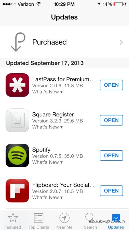
There's also automatic updates, which can now keep your apps at the latest version. We'd not argue with the option to choose which apps can update themselves and which will wait for manual updating, however, but for now it's all or nothing.
iOS 7 Software Update
iOS 7 will come preloaded on the iPhone 5s and iPhone 5c, but that's not to say only the new handsets will get all the features. As of September 18, Apple will release iOS 7 as a free update for existing iPhone, iPad, and iPod touch owners. You'll need an iPhone 4 or later, an iPad 2 or later, an iPad mini, or an iPod touch 5th-gen in order to install it; earlier devices will remain on iOS 6.

However, what existing owners won't get is the bundle of content creation apps Apple is offering free with the iPhone 5s and iPhone 5c. As of their launch, the trio of iWork titles – Pages, Numbers, and Keynote – along with iMovie and iPhoto, will be offered as free downloads when new owners start up their smartphones. That's nearly $40 worth of software.
Wrap-Up
iOS 7 feels like it has been a long time coming. That's not to say that Apple's smartphone and tablet platform had necessarily fallen behind, but the aesthetic and functionality changes bring a welcome feel of modernity to the OS.
There's no question that iOS 7 is better than the versions that came before it. Control Center and Notification Center are more intuitive; the carefully animated and designed UI is somehow both more refined and more bold at the same time. What changes have been made across the board have been done more in the manner of polishing off rough edges than revolutionizing for its own sake, keeping things just familiar enough for existing users while at the same time keeping the OS as a whole fresh.
A few features stand out as stars. iTunes Radio is what we wanted from music on the iPhone in the first place, and Siri's new functionality elevates the personal digital assistant from gimmick to a legitimately useful service. That Apple aims to better integrate it with in-car infotainment systems only seems like a good thing from our perspective.
Best of all, this isn't a software version reserved for the very latest devices. Apple's decision to release iOS 7 to the past few iterations of iPhone, iPad, and iPod touch will mean whole generations of device get a new lease of life. We'd say iOS 7 was worth it even as a paid upgrade; as a free one it not only keeps Apple at the top of its game, but sets the stage for a new age of smartphones and tablets.
