Apple Got A Painful Reminder That Design And Safety Aren't Friends
Apple is discovering that sleek architecture doesn't necessarily play nicely with health & safety, after multiple reported cases of Apple Park staff walking into glass doors and windows. The facility, colloquially known as "the spaceship" for its unusual ring-like shape, has only just begun accommodating staff, having seen its opening delayed after construction took longer than expected.
Part of that construction hold-up was down to just how demanding Apple has been with its architects, contractors, and the specialists doing the internal fit out. Jony Ive, Apple's design chief, stepped away from his regular role for roughly two years in order to shepherd Apple Park to completion. That, reports claimed, included exacting attention to detail on everything from emergency signage, through door handles and switchgear, to the layout of the often open-plan facilities.
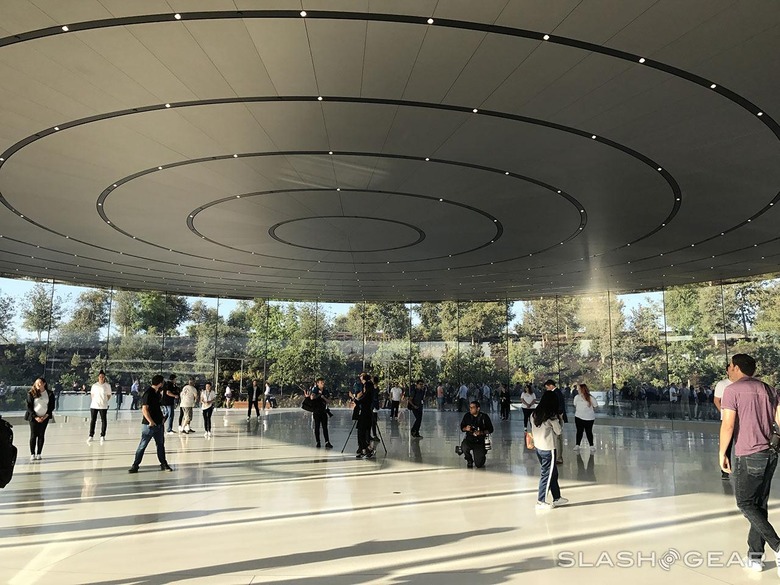
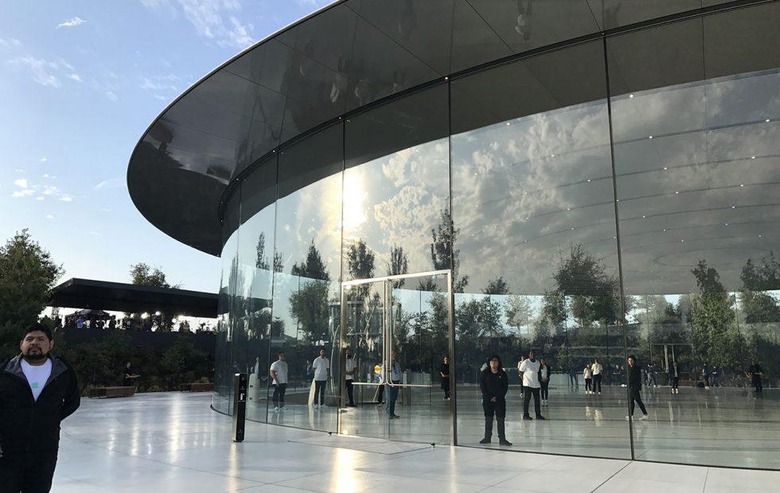
If there's one common theme that runs through the whole building, however, it's the use of glass. Apple certainly is a fan of the material, and undoubtedly an expert in its use. The company has numerous patents around the glass construction and facades of its retail stores, for example, while the Steve Jobs Theater – where the iPhone X made its debut – pushes the limits of structural technology by seemingly suspending its entire circular roof atop thin panes of curved glass.
Being optically pure and unadorned, though, can have a downside when you're talking about something separating corridors and offices, rather than just the cover glass on your new iPhone. At least two incidents where people at Apple Park have injured themselves by walking into panes of glass have led to calls to emergency services, according to public records documents obtained by MarketWatch. The men involved in the cases were left with minor cuts, it's reported, though were not, apparently, hospitalized.

Ironically, Apple's own obsession with detailing has likely exacerbated the problem. Apple Park's recessed lighting is designed, in part, to minimize reflections and glare on glass. In doing so, however, it has probably further reduced the likelihood of people seeing that there's actually glass in front of them.
Apple certainly won't be the first company to figure out that sometimes you have to tone down the aesthetic to save on trips to the emergency room. Indeed, there are health & safety regulations specifically intended to prevent this sort of accident. It's with good reason, too: there are multiple examples of people getting cut seriously after having inadvertently smashed through what they thought was an open doorway, but turned out to be a closed glass door.
According to California law, "employees shall be protected against the hazard of walking through glass by barriers or by conspicuous durable markings," so the Labor Code reads. The usual fix is to apply some sort of decal or frosting to at least part of the glass. That could be a strip of frosted rectangles, a strip running the length of the door or window, or some sort of rail that would give a visual signifier that there was a barrier in the way.
Indeed, Apple makes use of visual indicators like that at its One Infinite Loop campus already. They may not look so great in the glossy promotional photos of an empty office, but they certainly make working in it day to day less of a peril-filled task.
