Apple Dumps Scroll-Wheel, Replaces With Scroll-Strips?
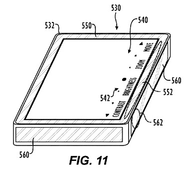
If filing for patents wasn't such a pain in the ass, I'd be starting to wonder whether Apple was thinking up new "could it be a touchscreen iPod?!" concepts and putting them through the system just to keep people's anticipation high. Seriously, they must have their patent lawyers as number one speed-dial. The latest to emerge from Cupertino is what looks like a small-form-factor device predominantly taken up by a display, the edge bezel of which is touch and scroll sensitive.
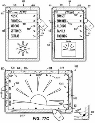
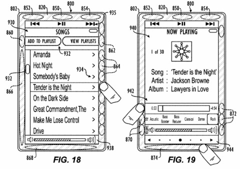
Hot-spots around the edge relate to particular functions as displayed on-screen; for instance in the picture above the transport controls at the top of the display are mapped to three virtual "buttons" on the top bezel, while the entire left side is a scroll bar and the right side is used for specific track selection.

The concept also has sensors inside which monitors its orientation, rotating what's displayed on-screen appropriately. As usual, Apple are keeping their options open in the patent as to what exactly this could all be used for:
"In one example, the electronic device 100 can be a picture frame having memory for storing digital pictures and for viewing on the display 110. In another example, the electronic device 100 can be a digital media device having the display 110, the touch sensitive bezel 120, and lacking most or all buttons or similar physical controls on the housing 52. In other examples, the electronic device 100 can be an electronic game, a personal digital assistant, a multimedia device, a cellular telephone, a portable video player, a portable navigation device, or the like."

Leaving aside the fact that whoever created these drawings doesn't know how to spell "FRIENDS" (um, "i before e", Apple), could this be the music-centric Apple cellphone so many are expecting early next year? Or perhaps it's a reinvention of the iPod, this time with a wide-screen display to satisfy those with poor eyesight?
