Android Wear Review: Your Wrist Just Got Smarter
I've wanted Google Now on my wrist since Google's contextual engine was officially announced. Android Wear, revealed at I/O last week, is the first stage in Google's mainstream play for the wearables space, at launch effectively the Android notifications tray delivered to your wrist. That's something we've seen tried before, from Pebble and others, but with Google Now there's the promise of interactivity too.
Turbocharged Notifications
The Android notifications center has been steadily getting more powerful over the years, to the point where you could argue it's already exceeded its name. Yes, it's where alerts come in from apps across the Android system, but they're also actionable: you can reply to emails, snooze alarms, share images, and more, all without having to tap through into the apps themselves.


To understand how Android Wear operates, then, you need to understand how notifications have improved, and how vital the difference between passively being notified from being able to actually do something in response is.
For me, a successful smartwatch is all about cutting down on the number of times I have to pull my phone out of my pocket. Some people can ignore the buzz of their phone; for better or worse, that surreptitious vibration triggers a Pavlovian response I struggle to avoid.
That's why I've had a hard time with previous smartwatches: sure, there are a few times where it's sufficient to simply see an alert, but most of the time I want to act on it, even if it's in a minimal way. Android's notification actions open the door to that.
Currently, each alert can have up to three actions associated with it, to which Android Wear also appends "Open on phone" to bring the app to the foreground.
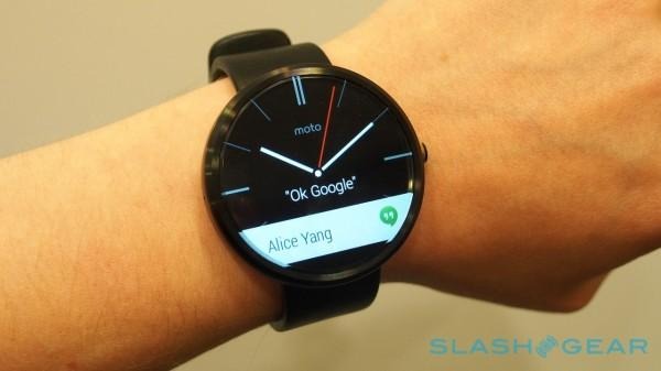
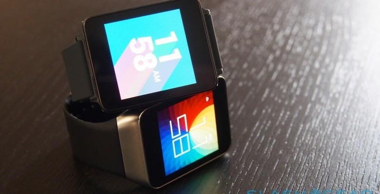
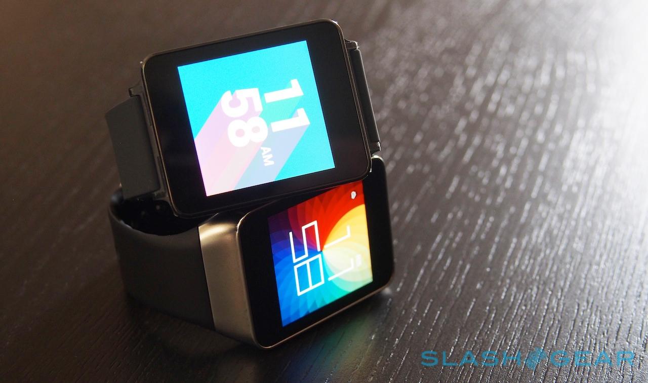
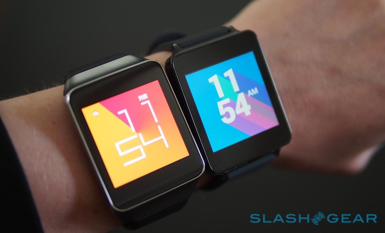
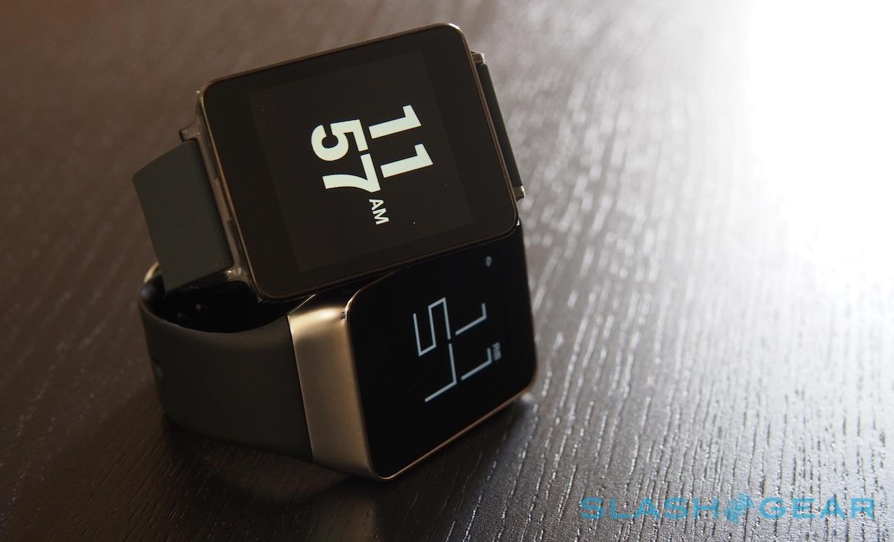
Android Wear is made up of a string of cards, each representing a different app or alert. Initially, the two Android Wear models – LG's G Watch and Samsung's Gear Live – have square displays, but eventually there'll be at least one round watch in the shape of Motorola's MOTO 360, due sometime this summer.

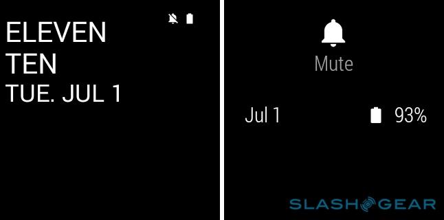
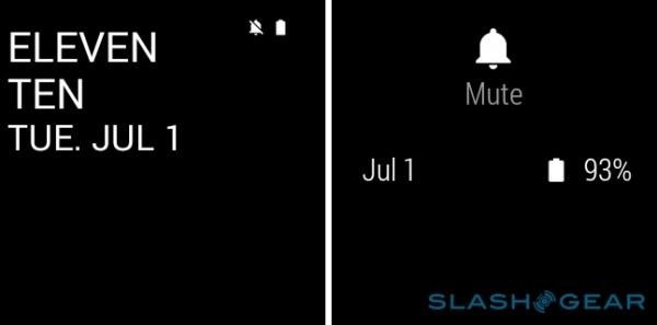
It defaults to a watch face screen, with the time, date, and a little preview of the card you were last looking at – your current step count, for instance – or the most recent notification, with various different styles available by long-pressing on the screen and then swiping left and right through the gallery. Pulling down from the top of the watch face screen unfurls a status shade with date and battery status; dragging it all the way down and releasing it toggles mute status.
Swiping up and down takes you through the list of cards; you can dismiss them by flicking them off to the right – which also gets rid of the matching notification on your phone – or flick them left to see the actions that are possible.
So, for an email, you'll get "Archive", "Reply", and "Open on phone"; choose to reply, and Google's voice recognition system kicks in to allow you to dictate a response. Unfortunately, there's no way to customize what controls are offered: for instance, I seldom archive email and prefer to delete it, but there's no way to do that from Android Wear (Update: You can switch "Archive" for "Delete" in the Android Gmail app settings, but in general you still can't change what actions each Android Wear notification shows). Similarly, if an email comes in that would be more suited to someone else, there's no "Forward" option.

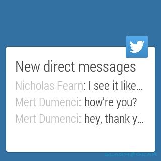
You're also limited by how apps themselves use the notifications area. Twitter, for instance, will slot separate cards into the timeline for activity on your account, information about who your friends recently followed, and topics of conversation they're discussing, but all of the activity – replies, retweets, and favorites – is condensed into a single card with no way of breaking them out individually. All you can do is open them up in the Twitter app on your phone.

Similarly, there's little in the way of filtering or granular control within notifications. You can tell Android Wear not to ping you with alerts from certain apps, but not to only notify from a set group of people, for instance, or with tweets from certain people. What would be great would be some sort of learning system that curated notifications based on who you interact with, similar to how Gmail figures out which are important conversations and which aren't.
I've also encountered at least one time when an app on the phone prevented Android Wear from working properly. A pop-up shown after a Google Maps update stopped the smartwatch from going into navigation mode, but with no indication on my wrist of what the problem was. Only pulling out my phone and opening the Google Maps app itself revealed the actual issue.
Much of this will be addressed as app developers get to grips with the display foibles of Android Wear, and Google's underlying APIs for the platform are flexible enough to support things like extra pages of information shown on a watch, or change how notifications are broken down.
Google Now
I don't necessarily think beaming notifications to your wrist qualifies a watch as being "smart" in and of itself. Happily, Android Wear doesn't end there: among the alerts from apps, there are also cards fed in from Google Now.
If you're unfamiliar, Google Now is most accurately described as a contextual engine. A native part of Android (and an often-overlooked part of the Google app for iOS), once granted permission it digs through your Gmail inbox, your calendar, your web search history, and more, pinging up relevant notifications in response.
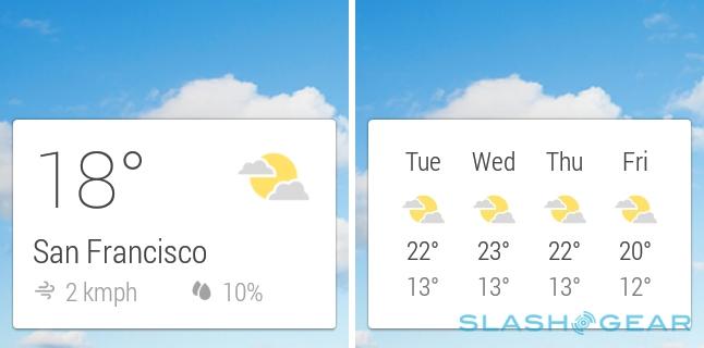
For instance, if you're traveling in a different timezone then Google Now might show you the time back home. If you use public transportation regularly, it will bring up nearby bus stops and train stations, complete with timetables for upcoming journeys. Based on your next appointment, it will notify you as to when you should leave, taking into account traffic jams or other delays.

Google Now and a wearable device arguably make perfect sense together, the sort of contextual micro-alerts that might prove frustrating if you pulled out your phone for each and every one of them, but which are easily acknowledged or ignored when they're a wrist-glance away.
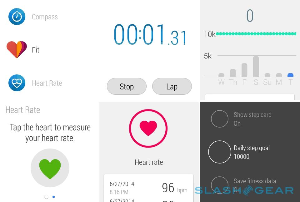
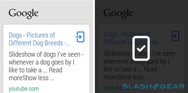
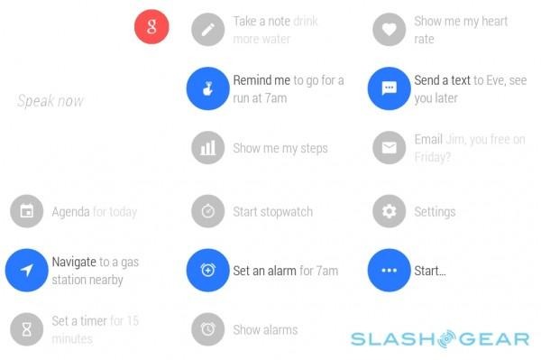
There's also voice command support, triggered either by tapping the clock on the watch face, or by saying "Okay Google" while the watch is active. There's no need to pause while the dialog pops up, either: simply say "Okay Google and continue with your command." You can do regular searches or ask for conversions – some are shown on-screen, like switching Fahrenheit temperatures to Centigrade, while others pop up as options to open in your phone's browser – or instruct apps such as "Send an SMS" or "How many steps have I taken?"
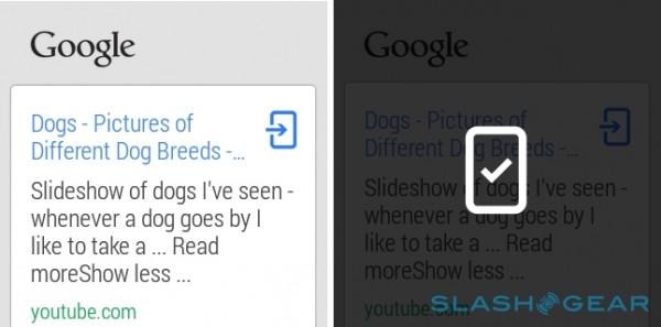
In fact, if a card is off-screen, there's no way other than a voice command to access it. There's no menu of apps or features, which means there's no discrete way to launch them beyond getting right up close to your smartwatch and whispering at it. I also experienced some issues with recognition, though that appears to be down to my having a British accent: American users who tried the smartwatch had no such problems.
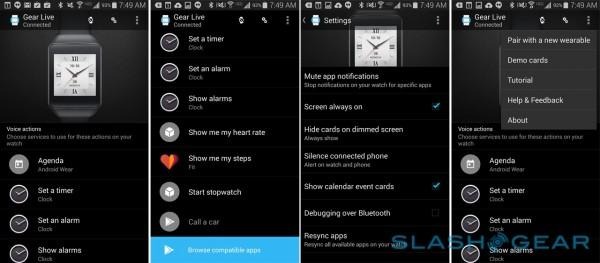
Somewhat counter-intuitively, the voice UI is also where settings are accessed from: down at the bottom of a list of command options. Some watches will have physical ways to access settings too, if they have a hardware button.

Navigation
Nothing quite marks you out as a tourist as staring at your phone in the street, trying to figure out which direction you're meant to be walking in. Shifting navigation to your wrist seems like an obvious solution, then, but so far the experience on Android Wear is patchy.
The basics are fair. A command like "Okay Google, navigate to the nearest Starbucks" will first trigger a hunt for the closest location and then trigger a Google Maps route: if you have the phone on your desk next to you, you can see it go through all the usual stages of navigation as if you were doing it manually.

From then, you get a simple screen of instructions on your wrist, telling you when to turn and down which street. Since neither of the current Android Wear devices has an internal speaker, any voice instructions come from the phone in your pocket instead. On the watch, you can swipe across and see the upcoming route.
Unfortunately, while pedestrian navigation seems the most obvious application for Android Wear, by default the navigation command gives driving directions. Even though the Google Maps app will remember the last travel method you selected when you use the app on the phone, guidance triggered by the smartwatch will always flick to the car.

You can specifically ask for walking directions, but not trigger them in preference when you hit the "Navigate" button on an appointment notification or a location search result on the phone. Google Now already has a setting that allows you to specify whether you normally drive, walk, cycle, or take public transit – it uses that to automatically calculate when you should leave for your next appointment – but that's currently ignored on Android Wear navigation.
Google tells me that it will be changing how navigation is handled in future, however, to better support personal preferences like method.
Don't judge yet, though: Third-party apps
To say it's early days for Android Wear is an understatement. Right now, we're seeing the first stages of Google's vision for smartwatches, but that's only half of the equation: still to come is the expected rush of third-party applications.
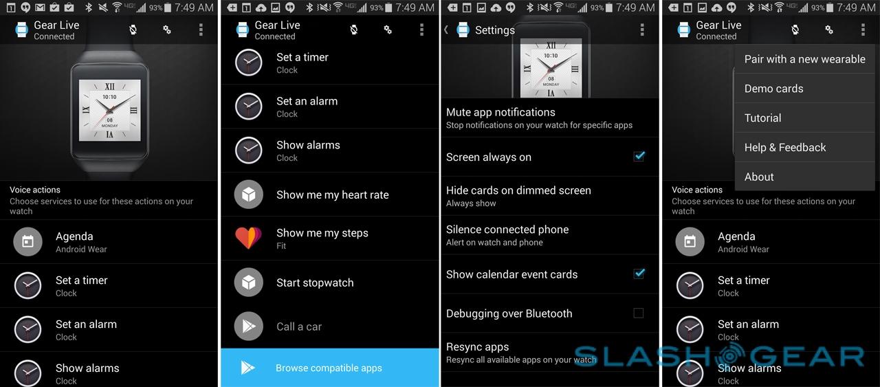
Hitting the "Browse compatible apps" section in the Wear companion app takes you to a special section in the Play Store. One day, Google envisages it being as thriving a software hub as the market for Android smartphone apps.

It's those third-party services which will help make Android Wear feel more personal. Google Now can be great at picking out timely reminders, but it's always going to be a top-level of relevance. The strength of wearables will be in how they bring value to individuals: not one single "killer app" but instead a "killer range" of features pieced together so that whether you're social network obsessed, a sports fanatic, a paranoid systems admin, or something else, your smartwatch takes on the form that best fits you.
On the flip side, the fact that Google will be limiting voice commands to its own choice of options may put a dampener on third-party services. Apps won't be able to add their own instructions to the list Android Wear recognizes, at least not initially, though there's support in the companion smartphone app for changing the defaults of what each of Google's preloaded commands refer to.

We're already seeing a wide range of different apps for Android Wear as developers test the water. Delta and United Airlines, for instance, have apps to show flight updates on-screen when you're traveling, as well as show a digital boarding pass. Evernote's app supports adding notes, searching them, or showing notes that were recently created or created near your physical location (the latter two generates three cards of the most recent results, the text of which can be scrolled through).
Perhaps most useful in integrating Android Wear with a broader digital lifestyle will be IFTTT, which adds Wear as both an input and an output option in its "recipes" of cross-service functionality. A recipe can be triggered by tapping it in the IFTTT app on the watch, or other services can send a card to Wear as a notifier.
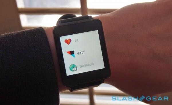
Actually accessing the apps can leave a little to be desired, however. Since there's no custom voice command support, you either have to modify one of the native commands' app association – such as using Evernote for notes, rather than Google Keep – or load the app manually. That involves tapping the clock, scrolling down to the bottom of the list of suggested voice commands, then hitting Start, and picking the third-party app from the list presented.
Wrap-Up
I love wearable tech, but I'm also a tough user to convince: a smartwatch has to deliver actual improvements in my workflow if I'm going to continue to give it prime space on my wrist. To me, that means actually keeping my phone in my pocket more, as well as taking advantage of its privileged position with extra features and enhancements.

On that level, Android Wear has proved a solid first attempt by Google. There are certainly limits – it's Android 4.3+ only, for instance, and there's no iPhone support – and both Google Now and the notifications system could each use some extra flexibility, particularly in what functions are available from the wrist, but it's the simple fact that there's broad two-way interaction between watch and handset which makes Android Wear special.
It'll be down to smartwatch manufacturers to make wearables which have broad aesthetic appeal, but even at this early stage with third-party apps in their infancy, I'm enthusiastic about Android Wear. It's the first smartwatch platform I've wanted to keep on my wrist for more than just a honeymoon period, and assuming developers embrace it in the same way that they have Android on smartphones, this is to my mind the strongest play for the wearable space so far.
Check out our full reviews of the LG G Watch and the Samsung Gear Live!
