Android Wear 2.8 App Update Improves Readability, Battery Life
One of the most basic uses of a smartwatch, which sets it apart from a fitness tracker, is that it can show you notifications and messages. That purpose, however, is defeated when you can barely make out what's on the screen, especially in brighter lighting conditions. To help improve that situation, and perhaps marginally extend battery life, Google is rolling out a small update to the Android Wear app, now at version 2.8, to increase readability by using a darker background.
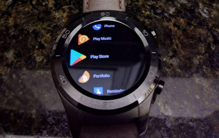
Previously, Android Wear smartwatches used a dark grey background for the UI, regardless of the theme used. While it might look nice, it doesn't give enough contrast against the white text or colored icons. In version 2.8 of the app, the background has been made to be nearly black, if not really black, to remedy that.
As a side effect, it could also help prolong the battery life of some of the Android Wear smartwatches, at least those that use AMOLED or P-OLED screens. Black requires no power to display on such panels, so it would only sip from the battery to show the white or colored text.
Google also added one more change to improve readability. The changelog says that notifications sport a new layout that gives more space to the actual message. When screen real estate is at a premium, the last thing you want is for unnecessary text or UI elements to take up space.
The 2.8 update is for the Android Wear app on the phone, which means users won't have to worry about downloading and installing a firmware update. That said, the update is rolling out in waves and Google has not mentioned which smartwatches will get it and which ones won't.
SOURCE: Google
VIA: Reddit
