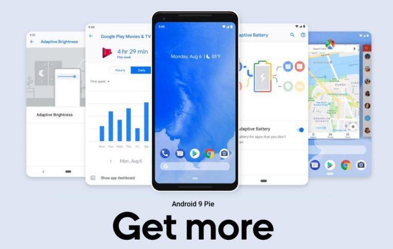
Android Pie Gestures Are Changing More Than Just Navigation
Google has just christened Android 9 as Android Pie and its rather plain-sounding name mirrors this release' identity. The good things are all packed inside with AI filling while the crust almost feels like just for show. It's biggest visual change and probably its most controversial is the new navigation system that favors a pill and a non-permanent back button over the navigation panel that has become Android's identity for over a decade now. And yet that seemingly superficial change could actually be the beginning of an even bigger identity shift that's happening in Android.
Pill or Button
Android Pie's new navigation system has a certain dichotomy to it. Since Apple came out first with its gesture-based navigation, ditching the now iconic navigation buttons almost feels like just a cosmetic change. And yet, at the same time, it is probably the biggest change Google has done, next to doing away with the app drawer icon in favor of a swipe up gesture in the Pixel Launcher.
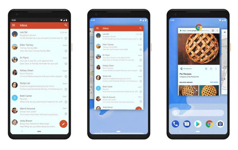
Over the years, changes to the core Android user interface has mostly been visual, with a few functional changes here and there. The status panel is still littered with icons, quick settings are always in a grid, and the bottom of the screen is always dedicated to those three essential buttons. Those buttons have changed how they look, mind, but for the first time since Google standardized their function and layout, they're changing not just how they look but also how they behave. In a nutshell, they're practically gone.
Back from where
Google UX Manager for Android EK Chung attributes the rather significant change to a few factors, like increased screen space, taller display panels, and, most notably, confusion. And it can perhaps all be blamed on just one of those three buttons: the Back button. While the Home button and Recents button are both self-explanatory and unambiguous, the Back button behaved in rather unpredictable ways, depending on what's on screen and where you came from.
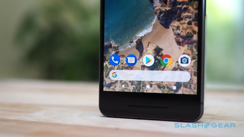
The Back button has been both the pride and shame of Android. For the longest time, Android users lorded over their iOS counterparts that they always had a way to jump back to the app they were on after they had been forwarded to another app by tapping on a link or an action. At the same time, that Back button may also take you back to another page in the same app, reopen a closed up, jump to a forgotten app, or do things you didn't expect. It baffled both newcomers and old-timers alike.
Maybe Apple was right
Android users' claims of superiority didn't last forever. With iOS 9 in 2015, Apple somewhat conceded defeat and added something like a Back button. But instead of wasting permanent space, iOS simply displayed a link back to a previous app in the status bar if and only if the user was thrown from one app to another. It wasn't there in any other situation and even disappeared the moment you break the chain, like by swiping up to see all running or recent apps.
This time around, Google may have taken a cue from Apple, though not completely, of course. The Back button is now contextual and disappears when it doesn't make sense, like on your Home screen. It still pretty much functions the same way, but at least doesn't clutter your screen or your head when it's not needed. It does make the layout look lopsided when it's there, but that's pretty much the most you'll get from Google admitting some form of defeat.
No home for Home
But more than just direction navigation, the new system also sets the stage for an overhaul of Android's primary interface: the home screen. To put it bluntly, it seems that Google is headed down a path that will eventually kill the home screen. There's no need to go to that screen anymore since you can reach the app drawer right from the overview mode. Or search for apps. Or let Google Assistant suggest ones to open. All you really need to do is to jump between apps and launch apps. Why would you need a home then?
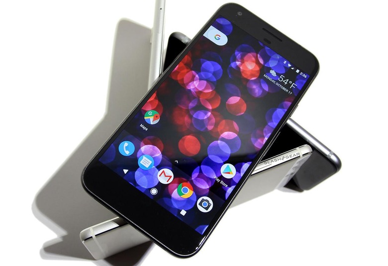
That, however, will have ramifications for app developers, particularly third-party ones. The new navigation system and overview screen will have features and hooks that Google will probably never make available to third-party developers outside of its OEM partners. De-emphasizing the home screen could also lead to de-emphasizing third-party launchers. That could also push widgets out of the picture, another part of the Android system that users gloat about but which Google has never really been fond of.
Wrap-up: iOS-like Android
With the Pixel 3 carrying a notch and Android 9 Pie using gesture-based navigation, there will be no shortage of claims that Google is copying Apple yet again. In a sense, they would be correct. Especially if you consider simplifying and cleaning up the user interface an Apple exclusive.
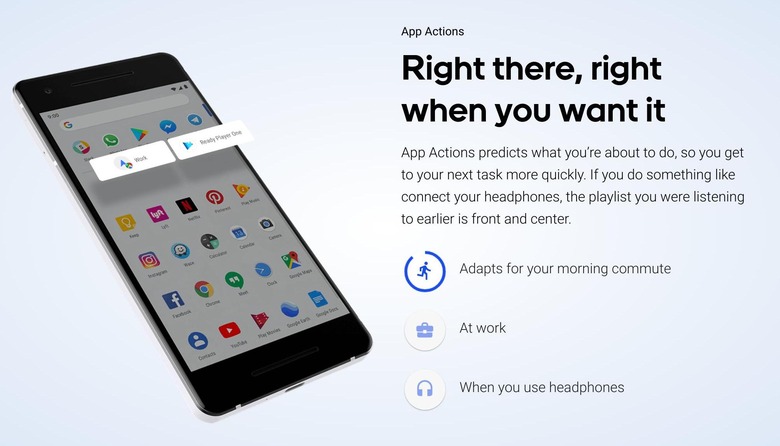
But, at the same time, Google is actually doing something bigger but subtler. While it is cleaning up the interface, it is also replacing the engine under the hood, taking the focus away from dozens of apps and icons and moving it into AI and machine learning. So don't be surprised if, one day, you unlock your phone and Android will already have your next app ready for you. That is probably the holy grail that Google is searching for.
