Android P Feature: New UI And Gestures
Google will launch the next evolution in Android, simply called Android P for now, later on this year. Ahead of that, though, is a look at the changes users can expect — and there are quite a few of them. Unlike past iterations of Android, the upcoming version will be designed to help users better manage the time they spend on their phone, quickly access the content they want, intelligently perform actions, and more.
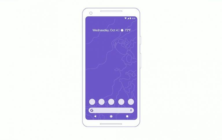
Android P won't look quite like the Android you've come to know, instead bringing some notable UI changes that include a reduction to a single home button. Google explains that the new version of Android is simplified, made with smaller screen bezels in mind, and ultimately more intuitive for anyone to jump in and figure out.
A key part of the new UI is gestures in Android P which largely center around that home button. Swipe up on it, for example, and the user is presented with a handful of their most commonly used apps, as well as a Google search bar. Swipe up again and you'll get all of your apps. This gesture works anywhere within Android P, as does a swiping gesture on the home button that enables the user to quickly scrub through apps.
As noted by Google, that swiping ability shows full app screen previews, making it easier for the user to swipe back and reference information on that app without fully launching it. Smart text selection makes it easier to open content — you can, for example, select an artist within text, then automatically open them on Spotify.
Google is also is addressing the volume menu, making it easier for the user to use it — you get a vertical menu near the physical volume rocket. Rotation is similarly simplified with a new rotation button on the screen. That's just a bit of the changes Google is bringing to the system — it is adding the ability to directly draw on screenshots, better manage notifications, and more.
