Google Material Design Adds Pixels With Depth
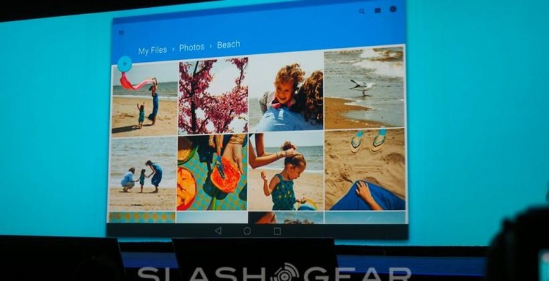
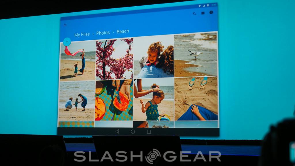
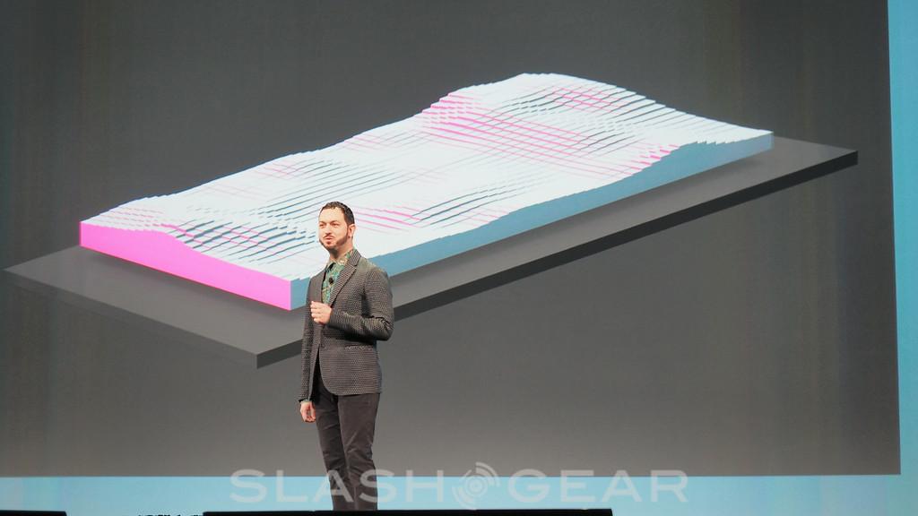
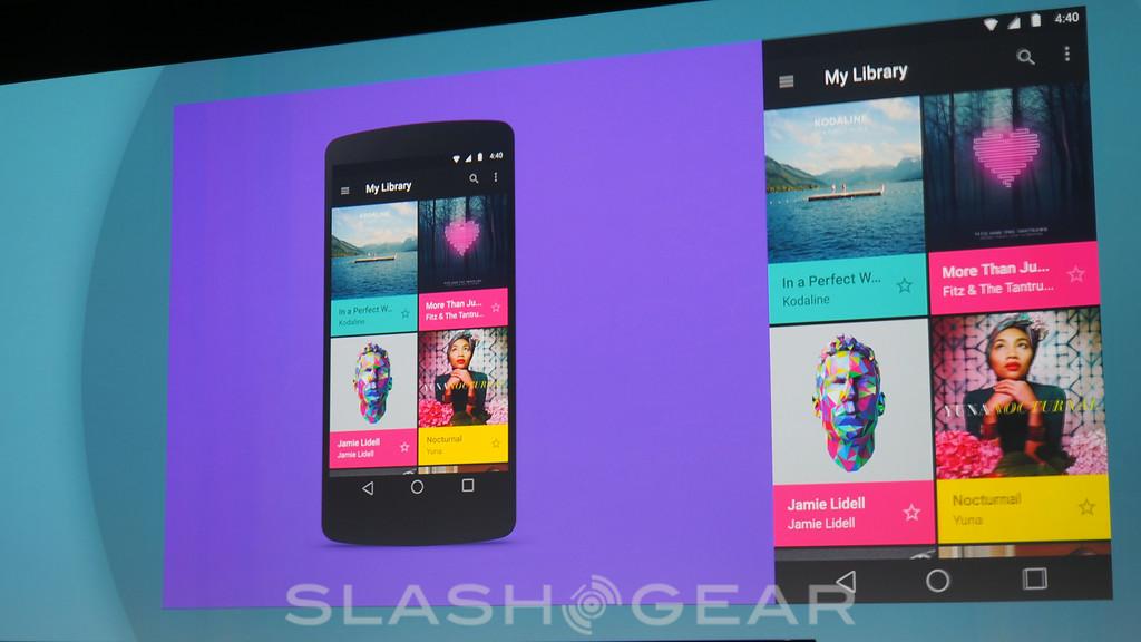
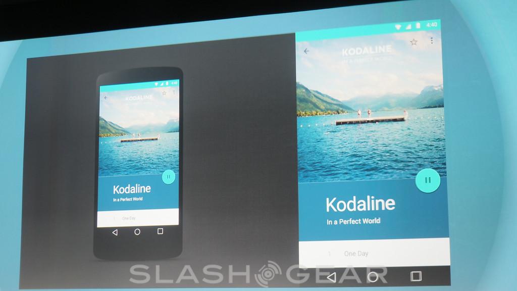
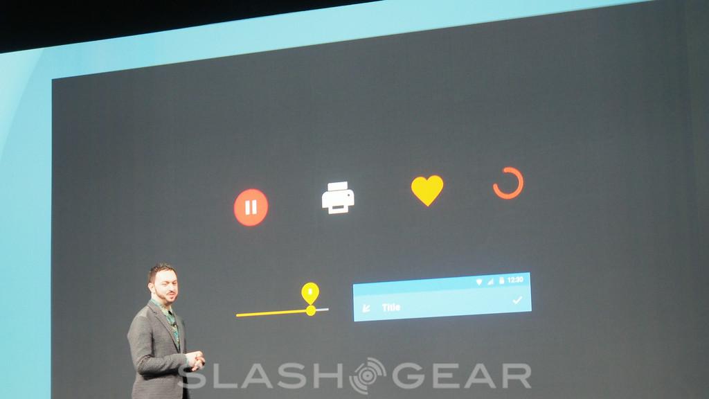
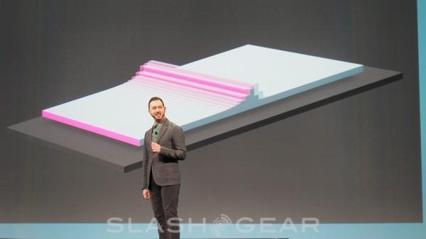
Google has revealed its new Android and Chrome design language, Material Design, cleaning up the smartphone and tablet UI by taking inspiration from paper and ink along with depth. "We took real inspiration from paper and ink," Google's Matias Duarte said during the I/O opening keynote, "but unlike real paper our digital material can reform and shape."
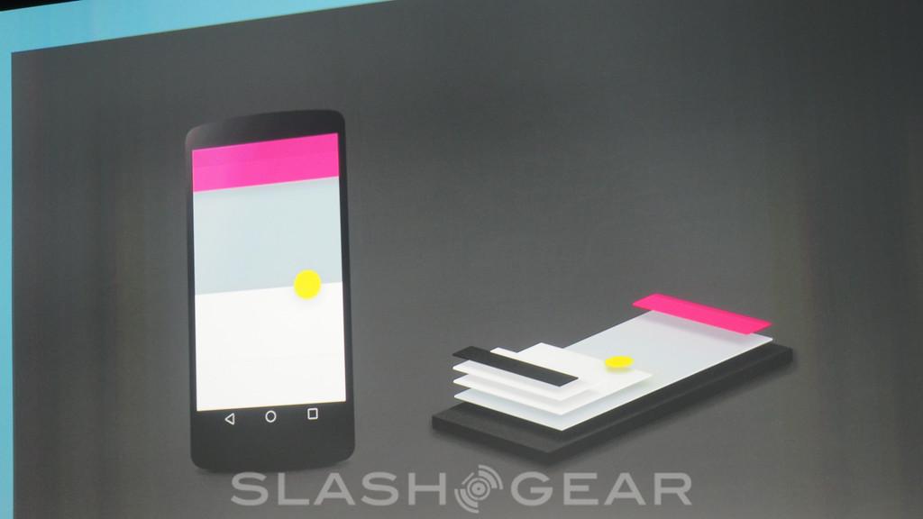
Material Design pares back the interface to a much cleaner, slicker UI. Developers will be able to assign an elevation value for each aspect of their app interface, and Google provides a framework for rendering with virtual light sources and real-time shadows.
There's also support for seamless animations between any screen, whether in activities within an app or between applications themselves. There'll be a new, easier colorizing of apps, with a support library called Palette, that should make apps more consistent with less effort.
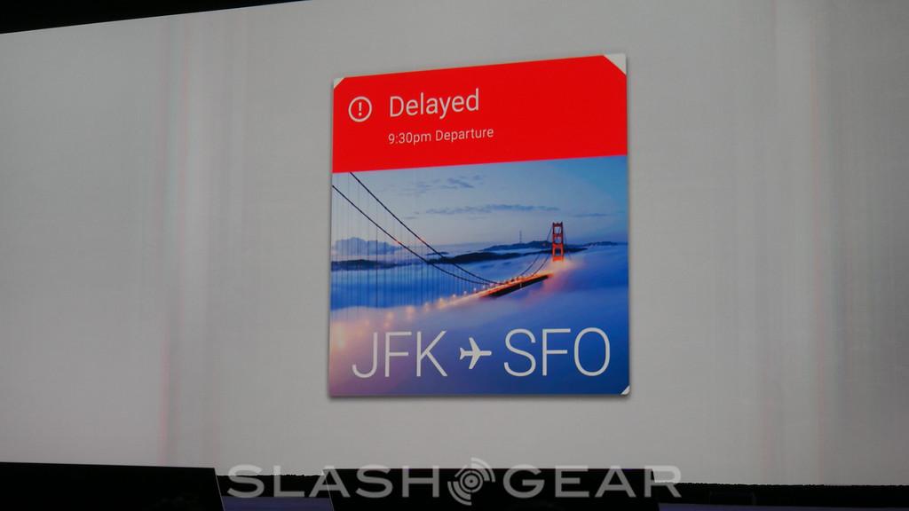
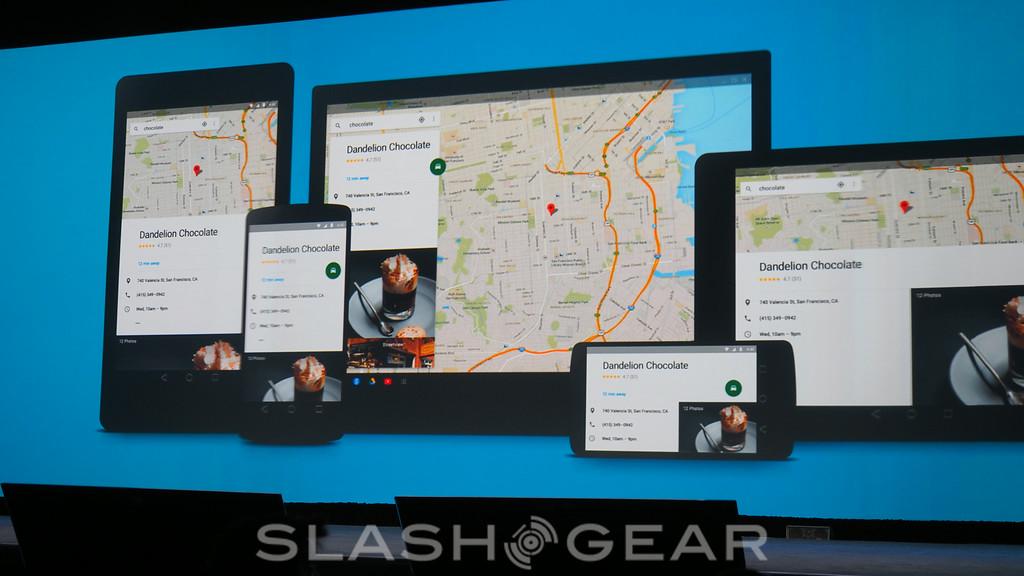
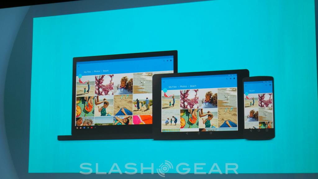
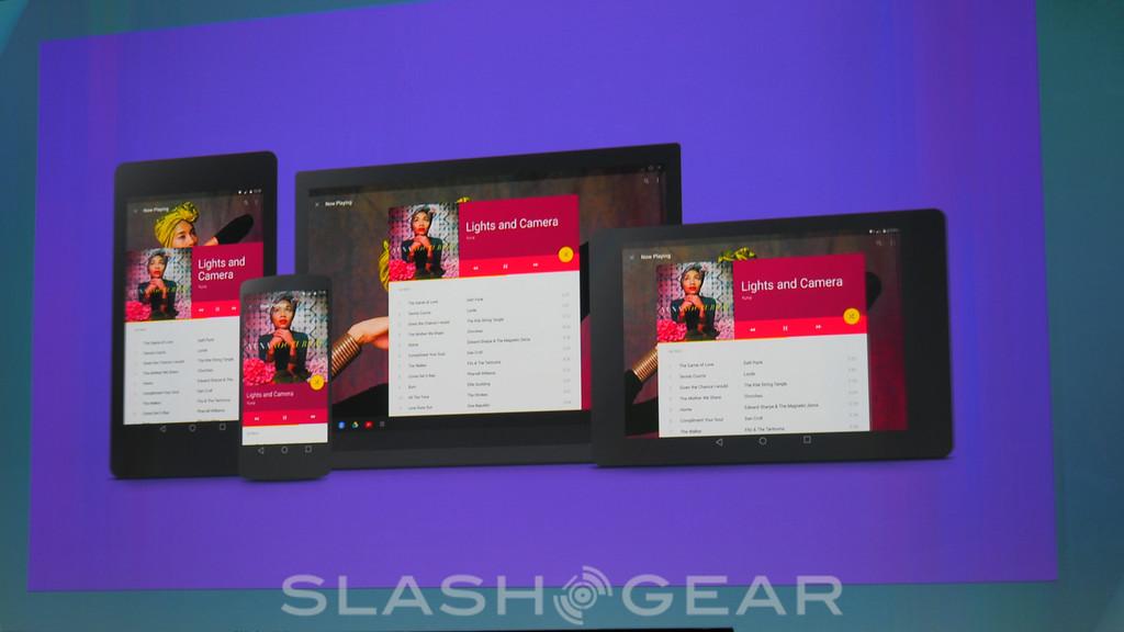
Palette and the color themes will also make it easier to create consistent apps for different form factors. That includes phones and tablets, of course, but Duarte also name-checked other devices like smartwatches or TVs.

As for web developers, they now get an update to the Polymer tool launched last year, with exactly the same Material Design and Palette support as native apps get. That all runs at 60fps in the browser.
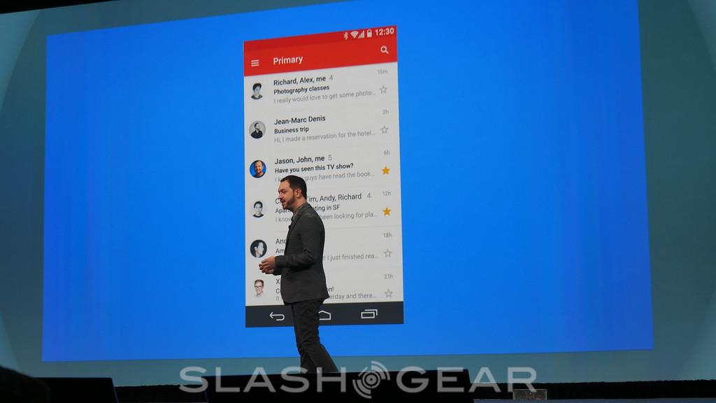
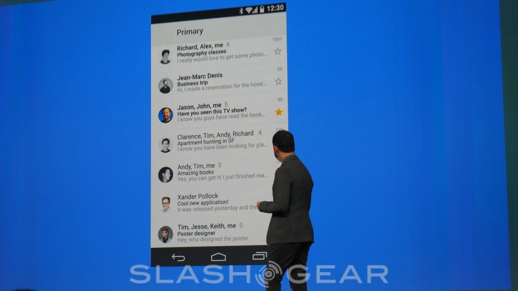
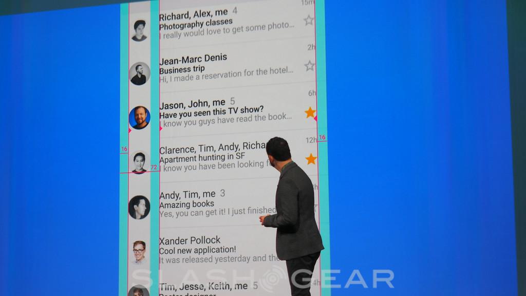
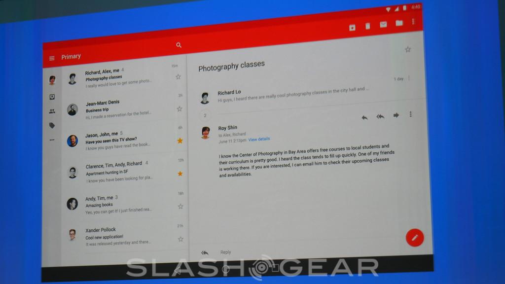
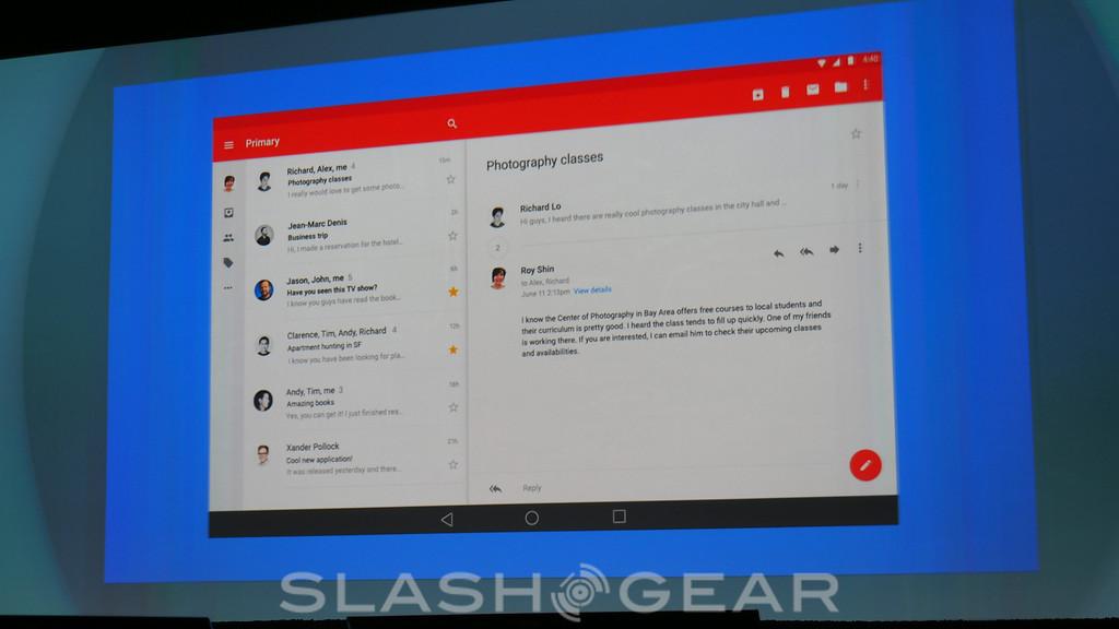
The preview of Material Design goes live today, giving developers an opportunity to get up to speed with the new interface style, and Google gave a preview of the updated version of Gmail for Android phones. All of Google's own apps, including those for Chrome OS, will be updated to Material Design over the coming months.
SOURCE Google Design
