Android M Preview Update Brings A Lot Of Sweet Goodies
Google has just announced the first ever update to its developer preview of Android M, which still has to be christened with a name. Continuing the new tradition it set last year. Google is rolling out limited updates in order to let developers prepare their apps in advance as well as report bugs. And while Google is only officially sharing some of the juicy tidbits that are relevant to developers, the update also so has some hidden treasures for end users waiting to be discovered.
See our previous coverage of the first Android M preview for a reference of some of the changes for this second round.
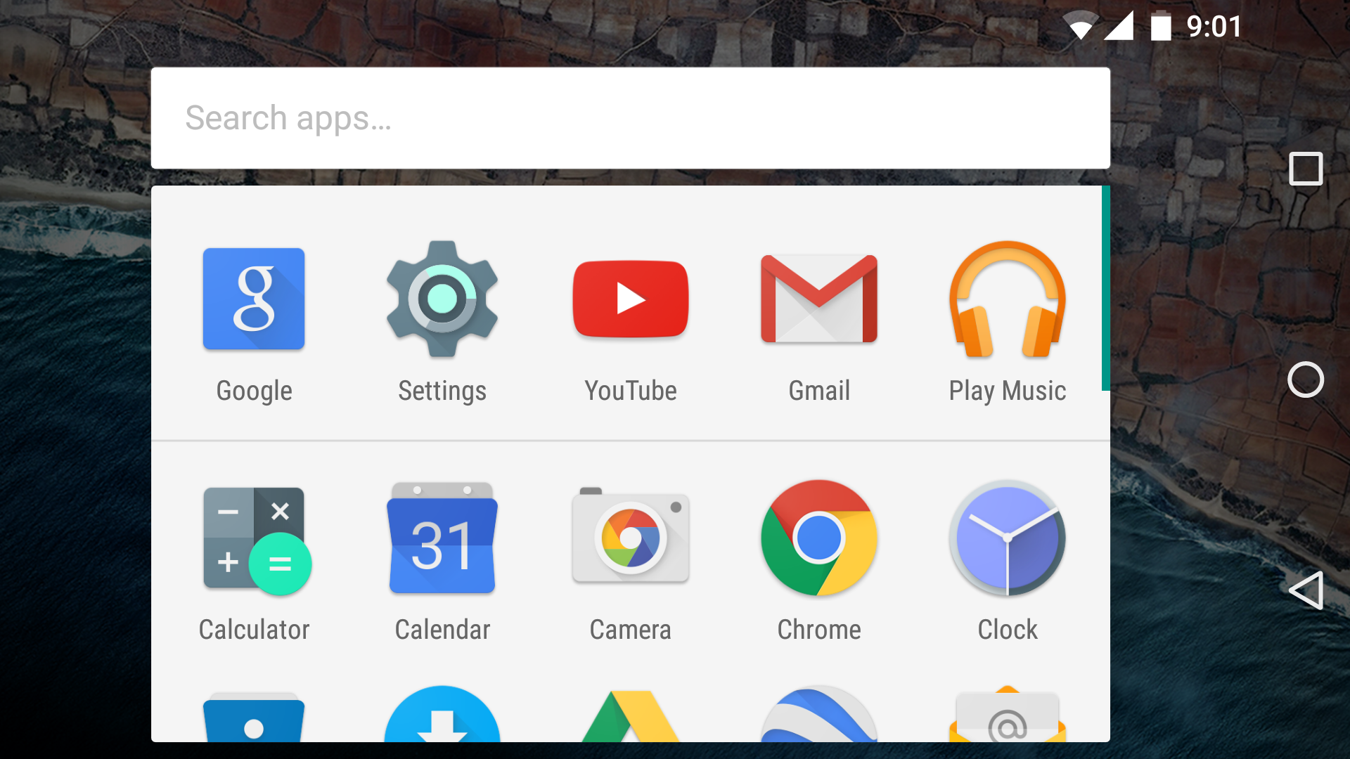
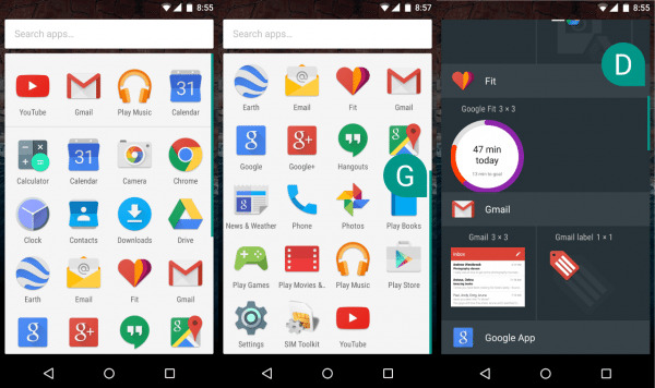
At a glance, not much has changed, especially in the setup part of the process. However, the moment you open the app launcher, you're already in for a probably pleasant surprise. The app grid has now lost the segregation by letters. This was a setup somewhat reminiscent of Windows Phone 8, except it still used a grid of apps instead of a list. In its stead, the app gird/list has a fast-scrolling feature, letting you slide your finger on the right-hand scrollbar to quickly peruse apps by letter. That same feature is now also found on the Widgets list, which hasn't changed its appearance or behavior.
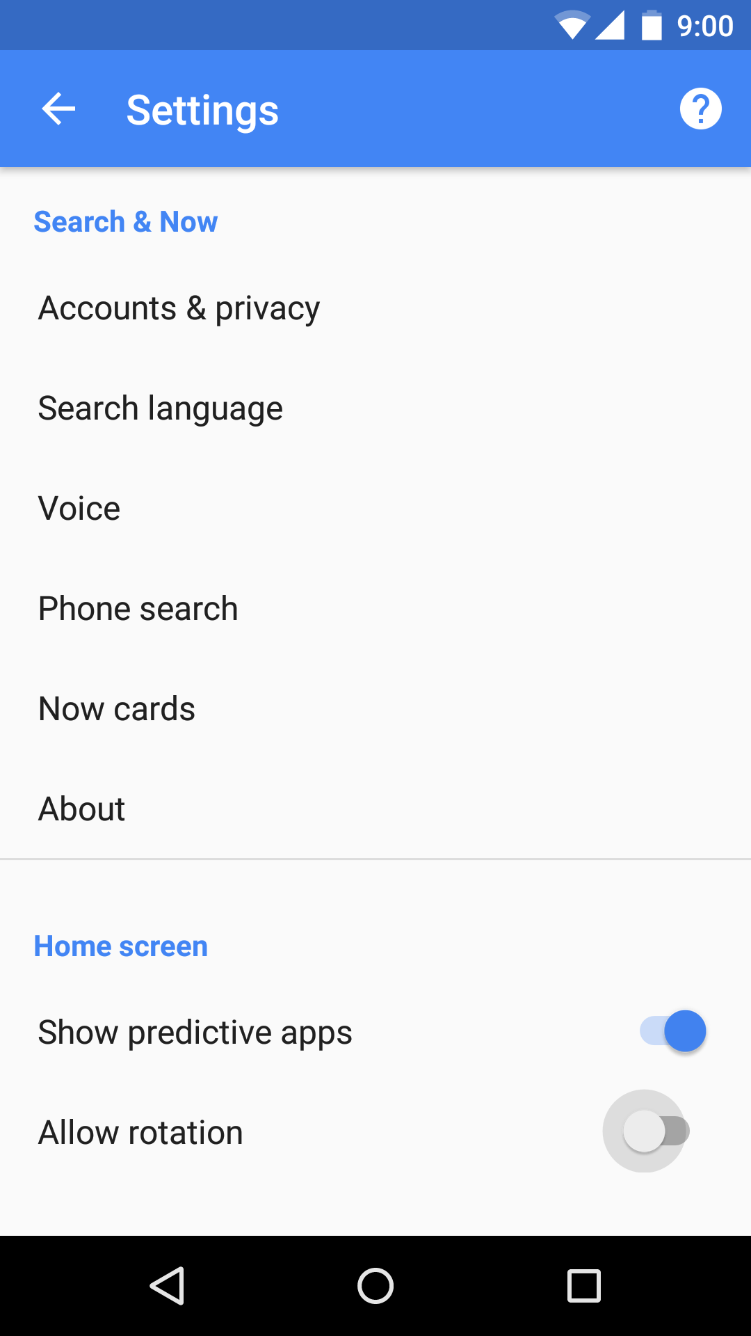
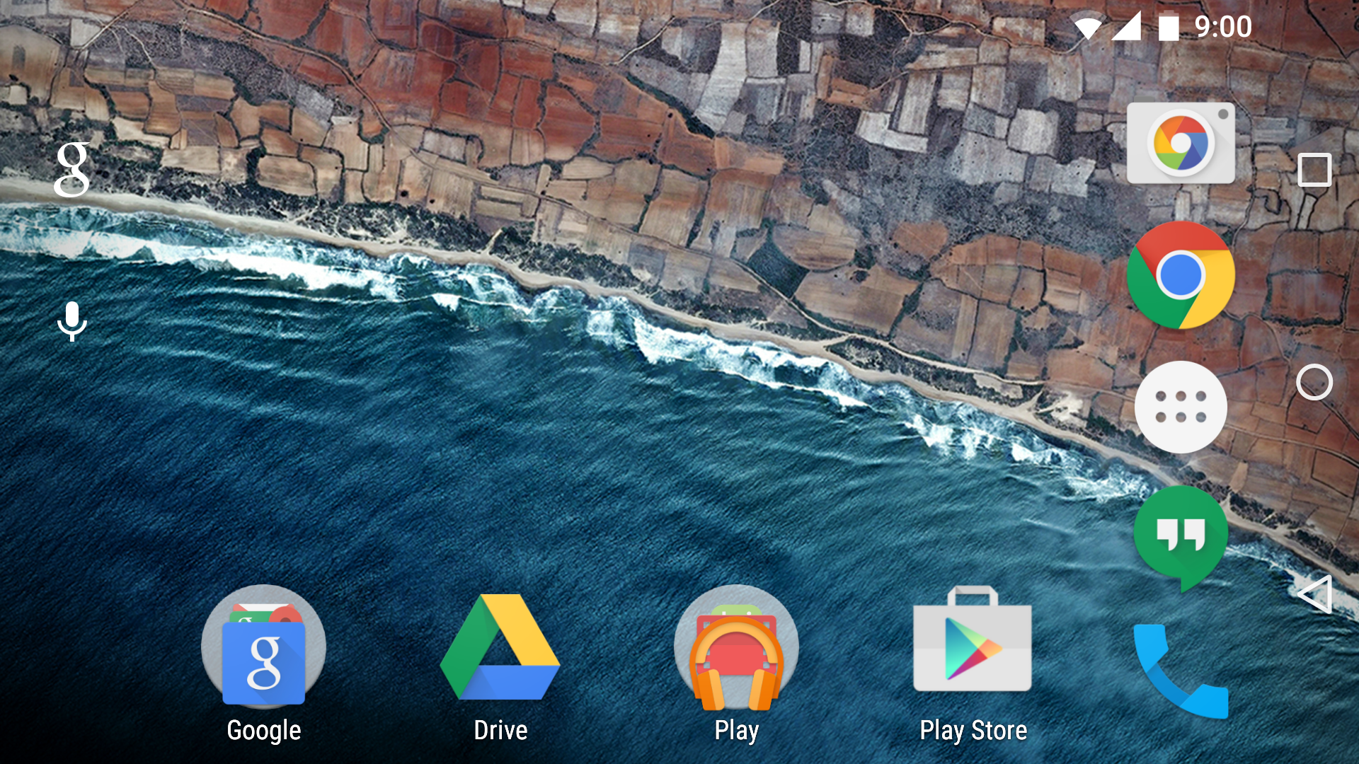
A more hidden treasure, but also related to the new Google Now launcher is landscape mode. Yes, finally, Google is supporting rotating the homescreen and the launcher. Strangely, it's not a default feature even if you have auto rotation turned on. You'll have to go to Google settings to flick the switch.
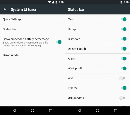
We had hoped that the System UI tuner would someday get more options and that day has arrived. Last time, Quick Settings sat there alone. Now it is joined by some more friends. First, let's get this out of the way first. Yes, finally, after so many years and so many iterations, Google is officially allowing the battery percentage to appear on the battery icon, something that OEMs and root mods have been doing since who knows when.
One surprise, however, is the ability to switch off Status bar icons. No, not the Quick Settings ones, but the row of icons at the top that shows, for example, if you're connected to Wi-Fi, or if there's an alarm set, or if Airplane mode is enabled. Some of those might be useful to hide, but some might be critical to always be in sight. Regardless, it's still a plus that Google would allow this much control, provided it doesn't suddenly yank it out. Almost ironically, the battery icon isn't included in that list.
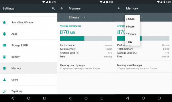
Google also did a bit of spring cleaning on the Settings and their locations. For one, the Memory view, which was previously a pain to get to, now sits at a top level position along with Battery, Apps, and Storage. This increases the discoverability of this handy utility. It also has a new landing page that gives you an overview of the system's memory usage. There is now also a drop-down menu that lets you switch from viewing usage in the last 3 hours up to the last 24.
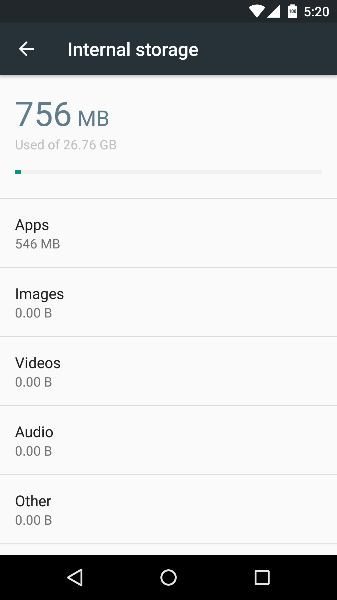
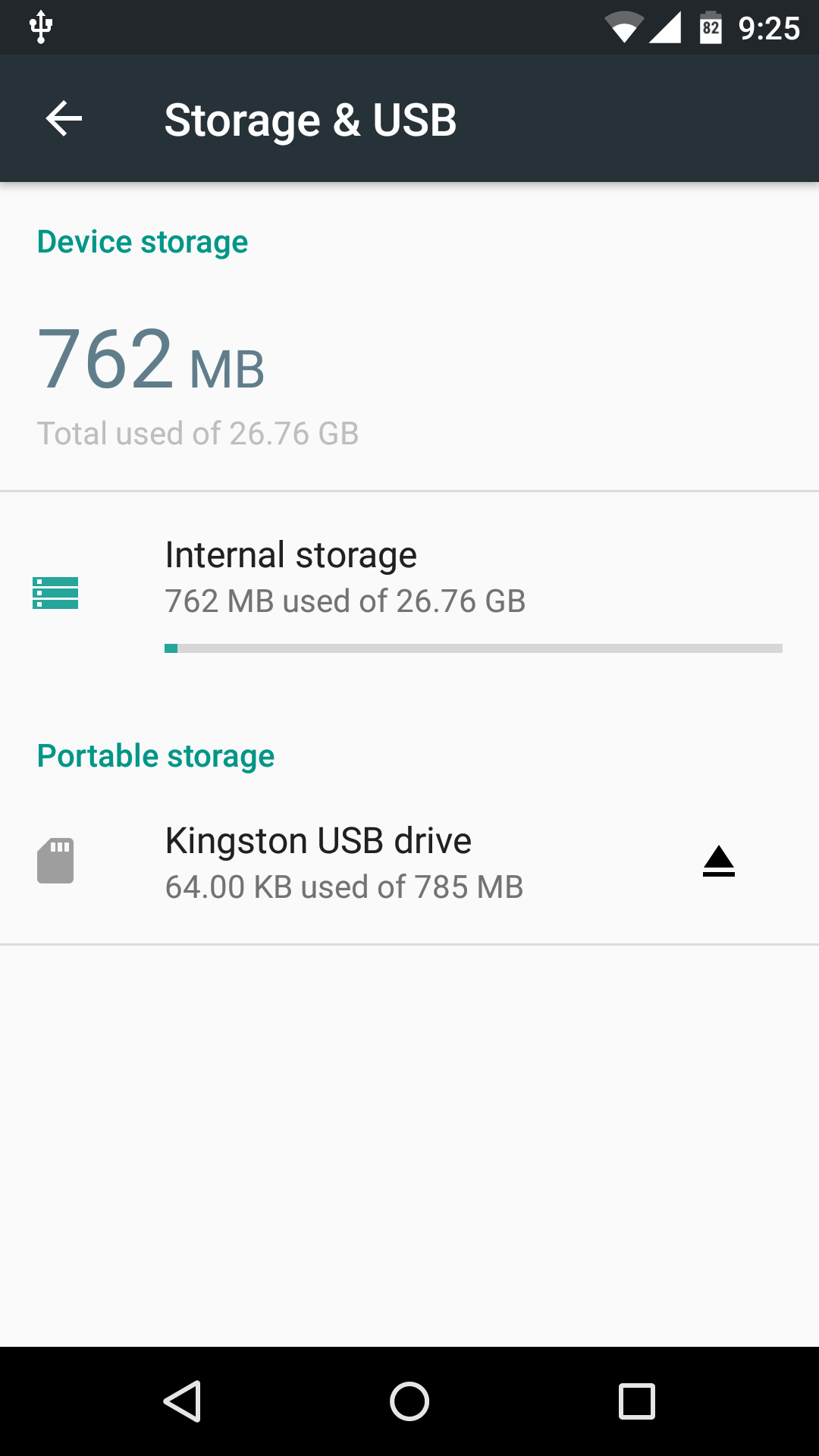
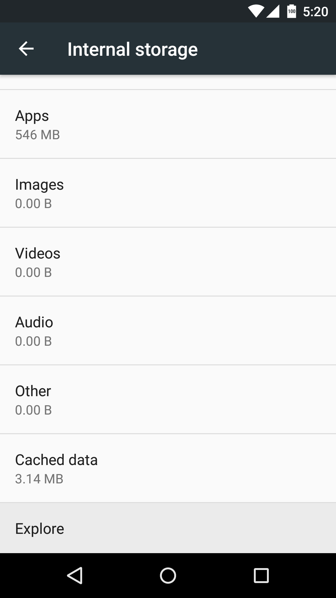
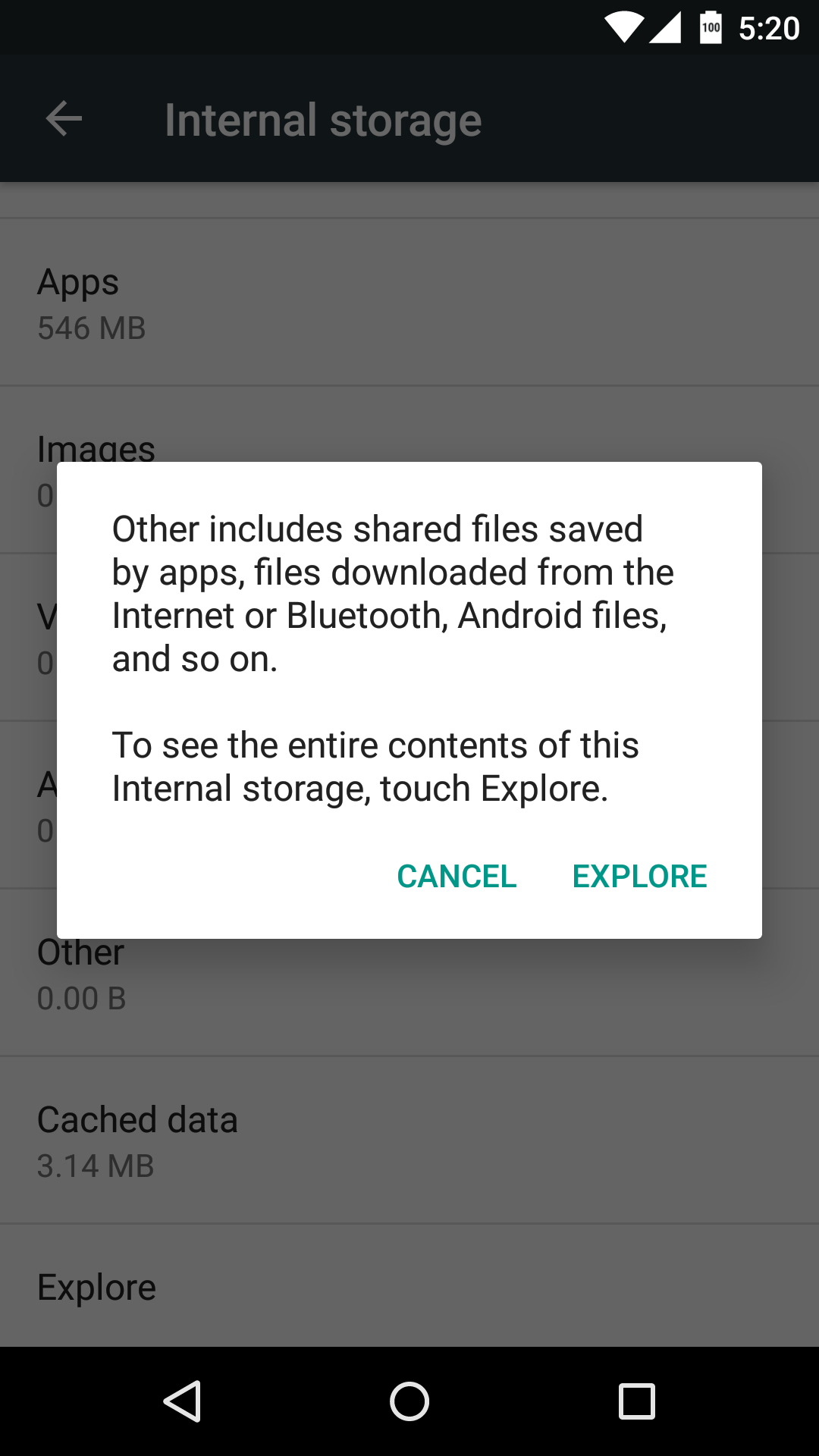
The Storage settings seemingly got the biggest revamp. Now called Storage & USB, the settings got more than just a visual makeover. What you see at first glance depends on whether you have a USB device, or any external storage, attached or not. If you do, you will first be given an overview of all storage devices available and their usage. If not, you are immediately taken to a listing of the different file types. Tapping on each one takes you immediately to the built-in but hidden File Explorer. Strangely, Google has removed the Downloads category. That said, the Other category, as well as the Explore option at the end of the list, does take you to the Explorer app, where you can access Downloads as well.
These are just some of the more immediately visible changes in the latest Android M preview. It does show promise and, in the case of the launcher changes, a willingness to listen. Google says that Android M is still on schedule, which means we will be expecting another update by the end of July before the final release before the end of the quarter.
SOURCE: Google

