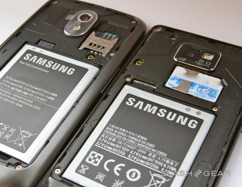
Android Ice Cream Sandwich Review
Android has come of age. Google's smartphone platform may have already taken the top spot for handset market share, but it arguable did that despite, not because, of the underlying Android user experience. Android 4.0 Ice Cream Sandwich, however, promises to change all that: a comprehensive refresh bringing both smartphones and tablets under the same umbrella, and demonstrating that Google can deliver software just as cohesive and compelling as Apple can. Laudable goals, but can the search giant deliver? Read on for the full SlashGear review.
UI and Widgets
If cleanliness is next to godliness, then Ice Cream Sandwich is a whole lot closer to heaven than previous iterations of Android. Google has comprehensively reworked the Android interface, borrowing elements from Gingerbread and Honeycomb and combining them into a UI that's distinctive and cohesive.
Android ICS and Galaxy Nexus Review
A liberal use of black elements – including the status bar, menu shortcuts and app launcher background – helps ICS blend in with the display bezel on the Galaxy Nexus (and also potentially has battery benefits, given OLED panels use more power to show bright colors). Bright blue highlights mix with grey and white for less important elements along with text, and the new Roboto font looks great. The dedicated menu button of prior versions has been replaced by a more straightforward menu shortcut – it took us a little while to get used to its new position, usually up in the top right corner of an app – and Google has squeezed in a slightly smaller row of persistent icons for common features so that you spend less time digging.
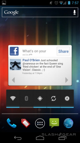
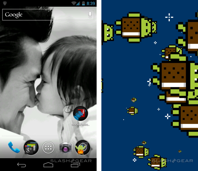
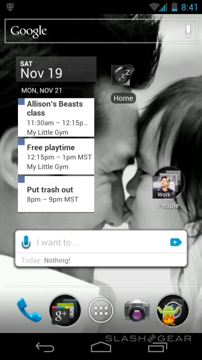
The homescreen consists of five swipeable panes, each with room for a 4x4 icon grid, a selection of widgets or a combination of the two. The Google search bar – with a voice search shortcut – is now persistent at the top, and a quick-launcher bar of four shortcuts (phone, people, messaging and internet by default) is fixed at the bottom, flanking the app menu shortcut. At the very bottom are the new virtual back, home and app-switcher buttons, automatically rotating to suit landscape-aspect software, and minimizing/disappearing at times to maximize the screen real-estate on offer.

Homescreen shortcuts are now dragged in from the app launcher, rather than added after a long-press on the pane – doing that allows you to change the wallpaper, but not add icons or widgets. Instead, widgets get their own gallery alongside apps in the launcher, though we found some third-party apps don't yet show preview thumbnails but only the size each widget variant will take up. Some of Google's own widgets – like bookmarks and calendar – can be dynamically adjusted in size once you place them. Dropping one icon onto another automatically creates a pop-up folder, which can be renamed by tapping its title.
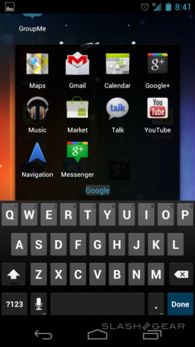
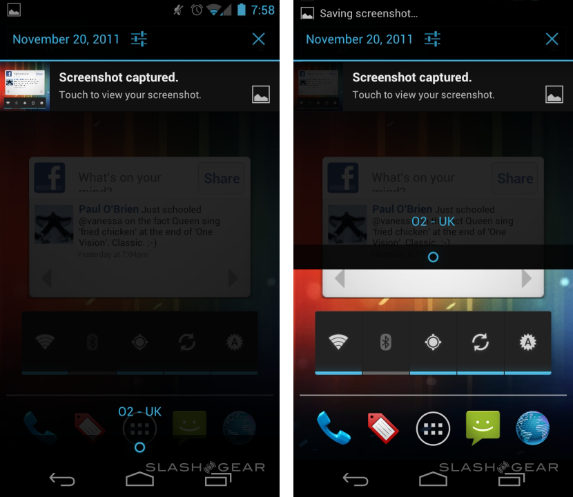
For the first time there's native support for screenshots – hold down the power button and volume-down button simultaneously, and after a second the screenshot is taken and then flagged up for easy access in the notifications bar – and you can capture the OS in various states. We were able to fire off a screenshot while simultaneously holding the notification slider halfway down the display, for instance.

Lock-screen options include the usual PIN and pattern unlock, as well as the new Face Unlock system covered later in the review. If you avoid a lock altogether, then you can load straight into the camera app by dragging the unlock-slider in the other direction. Unfortunately that option disappears as soon as you add some type of security.
Android 4.0 Ice Cream Sandwich first hands-on [Hong Kong]
Multitasking
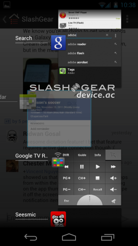
Honeycomb's thumbnail-based app switcher is borrowed for Ice Cream Sandwich, and it works very well. The multitasking button gets a dedicated spot on the screen, rather than being triggered by a long-press on the home button, and now shows a convenient small preview of each app's status.
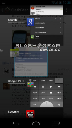
As well as tapping to re-enter the app, you can swipe it off to the right to close it down; alternatively, a long-press offers the option to remove it from the list or open its info page, showing storage use, permissions and other details. Altogether it works brilliantly, and we were soon whipping around from app to app.
Notifications
Android's notifications system has always been reasonably comprehensive, but ICS introduces new levels of granular control over alerts. As well as clearing the entire list in one fell swoop, you can individually swipe away each notification: that's particularly useful when several apps have just updated, and you want to get rid of the confirmations without losing, say, a calendar reminder or new SMS alert just yet. There's a handy Settings shortcut in the notifications drop-down too.

Keyboard and Voice Input
The Galaxy Nexus' capacious display certainly doesn't hurt typing accuracy, but there's plenty of improvements going on behind the scenes in ICS. Responsiveness and auto-correction accuracy have each received a huge boost, while errors are highlighted with red underline and can be easily picked through when you've got your email, SMS or other text down on the screen. Double-tapping a word highlights it – with easily dragged selection nubs – and offers a "Replace" option with suggestions from the dictionary. Alternatively you can teach ICS new words, and there's a choice of auto-correction "aggressiveness" to suit how slapdash your typing is.
Active Voice Dictation, Unlock to Camera, and more
Voice input, meanwhile, has been improved to support up to real-time transcription, though obviously you need a live data connection for Google's server-side processing to work. Accuracy proved better than previous versions of Android, though still – like Siri dictated messages on the iPhone 4S – required some tidying up before it was ready for prime-time.
Phone and People
Android supports SIP VoIP natively, with the potential for several such accounts to be registered and picked between for outgoing calls. Incoming VoIP call support is optional, with ICS warning that it will have a detrimental affect on battery life. Of course you can also use Skype and other VoIP apps from the Android Market.

The other new addition to the phone app is "quick response", a list of preset and custom text messages that can be used to reject an incoming call. If you're in a meeting, for instance, you can fire back an "I'll call you later" message to explain why you're not picking up.
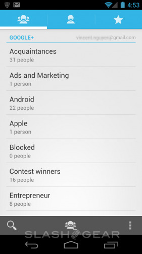
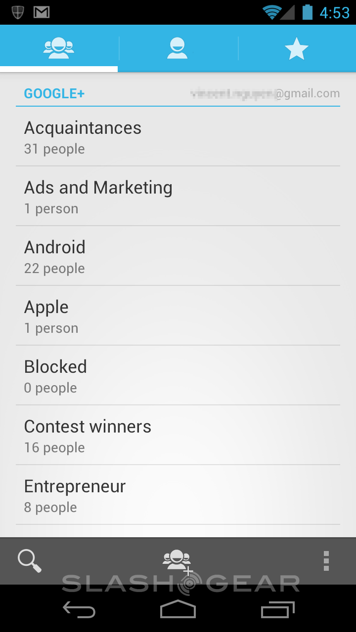
Android's contacts app has been gradually getting more complex since the first-gen release, with Google borrowing OEM ideas for integrating social networking updates in with individual contact records, and including that in the core app itself. In ICS the People app is more of a hub than a simple address book: it will obviously show individual records, pulled in from your various Google, Exchange and other accounts, but also synchronizes what groups you may have organized them into.
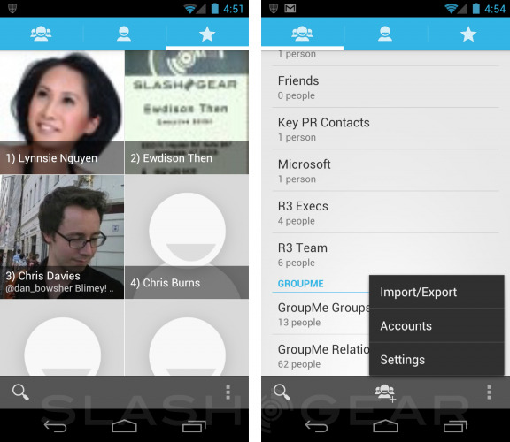
Tap an individual – or a group – and you see their thumbnail picture, assuming the social networking services they're using, like Google+ or Twitter, have one, along with their contact details. Swipe to the right and you see a summary of their recent activity, including how many +1 or comments they have on Google+ posts; tapping within the activity list opens the relevant app. Finally there's a favorites pane, allowing you to pin your most frequent contacts to the top of the list, as well as showing those you get in touch with – either by phone, email or some other method – most often underneath.
Browser
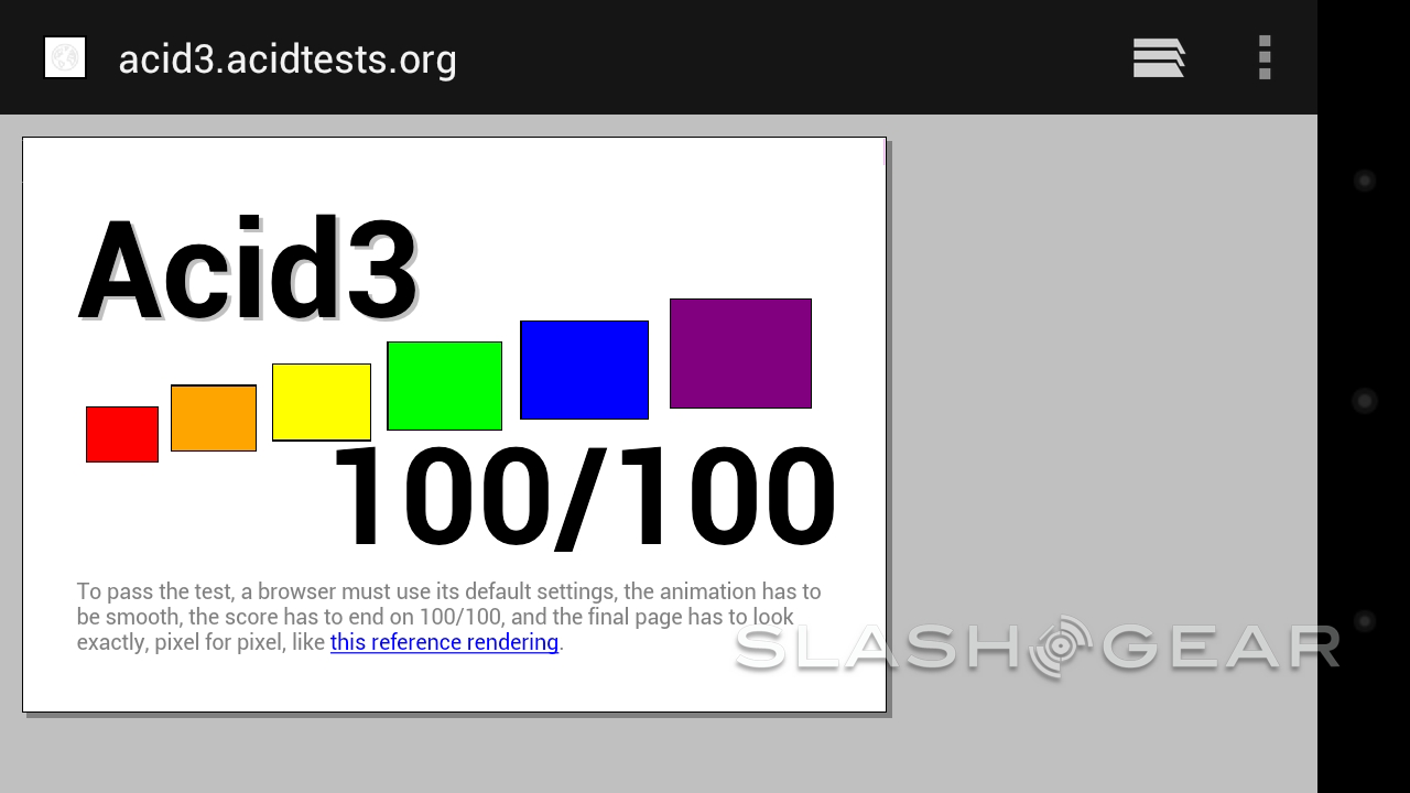
Mobile internet access is, along with email, one of the most common uses for a smartphone, and happily the ICS browser is an excellent way to get online. Performance of the WebKit-based app is a particular highlight, with pinch-zooming and panning both silky smooth. However, it's also fast under the hood: we ran SunSpider, the test of JavaScript performance, and the Galaxy Nexus came up with a score of 1,987.3ms overall. The Acid3 test of standards compatibility scored a cool 100/100.

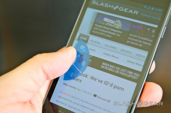
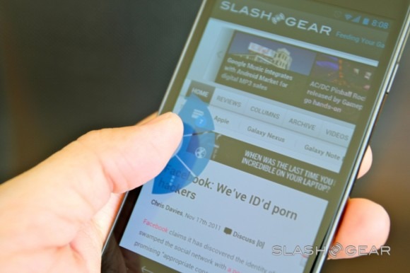
Tab previews are carried over from the multitasking UI, with the same thumbnail style; you can have up to 16 open at once, and side-swipe to close them down. Meanwhile, under the "Labs" features there's a useful semi-circular menu that can be dragged on-screen with a thumb-swipe gesture from the right or left edge. That offers quick access to the browser tabs – with a list of them floating next to the menu while your thumb is on the button – as well as the address bar and options menu, but otherwise leaves more screen space for the browser itself.
The option to save webpages locally for reading later – even if you have no connection – is present, complete with images, though unlike with some offline reader apps there's no way to specify a number of links "deep" to follow and locally cache as well. Try to navigate beyond the saved page and you'll need to go online again. More useful perhaps is the "Request desktop site" option which attempts to bypass the slimmed-down mobile pages many websites now offer, and head straight to the full-fat version.

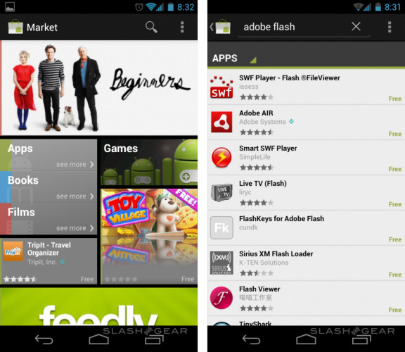
One topical omission is Flash Player support. ICS has launched without a version of mobile Flash, and we had no luck attempting to install the old version. Adobe has confirmed that it plans to have an updated version for Android 4.0 ready by the end of the year. Until then, figure you'll be spending more time in the dedicated YouTube app, which has been updated to prioritize higher-quality videos.
Gmail
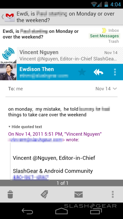
Android's Gmail experience has always been the best of any mobile platform, and ICS raises the bar again. Commonly accessed controls have been shifted to the fore, like managing archiving and tags, along with marking emails as read/unread and trashing them. Rather than small arrows to move through messages in order, swiping takes you forward and back, though unfortunately there's no pinch-zooming on offer. You do get offline sync though – set by default to 30 days, but user-adjustable – which keeps a cache of the most recent emails for browsing when you're without a signal. Best of all is the speed, though: hardly any lag when opening even the busiest of inboxes, while messages themselves load in short order.

Calendar
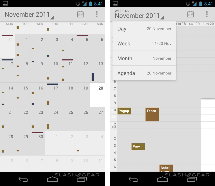
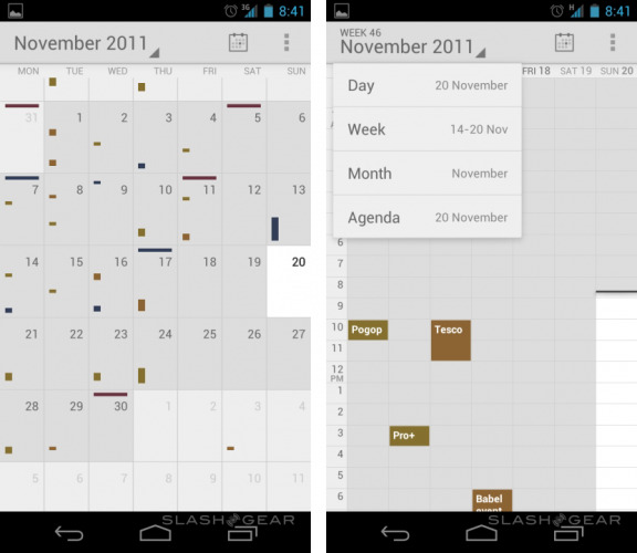
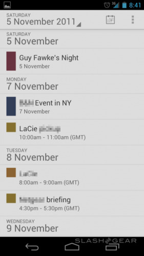
Swiping and pinch-zooming make themselves known in the Calendar app, supporting all the various agendas from your Google, Exchange and other accounts, with the new ability to – webOS style – pinch to expand or shrink how much of the day/week/month is on-screen at a time. That's useful for flipping between an overview and getting to grips with the specifics of a busy morning, for instance. Color coding is obviously supported, and there are day/week/month/agenda views.
Camera
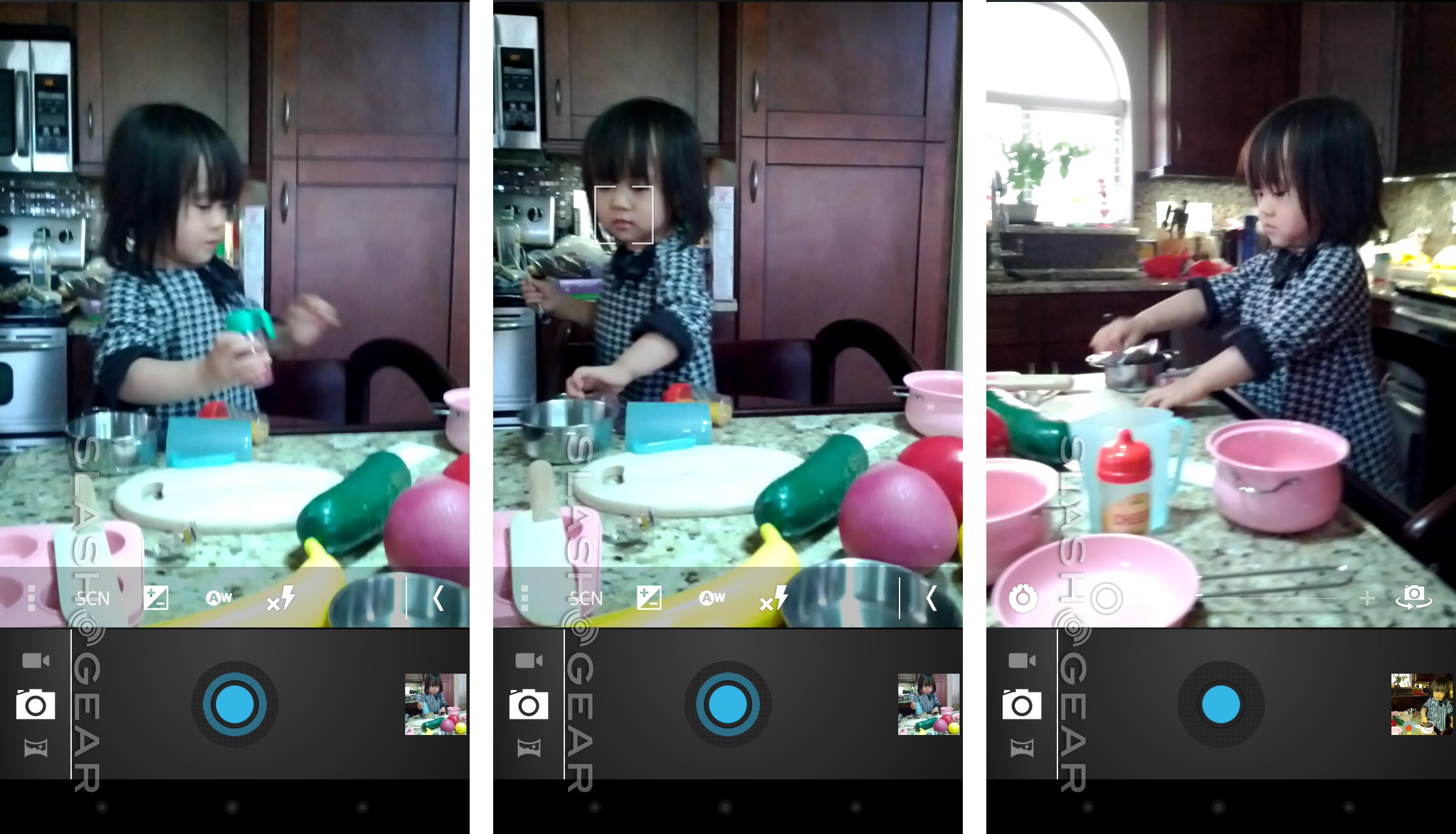
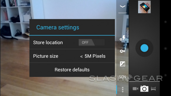
Google's new camera app introduces zero shutter lag, with the ICS promise being virtually no delay between opening the app, firing off a shot and then capturing subsequent images. In practice, it's certainly quicker than previous iterations of Android, though we've found some of our images have ended up showing blur simply from the movement of tapping screen.
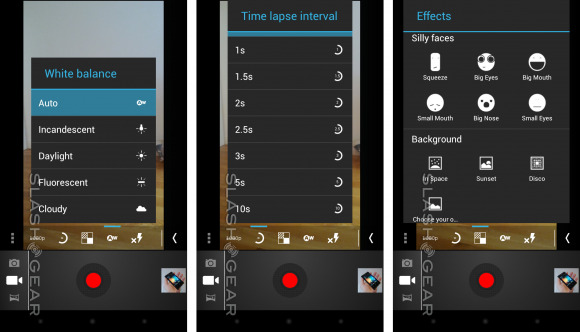
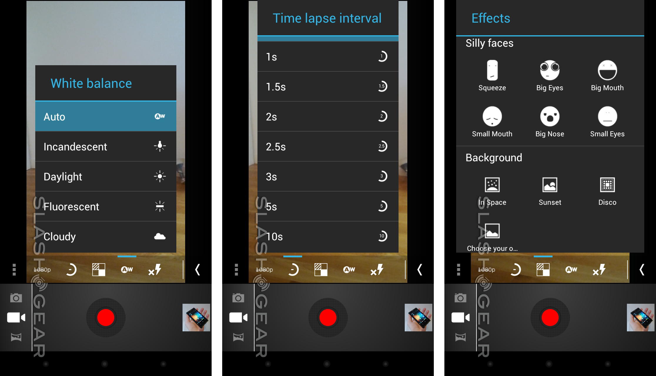
Touch focus works well, though we'd prefer to see both the digital zoom and settings options on-screen simultaneously, not toggle between them. There's certainly enough space for it. Alternatively pinch-zoom would be a welcome addition, as on the iPhone. For stills there are five scene modes – auto, action, night, sunset and party – along with adjustable exposure, white balance settings and flash control – auto, on and off – while for video there are white balance and LED light options, together with time-lapse shooting (ranging from 1s to 10s). Cleverly you can tap the screen during video recording and save an image, without pausing the video capture.
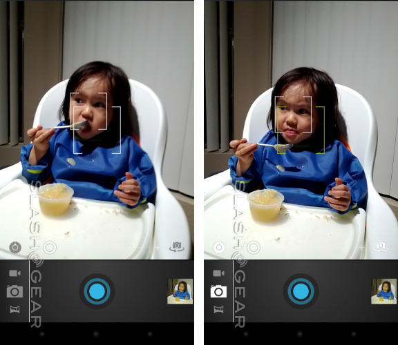

Video also gets a range of digital effects. Face-tracking is used to morph your subjects in real-time – squeezing their face, giving them oversized or undersized eyes, mouth or nose – or digitally change the background behind them. Having chosen your background (either a preset or an image from the Gallery) you then step out of frame, and when you return you're digitally overlaid on top. It works, just about, though is more gimmick than anything useful.
Finally, there's panorama mode, which allows you to create a wide image pieced together automatically from multiple frames. It's certainly easy to use – hit the button and then pan around, with an on-screen gage showing your progress and pop-up warnings telling you if you're going too fast – though the end results aren't always equally impressive. Sometimes ICS seems to struggle pasting the different frames together neatly.
Once you've taken shots, there's on-device photo editing, including Instagram-style filters, red eye reduction, color tweaking and various effects that can be applied. Edited shots are saved as separate copies, leaving the original intact. Sharing is made simple, with a drop-down menu of all the options and Gmail a dedicated button at the top.
Data and Battery Monitoring
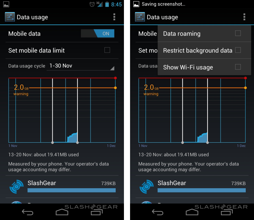
As more people get to grips with the capabilities of their smartphones, carriers seem to be taking backward steps with their data networks, reducing monthly allowances and following through on expensive out-of-bundle overage fees. ICS introduces granular monitoring of data use, with the option to set global limits – custom to your own particular tariff – as well as investigate which apps have been chomping through megabytes. If you find a particular culprit, you can choose to curtail its background data access altogether. The whole thing could be overwhelming, but Android 4.0's straightforward draggable guidelines over a graph of use makes it somewhat more approachable.

Similar insights are available for battery use, with a breakdown of which apps or services are most demanding – the core Android OS and the screen were the most gluttonous in the Galaxy Nexus, unsurprisingly – though there's obviously less flexibility over what to do with power-hungry software. Basically, your choice is to shut it down or use it less, though at least seeing which are the worst culprits can help you eke out more runtime when you're running low.
Face Unlock
Is a phone that recognizes your face a gimmick or the next step in biometrics? Right now, though certainly eye-catching, Google's Face Unlock feature in Ice Cream Sandwich is more toy than dependable security feature. The concept is clever: you teach your phone what your face looks like, and then next time you go to unlock it it merely looks at you and lets you in.
Facial Recognition, Battery Life, GPU Rendering, and more
Unfortunately, reliability proved patchy. The recognition rate is fairly decent – as long as the lighting is good – but we still experienced more than a few occasions where the Galaxy Nexus would claim either not to recognize us or, even more insulting, that it couldn't even find a face in-shot. If you're wearing sunglasses or a hat, that can also confuse the system; we'd like to see multiple profiles supported, so that we could show ICS what we look like in a few different ways and hopefully boost recognition accuracy.

There's also a reasonably pregnant pause in-between waking the phone up and Face Unlock starting: time within which you could easily have swiped out a traditional security pattern or punched in a PIN. That's before you get to the well-publicized fact that you can fool the system with a photo of your face. In short, it's a cool trick for (well lit) parties, but not something we'd entrust anything legitimately confidential to.
Android Beam
Google is already pushing NFC as a mobile payments system, but Android Beam uses the short-range wireless technology for data transfer instead. Given the speed and proximity limitations, it's being positioned as a way to quickly exchange links – such as to webpages, apps, YouTube videos and the like – along with contacts and directions between two phones.

Obviously each phone has to support NFC, which meant we were unable to test it on our Galaxy Nexus review unit, though if we had a Nexus S we could apparently transfer the data as a collected tag. However, having tried it during previous press access, we know it works: simply hold two phones back-to-back, tap the "share" button on-screen, and the data zips across.
Android Market
Google's download store looks just as we've seen in recent updates on older devices, with a refreshed block-based UI that's more engaging than previous iterations. Unfortunately the actual content of the Android Market isn't entirely up to speed with ICS: as well as the obvious Flash incompatibility, we've spotted a few other apps that aren't included in search results as they're not yet supported. The official Tumblr app doesn't work, and several games were also missing.
We've also noticed some issues with widgets, though that could also be connected to the font change. Most obvious is the Facebook widget, the "What's on your mind?" text no longer fitting into its usual space. These problems are likely to get addressed as more developers get access to Ice Cream Sandwich.
Wrap-Up
Good software does its job in a clean, consistent way. Great software does all that, but then delights you with its usefulness, the thoughtful moments peppered throughout by developers who really care about their work. That's the level Android has been elevated to with Ice Cream Sandwich.
Core apps, like the browser, calendar and Gmail "just work" while the UI around them feels tailor-made for multitasking. Google has pared down unnecessary lists and, for the most part, extra button-taps, replacing them with clear iconography, easily learned gestures and bold graphics. It all looks great, certainly better than any manufacturer skin we've seen.
Google's Nexus range always raises the bar for Android OEMs, laying out the company's expectations for the next generation of mobile devices. With Ice Cream Sandwich, Google has done the same for Android software developers: set a standard by which it – and users – will judge their apps. If Android coders can live up to that challenge, Ice Cream Sandwich will mark a huge turning point in the platform's lifecycle. Android has always had huge promise: Ice Cream Sandwich delivers on it.
Chris Davies contributed to this Galaxy Nexus review.

