Android Cheeseburger Emoji Fixed: Our Long National Nightmare Is Over
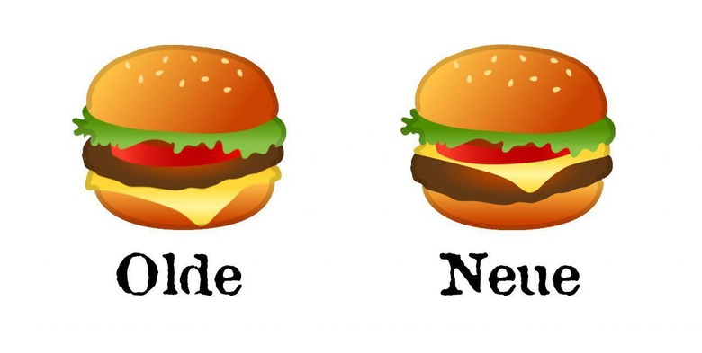
Thank goodness, some good news is finally here – Google's taken the time to correct an egregious error. Before today, the Google-designed emoji for the *burger* had its ingredients out of order. It went bun, lettuce, tomato, burger, cheese, bun. That's complete madness of course – the correct order has the cheese ABOVE the burger, to ensure maximum taste and minimum soggy bun.
Google CEO Sundar Pichai responded to an inquiry last month about the state of Google's burger emoji. He said they'd drop everything and make this burger their top priority. We now know we can fully trust Pichai with all things both burger and non-burger related.

The emoji change happens in Android 8.1 Oreo. This is the version of Oreo that comes with the Android Beta Program update this week. It would appear that the burger's design was redone ever-so-slightly, with a few color tweaks to account for the movement of elements.
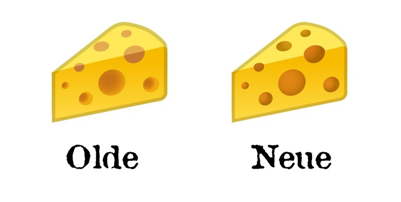
There's also a cheese-related update which deepens the holes of said cheese. This cheese's design cuts the borderline between top and side, but now only where the holds make it cut. These holes also now have darker edges on their insides, allowing the image to portray actual holes, not just sorta-holes.

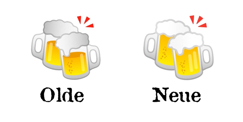
As Emojipedia shares today, Google also fixed some beers. The *beer* emoji as well as the *beers* emoji now have their physics a bit more correct. Before now, both beer and beers had their frothy heads in place, but above a partially-empty set of mugs. That just doesn't make sense.

In the newest versions of the beer and beers emojis, Google's done the right thing. They've went ahead and filled up these beer mugs right on up to the top. As my ancestors have said since god knows when: In heaven there is no beer, that's why we drink it here. Prost to you, Google design crew.
