Android 4.4 KitKat Screens Leak For Nexus 7
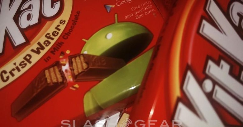
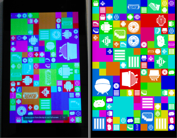
It's time to have a peek at Android 4.4 KitKat in its dualing near-complete edition for the masses on a Nexus 7 tablet from 2013. This version of Android is shown with a couple of clues as to its origins, the first being a glimpse of the software's single Easter Egg, one similar to each previous version of Android in its access through a hidden tap in a Settings menu deep within the device. Here you'll find the codename "Android KeyLimePie" sitting below a rather obviously referenced Nesle logo – saying Android instead of the candy company's original title.
Under the hood of that first Easter Egg screen you'll find a grid of desserts flowing in and around one another, this set of screens showing off Android Cup Cake, Donut, Eclair, Froyo, Gingerbread, Honeycomb (as a bee), Ice Cream Sandwich, Jelly Bean, and a set of KitKat bars (1, 2, 3, 4 of them). This screen will be accessible by tapping the Android version in About Phone in your device's Settings list – all the way down at the very bottom with a multi-tap.

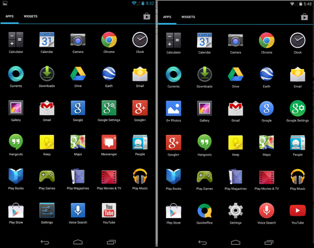
In apps you'll find a couple of cuts and additions. The addition of G+ Photos was made back in Android 4.2 and Android 4.3 for users out in the wild, but this comparison screen shows a few more blips in tune. You'll also find the change-up of the Google and Google Settings logos from squares to circles, placing these aside now from the Google+ logo which remains inside a square. Hangouts also sticks around while Messenger for Google+ leaves entirely.
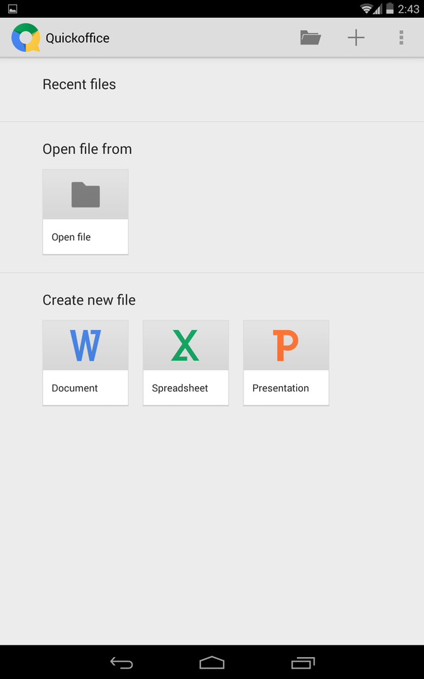
You'll also find the addition of Quickoffice (presumably right out of the box from Google), and updated Settings icon, and the changing of the Voice Search icon and the YouTube icon. The Voice Search icon now closely resembles that of the icon delivered with the Moto X.
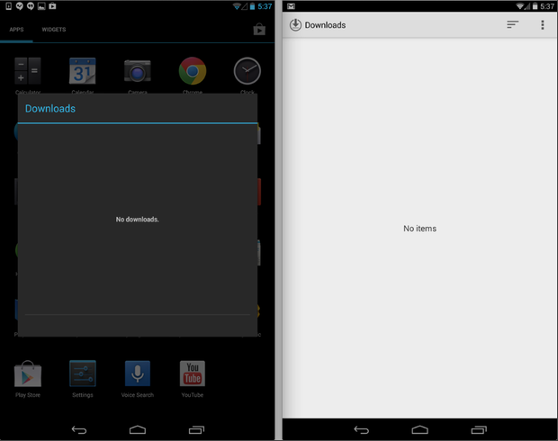
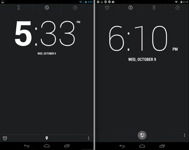
Also appearing in this drop of KitKat software is the addition of Tap & Pay, made for NFC smoothness with Google Wallet as we saw with previous leaks. In the deepness of these settings you'll find Cloud Print abilities as well. Tiny design changes are coming on with fonts and the changing of the guard for your clock, including connectivity to time zones through Maps. And of course the downloads screen has been updated, allowing a lot more workability than in past editions of the app.
Have a peek at the gallery of images above straight from ZDNet and be sure to have a peek at SlashGear's KitKat tag portal for more. This system will likely appear before the end of the month, right around the time Halloween and the Nexus 5 are delivered to the public. Keep an eye out!
