Android 3.2 Banishes Screen Incompatibility For Former Handset-Only Apps
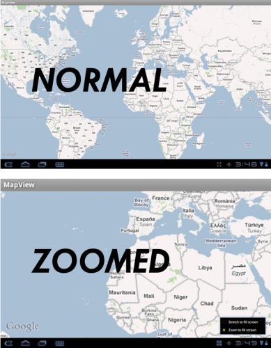
Today our good pals Tim Bray and Scott Main, Android developers the both of them, have let the world know that in an upcoming version of Android (that being more than likely Android version 3.2 (another version still classified Honeycomb,) you'll no longer have to worry about purchasing an app that'll only work on your smaller handset. Now instead of some apps going all wonky when they're brought up on a tablet-sized screen, Android has a new ability to choose between Stretch to fill screen and Zoom to fill screen. What a joy for the future of all-size-compatible apps!
What we already know to be true is that, while certain other mobile OSs rely in single buttons that take pixels and STRETCH them out of proportion for the larger screens they might be shown on, Android seeks to alleviate the problem with this new Android 3.2 Honeycomb release. The thing YOU as a developer should be worrying about at this point is the following, and it's actually more of a tidying up sort of situation: you need to make sure you update your apps as soon as possible to disable screen compatibility mode so that this new function can shine through.
What's going to happen here is that any app that doesn't specifically target Honeycomb – that is, apps that aren't specifically made for tablets only, will now have this button available that will allow them to either stretch to fill the screen with the app or zoom to fill the screen, whichever looks better to them. What Zoom to fill screen, aka the new screen compatibility mode does is to run your app in "an emulated normal/mdpi screen (approximately 320dp x 480dp" – taking that and scaling it up to fit the screen. What you'll be doing here is looking at the app the same way you'd be looking at it in a phone, but now the pixels are bigger. Aka it doesn't look very pretty, but it's not eating up resources.

SO, what's this all mean?
It means the solution is really no better than it is currently when you're using an iPhone app on an iPad. There's a 2X button sitting in the corner, for those of you that don't know, allowing you to actually see the app the same size you would on an iPhone or enlarge it, enlarging the pixels as you do so, essentially the same way they're doing it here with Android's next Honeycomb.
Good solution?
No, I don't think so. It's ugly on the iPad and it'll by ugly when I try to play tiny games up on the giant tablets sitting here on my desk. I'll just go ahead and wish for some sort of much better solution when Android 4.0 Ice Cream Sandwich is released. Please, oh please.
Meanwhile get a better idea of what Honeycomb is by checking our our original review and Android 3.1 hands-on and review. Then wait for Honeycomb 3.2, coming in August, perhaps.
[via Android Devs]
