Android 12's Widgets Focus Is Well-Timed But Long Overdue
Although it is often criticized for copying every new Apple innovation, there have been times when Android actually demonstrated new features that would eventually become commonplace in the mobile world. Unfortunately, some of those features may have been ahead of their time, or the opportunity to take advantage of them was squandered. Home screen widgets almost became a tragic footnote in Android's history, but it's, fortunately, getting a renaissance in Android 12, perhaps thanks a bit to Apple again.
A Home for Widgets
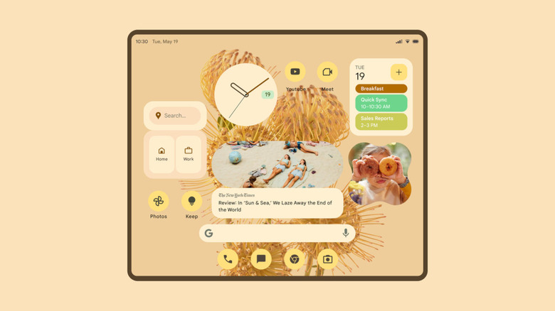
Widgets, those interactive elements that you can slap onto your Android home screen, have been around since the earliest days of the platform, even back when phone screens were too small to have room for them. Android has had support for exposing distinct functionality or shortcuts to parts of an app that many developers, designers, and users have taken advantage of. This can range from an embeddable calendar to a shortcut to a cloud storage folder to even graphs for the phone's many sensors.
Widgets were once a source of pride for Android users, a distinct feature that was sorely lacking on iOS. It opened the door for customization, and some third-party app launchers took advantage of that. Even today, the Google Play Store is home to many widgets and home screens with rather ingenious and captivating designs, though not all of them turn out to be safe to use.
Unfortunately, Google itself didn't seem too keen on actually capitalizing on this unique platform feature and seemed content to just provide the functionality and leave it at that. Over time, it even seemed like Google was trying to phase out widgets with Google Assistant, Search, deep indexing, and instant apps. So it's a bit surprising that it suddenly took a U-turn and is making widgets a bullet point for Android 12.

Widgets for a more Material You
There have always been two aspects to Android widgets. One is the ability to quickly see or even access features that an app provides. That's the aspect of widgets that Google almost made redundant with Search's ability to dig into installed apps without even having to open them first.
The other appeal of widgets, however, isn't one that Google has been able to replicate in some other way, which is how they allow users to customize and personalize their phones to match their preferences. Arguably, that may be the bigger pull of Android widgets, and it is something that Google is now finally trying to tap into.
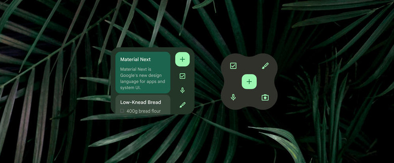
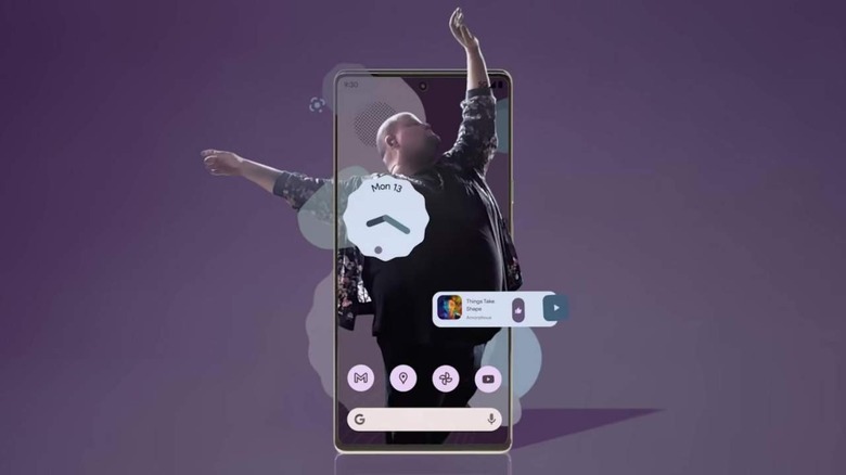
With Android 12 and the Pixel 6, Google is making a bigger push for more personalized experiences than ever before. What better way to do that than by improving and highlighting Android widgets, especially ones that can change shapes and colors to match your phone's theme. At long last, Google is giving widgets their due, though hopefully, it won't be a short-lived affair.

Timing is Everything
Google's timing to put widgets under the spotlight may seem perfectly timed for Android 12, but there might also be a different motivation for it. No longer an exclusive Android feature, widgets have landed on iOS and are even becoming a centerpiece on iPadOS. There has probably never been a better time for Google to both inform and remind people that Android has been there first.
Of course, Google also now has the opportunity to take widgets to the next level instead of just trying to outdo Apple's implementation. After stagnating for many years, there is most likely a lot of room for improvement, especially now that Google is pushing Android 12L, its own spin on what Apple did with iPadOS.
