Amazon Fire TV's New UI Arrives, But Most Users Will Have To Wait
If you're one of the many people who have been less than thrilled with the Fire TV interface, good news: Amazon is rolling out the update we were promised months ago, one that reduces the clutter and wasted space while making it easier to find the apps and shows you like the most. The bad news? The new UI is first arriving on only a couple of devices.
Amazon's Fire TV platform remains popular, but many users have criticized both it and Prime Video's interfaces, complaining that they were both too cluttered and too full of empty space, making it hard to find apps and content. Back in September, Amazon announced that it had redesigned the Fire TV interface, only the second big design change we've seen on the platform.

As expected, the new UI will arrive first on the Fire TV Stick 3 and Fire TV Stick Lite, the two new models introduced earlier this year. It seems that other Fire TV device owners will have to wait until some time next year to get the update, but it's unclear when it will arrive and which other devices will get it.
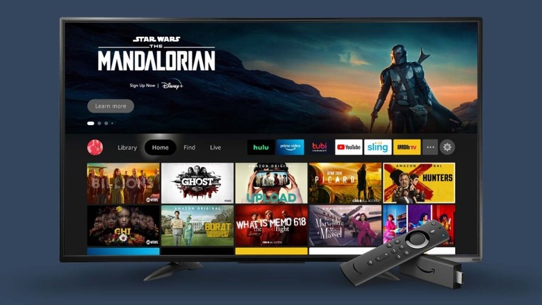
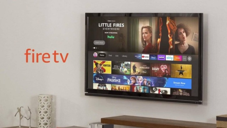
The details were provided to AFTVNews, which also shared multiple press photos of the new interface. Among the big changes is the addition of user profiles, meaning soon you'll be able to set up different profiles for the adults and kids in the house to keep content isolated and avoid having your shows messed up.
As well, the UI's navigation bar has shrunk and is now located below the main banner; the recently launched apps are displayed as small thumbnails next to the smaller navigation menu, plus there's picture-in-picture for pulling up (for example) a security camera feed alongside your show. The Alexa screen has also been minimized so that it no longer takes over the entire screen.
