Amazon Finally Gives The Kindle Home Screen An Upgrade
We may receive a commission on purchases made from links.
These days, tablets and smartphones are all the rage. But despite the number of these devices with colored screens, the faithful ebook reader has never gone out of fashion. At least the devices haven't. Their home screens, on the other hand, might need a show of love or two or more. Amazon is finally giving its Kindle ereaders some much needed attention. Without changing much of the reading experience, Amazon is tweaking the home screen and adding much desired features that make it easier and quicker to get to the content or controls that you want.
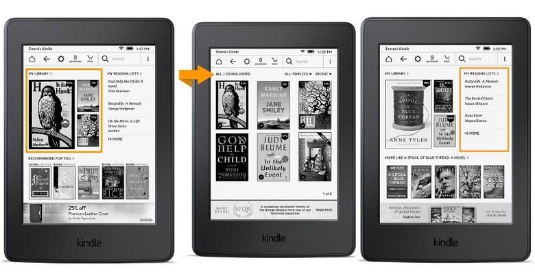
Ebook readers are hardly the beefiest computers, and they're not meant to be in the first place, but that doesn't mean their interfaces shouldn't be fast. If you felt that getting to your Kindle books was like a chore, you'd probably be happy to know that Amazon as sped things up a bit. Now your most recent reads are right on the upper left side of the home screen. And just one tap away, you have access to your library of books, both downloaded and still in the cloud.
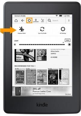
Getting to most used and most important controls is also faster. A single tap on the gear icon at the top brings down toggles for Airplane mode, Sync, Brightness, and a shortcut to all settings.

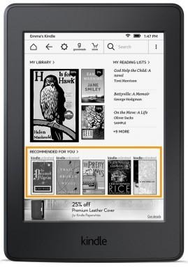
Of course, Amazon will also take the opportunity to sell you more books, and a recommendations slide in the homescreen rotates selected titles that might be of interest to you.

Sharing has also been made easier, both for the reader and for those you share it with. A quote or book can be easily shared on Goodreads, Facebook, or Twitter and those interested in your links can simply click on them to see a preview in their browser, even if they've never used Kindle before.

The new home screen and sharing features will be rolling out to the Kindle Paperwhite (2013 and 2015), Kindle (2014), and Kindle Voyage (2014) in the next few days via OTA updates.
SOURCE: Amazon
