Adobe Photoshop Sketch Review With iPad Pro And Apple Pencil
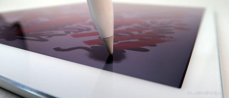
Over the past week and a half I've been using the app Adobe Photoshop Sketch for iOS with the iPad Pro and Apple Pencil. It's not what I expected. I expected it to be an experience in which the stylus (the Apple Pencil) would be speedy and the app would have simple basics. As it turned out, the Apple Pencil is speedy, yes, but latency is so extremely small it's as if the hardware were made for this app specifically. This goes for the app interacting with the Pencil as well – tapping between brushes and backing up and drawing – all of this felt entirely natural.
The app Adobe Photoshop Sketch is made for painting pictures. I'd say it was made for drawing, but that'd be confusing due to the name of Adobe's very similar app called Adobe Illustrator Draw.
In Adobe's Illustrator Draw app, you're able to create vector illustrations – this Adobe Photoshop Sketch app is all about flatness and variety. If you're a graphic designer looking to do design work, you might lean towards "Draw", while if you're an artist, you man lean towards "sketch" – or if you're both, you'll use both.
Where "Draw" is all about flat, smooth edges, "Sketch" is about creating anything you want, however simple or detailed.
In Adobe Photoshop Sketch, I was able to work with a selection of brushes that emulate the effects of pencils, pens, brushes, and spray paint. Each brush allows you to be flat or blend – each color is able to participate with the rest of the image already on the page or fall flat upon it.
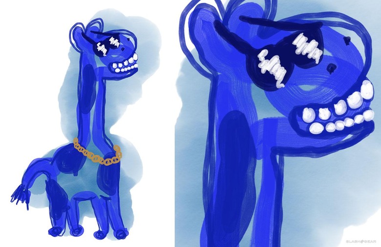
ABOVE: This giraffe is created with a set of several brushes. Starting with a blue watercolor brush, the color is allowed to spread and wash out. Later in the image, paint markers are used to create flat, non-blending areas (like the teeth).
Once you've created a sketch, you're able to send said piece of media to Illustrator or Photoshop, scaling your work up "4x" to print, if that's what you're all about, or creating a layered PSD with Photoshop.
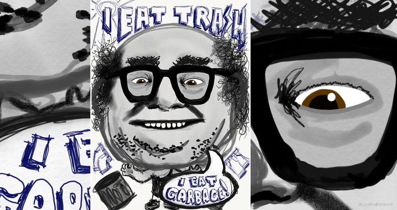
ABOVE: A variety of brushes are used to replicate real-world tools. Paint, marker, and a blue ball-point pen are created here, for example.
The layers bit isn't as exciting as you might imagine. While you are able to keep your background image (if you have one) separate from your sketch, that's about the extent of it all. This isn't like full Photoshop where you're able to have as many layers as you want.
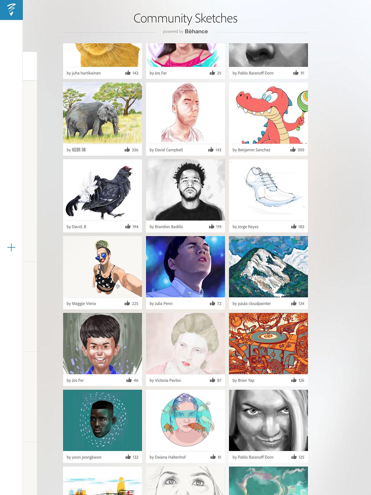
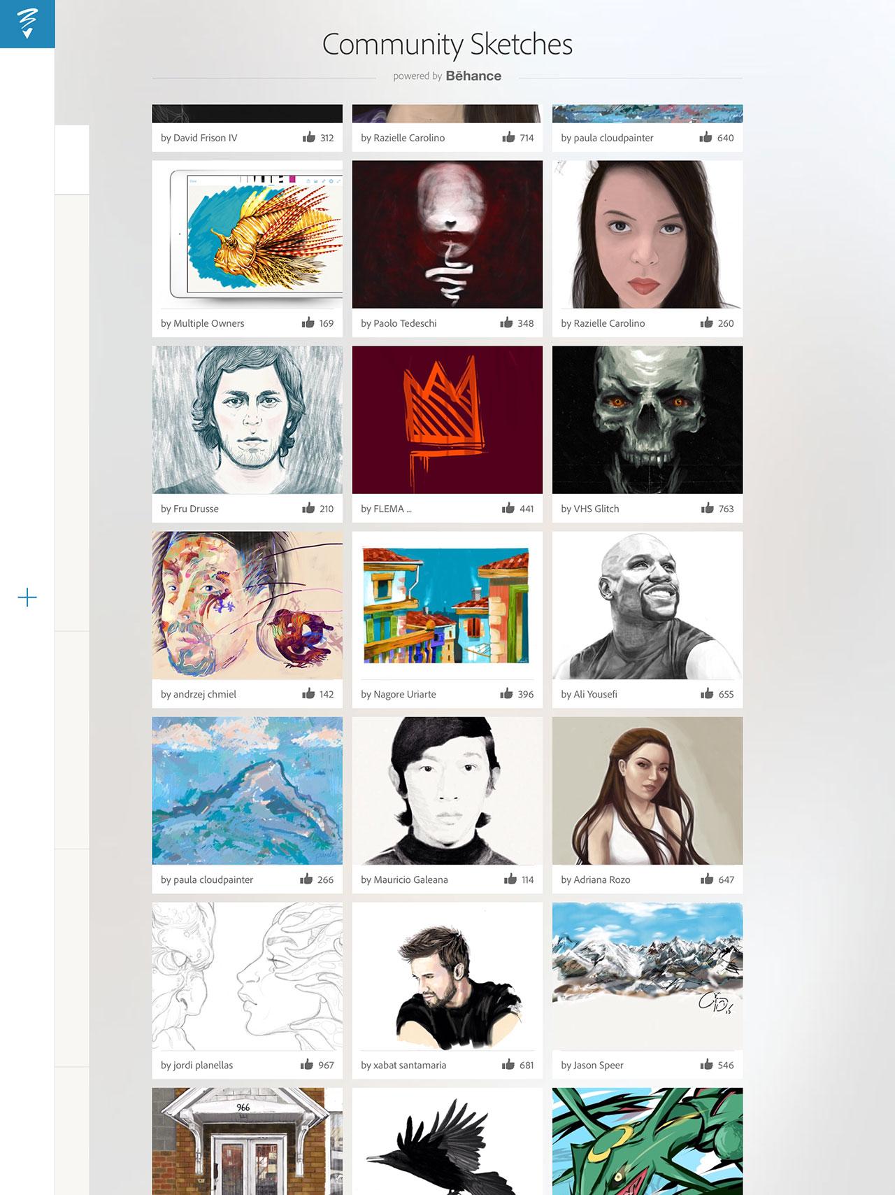
This app is connected to the art/design social network Behance, allowing you to share your artwork really, really easily. Sharing occurs from within the app, and you're able to browse other users' works made on the same platform from within the app as well.
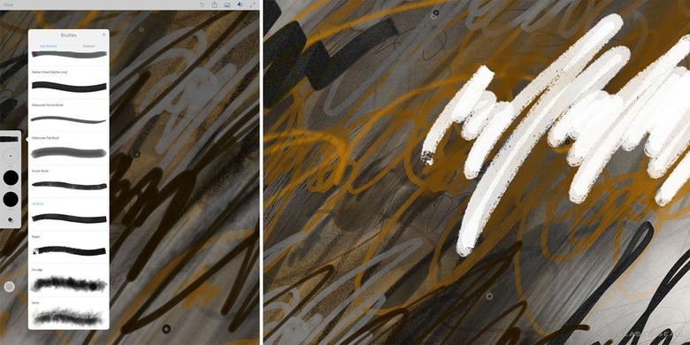
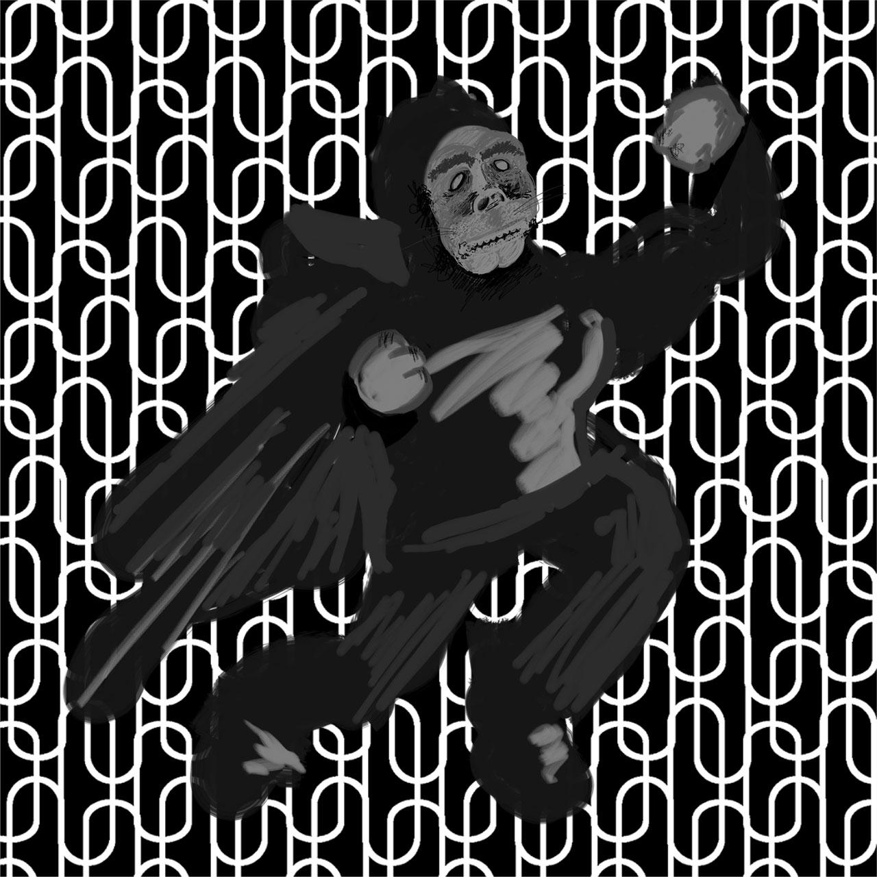
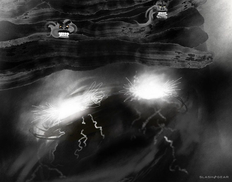
ABOVE: Brushes of all sorts allow the artist or designer to create a wide variety of strokes and blends. BELOW: While brushes replicate real-world tools, the user benefits from remembering that they're working with an inverted canvas, where light doesn't just bounce off the image, it shines out from it.
I find that working with Adobe Photoshop Sketch makes me want to draw more than I have time for. It's a testament to the quality of the app as much as it is the quality of the hardware that I've not grown tired of using either together for almost two weeks, every single evening.
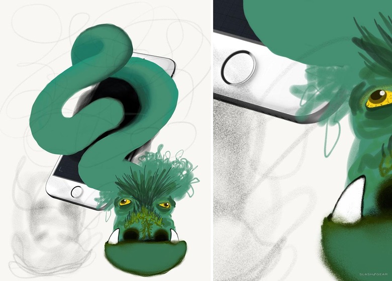
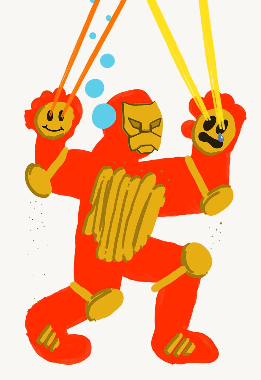
ABOVE: A dragon exits an iPhone, the iPhone having come from Adobe's stock library, accessible through the app. BELOW: A set of images created with Adobe Photoshop Sketch on the iPad Pro with the Apple Pencil (as it is with the rest of the illustrations in this review).
My only real concerns lie in the inability to use the side of the "lead" tip of the Pencil – which is more of an Apple hardware sort of problem than it is an Adobe thing – and the Adobe Stock UI and process.
iPad Pro is here: now its trial by fire begins
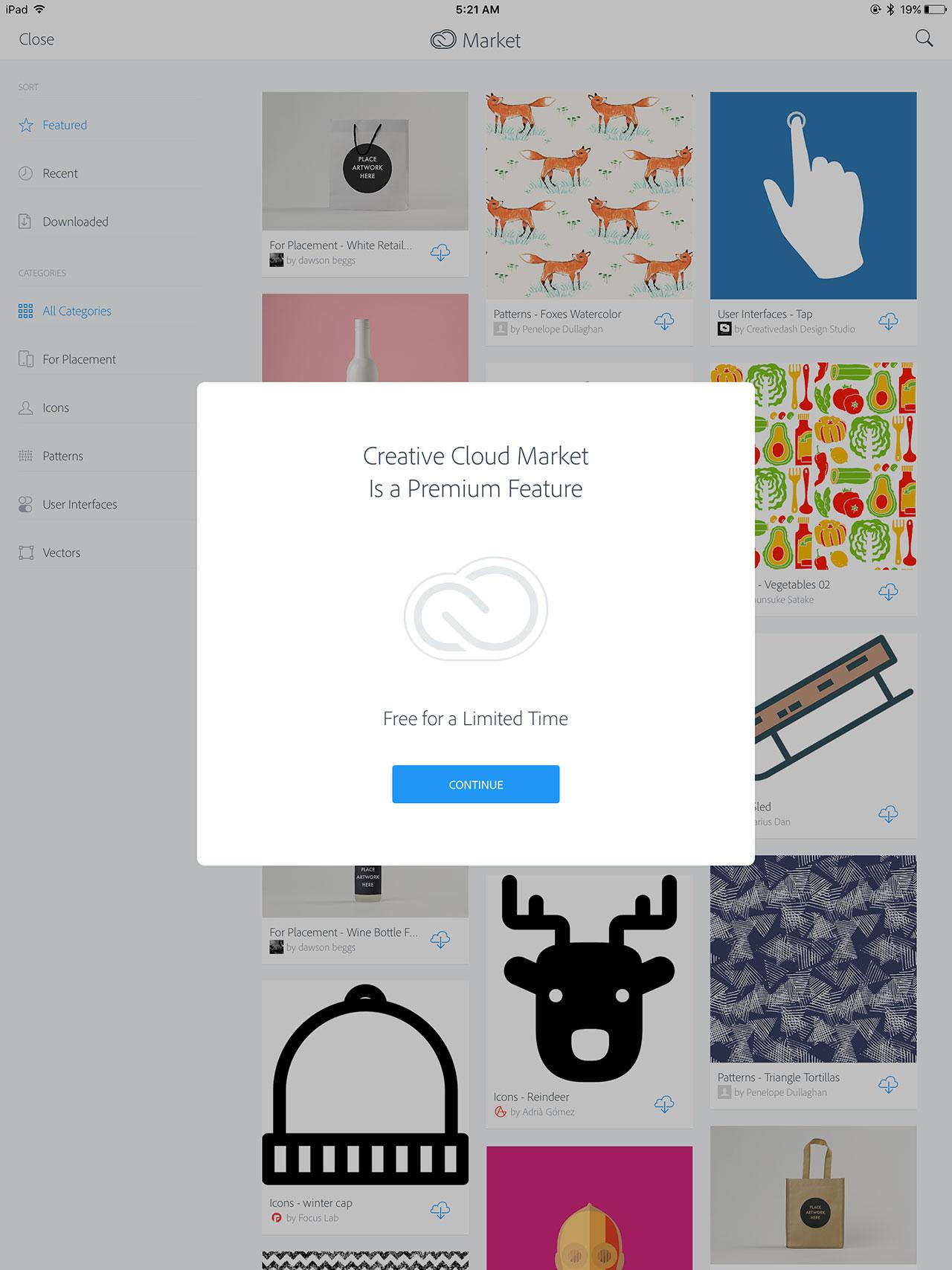
When I head in to find stock photography, brushes, backgrounds, etc., I feel that Adobe could be more up front about which bits and pieces are going to need additional licensing in order to use in a piece of media I'm planning on selling in the future.
Grabbing brushes and making brushes with the Adobe store interface here, too, isn't as intuitive as I feel like it aught to be.
Granted, the brushes that come with the app right out the gate, they're fine. But if I were planning on using this app to really and truly create a great work of art, I'd want more options.
Wrap-up
Adobe Photoshop Sketch is a perfect example of why artists and designers should give the iPad Pro some real thoughtful consideration. Along with the Apple Pencil, the iPad Pro and Adobe Photoshop Sketch feel as though they were made for one another.
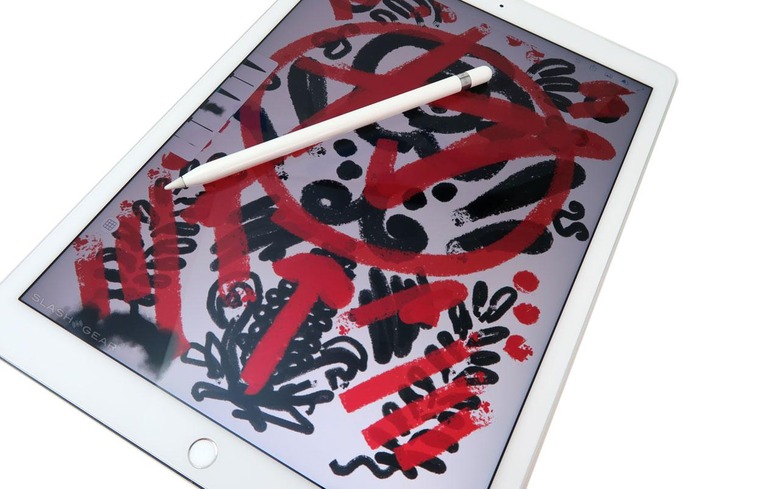
I'd say the same about devices with Android that have high-quality stylus action – like the Galaxy Note series – but with Sketch I'd much rather be creating on a far larger drawing board.
If you're considering checking out Adobe Photoshop Sketch, I suggest you to check out the free trial run of Adobe Creative Cloud. From there you'll be able to move back and forth between devices – tablet, smartphone, and desktop machine easily and seamlessly. It makes the whole digital creative process simple enough to be enjoyable.
